|
Curso de Paint Shop Pro
(PSP)
10 Texto
Perspectivado
Step 1 Start with a new file, white background, 16
million colors. Begin with something that's quite a bit bigger than the
size you want when you're done. You're going to want room to maneuver
your text. For the example I started with a file that was 400 x 400.
Make your foreground color blue (RGB 0,0,255) and put in some text. Be
sure that 'Floating' and 'Antialias' are both checked when you add the
text. A font with reasonably straight edges seems to work best. Here
I've used Times New Roman 48 pt. Be sure to leave your text selected.
Step 2 Now go to Image: Rotate. Check the box for
90 degrees, and the box that says Right. When you're done, move the text
close to the right hand border of your window and deselect it by hitting
[Ctrl} D.
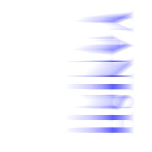
Step 3 Next, go to Deformations:Wind. Check From
the Right and make the strength 20. Your letters will blur and you
should get long streaks.
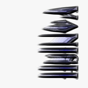
Step 4 Time to make things a bit more three
dimensional. Make your foreground color white, then go to Image, Other:
Hotwax coating. Apply the Hotwax twice.
Step 5 Next we take this image and blur it. This
will serve as the glow around our vans. Go to Image, Blur:Gaussian Blur.
Set the Radius to 5.00. This blur is the reason that your background
color should match your webpage. Transparent GIFs don't deal with blurs
very well.
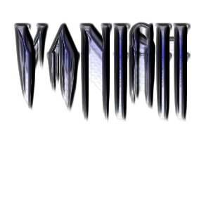
Step 6 Next we make sure that the text is easier to
read. Set your foreground color to RGB 48, 48, 101. This is a nice dark
gray that compleiments the other colors well. Other colors might work
even better, so experiment a little until you get something you like.
Now add your text again. Place it where your letters originally were, or
offset it a few pixels if you like. Remember - it's a 3D look you're
going for.
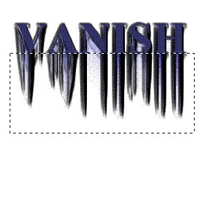
Step 7 Okay, now with the Selection tool, draw a
rectangle whose upper edge lies directly along the base of the text you
just layed down. You should have something like this:
Step 8 Next, use Deformations:Perspective -
Vertical. Set the % difference to 100. Deselect and you're done. To
finish up, crop your work and save it as a GIF. Remember, to set white
as your transparent color, first make it the background color, and then
go to Colors: Set palette transparency. Let the program decrease your
colors to 256, and then choose "Set the transparency value to the
current background color" from the popup menu.
Step 9 If you think the text looks too dull, there
are a number of ways to brighten it up. Here I've used Color, Adjust:
RGB with settings of Red 50, Green 0, Blue 100.
Step 10 Two more quick tips. The effect works best
if the words you choose have letters with vertical edges at the
beginning and end.
Espero que les sirva de algo
la ayudita
|
|
|