| Artists/Graphic
Designers |
Abram Games 1914
-1997 |
|
|
| Abram Games was part of generation
of British graphic designers who injected
new life into their profession. These designers
succeeded in developing a distinctively English
visual identity, often displaying gentle humour
and an illustrative, decorative 'touch' that
was popular in the post-war years. |
| |
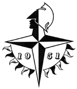 |
The
most famous example of Abram work is
the 1951 Festival of Britain, half circle
of waving flags in red, white and blue,
and use of Victorian style typography
(year date) as a link back to the first
1851 Great Exhibition. |
| |
| < Black
and white example |
| Symbol
designed in 1948 by Abram Games for
The Festival of Britain
in 1951 |
|
| |
| Born in Whitechapel, London,
Abram Games was the son of an immigrant Latvian
Photographer, and from him Abram learnt techniques
such as airbrushing. |
| |
| When, in 1936,
he won first prize in a London Country Council
(poster competition) he attracted the attention
of the legendary art director Ashley Havinden
and started to build up a client list that
included forward-looking companies such as
Shell, London Transport and The General Post
Office. |
| |
| In 1940 Games enlisted in the,
army and it was during the Second World War
that his reputation as one of Britain’s
leading poster artists was established. |
| |
| In 1942 he was appointed Official
War poster Designer, often using Surrealist
imaginary to create powerful propaganda images,
as in his famous ‘Careless talk Costs
Lives’ series. This willingness to use
the graphic language of the twentieth century
avant-garde makes his work of lasting interest. |
|
| |
| His
personal views on design were: |
 |
| -
Maximum meaning |
| -
Minimum means |
| |
| Both
statements are characteristic features in
his works with conceptual and symbolic quality. |
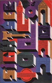
| Round
London Sightseeing Tour 1971, Games first
designed for London Transport
in 1937 > |
| |
|
|
|
| |
|
|
|
|
|