Print Design | Typography
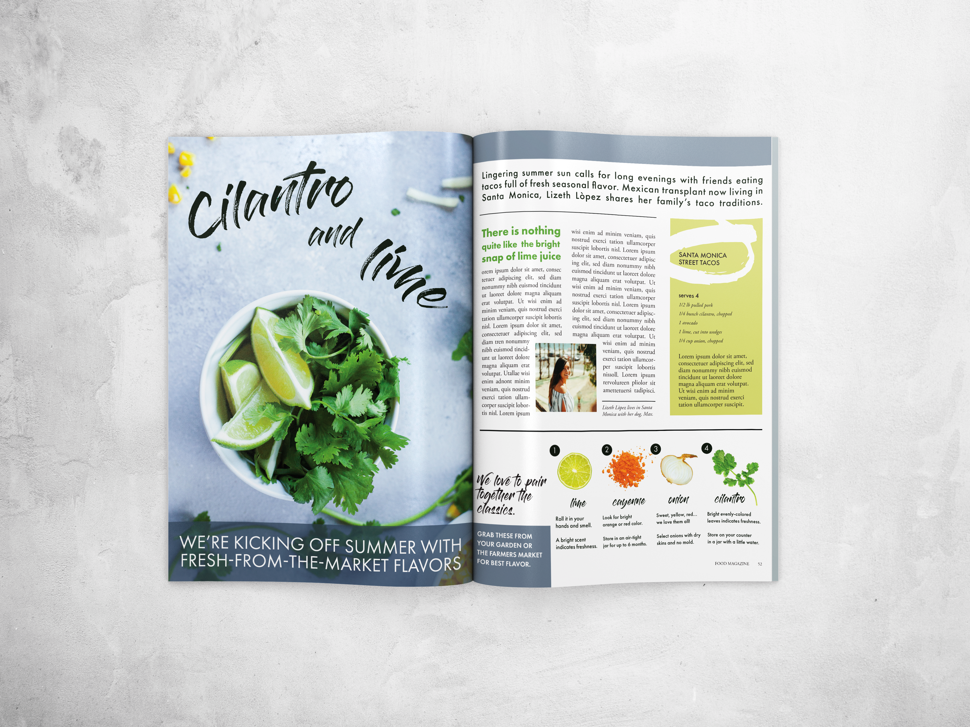
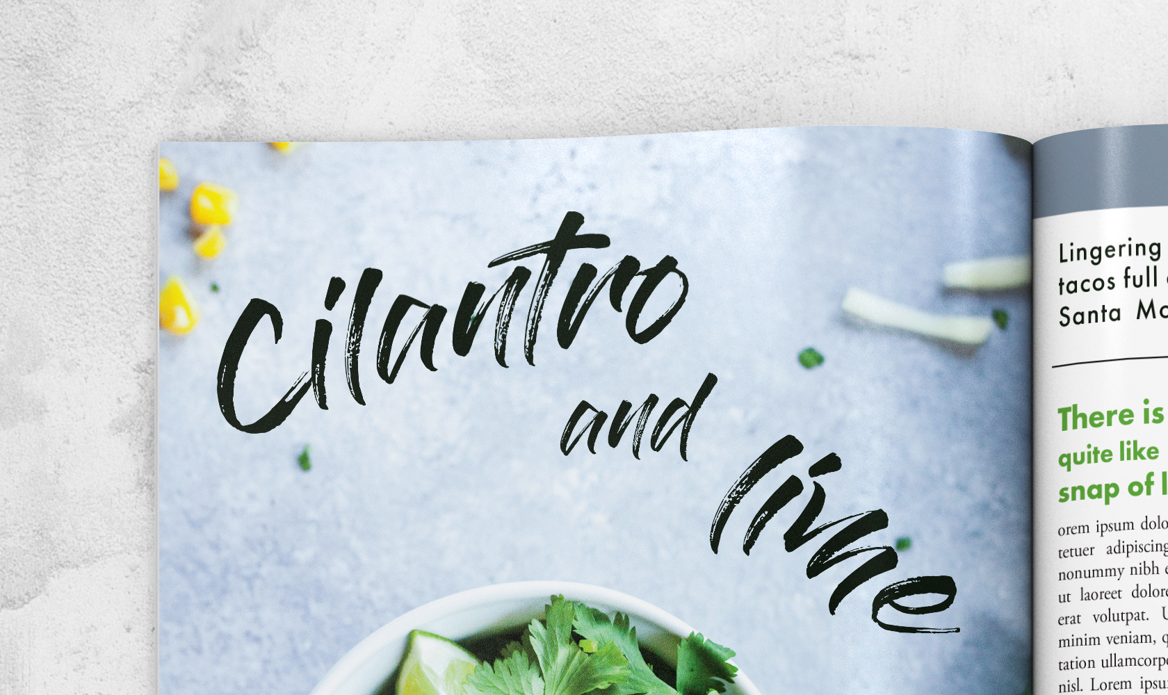
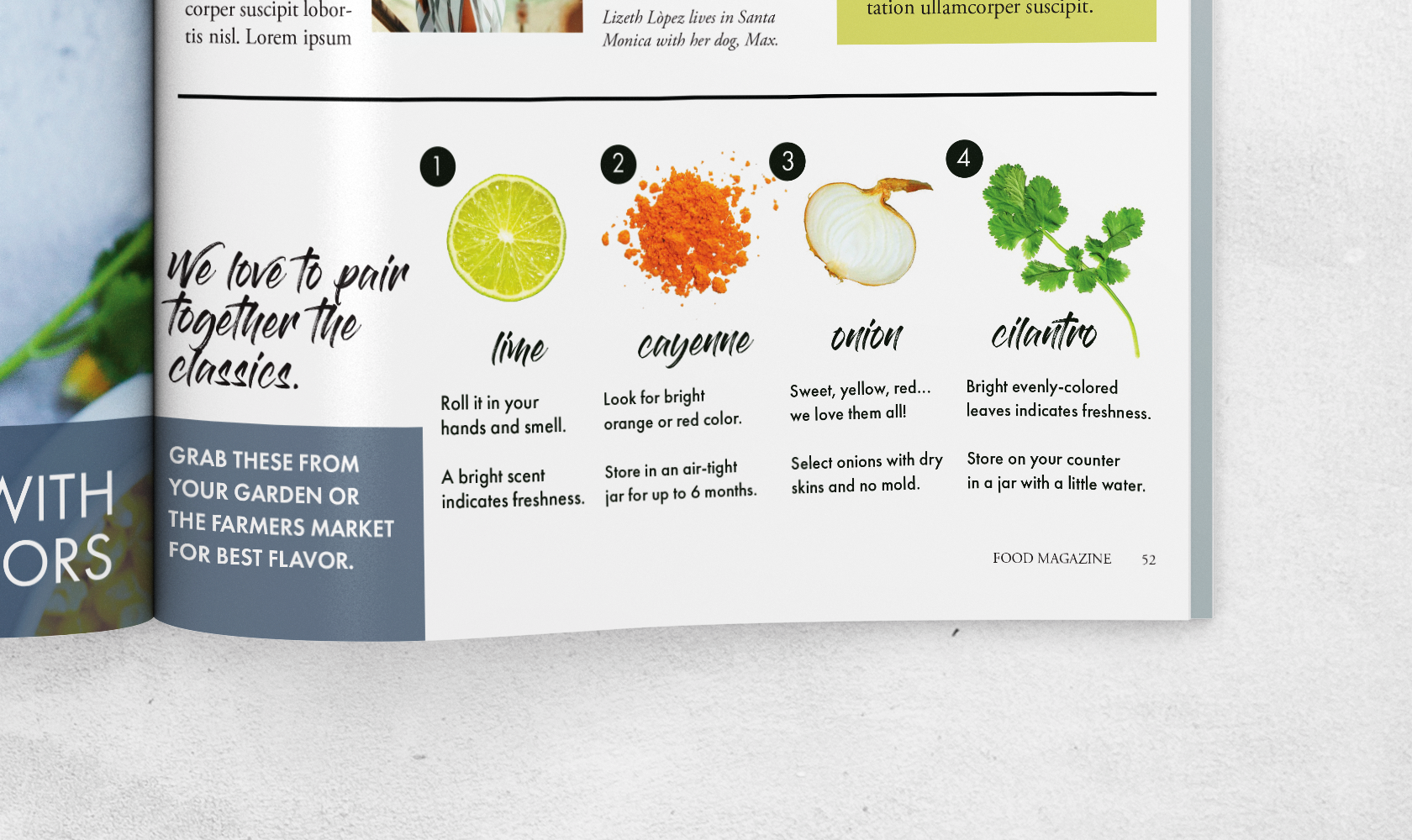
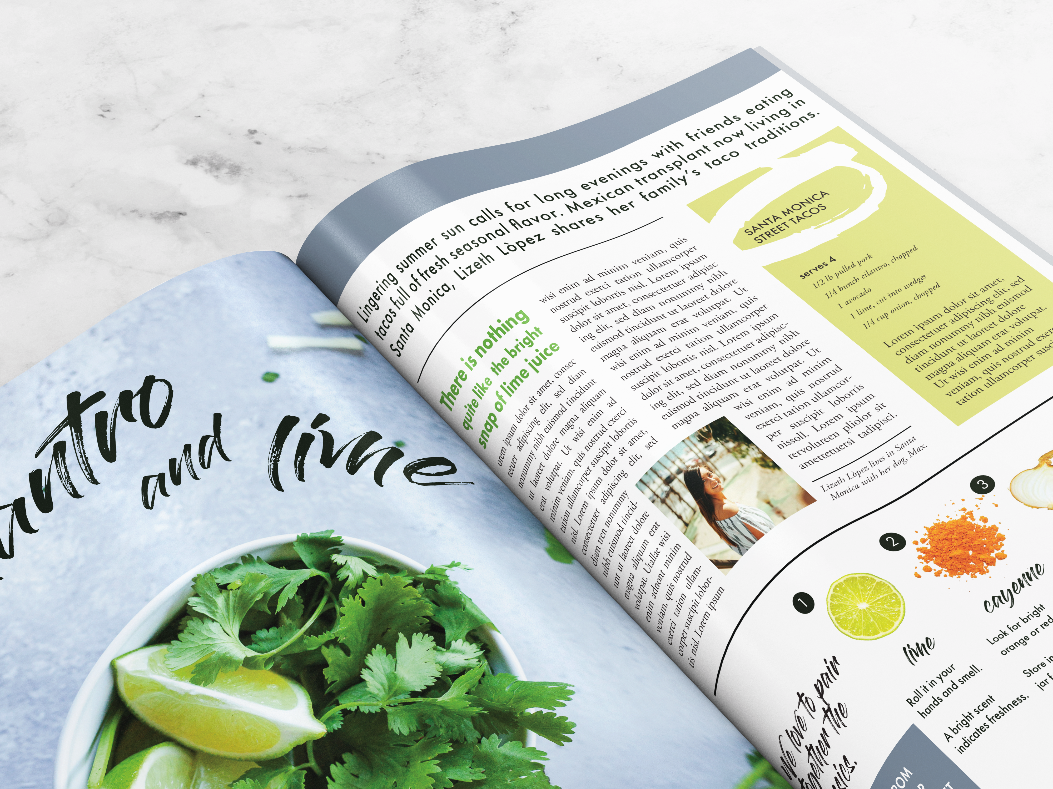
For Food Magazine's July/August issue feature on summer flavors, the main article features traditional Mexican cooking in America. Because the issue is highlighting the flavors of ingredients, I chose a full-page image with striking colors and modern composition and designed the title typography to play off the shapes in the photography. The same ingredient focus can be seen on the right page, where color and shape balance the negative space of the right page with the visual interest of the left page.