
|
| / Wallpapers |
|
| commentary\ |
|
 1600 x 1200, JPEG, 232k |
06.19.2005, 10:25 P.M.
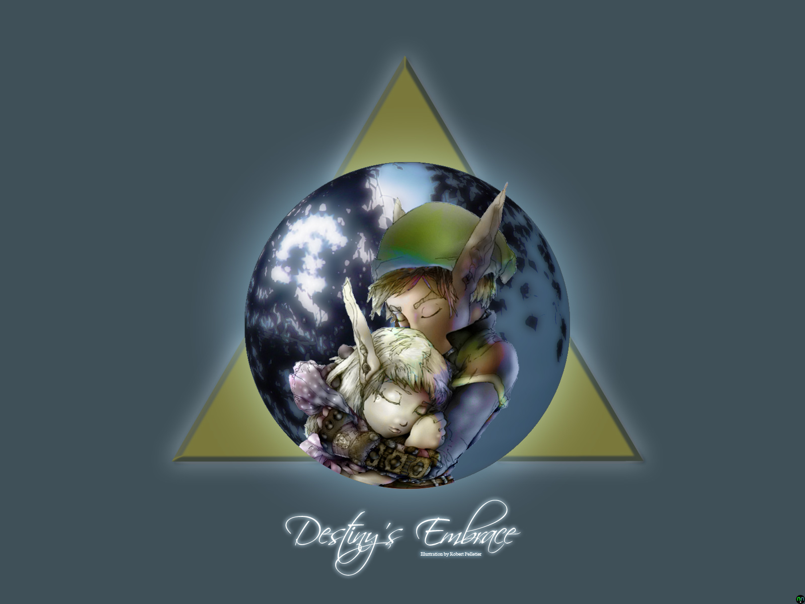
Not really much to say about this particular desktop design other than I just couldn't cut the umbilical cord. It was literally my baby off and on for months. A slight adjustment here, a tweak in lighting there, a complete change in tone and mood; you name it. I was blessed enough to have saved this illustration by Robert Pelletier for years after the GIA's untimely shutdown, and finally stopped sitting on my laurels and made it into the subtle, charming wallpaper it deserved to be. The background color was chosen to give the viewer a relaxing, tonal backdrop that would accent the center, while the "circle focus" in the center was made from Robert Pelletier's illustration and a stock photo of brilliant moonlight as it's seen through a willow tree's branches. The portrait of Link and Zelda's embrace was heavily accented and enhanced to make it look closer and more vivid than it originally appeared. This, of course, should keep the wallpaper simple, while drawing the viewer's eyes to the center. The font, by the way, is Scriptina and the Triforce in the background was hand-drawn then rendered to resemble the Triforce from A Link to the Past, the best Zelda game ever made... and now I'm done with it. I sincerely ask that all of my fellow Legend of Zelda fan enjoy this desktop design as much as possible, as it's taken up far too much of my time as it is.
|
/evaluation ::chrono cross ::chrono trigger ::devil dice ::dual hearts ::ephemeral fantasia ::fear effect 2: retro helix ::final fantasy ix ::final fantasy x ::grandia ::grandia ii ::harvest moon ::heart of darkness ::kaze no klonoa ::kaze no klonoa 2 ::metroid prime ::mischief makers ::panzer dragoon saga ::parasite eve ii ::shenmue ::silhouette mirage ::sonic adventure ::soul calibur ::strider 2 ::super mario sunshine ::tales of eternia ::tron ni kobun ::vagrant story ::virtua fighter 4 ::xenogears :.zelda, majora's mask
/texts
/wallpapers
/elsewhere
/legends
/contact |
 1600 x 1200, JPEG, 595k |
12.08.2003, 12:40 A.M.
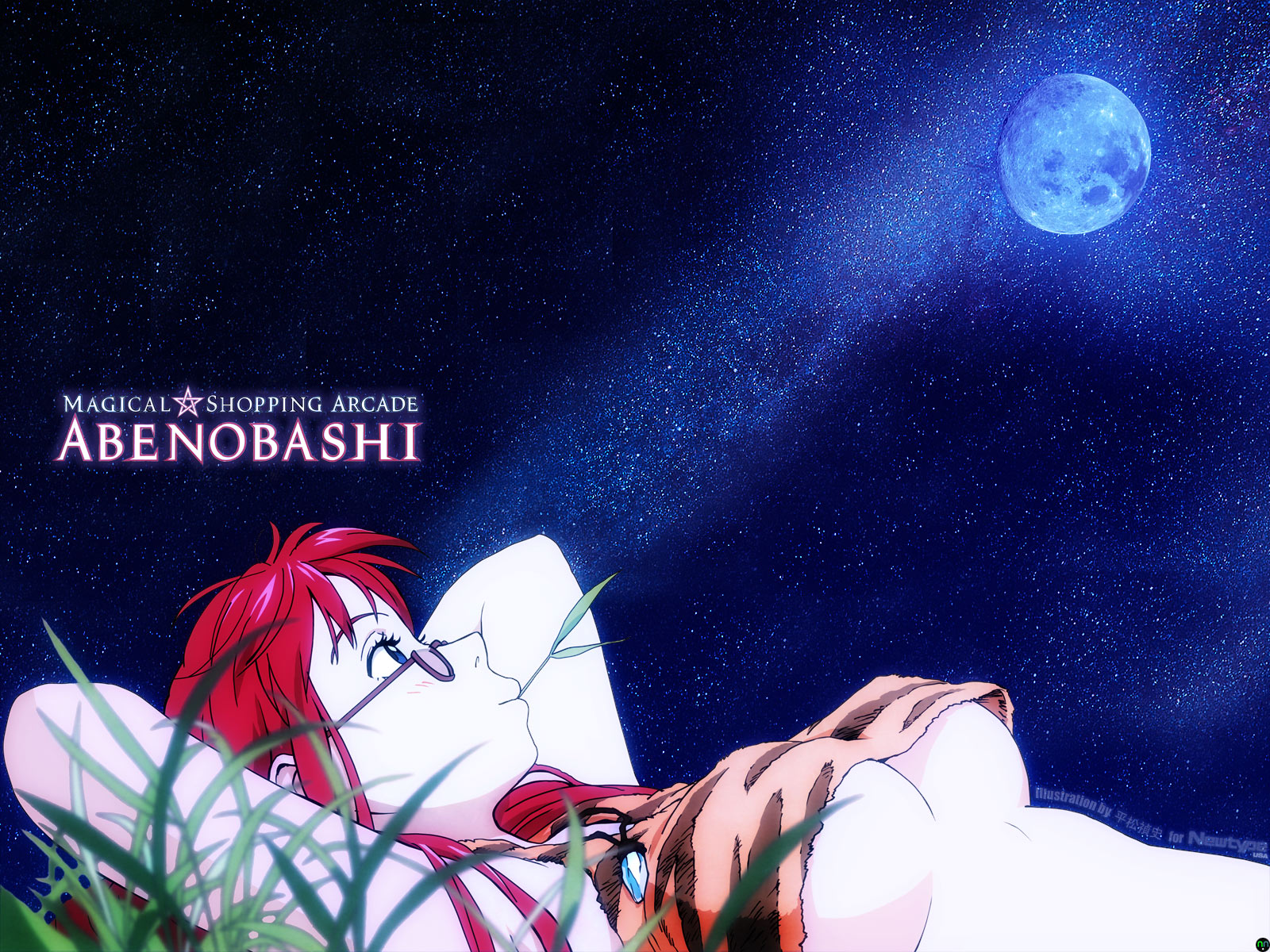
As I learn the finer points of scanning and redraw, my desktop designs have gotten a lot more attention. Normally, I acquire the scans I use from reliable sources (i.e. people who know how to scan things much better than I), but this time, I was involved in nearly every part of the creative process, with the exception of the illustration itself. Quite like my Last Exile wallpaper back in September, I discovered this particular scan in one of my many magazines, specifically December 2003's issue of Newtype USA. The final, cleaned scan was originally seven 1200 dpi scans that I had to adjust, match and stitch back together. There were also creases and staple holes to edit out, as this scan started out as a rather intimidating 11.5" x 35" centerfold poster. Erasing the poster's pesky background and redrawing the tips of her hair, which were cropped out of the poster's boundaries, I then recolored Mune Mune's red hair, pale skin and the highlights thereof. The grass was next, and because it was blurred in the scan, it was quite a pain in my hindquarters to extract. To me, the fixed scan begged to be made into a moonlit wallpaper, so I set out to find stock photography of the night sky in Japan. The only problem I ran into is having to redraw and expand the starry sky with the Clone Stamp brush, as well as enhance its colors, as the original photo I had to work with was quite small and wouldn't stretch to 1600 x 1200 without some noticable artifacting. I also added a black-to-blue gradient from top to bottom over the starry sky layer, to get that subtle blue-filled horizon effect that's visible when the stars have just reaching the pinnacle of their brilliance. And since I like to try new features and always attempt to give the illustrator a proper credit when I can, I took the opportunity to use Photoshop CS's Text-on-Paths feature to place an illustration credit right above Mune Mune's exposed torso. I then used the new Photographic Filters to apply a cooler, ever so slightly blue tempurature to the existing palette, making it look less sunny and more moonlit, as it should. As my first experience working with Adobe Photoshop CS, I can honestly say that it did make many things I had envisioned that much easier to accomplish.
|
|
 1600 x 1200, JPEG, 480k |
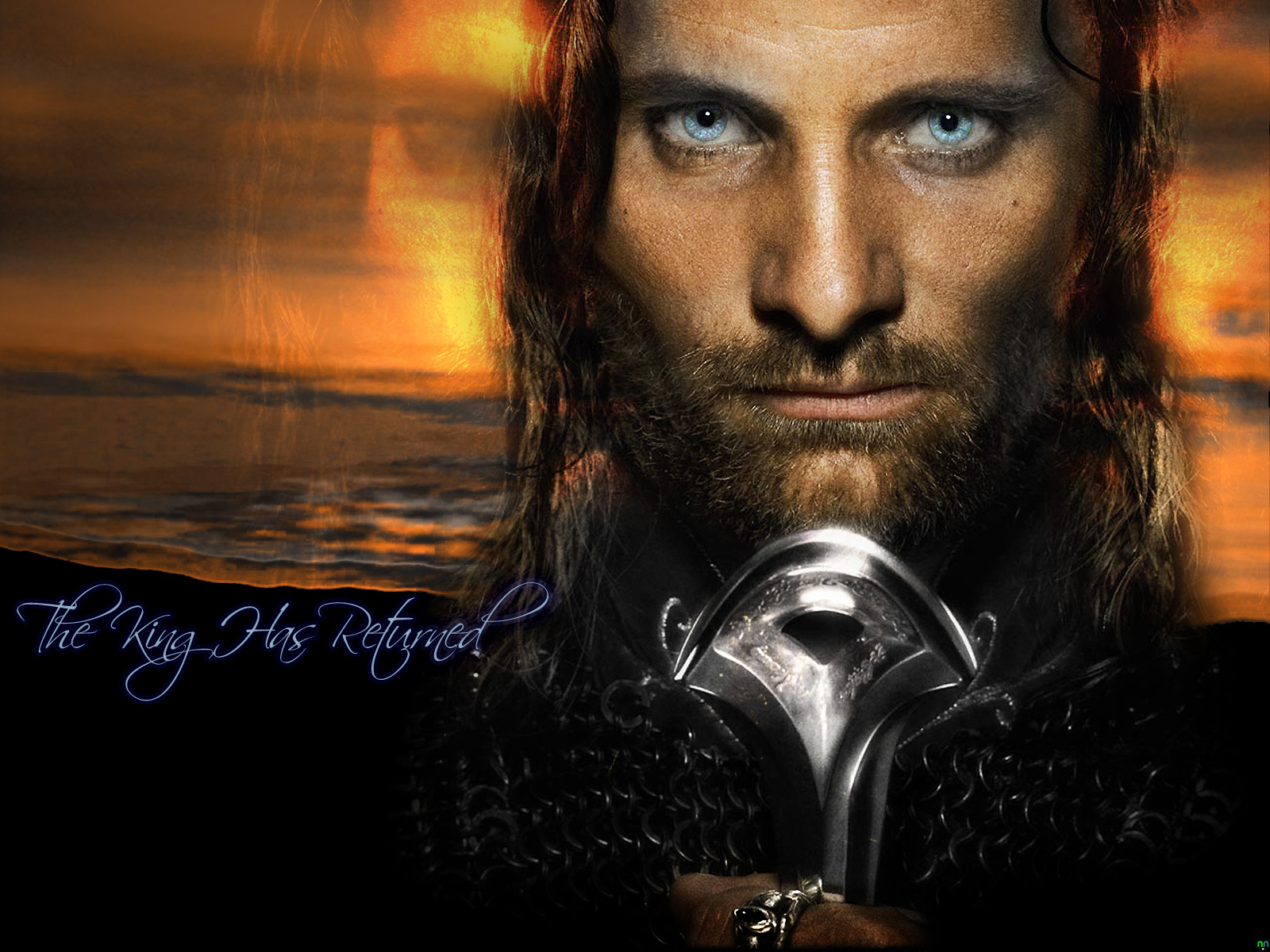
09.23.2003, 12:20 A.M.
I saw the teaser poster for Return of the King and just had to design a new wallpaper with it. The promotors of the Lord of the Rings trilogy have managed such great photography of the cast, and this close-up of Viggo Mortensen as Aragorn simply begged to be manipulated. Since this was my very first photo manipulation, I figured I would start by erasing and blending a portion of his man-mane (heh), so that it would show through whatever backdrop I chose to place behind him. His eyes also needed to be accented and enhanced, so I decided to paste a copy of them into their own layer, then lighten and blend them with his original eye color. This gave his eyes that haunting, piercing gaze. I also sharpened up Aragorn's face, so that his pores and facial hair would be much more detailed than in the original poster scan. It still seemed to need a little something, so I decided that I would make an afterimage to the right and left of his face. Shading and hollowing out the eyes of the afterimages, I then lowered their opacity down to a color dodged 68%. Shutting off the foreground elements for a moment, I then worked on creating a beach at sunset, which would make a stark backdrop for the well-defined and highlighted photo of Aragorn. The beach was simple to make; all I did was place a single 1600 pixel wide stroke of a cloudy skies brush in a deep, dark orange, then placed an omni lighting effect right behind where Aragorn would be in the final version. I burned and dodged the beach's highlights a bit, so that the colors would seem richer upon first glance, then followed the lapping crests of the gentle waves with the sharpen tool. As the finishing touch to this wallpaper, I felt that a nice calligraphic font, Scriptina in this case, would fit quite nicely. So, just below the last lapping wave, I put the statement "The King Has Returned", in the same color as Aragorn's eyes, highlighting the flowing letters with a slight blue afterglow. The first response I received after posting this on Anime Layer was "Spooky... it's, it's JESUS!"
|
|
 1600 x 1200, JPEG, 565k
|
09.13.2003, 2:55 A.M.
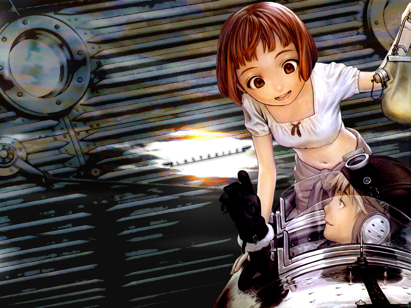
Once again, my Video Business magazine gets the scan-and-wall treatment. Much like my Haibane-Renmei wallpaper three months ago, this picture from Pioneer Animation's upcoming series "Last Exile" was composed of two separate magazine scans, one of which was adjusted to a richer palette of color and the other which was not only filtered, but burned/dodged, tweaked, redrawn and so forth to accent the picture above it. The top layer scan, of the pilot Claus and his navigator Lavi, was really annoying to extract. The original source image was softened and needed to be recolored, since the magazine resolution made it look washed out. To give it a richer palette, I duplicated the picture, placed it under the original, modified the colors and hues a bit, then set the layer above it to blend with colors. Viola! The second step was a little less involved; I had to take a less than stellar scan of a vanship's hull and blend it with the characters' primary coloring. This involved many tools, most notably the cutout tool, which gave the solid metal lining of the ship seem softer and darker than before. Third, I had to incorporate the logo somewhere that most would consider non-intrusive. I tend to like logos to be centered or offset, so I set it to centered, tilted it a bit, then carefully deleted the space around it, all the way down to the bottom layers, where I created two more layers. With these layer set to blend everything else, I used a horizon cloud brush that I found a week or so ago to make dark purple storm clouds on the lower layer, and stark brown clouds on the upper layer. This gave the vanship hull a rusty, hand-painted look, while the centered empty space, with a few choice lighting effects applied, made a nice twilight horizon for the logo to sit inside of. After a little adjustment to the hue, color and contrast, I put a few finishing touches on the characters themselves, such as highlighting Lavi's auburn hair and making the windshield glass look shiny again. Not really too shabby when you consider that it's essentially my second attempt at a "from scratch" magazine scan wallpaper.
|
|
 1600 x 1200, JPEG, 495k
|
08.26.2003, 11:07 P.M.
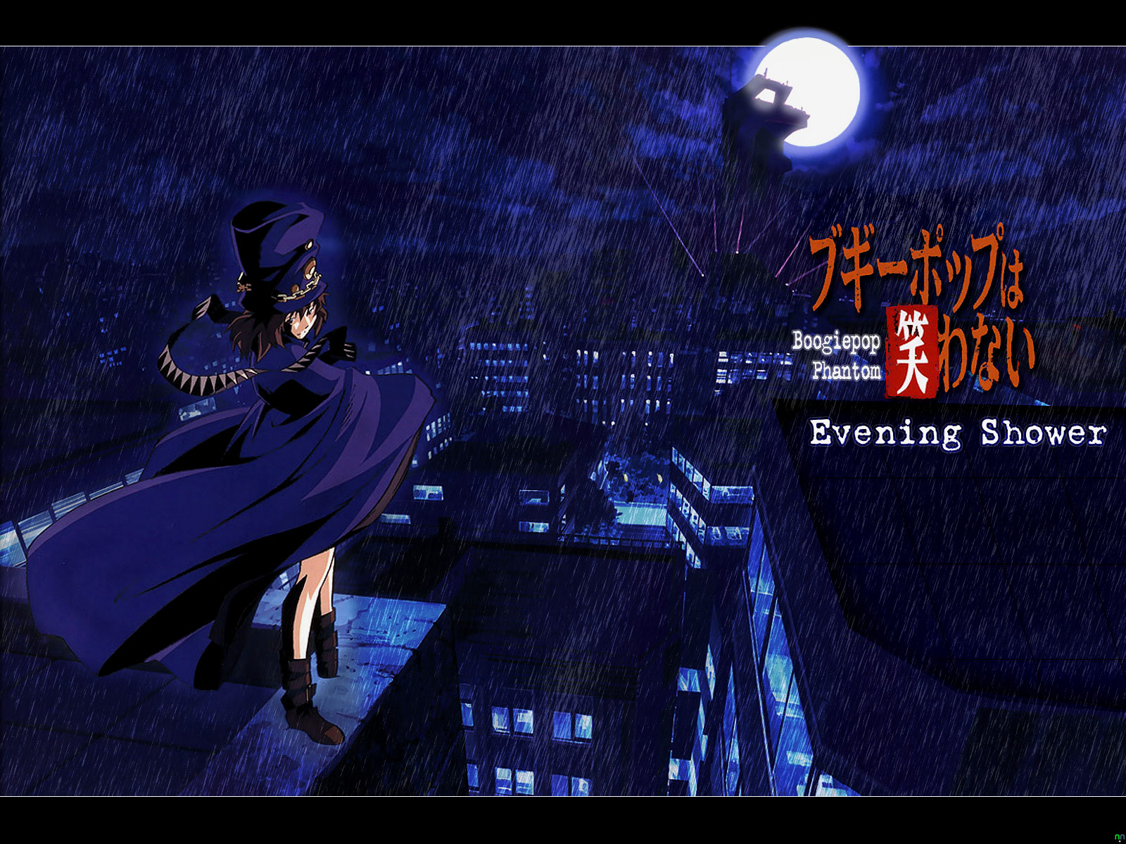
This particular wallpaper design has been quite a long time in coming. I had acquired the primary scan involved several months ago from John at animeprojects.com, but hadn't really thought of how to use it as a basis for a wallpaper. Then it dawned on me about three days ago; I could take a whack at some rain effects. First of all, the source image had to be cleaned and scaled to fit the canvas, which required some redrawing and smoothing. I also had to carefully delete the Japanese promotional text from the scan, since the source image was some sort of advertisement. I also had to redraw and shade the top of the building opposite Boogiepop, as cleaning off the promo text left a gaping hole in the scan. After this was done, I had to fill out the moon's outer glow, since the original scan cut the moon off at the top. Placing a brand-new layer over the moon, I carefully applied several airbrush strokes over it, then reduced the new layer's opacity and fill to 54% and 90% respectively. After I cleaned up the Boogiepop logo a bit, I decided to give the rain effects a go. Creating another new layer, I filled it completely with white and filtered in some monochromatic noise at a uniform 400%. Applying a simple motion blur at a 73° angle, then carefully adjusting the levels, I duplicated the layer, lowered the original layer's opacity to 20%, then burned and dodged the new layer to give the newly-added downpour some depth and variance. Using a 95 pixel airbrush eraser, I gently cleared two sections of the rain layers, so that Boogiepop herself and the Moon could show through the torrential downpour. Adding some thin white lines to define the letterbox format I had once again chosen, I then rendered in the phrase "Evening Shower" (derived from the series' title song of the same name) in the LoveLetterTW font, right below the Boogiepop logo. In retrospect, this concept came together with almost no hitches whatsoever. I love the end results, but I'm glad it's finally over and done with.
|
|
 1600 x 1200, JPEG, 254k
|
08.18.2003, 12:01 A.M.
Well, it's already been posted on Anime Layer for about a day, but I figured since it was my first desktop design to get a thorough round of applause from my AL comrades, I'd better post it here as soon as possible. This idea came to me after watching the six English-dubbed episodes from my fresh-smelling FLCL box set, which I highly recommend, as it's about as direct a translation as you can get. Anyway, the process of creating this desktop took a little longer than I'd initially anticipated. First of all, I started with a pencil sketch of Haruko (Groundwork of FLCL scan, I believe) and proceeded to touch it up to make it look like a marker drawing. In order to do this, I'd use Photoshop 7's Cutout filter, in conjunction with a very heavy useage of equalizing, manually retouching here and there and inverting the picture numerous times, all to make it look just right. Once it looked marker drawn, I slowly separated the various levels of depth through liberal use of the Burn and Dodge tools. These tools tend to leave a fuzzy outline, much like the wide airbrush does, so I had to manually retouch the picture's edges. Flattening and merging layers down as I went, the picture kept building upon itself until I had all that you see here, with the exception of the pink hair. That came from careful application of a light-to-dark-pink gradient in a layer mask placed just above the layers of burned and dodged grays. I placed a Satin blend on top of the whole thing, which brought out the contrast highlights. I added a rounded egg-shape with the manga-style FLCL logo over it, and then I drew-in a crack on the bottom. For the finishing touch, I added silhouettes of both Canti and Naota to the lower right-hand corner of the "theater screen." And if you can catch that reference, you're way cooler than most. I really enjoyed working on this one, and though it may look simplistic and minimalistic at first glance, it's probably the most difficult wallpaper I've done thus far. Of course, I also made a colorful version, for those who were curious...
|
|
 1600 x 1200, JPEG, 465k
|
06.25.2003, 9:41 P.M.
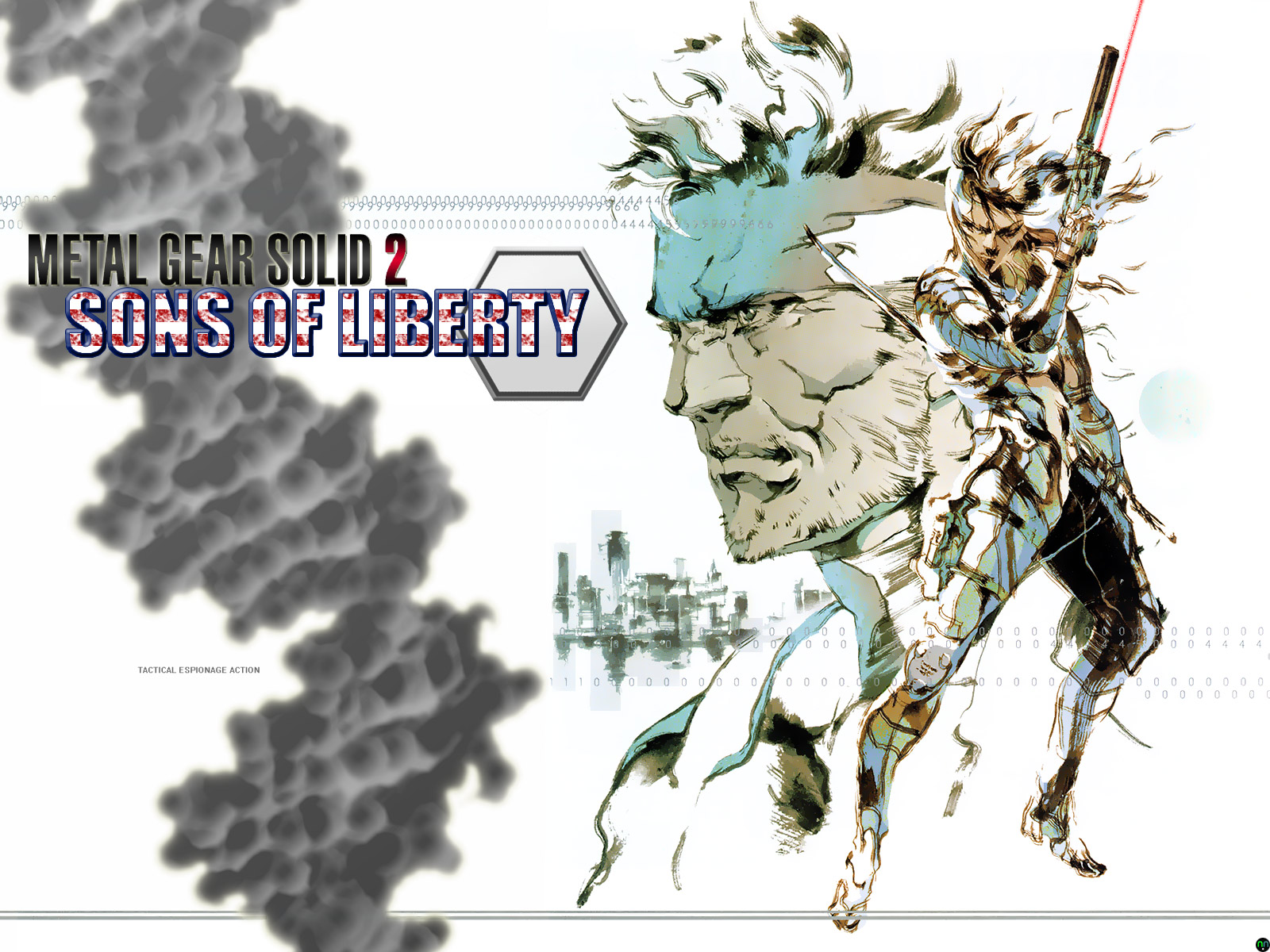
It may sound odd to my fellow gamers, but I hadn't played through Hideo Kojima's Metal Gear Solid 2: Sons of Liberty until about two weeks ago. Sure, I've actually owned the game for nearly two years now, but I had never really felt compelled to play it, not even for a few spare minutes. When I got back from E3 this year though, I found that something had renewed my interest in Kojima's infamous stealthy action series. Of course, what I am undoubtedly talking about is the Metal Gear Solid 3: Snake Eater trailer that was shown at this year's mecca of all things gaming. Fanaticism seldom leads one to commit acts of productivity, and this particular story is of no exception. After beating Sons of Liberty last night, I chanced upon an illustration from the strategy guide, which almost lept from the page pleading to be turned into a desktop wallpaper. So, I set to work. I scanned that bad boy in at a whopping 1800 dpi with moire correction, which resulted in a 447 MB PSD! I then wrangled the monster scan down to a workable size and set it to the right side of a blank canvas. I had to make the numbers across the top and the line at the bottom continue all the way to the left, so I copied-and-pasted until I was satisfied. I used the font tool to write out "SONS OF LIBERTY" in the Impact font, made a blood-spattered pattern to fill the letters with white and red. I then beveled and stroked the letters with a deep blue outline. I added an inverted, desaturated, blown-up pic of a DNA helix, reduced its opacity and fill to 80% and 74% respectively, then tilted it 15° counter-clockwise. Adding the Metal Gear Solid 2 logo for good measure, I decided that it needed some sprucing up. So, I added a tiny drop shadow, a little outer glow and a reflected, red-to-grayish-black gradient over the letters. As you can see, almost every layer interacts with another and nothing is quite as simple as it first appears. Oh, and the famous series tag-line got the microtype treatment. No conspiracies involved, just a good wall to get your adrenals pumping.
|
|
 1600 x 1200, JPEG, 370k
|
06.07.2003, 1:35 A.M.
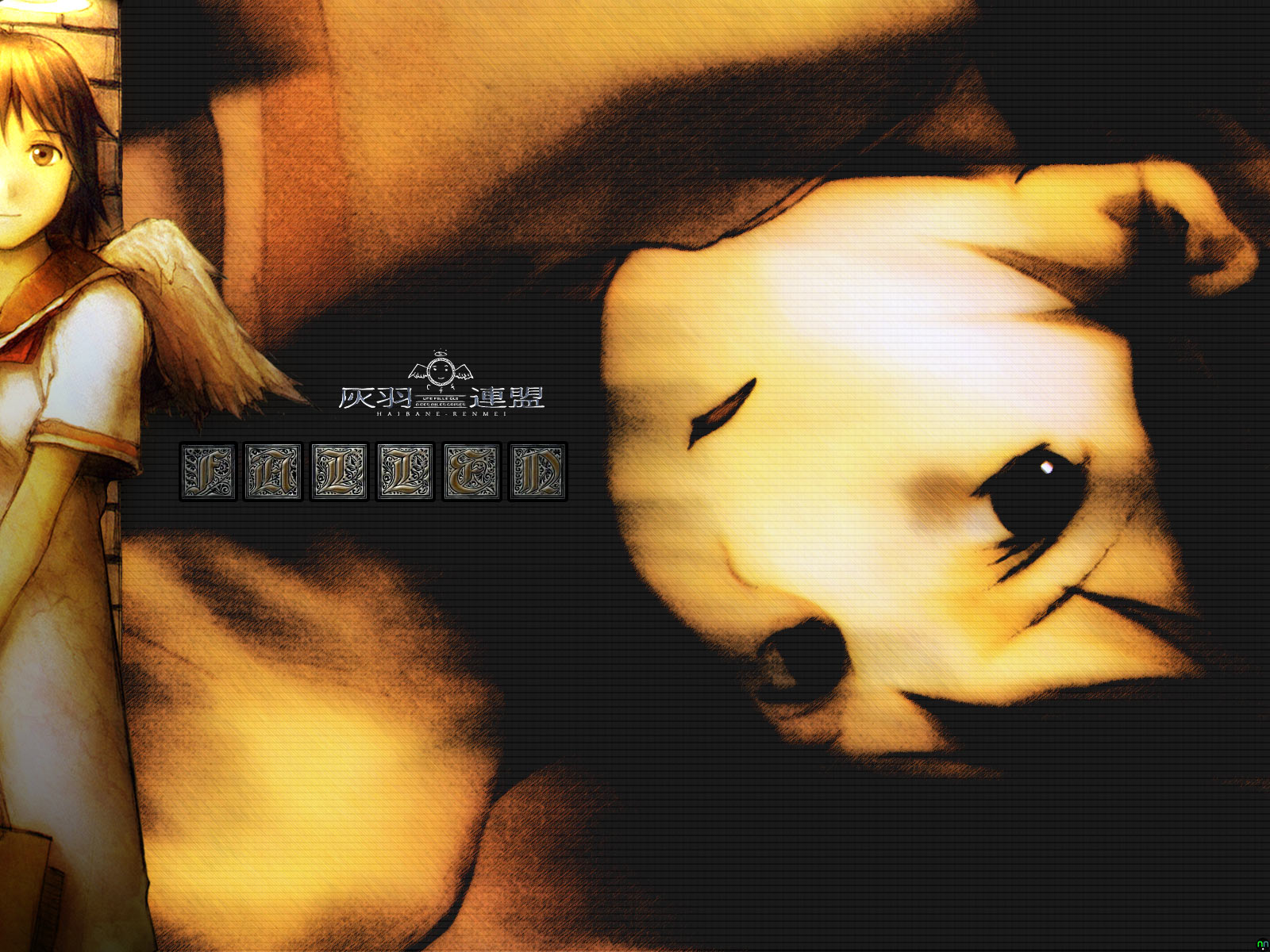
Here's a useful tip for those of you, like me, who work more than forty hours a week. If you ever only have one day off and have ready access to Photoshop 7, plan to spend the day away from home and go waste time with friends instead. I, however, did not heed this warning, since it was inevitably too late for me. Hooked by the gothic undertones, shrill lyrics and pounding guitar riffs of the Evanescence CD "Fallen", I found the June 2nd, 2003 issue of Video Business awaiting me in my mail on Thursday, the day before my only day off this week. Seeing two full-page pieces of artwork, I went to work scanning and cleaning the images until they started to show potential. Though I'd only seen a single episode of Yoshitaka Abe's newest creation known simply as Haibane-Renmei, the series from which the two beautiful scans I used originated, I somehow knew that the themes and lyrics in the Evanescence songs I enjoyed would fit well with the series' main character, Rakka. (Incidentally, the name Rakka apparently means "fallen" or "falling" in Japanese.) Anyway, I took my self-cleaned scans into a fresh transparent 1600 x 1200 pixel canvas, rotated the foreground picture so that it was vertical rather than diagonal, added some directional lighting so that her halo lit up her face and wing, but left most of her body in the darkness. I then took the fetal picture of Rakka, turned it 90° clockwise (it was originally a vertical piece), then horizonally flipped it. I applied the Patchwork filter to a white opacity layer that I had set over the background image, then used the Dark Strokes filter to give the background a gloomy look. To my surprise, one of Rakka's eyes retained a tiny sheen of moisture from the original scan, a fluke filtering result which I could never get Photoshop to duplicate. For added effect, I used the burn and dodge tools to highlight her face and add a bruise to her left eye, the filtering fluke that still had some life left in it. Anyway, to finish it off, I added a small tasteful Haibane-Renmei logo, and the word "fallen" in the Gebetsbuch Initialen font, between the portrait in the foreground and the desperate emotional face in the background. Notice that the goldish brown lettering of the word "fallen" is being hit by the light cast from the halo in the foreground. I think I'm starting to enjoy this...
|
|
 1600 x 1200, JPEG, 532k
|
04.18.2003, 2:35 P.M.
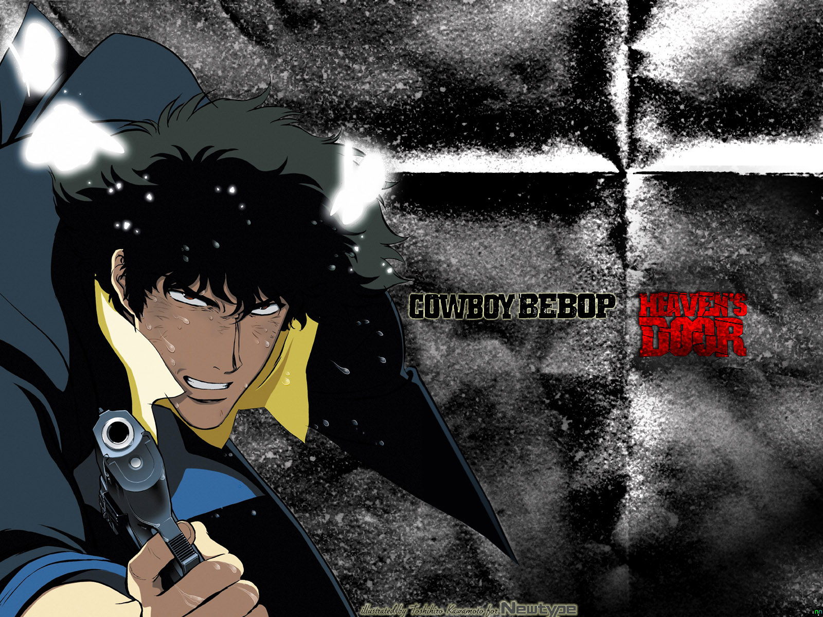
Anticipation can sometimes be a very powerful thing... With Columbia TriStar not releasing the Cowboy Bebop movie, Knockin' on Heaven's Door, until June 24th, I've been forced to use my free time for other more creative purposes. While poking around Google the other day, I found a new scan archive called Project Zen, which had a spectacular poster scan from the Japanese Newtype magazine by noneother than Cowboy Bebop's conceptual artist and illustrator Toshihiro Kawamoto. The look of desperation and distress, combined with the silent rage of the hunter becoming the hunted was all captured perfectly, and made this scan ideal for my newest wallpaper concept. The image itself was originally a tall poster, and I immediately thought that they had cut off his left hand. However, judging from the high angle of his left shoulder, I would place his left hand somewhere behind his hip. Fortunately, this meant that the magazine poster had only cut off part of Spike's jacket pocket, so I just had to redraw it back in, adding a thin gradient from his jacket's black color to the dark blue on his sleeve for good measure. At first, I had planned on using a lot of text on this wallpaper. However, taking into consideration the complaints about my last two walls needing to be a bit more minimalistic, I decided that a non-intrusive black Bebop logo with a soft bit of yellow light around it and a stark red Heaven's Door would be more than adequate. After some suggestions, I also decided to add a film grain to the background, giving it a grittier look, and used a paper fold brush to add a subtle, slender cross between Bebop and Heaven's. Adding some dust and scratches for the sake of making the wallpaper that much more grungy, I then redrew the white fuzzy butterflies, so that the light they give off in the scan would also affect the newly-placed backdrop. I kind of get the feeling that I'm either looking at concrete or an aged, dusty wall behind Spike. An excellent effect, even though it was mostly an accident. =) Overall, it turned out to be somewhat plain, but with a bit of effort and advice (this is my first grunge), it turned out quite different.
|
|
 1600 x 1200, JPEG, 368k |
11.19.2002, 1:15 A.M.
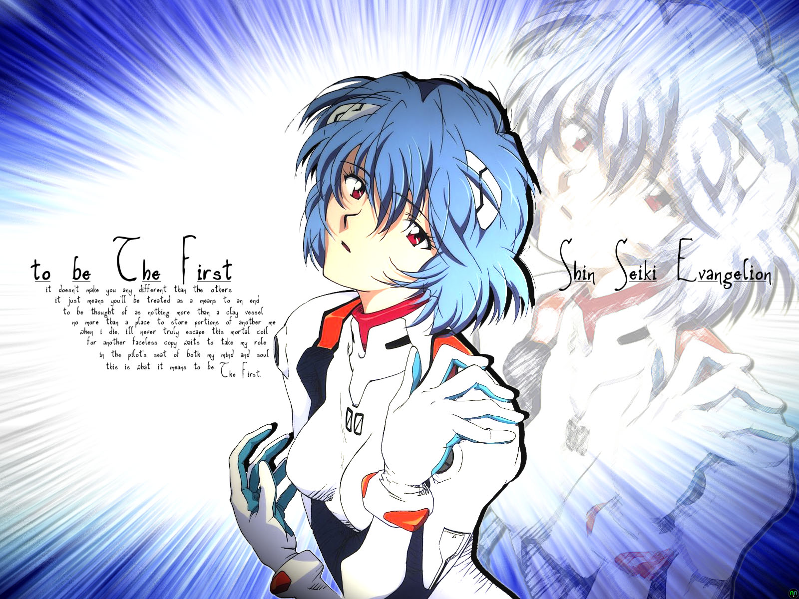
Ever since I finished watching the entire Evangelion TV series and the movies that followed, I always wondered why Rei was so silent. "What is going through that girl's mind?", I thought to myself. Earlier this week, I found an excellent scan of the First Child of NERV, so I decided to make another wallpaper. The first draft was far too messy to be a stylish wall, so I deleted all of the pics except the one seen here. Next, I crafted the shining blue background by extruding a slightly tilted gradient of dark blue to light blue into blocks, played with some omni lighting effects, and then used a zooming radial blur to make the transition smooth. Taking the excellent Rei artwork I had found earlier, I pasted it into its own layer and adjusted the blending, that way the lighting made her suit and face look as pale as possible, yet also made her hair look like a slightly lighter gradient than the one in the background. Taking the Rei image into a separate window, I applied a colored pencil filter to it, adjusted the opacity to 35%, then pasted it back in, behind and to the right of the centered, full color Rei. The poem, which gives the wallpaper its name was written entirely by me. It came to me while I was staring at the two Reis; one solid colored, the other a faded sketch. Originally, the poem was in the shape of a clay vessel, which wasn't done intentionally at all. Kinda creepy, considering the subject matter of the poem... =)
|
|
|
|
site design and logo © 1997-2008 |