09.23.2003, 12:20 A.M.
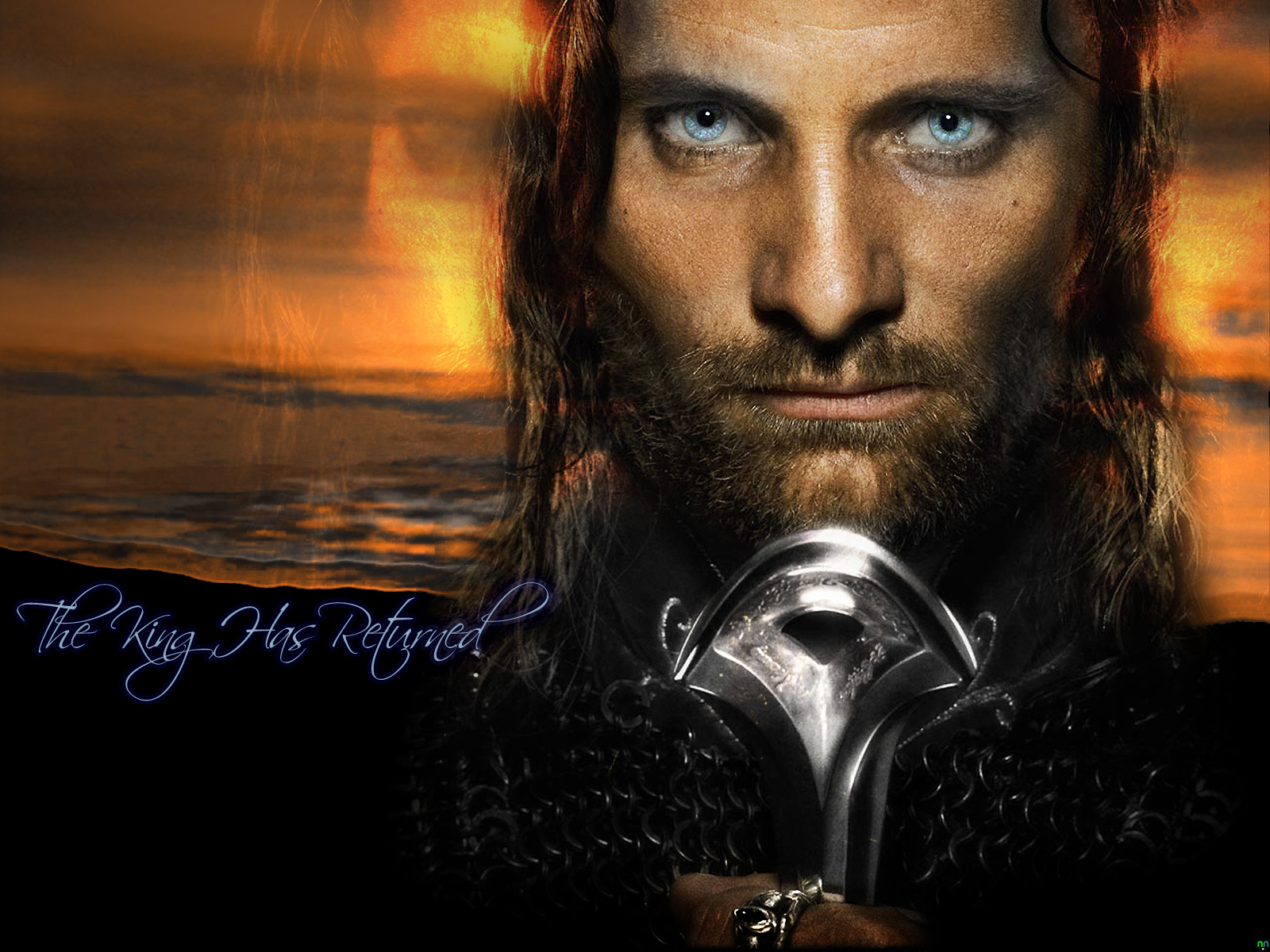
I saw the teaser poster for Return of the King and just had to design a new wallpaper with it. The promotors of the Lord of the Rings trilogy have managed such great photography of the cast, and this close-up of Viggo Mortensen as Aragorn simply begged to be manipulated. Since this was my very first photo manipulation, I figured I would start by erasing and blending a portion of his man-mane (heh), so that it would show through whatever backdrop I chose to place behind him. His eyes also needed to be accented and enhanced, so I decided to paste a copy of them into their own layer, then lighten and blend them with his original eye color. This gave his eyes that haunting, piercing gaze. I also sharpened up Aragorn's face, so that his pores and facial hair would be much more detailed than in the original poster scan. It still seemed to need a little something, so I decided that I would make an afterimage to the right and left of his face. Shading and hollowing out the eyes of the afterimages, I then lowered their opacity down to a color dodged 68%. Shutting off the foreground elements for a moment, I then worked on creating a beach at sunset, which would make a stark backdrop for the well-defined and highlighted photo of Aragorn. The beach was simple to make; all I did was place a single 1600 pixel wide stroke of a cloudy skies brush in a deep, dark orange, then placed an omni lighting effect right behind where Aragorn would be in the final version. I burned and dodged the beach's highlights a bit, so that the colors would seem richer upon first glance, then followed the lapping crests of the gentle waves with the sharpen tool. As the finishing touch to this wallpaper, I felt that a nice calligraphic font, Scriptina in this case, would fit quite nicely. So, just below the last lapping wave, I put the statement "The King Has Returned", in the same color as Aragorn's eyes, highlighting the flowing letters with a slight blue afterglow. The first response I received after posting this on Anime Layer was "Spooky... it's, it's JESUS!"
Lord of the Rings, The King Has Returned
1600 x 1200, JPEG, 480k
09.13.2003, 2:55 A.M.
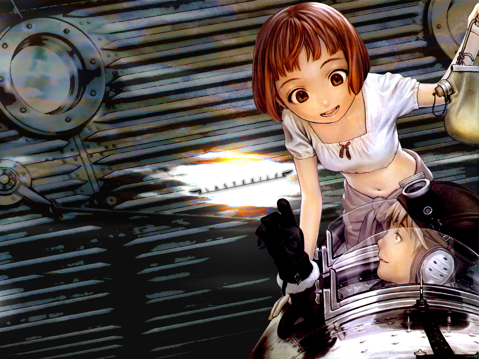
Once again, my Video Business magazine gets the scan-and-wall treatment. Much like my Haibane-Renmei wallpaper three months ago, this picture from Pioneer Animation's upcoming series "Last Exile" was composed of two separate magazine scans, one of which was adjusted to a richer palette of color and the other which was not only filtered, but burned/dodged, tweaked, redrawn and so forth to accent the picture above it. The top layer scan, of the pilot Claus and his navigator Lavi, was really annoying to extract. The original source image was softened and needed to be recolored, since the magazine resolution made it look washed out. To give it a richer palette, I duplicated the picture, placed it under the original, modified the colors and hues a bit, then set the layer above it to blend with colors. Viola! The second step was a little less involved; I had to take a less than stellar scan of a vanship's hull and blend it with the characters' primary coloring. This involved many tools, most notably the cutout tool, which gave the solid metal lining of the ship seem softer and darker than before. Third, I had to incorporate the logo somewhere that most would consider non-intrusive. I tend to like logos to be centered or offset, so I set it to centered, tilted it a bit, then carefully deleted the space around it, all the way down to the bottom layers, where I created two more layers. With these layer set to blend everything else, I used a horizon cloud brush that I found a week or so ago to make dark purple storm clouds on the lower layer, and stark brown clouds on the upper layer. This gave the vanship hull a rusty, hand-painted look, while the centered empty space, with a few choice lighting effects applied, made a nice twilight horizon for the logo to sit inside of. After a little adjustment to the hue, color and contrast, I put a few finishing touches on the characters themselves, such as highlighting Lavi's auburn hair and making the windshield glass look shiny again. Not really too shabby when you consider that it's essentially my second attempt at a "from scratch" magazine scan wallpaper.
Last Exile, A Good Navigator
1600 x 1200, JPEG, 565k
08.26.2003, 11:07 P.M.
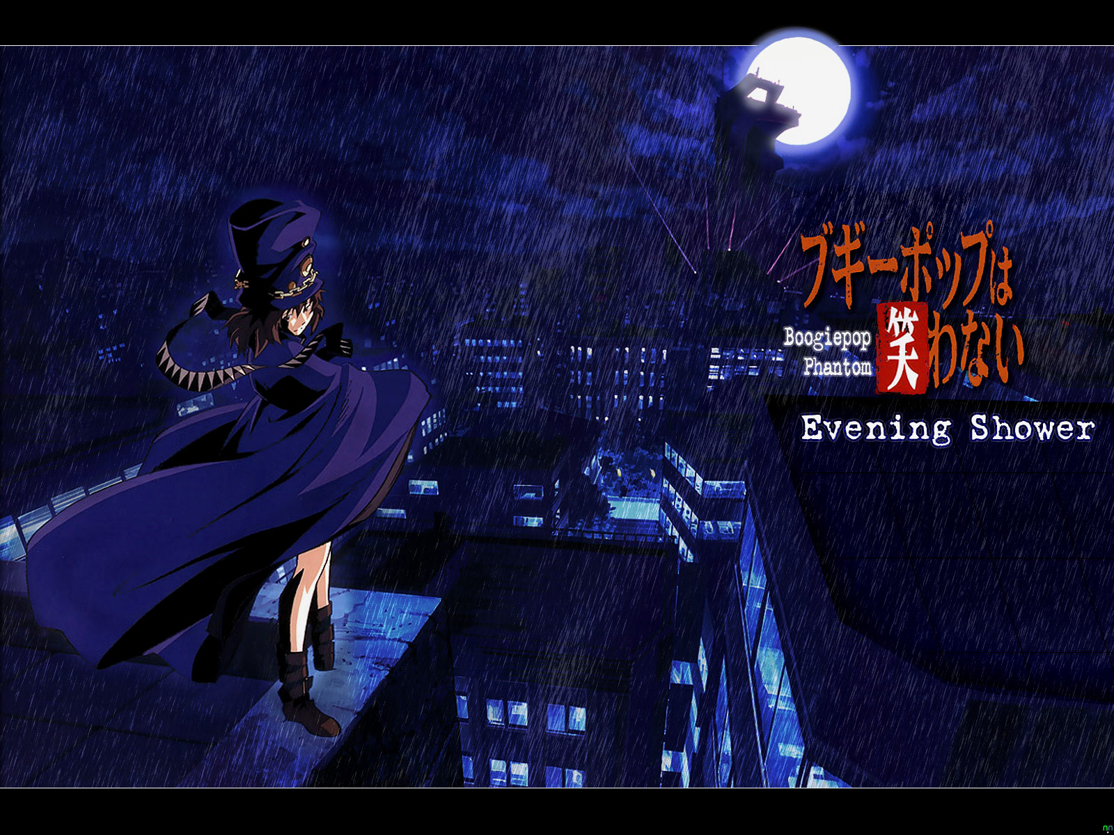
This particular wallpaper design has been quite a long time in coming. I had acquired the primary scan involved several months ago from John at animeprojects.com, but hadn't really thought of how to use it as a basis for a wallpaper. Then it dawned on me about three days ago; I could take a whack at some rain effects. First of all, the source image had to be cleaned and scaled to fit the canvas, which required some redrawing and smoothing. I also had to carefully delete the Japanese promotional text from the scan, since the source image was some sort of advertisement. I also had to redraw and shade the top of the building opposite Boogiepop, as cleaning off the promo text left a gaping hole in the scan. After this was done, I had to fill out the moon's outer glow, since the original scan cut the moon off at the top. Placing a brand-new layer over the moon, I carefully applied several airbrush strokes over it, then reduced the new layer's opacity and fill to 54% and 90% respectively. After I cleaned up the Boogiepop logo a bit, I decided to give the rain effects a go. Creating another new layer, I filled it completely with white and filtered in some monochromatic noise at a uniform 400%. Applying a simple motion blur at a 73° angle, then carefully adjusting the levels, I duplicated the layer, lowered the original layer's opacity to 20%, then burned and dodged the new layer to give the newly-added downpour some depth and variance. Using a 95 pixel airbrush eraser, I gently cleared two sections of the rain layers, so that Boogiepop herself and the Moon could show through the torrential downpour. Adding some thin white lines to define the letterbox format I had once again chosen, I then rendered in the phrase "Evening Shower" (derived from the series' title song of the same name) in the LoveLetterTW font, right below the Boogiepop logo. In retrospect, this concept came together with almost no hitches whatsoever. I love the end results, but I'm glad it's finally over and done with.
Boogiepop Phantom, Evening Shower
1600 x 1200, JPEG, 495k
08.18.2003, 12:01 A.M.
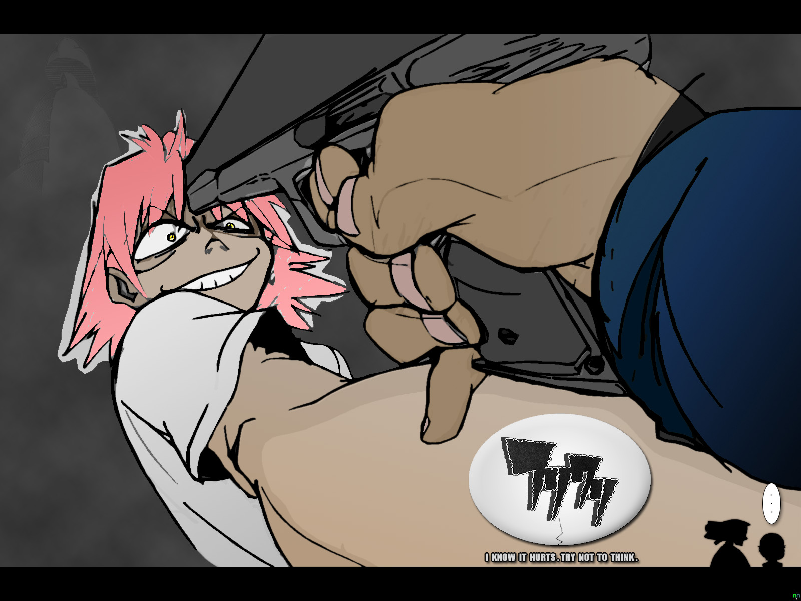
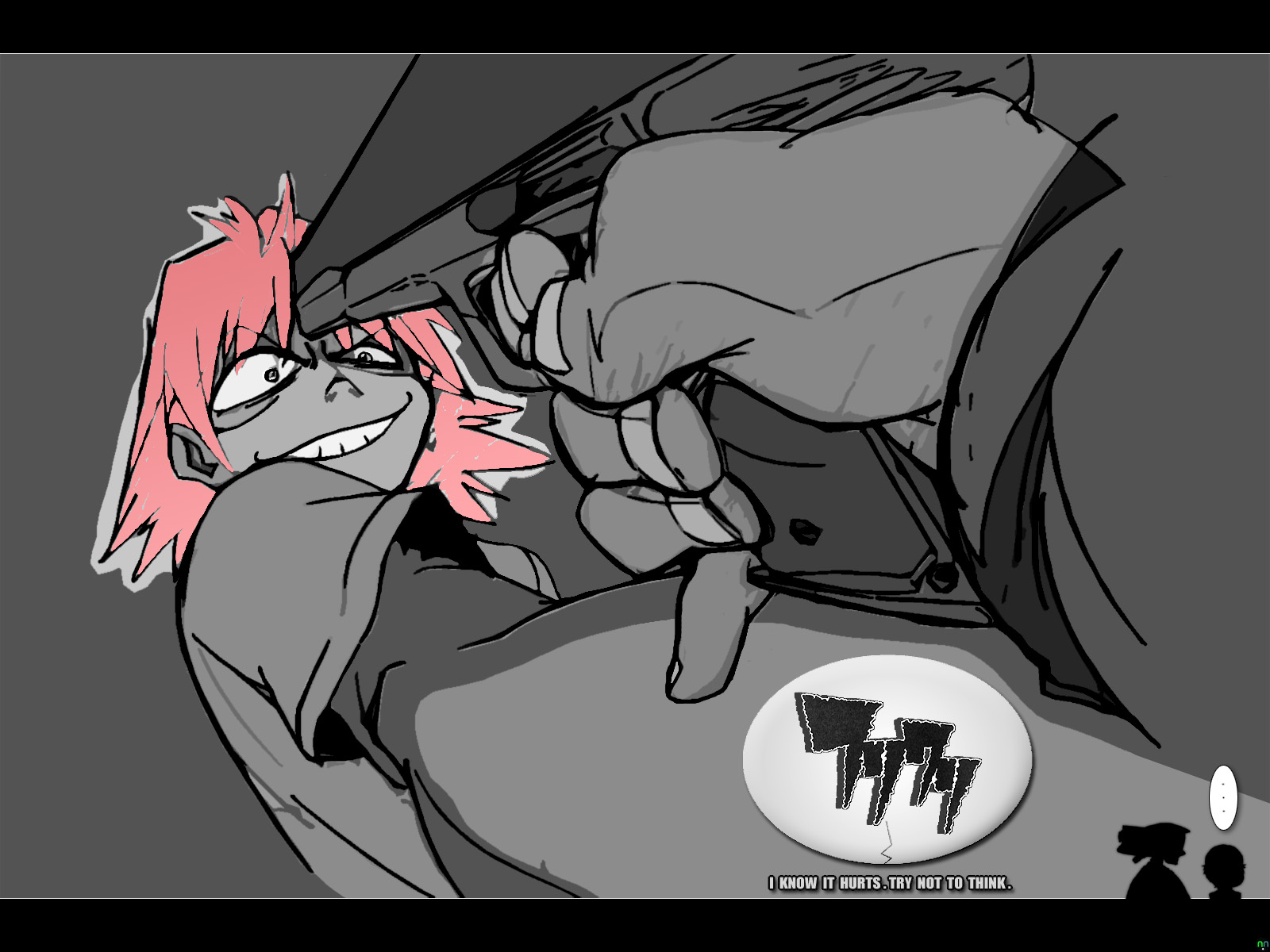
Well, it's already been posted on Anime Layer for about a day, but I figured since it was my first desktop design to get a thorough round of applause from my AL comrades, I'd better post it here as soon as possible. This idea came to me after watching the six English-dubbed episodes from my fresh-smelling FLCL box set, which I highly recommend, as it's about as direct a translation as you can get. Anyway, the process of creating this desktop took a little longer than I'd initially anticipated. First of all, I started with a pencil sketch of Haruko (Groundwork of FLCL scan, I believe) and proceeded to touch it up to make it look like a marker drawing. In order to do this, I'd use Photoshop 7's Cutout filter, in conjunction with a very heavy useage of equalizing, manually retouching here and there and inverting the picture numerous times, all to make it look just right. Once it looked marker drawn, I slowly separated the various levels of depth through liberal use of the Burn and Dodge tools. These tools tend to leave a fuzzy outline, much like the wide airbrush does, so I had to manually retouch the picture's edges. Flattening and merging layers down as I went, the picture kept building upon itself until I had all that you see here, with the exception of the pink hair. That came from careful application of a light-to-dark-pink gradient in a layer mask placed just above the layers of burned and dodged grays. I placed a Satin blend on top of the whole thing, which brought out the contrast highlights. I added a rounded egg-shape with the manga-style FLCL logo over it, and then I drew-in a crack on the bottom. For the finishing touch, I added silhouettes of both Canti and Naota to the lower right-hand corner of the "theater screen." And if you can catch that reference, you're way cooler than most. I really enjoyed working on this one, and though it may look simplistic and minimalistic at first glance, it's probably the most difficult wallpaper I've done thus far. Of course, I also made a colorful version, for those who were curious...
Furikuri, Try Not to Think
1600 x 1200, JPEG, 254k
08.17.2003, 3:08 A.M.
Nothing puts a damper on an overwhelmingly bad work day as well as hearing that one of my most anticipated Capcom games, Red Dead Revolver, has been cancelled. There is no doubt in my mind that cold-hearted businessmen made this decision. Curse them for not having the decency to cancel the title when it didn't look quite so promising.
07.08.2003, 1:04 P.M.
The simple joys of old-school gameplay should never be lost or forgotten. Take WarioWorld for instance; it goes back to the tried-and-true play mechanics of two-dimensional side-scrollers, but still allows for things to be presented (from an excellent array of fixed angles) in complete 3D. Sure, there will be those imbeciles who will say that WarioWorld's visuals are too basic, but that's just the point. When the game throws a plethora of baddies your way, you want there to be more to do that simply slam them all into oblivion. Thus the folks at Treasure, world-renouned developers of all things twisted and yet quite enjoyable to play, have given us a game that requires you to master each of Wario's moves, not only to pummel monsters, but to solve puzzles and progress through each of the ingenious level designs. Think it sounds good now? Just wait until the first time you go toe-to-toe with one of the game's numerous bosses. The cruel, obnoxious bad-boy that he is, Wario has always been one of my favorite Nintendo characters, since he basically personifies everything that isn't acceptable in a typical Nintendo mascot, and now Treasure has given him even more ways to rule. As Wario would say "Nya-nya nya-nya-nya! I'm-a gonna win!" Hopefully, this will be the beginning of a beautiful (maybe even ugly) friendship between Nintendo and Treasure. Maybe a Gamecube update of my long-time Treasure favorite Sin and Punishment isn't too far away.
06.25.2003, 9:41 P.M.
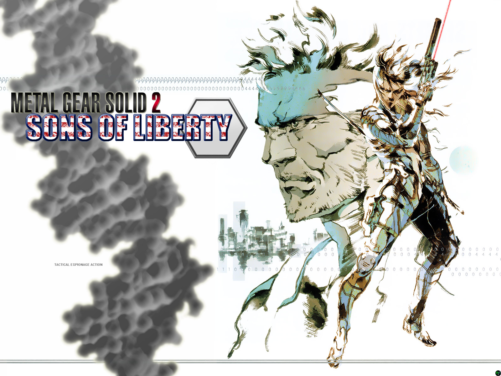
It may sound odd to my fellow gamers, but I hadn't played through Hideo Kojima's Metal Gear Solid 2: Sons of Liberty until about two weeks ago. Sure, I've actually owned the game for nearly two years now, but I had never really felt compelled to play it, not even for a few spare minutes. When I got back from E3 this year though, I found that something had renewed my interest in Kojima's infamous stealthy action series. Of course, what I am undoubtedly talking about is the Metal Gear Solid 3: Snake Eater trailer that was shown at this year's mecca of all things gaming. Fanaticism seldom leads one to commit acts of productivity, and this particular story is of no exception. After beating Sons of Liberty last night, I chanced upon an illustration from the strategy guide, which almost lept from the page pleading to be turned into a desktop wallpaper. So, I set to work. I scanned that bad boy in at a whopping 1800 dpi with moire correction, which resulted in a 447 MB PSD! I then wrangled the monster scan down to a workable size and set it to the right side of a blank canvas. I had to make the numbers across the top and the line at the bottom continue all the way to the left, so I copied-and-pasted until I was satisfied. I used the font tool to write out "SONS OF LIBERTY" in the Impact font, made a blood-spattered pattern to fill the letters with white and red. I then beveled and stroked the letters with a deep blue outline. I added an inverted, desaturated, blown-up pic of a DNA helix, reduced its opacity and fill to 80% and 74% respectively, then tilted it 15° counter-clockwise. Adding the Metal Gear Solid 2 logo for good measure, I decided that it needed some sprucing up. So, I added a tiny drop shadow, a little outer glow and a reflected, red-to-grayish-black gradient over the letters. As you can see, almost every layer interacts with another and nothing is quite as simple as it first appears. Oh, and the famous series tag-line got the microtype treatment. No conspiracies involved, just a good wall to get your adrenals pumping.
Metal Gear Solid 2, Sons of Liberty
1600 x 1200, JPEG, 465k
06.07.2003, 1:35 A.M.
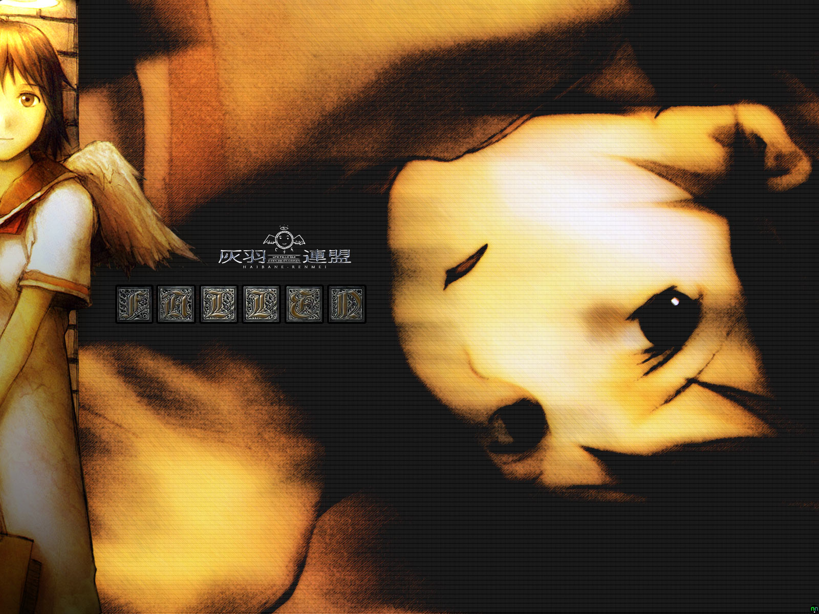
Here's a useful tip for those of you, like me, who work more than forty hours a week. If you ever only have one day off and have ready access to Photoshop 7, plan to spend the day away from home and go waste time with friends instead. I, however, did not heed this warning, since it was inevitably too late for me. Hooked by the gothic undertones, shrill lyrics and pounding guitar riffs of the Evanescence CD "Fallen", I found the June 2nd, 2003 issue of Video Business awaiting me in my mail on Thursday, the day before my only day off this week. Seeing two full-page pieces of artwork, I went to work scanning and cleaning the images until they started to show potential. Though I'd only seen a single episode of Yoshitaka Abe's newest creation known simply as Haibane-Renmei, the series from which the two beautiful scans I used originated, I somehow knew that the themes and lyrics in the Evanescence songs I enjoyed would fit well with the series' main character, Rakka. (Incidentally, the name Rakka apparently means "fallen" or "falling" in Japanese.) Anyway, I took my self-cleaned scans into a fresh transparent 1600 x 1200 pixel canvas, rotated the foreground picture so that it was vertical rather than diagonal, added some directional lighting so that her halo lit up her face and wing, but left most of her body in the darkness. I then took the fetal picture of Rakka, turned it 90° clockwise (it was originally a vertical piece), then horizonally flipped it. I applied the Patchwork filter to a white opacity layer that I had set over the background image, then used the Dark Strokes filter to give the background a gloomy look. To my surprise, one of Rakka's eyes retained a tiny sheen of moisture from the original scan, a fluke filtering result which I could never get Photoshop to duplicate. For added effect, I used the burn and dodge tools to highlight her face and add a bruise to her left eye, the filtering fluke that still had some life left in it. Anyway, to finish it off, I added a small tasteful Haibane-Renmei logo, and the word "fallen" in the Gebetsbuch Initialen font, between the portrait in the foreground and the desperate emotional face in the background. Notice that the goldish brown lettering of the word "fallen" is being hit by the light cast from the halo in the foreground. I think I'm starting to enjoy this...
Haibane-Renmei, Fallen
1600 x 1200, JPEG, 370k
05.20.2003, 9:00 P.M.
Well, E3 was a barrel of laughs, if not quite as fun and freebie-laden as last year, but at least we had some groundbreaking annnouncements made. The biggest announcement came from both Sony and Nokia. Turns out that Nintendo will soon find that they're no longer alone in the portable market. Nokia is coming out with their Sega-backed N-Gage cellphone/portable gaming hybrid, while Sony has successfully upped the ante with their PlayStation Portable--PSP, for short--which promises to outclass the Game Boy Advance SP in nearly every way when it launches in 2004. Weirder still is Shigeru Miyamoto's latest deviation. I've known for quite some time that his favorite game is Pac-Man, but never in my wildest dreams did I imagine that Namco Hometek would actually let him completely remake the classic arcade game in his own image. The tentatively-titled "Pac-Man" for the Gamecube allows one player to play as Pac-Man by plugging their Game Boy Advance into the Gamecube, while the remaining three players use the TV screen to chase him around the maze as the ghosts. I don't know if it'll ever come out, but let's hope so; it's a lot more fun than it sounds. The best lineup at the show would have to go to Capcom, especially for showcasing their fairly-comical Gamecube title, "Viewtiful Joe." Though nearly every game at the show had Matrix-styled slow-motion (which is really beginning to be quite a bother), Viewtiful Joe was the only game to do something different with it. Once past the brief introduction to Joe's many abilities, the player is allowed to fast forward and slow down the action, which doesn't just look cool, but allows players to deal more damage and pound enemies so hard, they'd simply fly offscreen. Steel Battalion went online, albeit with some rather choppy framerates, Chaos Legion took the action crown from Devil May Cry, and P.N.03 proved that trance music and shapely women really can be a lethal combination. And for those who remember Paper Mario, and would like to see more of it on the Game Boy Advance, Nintendo displayed a September 2003 release, simply titled "Mario & Luigi", in which players alternate use of the A and B buttons, the former making Mario jump and the latter making Luigi jump. The real fun starts in the battles though, as pressing the buttons at the right time powers-up your attacks, and allows for flawless evasion during retaliatory strikes. Sega flaunted the return of Altered Beast and Vectorman, as well as a Headhunter sequel, the multiplatform Sonic Heroes, and a new platformer from Yuji Naka entitled "Billy Hatcher and the Giant Egg." Mysteriously overlooked at the Microsoft booth was LucasArts' Halo-esque third-person shooter called "Armed and Dangerous", which showed off some of the most inventive weaponry that I've seen in years, including a springboard which allowed your character to flip the whole world on its head, freeing any nearby enemies from the forces of gravity. Somewhat unfinished, but still viable was Rare's rumored Conker game for the Xbox, entitled "Conker, Live and Uncut." As the title suggests, this is indeed the uncut version of Conker's Bad Fur Day that's been rumored to hit the Xbox for months now, along with an Xbox Live-compatible multiplayer setting, making it possible for players around the world to rip the stuffings out of some Tediz. I also sat down with my uncle to give the multiplatform Soul Calibur II a spin. Much to my disappointment, it seems that there will be no version that includes all three of the bonus characters (Link, Spawn and Heihachi) and to make matters worse, the game has been somewhat dumbed-down and redubbed in cheesy broken English. Ick. Let's just hope that we'll eventually see the original Soul Calibur on systems other than the Dreamcast. Come on Namco, Soul Calibur was the most balanced fighting game you guys have ever made, and you had to go and mess it up? Shame on you. A lengthy trailer for Metal Gear Solid 3: Snake Eater was also on display at Konami's booth, along with the promising Castlevania: Lament of Innocence for the PlayStation 2. The former showed a slightly-improved version of the Metal Gear Solid 2 graphics engine in a largely outdoor environment, along with a few witty jabs at Grand Theft Auto: Vice City, much to the crowd's amusement. The latter was honestly the first Castlevania done completely in 3D that looks interesting to me. Fear not the Castlevania games on the Nintendo 64, as this version's scope is in the same league as Symphony of the Night, while its action sequences are on par with the stylish combination attacks found in Devil May Cry. The only bad things about this year's E3 was the lack of free T-shirts (I practically had to beg the people running the Bandai booth for a .hack//QUARANTINE shirt), the weak showing at Tecmo's booth (no playable Ninja Gaiden or Dead or Alive 4?!) and the utter no-show that was the Working Designs booth. I still enjoyed the show, but it's just not the same without Vic and company there.
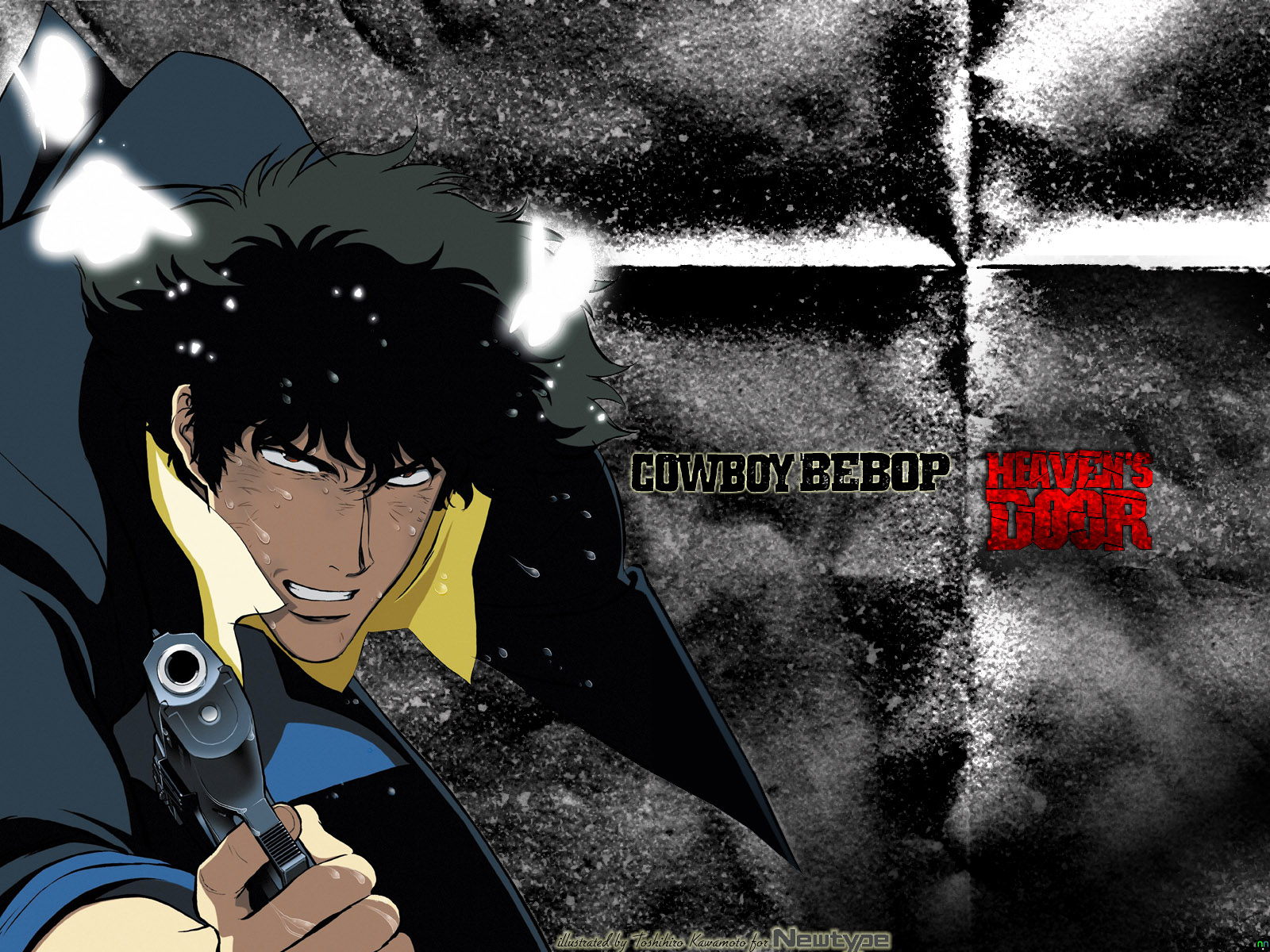
04.18.2003, 2:35 P.M.
Anticipation can sometimes be a very powerful thing... With Columbia TriStar not releasing the Cowboy Bebop movie, Knockin' on Heaven's Door, until June 24th, I've been forced to use my free time for other more creative purposes. While poking around Google the other day, I found a new scan archive called Project Zen, which had a spectacular poster scan from the Japanese Newtype magazine by noneother than Cowboy Bebop's conceptual artist and illustrator Toshihiro Kawamoto. The look of desperation and distress, combined with the silent rage of the hunter becoming the hunted was all captured perfectly, and made this scan ideal for my newest wallpaper concept. The image itself was originally a tall poster, and I immediately thought that they had cut off his left hand. However, judging from the high angle of his left shoulder, I would place his left hand somewhere behind his hip. Fortunately, this meant that the magazine poster had only cut off part of Spike's jacket pocket, so I just had to redraw it back in, adding a thin gradient from his jacket's black color to the dark blue on his sleeve for good measure. At first, I had planned on using a lot of text on this wallpaper. However, taking into consideration the complaints about my last two walls needing to be a bit more minimalistic, I decided that a non-intrusive black Bebop logo with a soft bit of yellow light around it and a stark red Heaven's Door would be more than adequate. After some suggestions, I also decided to add a film grain to the background, giving it a grittier look, and used a paper fold brush to add a subtle, slender cross between Bebop and Heaven's. Adding some dust and scratches for the sake of making the wallpaper that much more grungy, I then redrew the white fuzzy butterflies, so that the light they give off in the scan would also affect the newly-placed backdrop. I kind of get the feeling that I'm either looking at concrete or an aged, dusty wall behind Spike. An excellent effect, even though it was mostly an accident. =) Overall, it turned out to be somewhat plain, but with a bit of effort and advice (this is my first grunge), it turned out quite different.
Cowboy Bebop, Heaven's Door
1600 x 1200, JPEG, 532k
04.17.2003, 1:25 A.M.
Well, this is just dandy. Fully-intent on supporting the latest domestic releases of masterful Japanese animation director Hayao Miyazaki's work, I went out Tuesday and spent sixty bucks on the three-hit combination of Spirited Away, Kiki's Delivery Service and Castle in the Sky, all three published by the very company that sat on the rights like an overprotective mother hen for over six years, the infamous Walt Disney Pictures. Though elated at seeing these lovingly-released domestic versions of Miyazaki's greatest, my feelings of joy sharply decreased at the sight of a manufacturer's coupon for $2 off one of each of the three DVDs that I had just shelled out one-sixth of my hard-earned paycheck for. Let me get this straight, Disney; you want the average Joe Blow to recognize that Miyazaki's films are really for everyone to enjoy, just not all at once. By doing this, you're snubbing the very community that supported your publishing efforts to begin with. Someone deserves to lose their comfortably overpaid advertising job for including a $2 off coupon, to be presented at time of purchase, within the sealed case of the DVD that applied. Emails may be pretty much ignored nowadays, but let's see what they think of a two-page letter explaining how I would like my $6 off for supporting their stupid, half-assed efforts to underhype and underpublish Miyazaki's films to the point where one of them (Spirited Away) has to win a damn Oscar before it's given even a passable theatrical release.
Disney Rep: "What?! It won Best Animated Feature?! How the he--?! Err, I mean, yes, we always knew Miyazaki's films were of a similar caliber to our own, so it's really no surprise that it won out over all others in its category, including our own. We're pleased to be rereleasing this film in thousands more theaters for an encore showing, and, for the first time ever, on Disney DVD."
Me: "Ass."
04.02.2003, 12:55 A.M.
Well, yesterday obviously came and went with very few April Fools' Day jokes and pranks being pulled, most notably the lack of a wiz-bang GIA April Fools' joke. You know, the kind that used to send every Japanese gaming rag, including the infamous and opinionated Famitsu into a rabid frenzy. I, for one, refuse to participate in such stupidity, as playing the latest Zelda and the first episode of Xenosaga is far more important than a frivilous chuckle at the expense of others. On the other hand, I do feel compelled to point and laugh at the new Square Enix logo, which looks suspiciously similar to a certain oil conglomerate.

02.23.2003, 12:09 P.M.
Damn. With the imminent release of Xenosaga, Episode 1 and The Legend of Zelda, The Wind Waker, both within the space of one month, I find it difficult to concentrate on every day routine. As well it should be, with two presumably great game experiences coming out in such a short span of time. With my latest run of writer's laziness, my simple human brain might collapse from the sheer joy of playing through two excellent titles and then being unable to convey such joy. A critic's life can be so cruel sometimes.
Oh, and here's a belated and pathetically short Mario Sunshine review. Chow.
01.28.2003, 3:32 P.M.
I know it's been a while since I've done any game-related evals, but trust me, they're coming. Not only have I beaten both Mario Sunshine and Metroid Prime, but I'm currently working on Panzer Dragoon Orta and the latest crime 'em up for the PS2, The Getaway. Now, granted I've watched many a British mobster flick--"Lock, Stock and Two Smoking Barrels" notwithstanding--but this has to be the most f***ed-up language I've ever heard from a video game. I will say one thing though; so far, the atmosphere and chase scenes alone make for an excellent rent, if you're so inclined.
11.19.2002, 1:15 A.M.
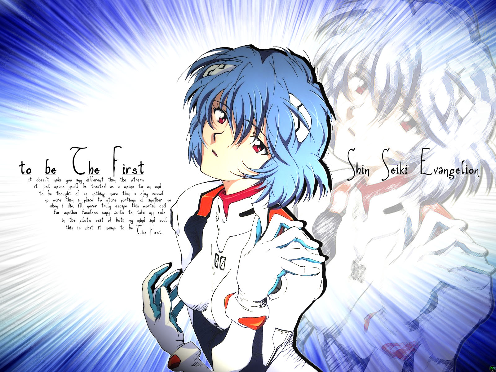
Ever since I finished watching the entire Evangelion TV series and the movies that followed, I always wondered why Rei was so silent. "What is going through that girl's mind?", I thought to myself. Earlier this week, I found an excellent scan of the First Child of NERV, so I decided to make another wallpaper. The first draft was far too messy to be a stylish wall, so I deleted all of the pics except the one seen here. Next, I crafted the shining blue background by extruding a slightly tilted gradient of dark blue to light blue into blocks, played with some omni lighting effects, and then used a zooming radial blur to make the transition smooth. Taking the excellent Rei artwork I had found earlier, I pasted it into its own layer and adjusted the blending, that way the lighting made her suit and face look as pale as possible, yet also made her hair look like a slightly lighter gradient than the one in the background. Taking the Rei image into a separate window, I applied a colored pencil filter to it, adjusted the opacity to 35%, then pasted it back in, behind and to the right of the centered, full color Rei. The poem, which gives the wallpaper its name was written entirely by me. It came to me while I was staring at the two Reis; one solid colored, the other a faded sketch. Originally, the poem was in the shape of a clay vessel, which wasn't done intentionally at all. Kinda creepy, considering the subject matter of the poem... =)
Evangelion, to be The First
1600 x 1200, JPEG, 368k
09.10.2002, 11:58 P.M.
In a surprising show of good faith, Atlus sent me a reviewable copy of their action-RPG "Dual Hearts" about a week ago today. Well, the game finally hits store shelves later this month, so for the first time in ages, I can review a game long before it comes out. And, now that I've finished playing through the game and mulling its contents over in my mind, I've finally come up with something decent to say about this little-known, Sony-funded adventure title that's coming to us via the same folks who developed Working Designs' Alundra and the kindness of those brave souls over at Atlus USA who took a big risk publishing a great title that no-one has probably ever heard of here...
08.14.2002, 6:02 P.M.
The Final Fantasy X evaluation is finally finished. Read it. That is all.
07.30.2002, 9:32 P.M.
Twenty-two days and one hour later, my site is streamlined and ready for updating. Unfortunately, due to the time and effort it took reformatting the whole shebang, I'll be taking a brief hiatus from anything having to do with this site at the moment. I have to admit, I don't know why I didn't immediately think of using Server Side Includes to load the same navigational array on every page, but to be honest, it helps to have studied how they're accomplished first. : | A big thanks goes out to Jeremy Parish of ToastyFrog for explaining how simple SSI-based menus are to pull off. Now, if I can just find the time to finish my thirty dollar copy of Halo and review it before Mario Sunshine streets--'cause you just know I'm gonna be buying it. Miyamoto games have a strange similarity to illegal narcotics, i.e. once you've had one, you can't say no to another. Maybe that's where all of these "growth mushrooms" and "oak leaves" came from...
07.08.2002, 8:28 P.M.
Just in case none of you have taken notice of the recent renovations yet, I'm currently trying to speed up my website's performance with some minor adjustments to both the navigational sidebar and currently defined margins. I also managed to salvage one of my older site logos and with the magic that is Photoshop 7, made it into something worthy of being placed prominently at the top of each page. Of course, since these changes are being made to each page gradually, this means that some things may appear to be a bit out of whack for the next few weeks. Not that anyone really keeps an active record of my website design tendencies, but it's nice to know that I care what my readers think, right? The only thing I don't like thus far is the fact that I have to abbreviate a few of the sidebar links. It does kind of fit though, in a somewhat 8.3 filename sort of way; and here you thought we were rid of those once and for all. ;)
05.03.2002, 3:45 P.M.
Well, to put things mildly, my belated trip to E3 this year has proven to be muy expensive, most likely due to stupid terrorists and other such inconvenient shtick. I would never object to paying a fifty dollar security fee, but it doesn't make it any easier to return to the real world after the magical three-day magic that is E3 2002 has ended. Of course, a measly $400, give or take a few expenses (more than likely "take") is more than worth it to see various over-eager company reps fight over the attentions of attendees, offering free swag and whatnot. Nothing to sway your opinion of any game company like a set of soft earplugs emblazened with their company's logo. As Stovey would say, "Nice touch there, GT Interactive..." You folks will certainly be missed. Hopefully, no one else will ever fill that void.
03.27.2002, 8:00 P.M.
Much to the dismay of many a United States Senator, it turns out that a thoroughly and utterly violent, obscene and/or tasteless game like Grand Theft Auto III actually managed to make my long overdue road test to get my driver's license today flow along like the falls at Niagra. I'm still not quite sure why, but practicing my Mad Driving Skillz™ while I completed a couple of missions without hitting any opposing objects throughout Liberty City helped to loosen my tense outlook on the dire circumstances of earning the right to drive myself to and from work each day. I just wonder whether I still would have passed had I revealed my newfound source of confidence. That'd probably be a no.
03.25.2002, 2:30 A.M.
Well, it seems that my utter lack of interest in video games over the holidays proved to be a quite a mistake, as I'm simply having loads of demented fun causing random mayhem and serious injury in my two newest games, DMA Designs' Grand Theft Auto III and Sega AM2's Virtua Fighter 4. You can call me a nut if you like, but even in fairly basic PS2 polygons, GTA is still all about the chase scene; especially so, if you can pull off a mission (with cops on your tail all the way) without blowing your current ride to little gravel-sized clumps. By the way, I find it very interesting that few people have mentioned that the real secrets of the latest GTA installment lie not in its deluxe 3D presentation, but in the cleverly hidden references to the classic U.K. original. Mainly because, I was having all sorts of fun when I finally discovered that the blue Dodge Viper look-alike was carefully stashed behind the glass of a used car shop. I even managed to find the title track from the original GTA on the Lips FM radio station. For the last hour or so of my me-time though, I decided to kick the living crap out of the other Virtua Fighters with Sarah Bryant and was enlightened to the real reason I bought a copy of VF4 for my PS2: Kumite Mode. I wonder if the fine folks at Namco and Capcom are taking notes on this stuff, because playing against artificial intelligence routines based on skilled arcade-goers was much more challgening than the tame Arcade Mode.
03.20.2002, 11:42 P.M.
It's been a good long while since we've seen the release of another Tomb Raider video game, and with Paramount's release of the Tomb Raider movie with Angelina Jolie last year (which I still haven't seen), Lara Croft's pop culture influence is back in such a way that it hasn't been back to since 1996. Now, the latest title in the series, due out for both the PS2 and Windows-based PC, will be known as Tomb Raider: The Angel of Darkness, and will reportedly tell the story of how Lara finds herself accused of some unspeakable crime, presumably murder, and how her quest begins to clear her good name. (Although, as far as I'm concerned, she lost that when Tomb Raider III came out.) The new installment definitely shows a lot of promise, but the real clincher for myself is that Lara will have over 150 moves--a vast improvement from her 32-bit days. Which is good, because according to Core Designs co-founder Adrian Smith, the new Tomb Raider will be familiar to long-time fans, but will likely surprise anyone expecting nothing more than Tomb Raider: The Last Revelation with PlayStation 2 level visuals and a darker plot. Oh, and for those of you who are curious as to how Lara Croft is still alive after what happened at the end of Last Revelation, don't expect an answer in Tomb Raider: The Angel of Darkness; Smith says that the definitive answer is still at least a few installments away.
03.18.2002, 12:16 P.M.
Well, it took quite a few months, but we all knew it would eventually come to pass. Nintendo Co. Ltd. has finally announced a "brand-new" Pokémon title for their Game Boy Advance handheld. Judging from the shamelessly ripped-off Weekly Famitsu scans I've seen on a number of other websites, I could almost declare Nintendo Co. Ltd. president Hiroshi Yamauchi's retirement for him. Unlike the graphical splendor and gameplay variety that pretty much personifies every other Game Boy Advance release from Nintendo, Pokémon Advance almost looks like a widescreen Game Boy Color title. Not that this is a bad thing though, as I'm sure all of you diehard Pokémon enthusiasts haven't had enough tile-based graphics for one lifetime. As for me, I officially stopped playing Pokémon a while back, when I finally realized that my imported copy of Pocket Monsters Silver was little more than a much more expensive, colorized version of Pokémon Blue (which I already owned) with a hundred more innane creatures to trap and domesticate. Let's face it; only the most bored people among the gaming populous (you know who you are) ever wanted to breed a freaking Pikachu with a Gyrados. I get chills just thinking about such a bizarre combination...
03.18.2002, 2:10 A.M.
Wow. So, get this; it actually turns out that Capcom's Resident Evil, quite possibly the most redesigned video game, has built up quite an enormous amount of hype. Especially now, less than three days after Japanese gaming rag Famitsu gave the iffy-but-pretty a near-perfect score of 39/40--a mere one point away from proposed perfection, the score held by only three titles thus far: Nintendo's The Legend of Zelda: Ocarina of Time, Namco's Soul Calibur and Square's Vagrant Story. And while Famitsu's editorial opinions have been put under pretty heavy criticism as of late, it's still quite an achievement to garner such a high score considering the meager 32/40 or so that the PlayStation original received from these ever-skeptical game critics. This definitely changes things quite a bit for me, as--I can't believe I'm saying this--I'm now really looking forward to purchasing Capcom's Resident Evil once again. This time around though, I'm pretty sure I won't feel any of my hard-earned money hit me in the back of the head.
03.17.2002, 2:08 A.M.
In one of the strangest, least-likely-to-happen deals of the new year, Square Co. Ltd. and Nintendo Co. Ltd. have announced a new joint subsidiary, known as the "Game Designer's Studio" (catchy, huh?), which will be the source of all Square-developed Gamecube and Game Boy Advance titles in the very near future. An as-yet-untitled Final Fantasy installment has already been announced for the Gamecube, though Square was quick to clarify that it was "a different type of game" and probably wouldn't tie directly into the main Final Fantasy series. So good; now that Square is back as a multiplatform developer, let's hope that Nintendo Co. Ltd. president and CEO Hiroshi Yamauchi can manage to not piss them off for another five years. Who knows? Maybe a Gamecube port of Kingdom Hearts isn't out of the question...
03.17.2002, 1:36 A.M.
And, while we're still on the subject of slow-going development of popular/unpopular role-playing game franchises, Namco Ltd. and MonolithSoft's upcoming "Xenosaga Episode I: Dur Wille zur Macht" has been pegged as one of the slowest-loading PS2 titles ever. Unfortunately for any of you North American fans of Xenogears, the PS2's Hard Disk Drive peripheral will probably never make it to the States, forcing us to once again wait through painful load-times and repeatedly press X through novels of in-game text. Not all is horrible and bleak though, as this particular picture would make the perfect box artwork for a North American release of the first Xenosaga installment. That is, of course, assuming that Namco will even bother to release it here at all. Namco, I hope you're paying attention, because bad box artwork should be criminally liable--at least, in Texas, where we still have a death penalty.

