Navigation Bar Tutorial #2, page 3:
Now it's time to add the navigation
buttons. Click on the
INSERT BUTTON ![]() icon or choose INSERT > BUTTON from the
menu. You'll get something that looks like the image below. If it isn't
already, make the button engraved, as opposed to embossed, so it looks like it's
been cut out of the top layer. You'll need
to type in the text you want for the button, then position the text into place.
The neat thing about inserting the button this way, as opposed to simply
creating a button and text independently, is that NetStudio links the text and
the button together, so that if you have the button (not the text itself)
selected, and you need to move it, the text moves with it.
icon or choose INSERT > BUTTON from the
menu. You'll get something that looks like the image below. If it isn't
already, make the button engraved, as opposed to embossed, so it looks like it's
been cut out of the top layer. You'll need
to type in the text you want for the button, then position the text into place.
The neat thing about inserting the button this way, as opposed to simply
creating a button and text independently, is that NetStudio links the text and
the button together, so that if you have the button (not the text itself)
selected, and you need to move it, the text moves with it.
If you decide you want to change the shape of your button, or any other object for that matter, after you've already created it, you can simply select the object you want to change, then choose FORMAT> CHANGE SHAPE TO... from the menu, and pick a shape. Thus, you can quickly decide which looks best. For example:
![]()
![]()
![]()
![]()
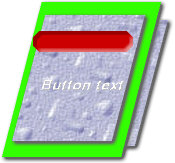
I've typed in my text for the button, and positioned it into place in the button. I've chosen an italic type style in order to give it a slant that's consistent with the rest of the image and added a shadow to the text. I then selected the button and filled it with the same color as the middle layer, and now I have this:
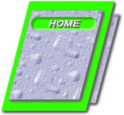
Again, I've made this image small so that the page will load quicker, since I'm using so many images on each page, but you'll want to create it larger in order to make the buttons more legible. By making the button the same color as the middle layer, and using the engrave effect on the button, I've created the illusion that these are sections "cut out" of the top layer. Now insert another button, and another, until you get all the buttons you want. Once again, NetStudio remembers your last button, so the font and the fills remain the same. After getting all the buttons and text into place, I've selected the bottom layer and increased the shadow on it, both horizontally and vertically, and increased the blur on the shadow. So the finished image looks something like this:
Of course, you may not like green as much as I do, but I showed you how easy it is to change that. Okay, on to the next one...


![]()
![]()
Home Navigation Bars Buttons Backgrounds Cool Tricks Next Page