My Designs
Stranger Things Postcards
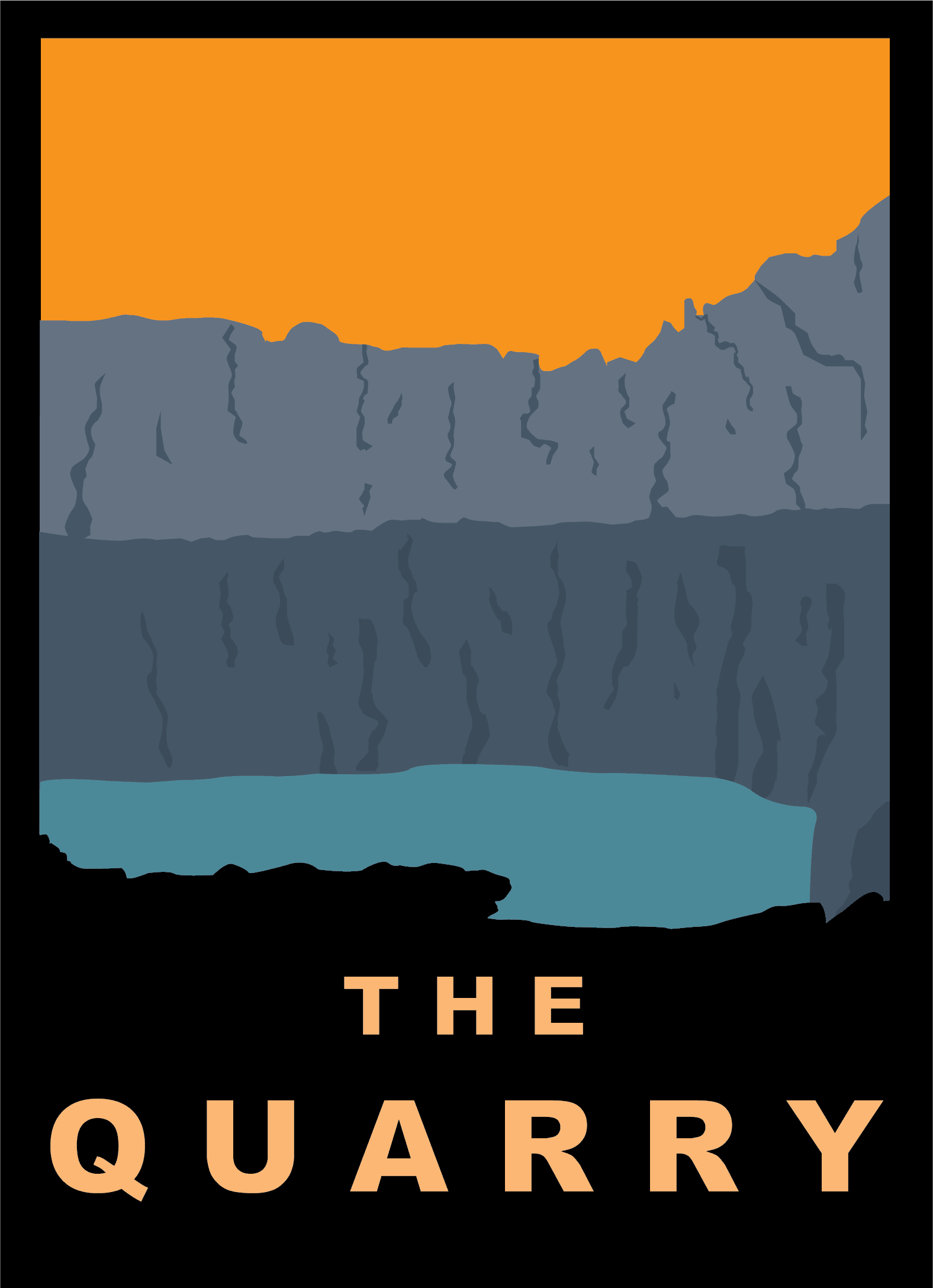
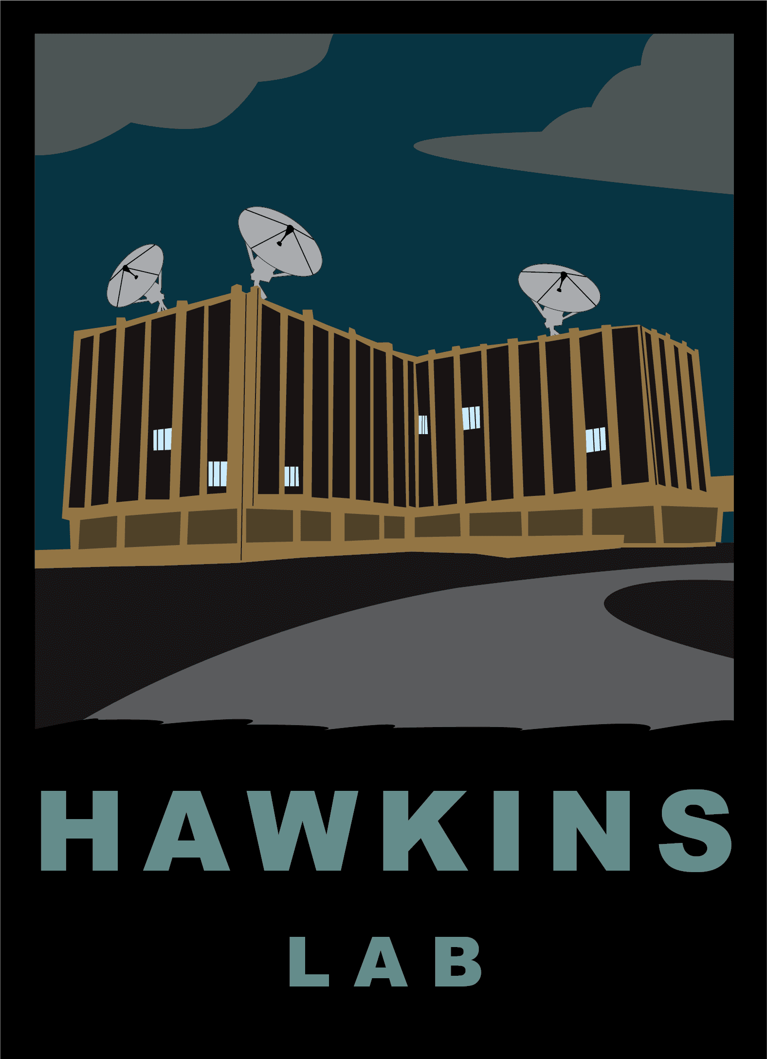
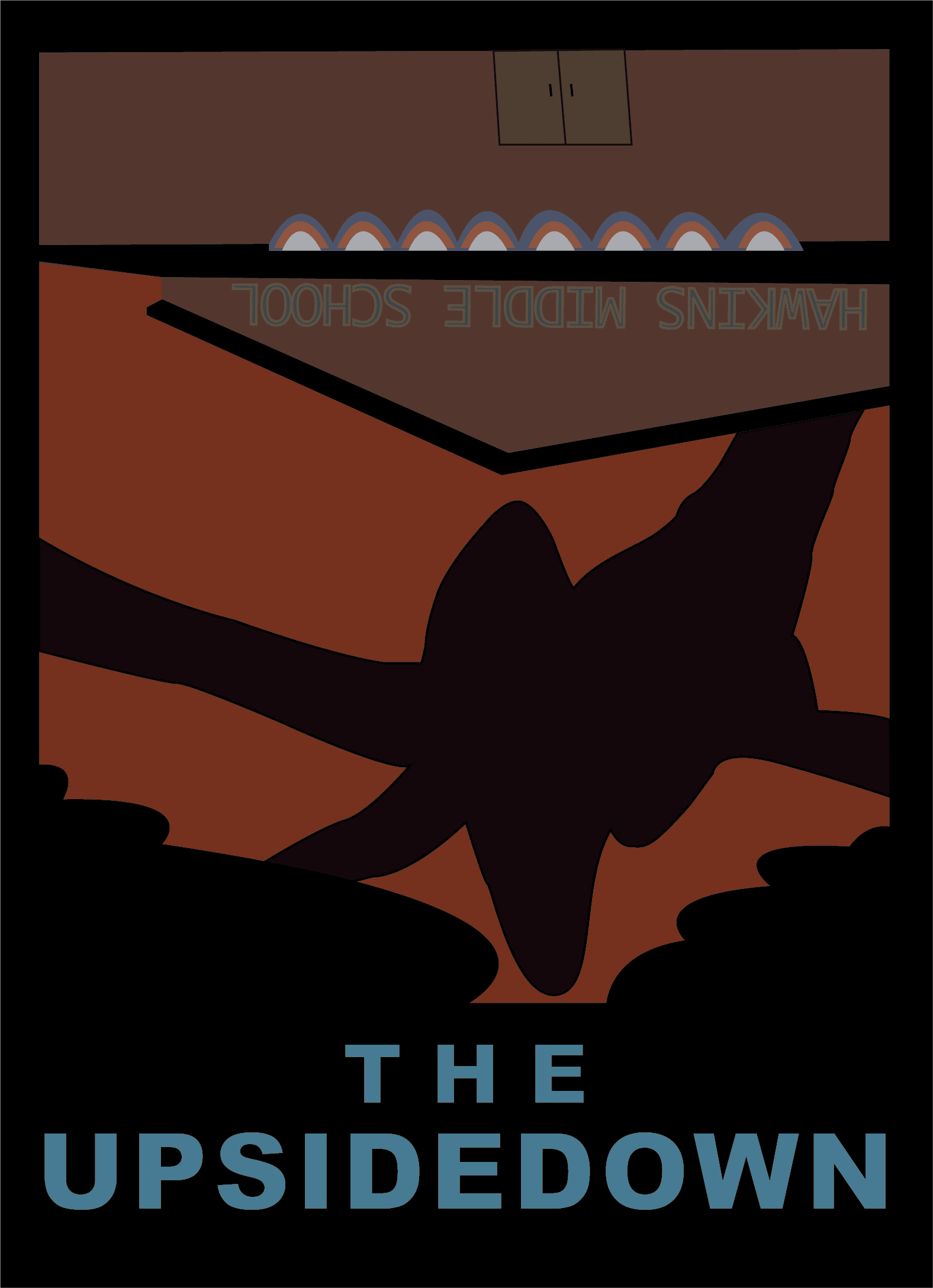
I made these "Stranger Things" themed postcards for an assignment in a design class. The assignment was to make postcards of whatever theme we chose, all in a similar styling. I took inspiration from artist Michael Schwab and his national parks posters to make these postcards from the fictional Hawkins Indiana. I had a lot of fun playing with the colors and getting very nit-picky with my tracing. Overall it was a great Illustrator learning experience! Select one to see it larger!
Room With a View
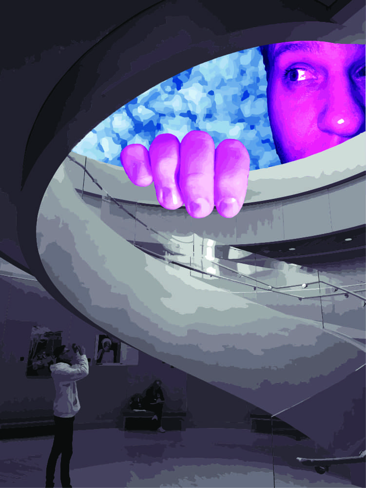
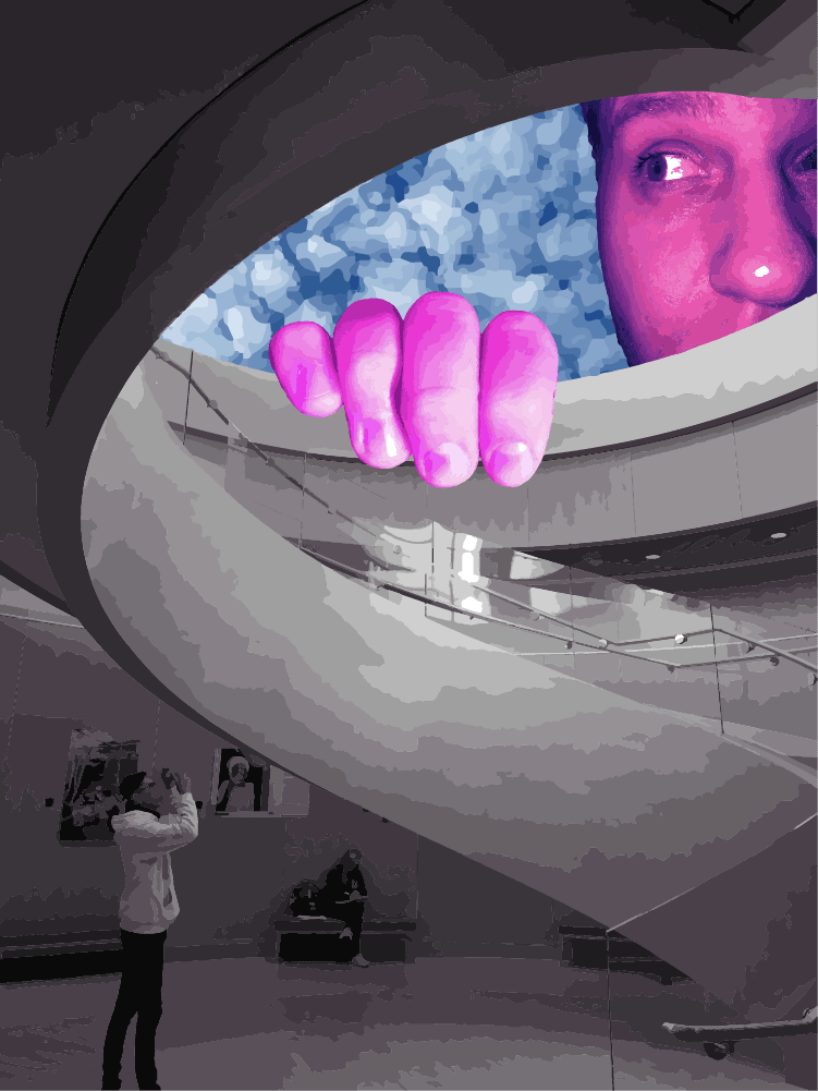
This design was made in my short stint attending BYU. We were tasked with making a design based on photography with the prompt, "Room with a view". I went with my classmate and took photos all around campus. This spiraling staircase was such an interesting shape and my classmate ended up being in the perfect pose to prompt an idea, "What fantastical 'view' could I put up there that he could be casually taking a photo of?" and with that thought I was off. There are two because I had a hard time deciding on the colors. Which do you prefer? Choose one to see it bigger.
Magazine Spread
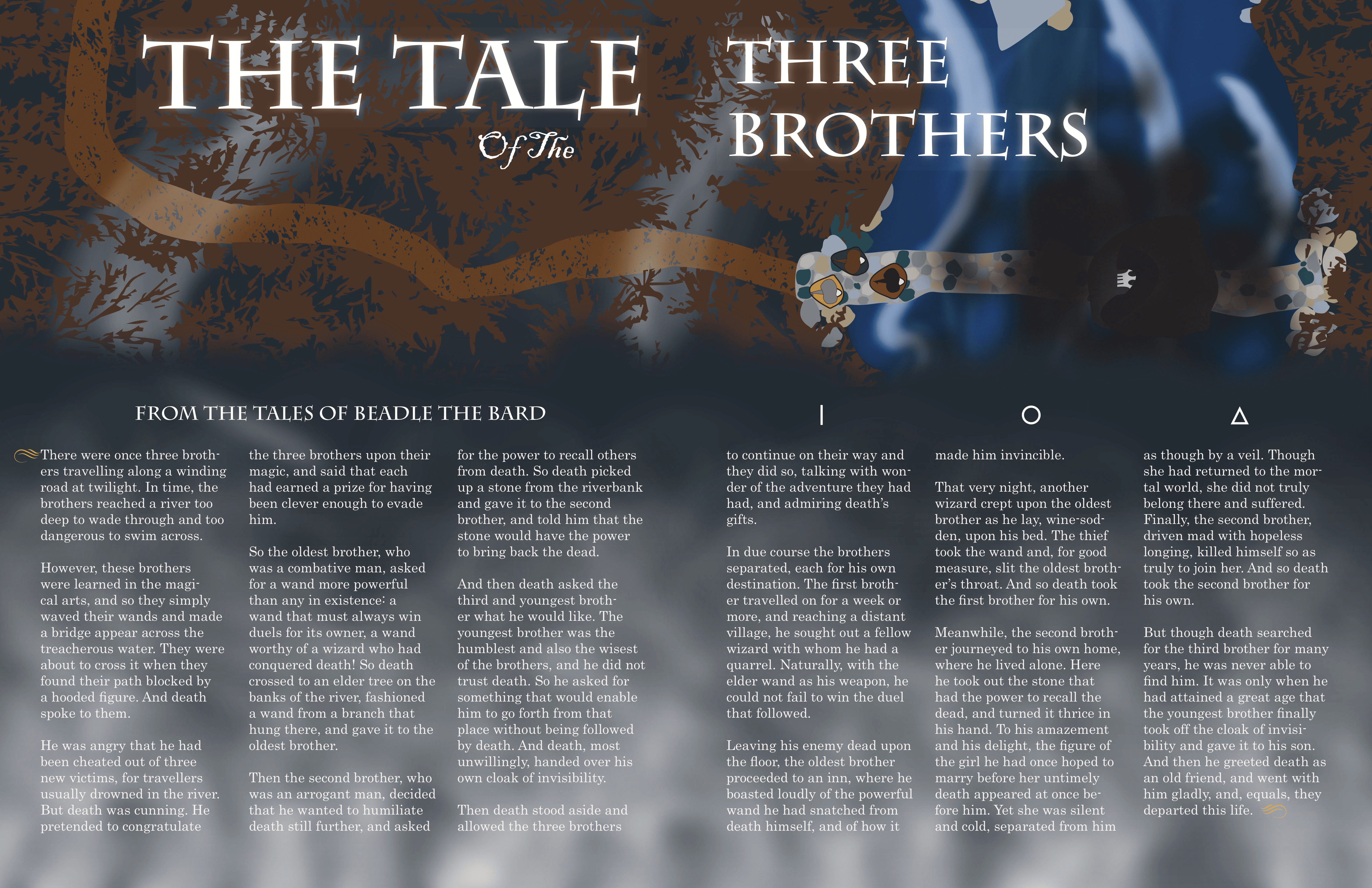
While it's not the most visually impressive thing you will likely ever see, this double-page spread is some of my best work combining Indesign and Illustrator. If you couldn't tell by now, I am very into pop-culture, which is why I had to choose a Harry Potter themed magazine spread. Everything here that you could classify as an image I made from scratch. I even made some brushes in illustrator which I used to make the smoky bottom part, and the white water in the river. Though it's subtle one of my favorite touches is the symbols that make up the Deathly Hallows symbol seen in the books, over the paragraphs on the right.
Grid Color Exploration
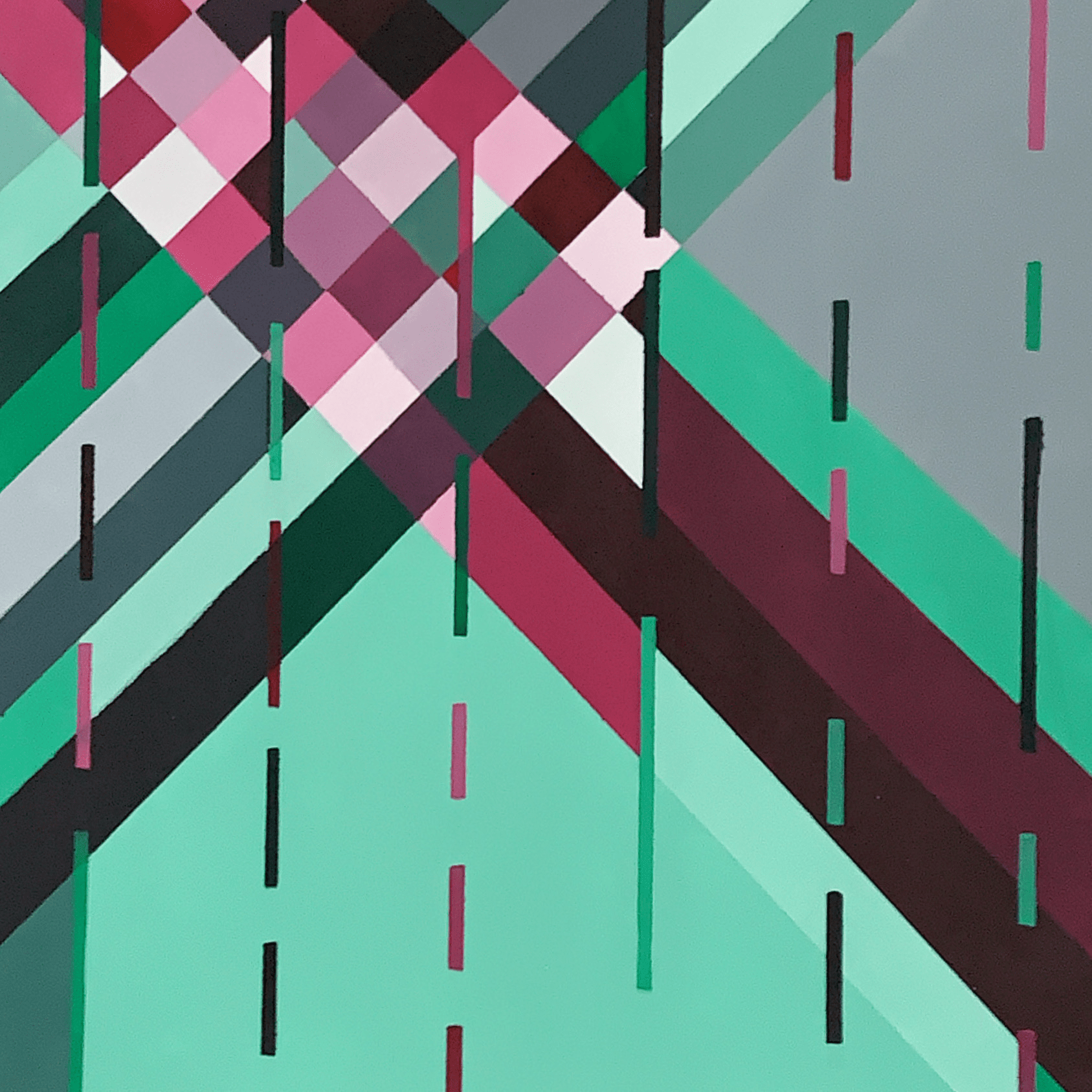
Design classes at BYU were not what I expected they would be at all. For example, we had many assignments where we had to use real paint and no digital programs. This was a challenge for me as most of my design experience was using Illustrator.
For this painting we had a few rules, the design had to employ a grid pattern, and we could only use four colors of paint, two of which had to be black and white. Once I had my design, it took hours of mixing, taping and painting. The discarded popsicle sticks and tape ball almost became a piece of art themselves once I was done. It's definitely best viewed at a distance so you don't see where my hand slipped or the tape bled, but overall I'm pretty proud of it
Framing Exercise
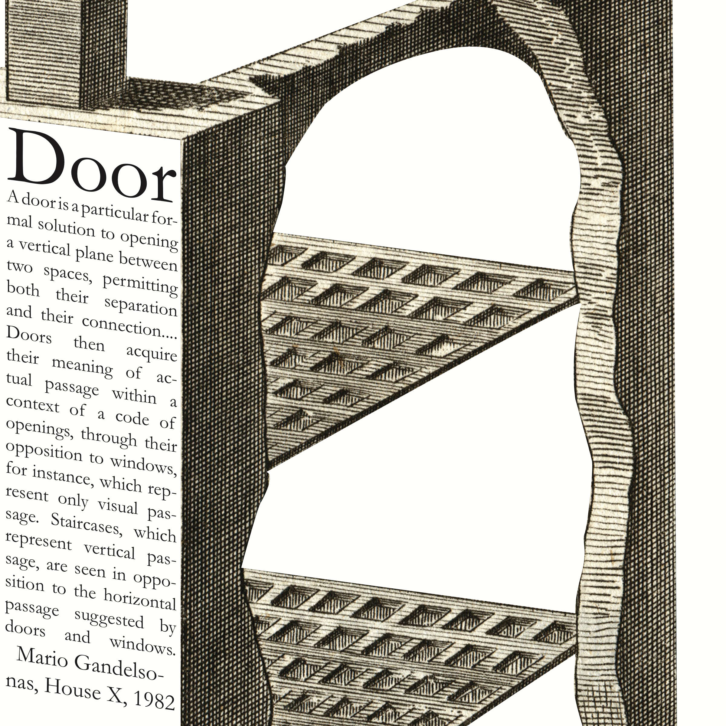
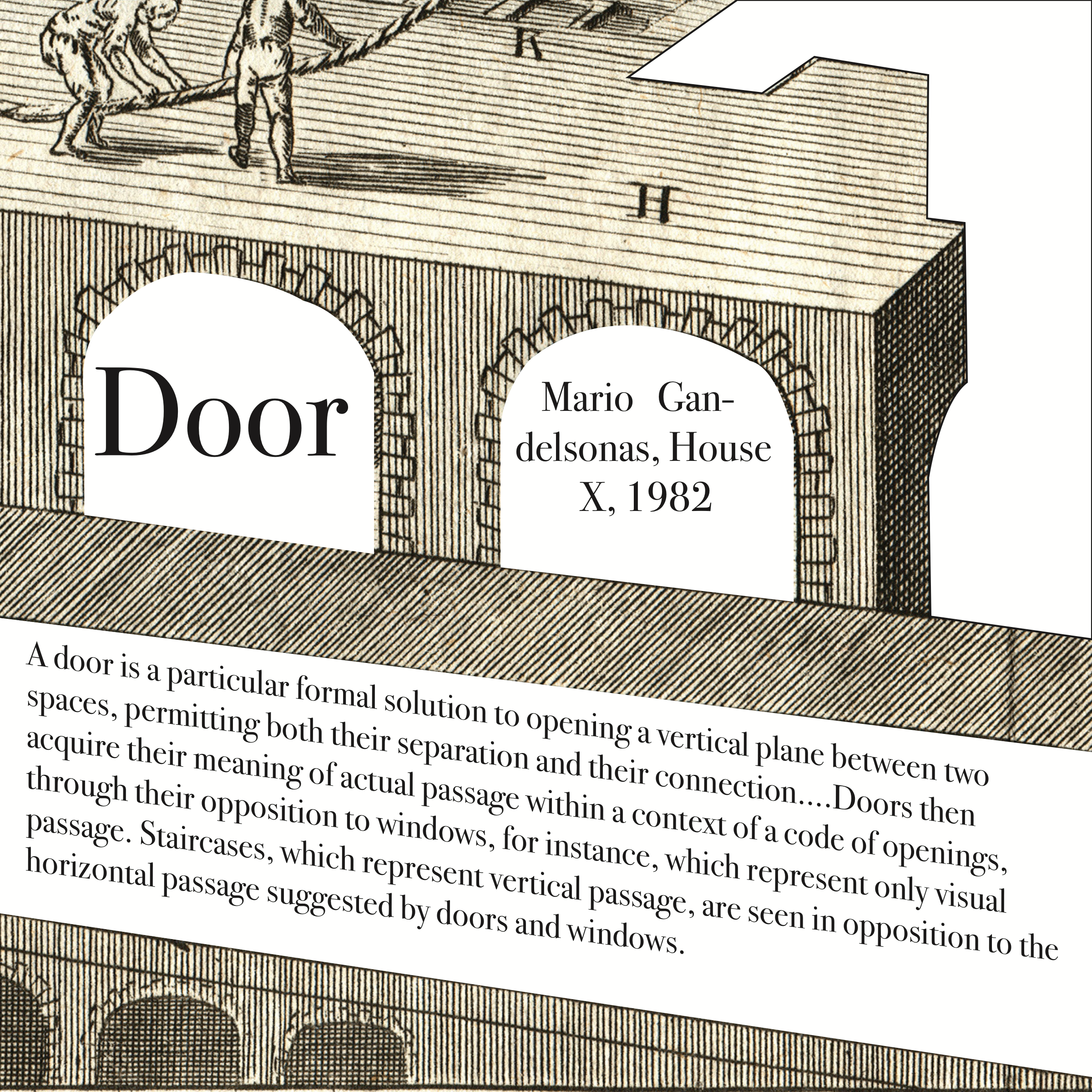
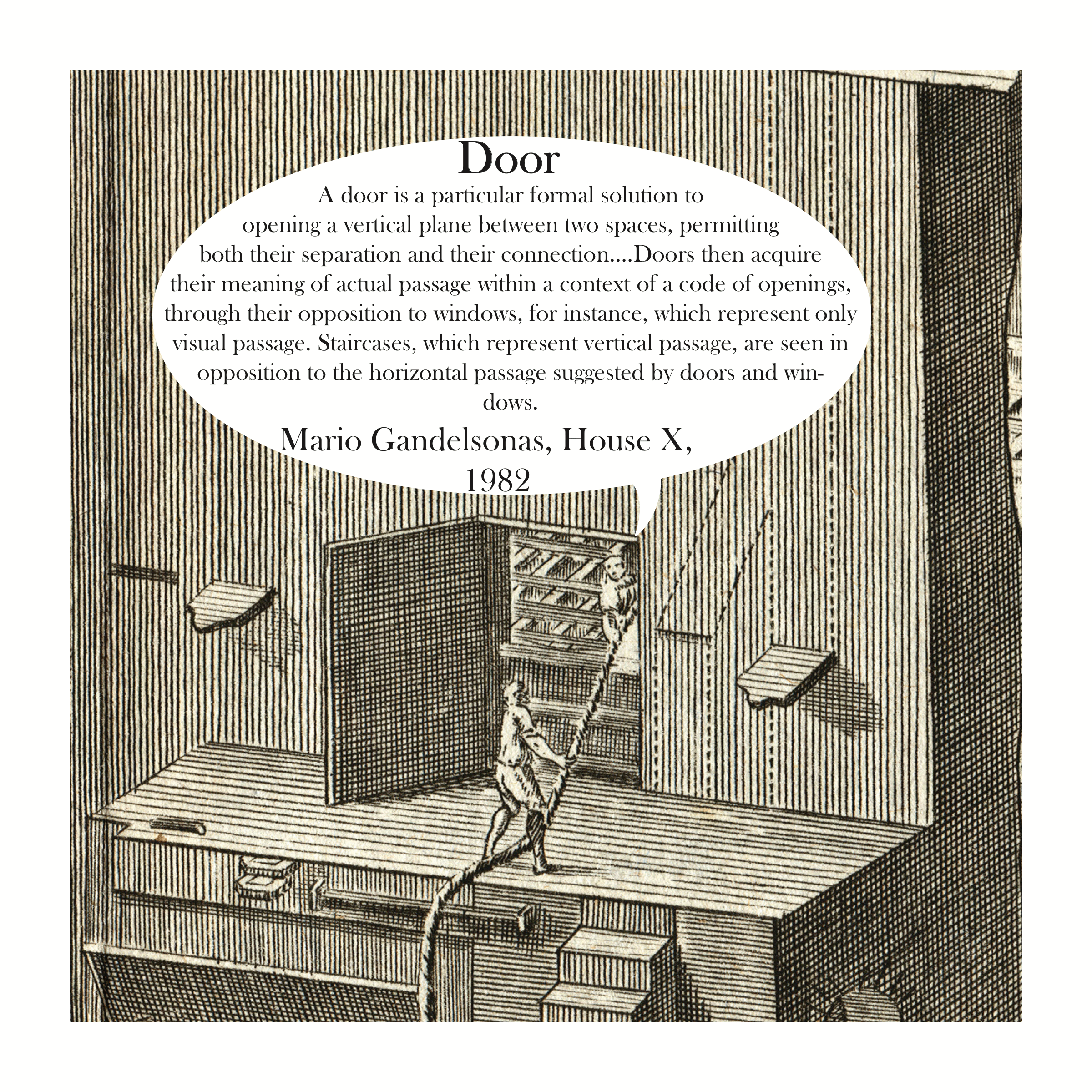
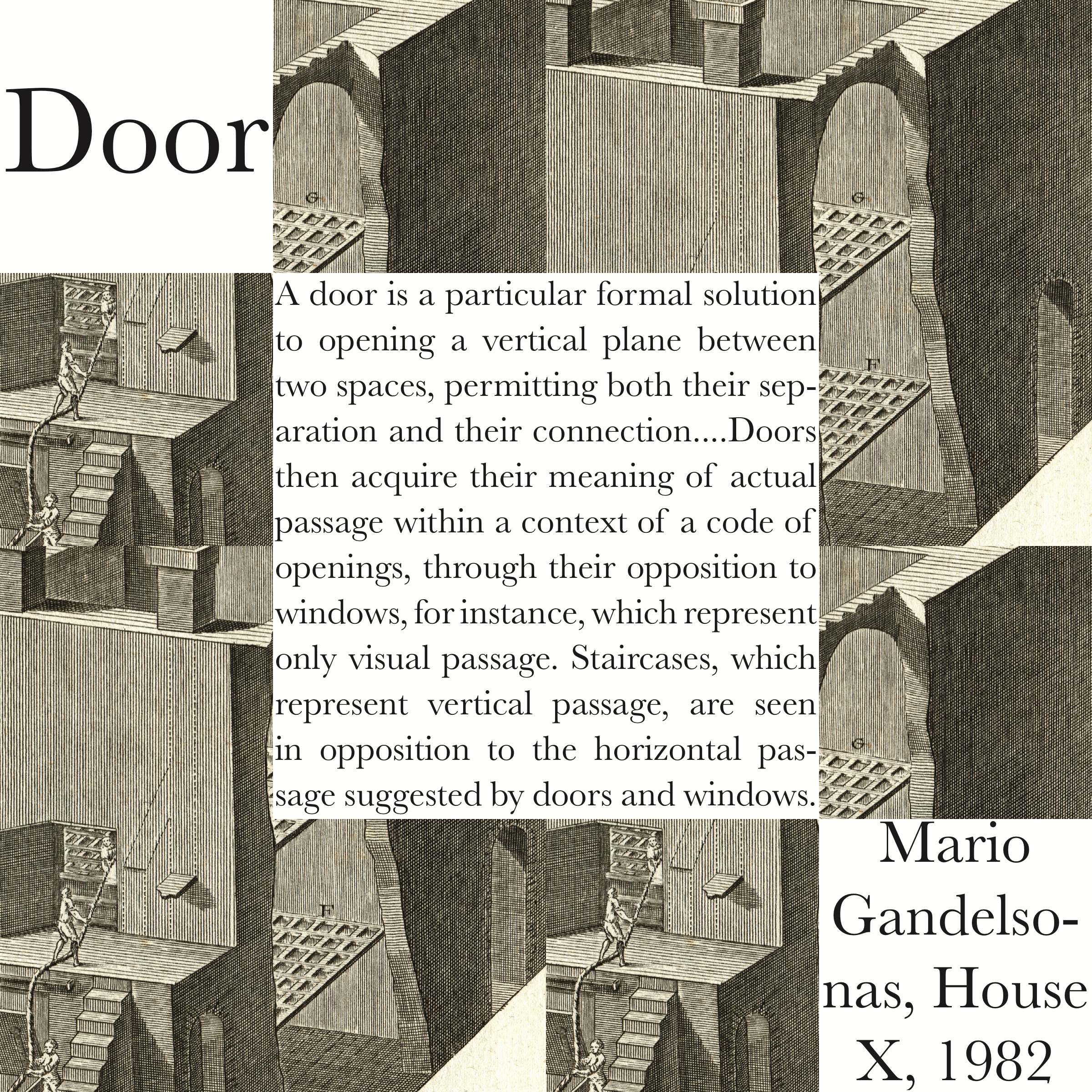
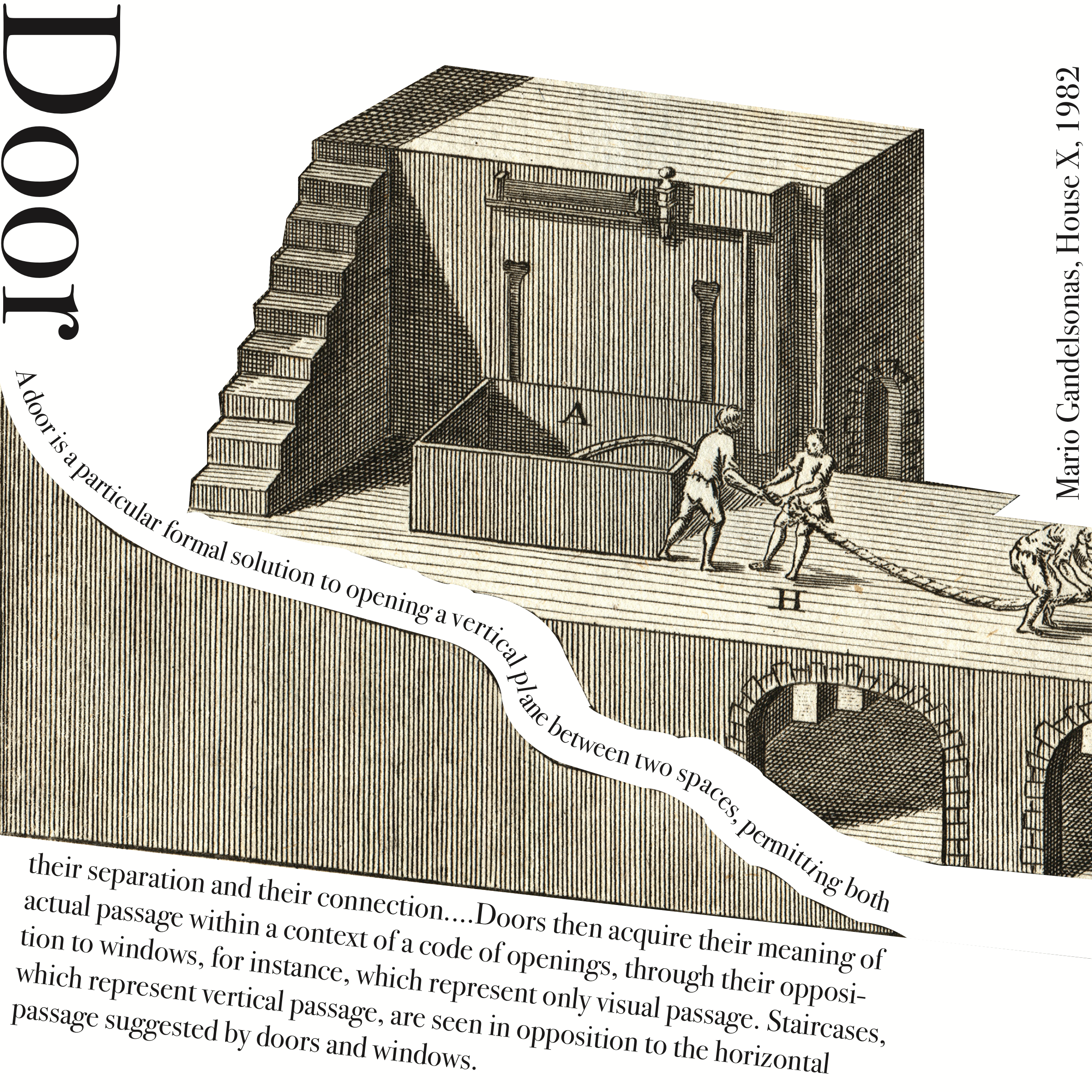
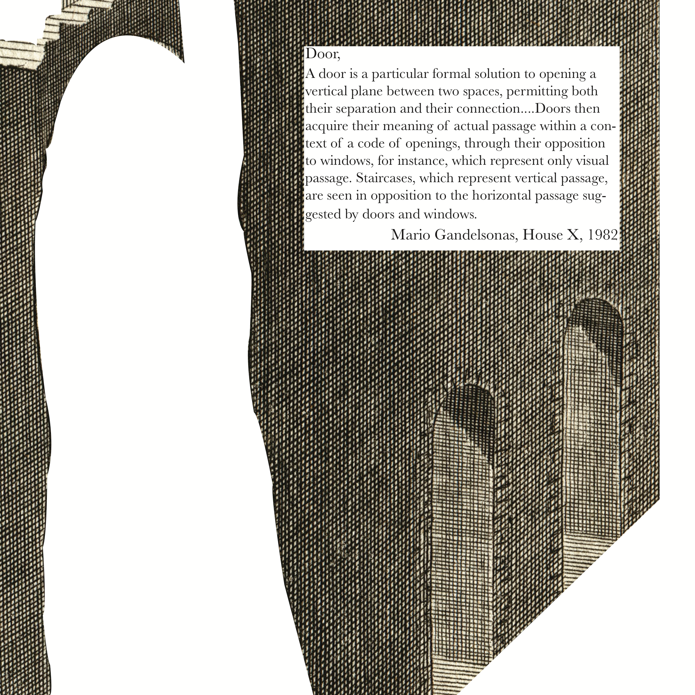
These all come from an assignment I did for a design class at DSU that was about framing and how the way you frame something can impact the overall feel of something. The picture parts were all from one big picture and we could take it and crop or change it as we desired as long as we included the quote in the design. It was a great exercise and made me learn the value of trying different iterations before deciding what your best idea is.