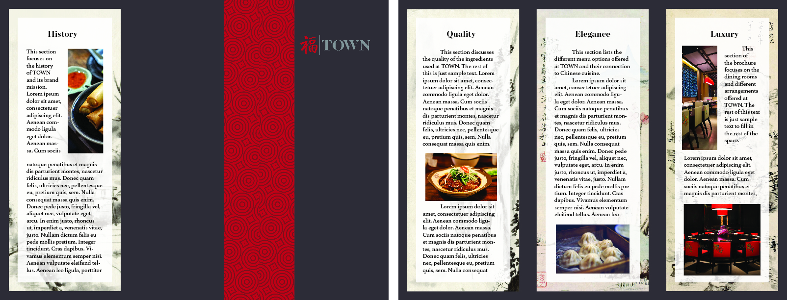
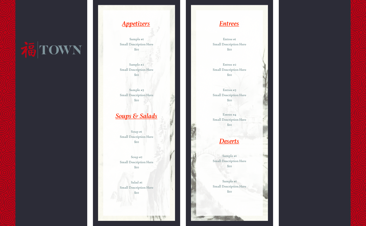
Print-Ready Projects
Here you'll find some examples of print-ready projects that I've created.
Here you'll find some examples of print-ready projects that I've created.
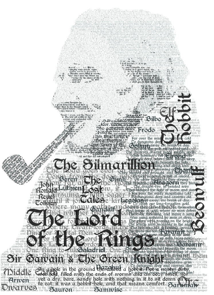
Easily one of the most challenging yet fun pieces I've ever worked on. A typographical portrait of writer J.R.R. Tolkien. Using digital type as a medium for art is an incredibly challenging task but something I highly recommend that any aspiring designer should try.
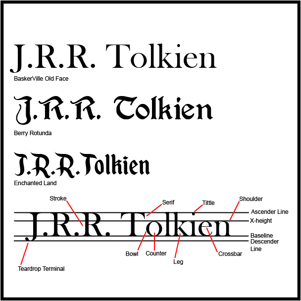
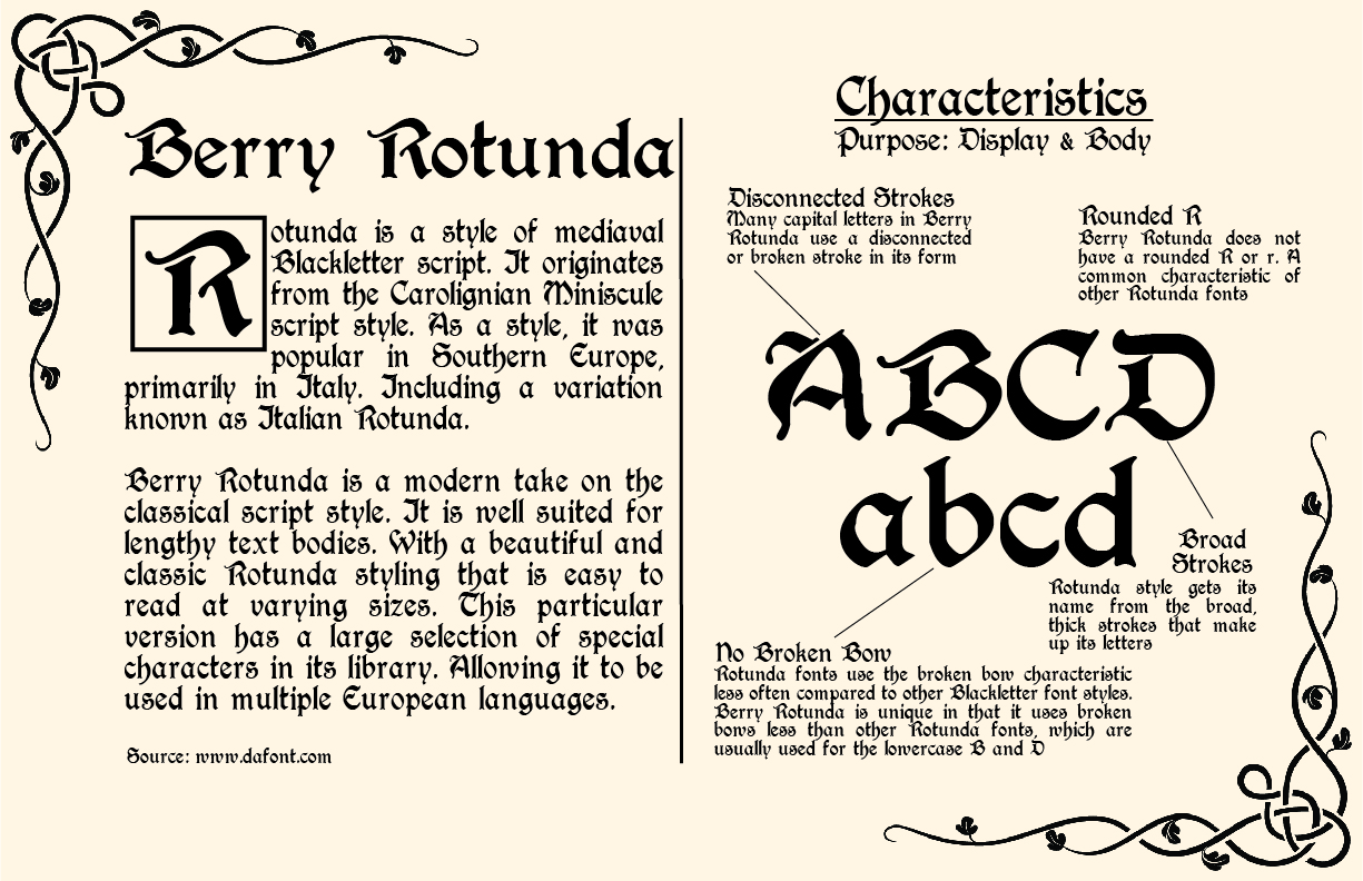
Typography is one of the most overlooked parts of graphic design and yet one the most essential. This piece is a sample of typefaces selected for potential use in the typographical portrait. As well as sample of the anatomy of typography.
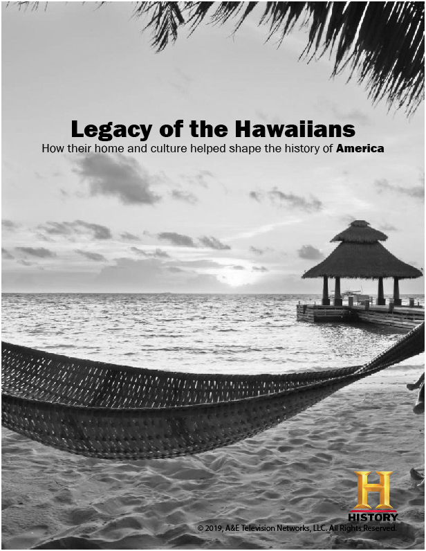
An important step in the pre-press process. Typesetting is necessary to achieve visual balance in the text of a design. Beyond this, the editing process of design layout, picture placement, and typesetting is one of the final steps of the pre-press process of preparing a file for print. This image is an alternate design sample of the article in the first magazine sample above. It showcases a justified alignment in the text, a more difficult alignment style to work with due to the greater risk of typographical errors like hyphenated words occurring. Can you see what errors appear in the sample?