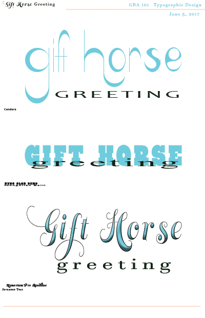
This typography project was a study on matching fonts. The first font that appears for "Gift Horse" was my own design, while the other fonts were found on Adobe's Typekit. Gift Horse Greeting represents my fictious company who's niche is in greeting cards. During this project, I really discovered how the style of the font can really impact the outcome of the final result. Both project were made in Photoshop.
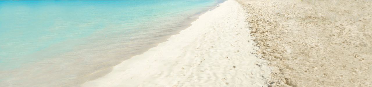
Amethyst Bay
The instructions for this project were to create a magazine page, Amethyst Bay is a fictious company. With access to the company's brand style guide I had clear understanding of approved logo usage, font, and color scheme. I immeadiately began forming a honeymoon package as a way to attract potential customers.I found stock images from Adobe. After creating the magazine page, I was able to utilize some of the same elements to also create an animated gif. Adobe Photoshop was used to create both the magazine ad and the animated gif.
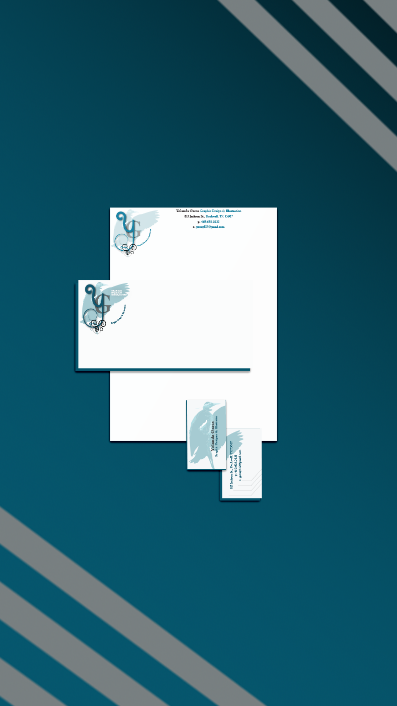
Studio Garza
For this branding suite, I wanted to setup a cohesive style that is not unique to me but also to the development of a trusted business. The heron in the logo design not only represents my last name but also the longlasting impression that I seek to gain with each design.
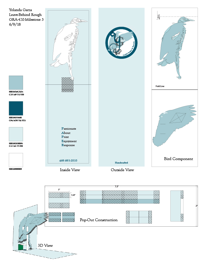
The pop-up leave behind piece is meant to initiate a reaction of curiosity and enjoyment. I think design should be more than just visual but also tangible. As a kid, I can remember how awestruck I was when I opened a pop-up book. I would love to be counted as one of those to brings joy to someone's life with a something more three dimentional and maybe even a conversation piece.