Documentation and Development Process
The intent of the website is twofold. The first, is to create an easy website for customers to follow. The second, is to increase sales at the local bakery.
Ease of use is especially important to end users. I believe that when everything is pleasing esthetic to the eye, the customer will spend more time on the website. Personally, I find it very hard to stay on a website that is not clean and is hard to read. I went with a clean and organize website. I went with simple but elegant. I kept the heading on each page the same making sure the customer knows which company they are gathering information about at all time. I also decided that since the navigation links were blue to move them below the logo this allow the links to be easily read. The other thing that helps with ease of use is the front size. I picked I size I could read easily without having to adjust the size in the browse or squinting. We want to make sure that the consumers do not end up with eye strain just from looking at the website.
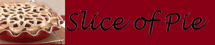
The second, the major purpose is to gain sales at the bakery. This was accomplished a few different things. The first is the color of the header and footer. Red stimulates the appetite, so I decided to incorporate that into the website. Second, when it comes to food, presentation is everything. People eat with their eyes. Since that is the case, I knew I had to find a video and images where the pies were perfect. The third thing, people want to be able to relate to a person, so I pick a picture of a chef who is smiling. It puts people at ease and seems to invite them into the world of baking.
With these things in mind, I made a paper drawing of what I thought I wanted the site to look like. It was pretty much just laying out the format of how many pages and what order they should follow. Then I started collecting recipes, the bare bones of the recipes are from different websites but all of them have my own twist on them. I then started looking for pictures or videos I could incorporate. I had to find pictures that represented perfect pies. These pies had to either inspire me to bake or at the very lease made me hungry. I then started creating the pages. I added the content first, then the images, then went back and did all the html tagging. I found it easier to get my thoughts on to the page then tag, instead of tagging as I went. I then created the CSS file for major components in the across the pages that should be the same and the visual aspects of the websites.
Defense of the Final Product
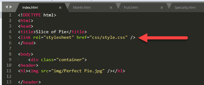
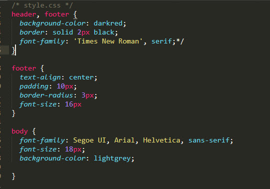
In keeping the website elegant and simple. I needed to create pages that were not cluttered and kept things looking professional. Using the CSS file was the easiest way to accomplish the look. Each page has a link to the same style sheet. This enabled the same settings across each page. There are two screen shots below. The first shows the link in each page pointing towards the CSS file. The second is a screen shot from the CSS file showing the same settings for the header, footer and body sections of each page.
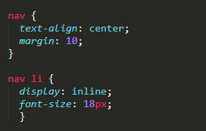
Navigation is something I wanted to look similar across all pages. Originally, I had the navigation within the header of the page. After receiving feedback from a class mate stating that the navigation was hard to read, I decided to move it just below the header. I also want to make sure it was not in a list format but in a straight line. I wanted to make sure it stayed aligned with the header. These things were again accomplished by using the CSS file. In the navigation code on each page you will see that the pages a in order. As you move through the pages, the navigation slightly changes so the pervious page is on the navigation list, but the current page is not. The screen shot below show the navigation list changing slight and the navigation settings in the CSS File.


Next was making sure all the video and images were aligned. I wanted everything to align as best as possible. In older versions you could use a center tag, since there are images on most pages it made more sense to add the align property to the image tags using the CSS file. And since I did that for the images file, I also did that for the video file. The screen shot below shows the coding from the CSS file.

On the home page, I wanted to make sure that our baker looked like he had good credentials. Like most professions, education is a strong component. In this case I picked a local culinary school and then a famous one. The Cordon Blue Culinary school in Paris is a well-known school in the culinary field and produces some of the best chefs around the world. Since I was talking about both schools, I add links to the external sites. Also, on the Fruit Pies page there is an external site for the Wounded Warrior Project.

In the end it was the style sheet that was the most important. It enabled me to deliver a professional website. The website is easy to follow and it inspires a person to either bake a pie or buy a pie. In my case, I ended up doing both during this project.
Opportunties for Growth
This site is much better than the one I build years ago for a class. I still think there is room for growth in multiple places. The first thing, would be a better logo. I think a logo that was specifically designed for a business is better than a made up one. It could be a little more creative than just a pie and the name of the bakery. Second, would be the navigation. While it is not horrible, I think it would be better if each link were spaced out a little more. Originally, I had planned to put the navigation down the left side of the page but decided to keep it where it was instead. Third, would be the images. I think it might work a little better if the images were either to the right or left of the description instead of below it. This would allow for additional content on each page. Fourth, would be the forms. I think it would be better to have multiple drop downs for the pies and then the quantity next to them. Currently, you can only pick a single type of pie but what happens if you want more than one type of pie. Fifth, the Order and Contact Us pages could probably use some pictures. Other than those things, I still believe this is a very good site.