IN COLOR SEPARATION | A COMPREHENSIVE GUIDE | By: Rodelio D. Balagot
| ARCHIVE DIRECTORY | PHOTOSHOP - IMAGE COLOR SEP | PORTABLE DOCUMENT FORMAT - PDF COLOR SEP | ILLUSTRATOR - SPOT COLOR SEP |
|
Color Separation |
|
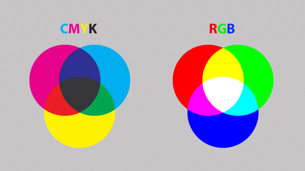
Color Separation is the process of converting an image, such as full color photograph into four separate components, corresponding to the four primary colors used in process color printing—cyan, magenta, yellow, and black. Process color printing involves overprinting halftone dots of each of these four colors in varying densities, the various combinations producing the wide range of reproducible colors. Consequently, a different printing plate needs to be made of each color and this, in turn, requires separate negatives or positives. (The term color separation refers to both the process and the products of that process.) The process of color separation can be accomplished photographically, electronically, or into the desktop. Therefore, you’ll be needing a computer equipped with at least ADOBE CS3 version graphic software such as Adobe Photoshop ®, Adobe Illustrator ®, and Adobe Acrobat 8 for PDF ® Color separation. Preparing and doing color separation is a very tedious task. So that’s why this first step will be very helpful for novice or students to simulate an actual job of prepress such as color separation in a computer aided instruction (CAI) step-by-step tutorial basis. A Guide to Preparing Files for PrintWith this guide, we are going to examine ways to prepare files for print, covering applications in the Adobe Creative Suite. This is a basic guide aimed to help people just starting out in the print design business or are looking to learn more about preparing files better to send to press. Understand the BasicsWith most print jobs, you should have specifications to adhere to. These specs work for preparing advertisements, brochures, business cards, and other printed mediums. CYMK vs RGBA lot of the colors you create in RGB mode are not achievable using standard four-color process printing. It is always best to create your document from the start in CMYK color mode to ensure that you have a better idea of how your colors are going to print. Some exceptions are tradeshow signs or large format prints, but the best way to know for sure is to check with the printer.
Four over Four (or 4/4)If you’re printing a flyer, you might be printing 4/4, which essentially means you are printing four color on the front and four color on the back. If nothing’s on the back, then it would be 4/0. For postcards, you might print 4/1: four color on the front and 1 spot color on the back. For business cards, you might print 2/2: 2 spot colors on the front and back. Print LayoutHere is a diagram of a typical document for print designs.
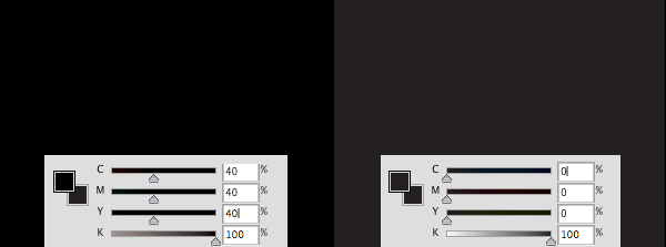
Trim Line: This is the finished size of the piece. Live Area: The area that is considered safe to keep any important information within. For example, if an ad’s trim size is 8.25 in × 10.25 in, the live area might be 7.75 in × 9.75 in. This takes into consideration the binding if the ad is placed on the left or right of a spread and you don’t want copy to be unreadable if it is too close to the spine. Bleed Area: The more bleed you can offer, the better.The minimum bleed you need for a printed piece is 0.125 in (1/8 in) but some specs require more than that. So if you are working with an image in Photoshop and you’re placing it in InDesign for print preparation, keep in mind the area you might need to use for the bleed. Crop Marks: Indicates where to cut the paper. Deciding to Use Black or Rich/Packed BlackWhen printing with black color, there are two types of black you can use.
Note: Rich/Packed black specifications may differ from printer to printer, so you should ask your printer what they recommend. Rich Black vs Black (100 K)Below, you will see the difference between rich black and black. It may be hard to tell the difference when preparing files on your monitor screen depending on your monitor type and monitor calibration since PC screens show richer colors in RGB. Therefore, it is wise to get a press proof when printing blocks of black.
Here is a sample of a flyer using the 2 blacks. The live area is denoted in green and the dashed, pink line is the trim area.
|

® Design & Developed by: Rodelio Dizon Balagot