COLOR EXERCISES
In the following exercises, neatness does not count much but visual
sensitivity and vocabulary do.
Do not use a brush. Use a palette knife for these exercises.
Do not proceed to the next exercise until you receive a passing grade on
the preceding one. Be prepared to discuss your experience using correct
vocabulary and by knowing the pigmentary names of your colors.
NOTE: Due to the vagaries of monitors and browsers and essential
differences between radiating colors on you monitor and the pigmentary
colors on your paper, the illustrations below are only rough examples of
these tasks. Your efforts will look different (better).

1. Make a 8 to 14 Inch COLOR WHEEL
on bristol board by placing swatches of all your high intensity colors
in their approximate positions on the rim. Fill the intervening space
with admixtures of these colors until the wheel is complete with no white
space between them. Do not dismay if some colors are "muddy".
(It is not necessary to fill the center of this wheel.)
Cut the wheel out of the paper. Cut the center out also. Temporarily
place the wheel on a black background ( your portfolio) and observe the
changed appearance of the colors.
2. Make an eleven step VALUE CHART
(above) of 1 x 2 inch bristol board chips by buttering 40 to 80 admixtures
of white and black paint into
swatches out of which a 1 x 2 inch chip may be cut. Cut and
select chips so that the contrast between steps are even. Butt join
them along their long sides by gluing down (using the temporary frisket
method with rubber cement) to a piece of bristol or mat board.
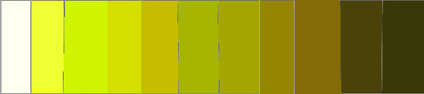

3. Make a comparable chart of TINTS
AND SHADES (above). Start by
matching a saturated color chip with its equivalent value on the above
VALUE CHART. Mix, swatch and "chip" a range of saturated tints (hue
+ white) and saturated shades (hue + black) of this hue. Make a chart
similar to the VALUE CHART by selecting higher (tints) and lower
values (shades) of the hue not so that they match their corresponding values
on the VALUE CHART (which is too difficult), but so that they are darker
and lighter than their equivalent value's adjacent chips. Repeat
with a different hue. (Only one chart has to "pass".) Note: unlike the
value chart, the tints and shades chart is not about making equal steps:
it is about the ability to see a colors value relative to a higher and
lower value gray.
4. (OPTIONAL) Select two high intensity colors that are approximate
COMPLEMENTS.
Make and label swatches. Neutralize them by mixing them until the
admixture resembles neither. Make and label a swatch of this color.
Make and label two or three tints of this color. Make and label swatches
of these tints. Determine the misalignment of the original high intensity
complements by seeing which side of the center of the theoretical color
disc (perfect gray) the admixture lies. Correct one of the complements
by adding an appropriate adjacent hue in order to bring it into a more
diametrically opposite relationship with its complement. Make
and label a swatch of this "corrected" complement. Neutralize this
pair as before. Make and label a swatch of this neutral color. Make
and label a few tints of this color. Repeat the above procedure two
times with different complementary sets. Each complementary set will have
five swatches plus the tints.