|

|
1.
Draw your piece as clean and as dark as possible. If you'd like, draw it
lightly with a mechanical pencil, ink it out and then erase away the pencil
marks. If your drawing is done by wooden pencil, the outcome would be
like this (left). So to save yourself a lot of time (and heartache), I
would recommend using a mechanical pencil. |
Do try and draw your drawing nice and big, so that your ink lines will
come out nicer when you scan your image and shrink it. Don't
worry about it being not perfect, you can still erase and smoothen
out your lines via mouse. If you can't be bothered to make your lines
really dark, it's all right too, just go to Image > Adjust >
Levels and make your lines nice and dark from there.
2.
When you scan your
drawings, resist the impulse to
shrink it too small! If possible, adjust the size so that it's around 1
1/2 or twice the size you'd like. This is to make colouring and other CG
work easier. When you've
completed your piece, you can adjust the size to suit your taste.
3. When colouring black
hair, you don't need to use the colour black. You'll go nuts trying to
find out whether you're colouring it right or not. You can choose a shade
of grey, and then when you're done colouring the hair (Or any black
object), go to Image > Adjust > Variations, and make it darker.
Walla, black hair :)
|

|
4. When drawing or
colouring eyes, remember that light and shadows also affect them.
Draw them with light reflecting off them, and add some shadows too. |

|
5. If your pencil work
comes out yellowish, or the paper itself is not in pristine condition,
don't worry.
|


|
If your paper comes
out yellowish, Go to Image > Adjust > Levels, and work the
arrows until you get the lines as dark as you like, and the paper as
light as you like. The black arrow controls the darkness of the
image, whereas the white arrow controls the brightness of the image.
Still not up to standard?
Just follow the procedures in preparing
a CG, and it'll solve your problems. The end result would be a
black/white/grey image that's ready for CGing :) Make
sure that you've made your image as bright or as dark as you like,
before you perform the procedures in preparing a CG. You won't be
able to change the brightness or darkness of the image after you've
done that. This is because after you separated your lines from the
white of the paper, any adjustment in contrasts and brightness won't
work. |
6.
While painting your artwork, it's a good idea to lock the layers you're
not working on. That way, you won't accidentally paint in the wrong layer
:P
7.
Do try and clean your images as much as possible. If you've already
separated your lines from the white background, and come across something
you'd like to erase, remember to untick lock transparencies.
It's the one that looks like 4 squares in the layers window. This is so
when you paint your artwork, you won't see 'ghost' lines of where your
lines were.
 |
8. Make full use of the
opacity option in the brush tool. It's very useful when you want a
certain colour, but lighter. Or you can use it to make something
look more unique and colourful. Paint in the base colour in 100%
opacity, then choose another colour, and change your opacity, maybe
to 30% or 40%, it's up to you. You can also change the brush size,
to get effects like this.
|
 |
9.
Make use of the blending mode in your layers window.
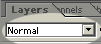
Blending Mode |
One
technique I like to use is to duplicate layer and use special
effects. After that, I can choose to lower the opacity, or
choose the blending mode. You can change that to other modes such as
Normal, Overlay, Screen or Difference.
In
this image of Goku, I duplicated the layer, used Filters > Blur
> Motion Blur on the duplicated layer. It looked like the first
image on your right. After that, I chose the Overlay Mode in the layers
window. Overlay means the layer will only show when there is
something underneath it. If you delete the original layer, you can't
see it. Cool huh? ^_^ To make it brighter, I adjusted the
opacity of the original layer to 68%. In the end, I got an intact Goku image and a motion blurred Goku on top
of that layer. :D |


|
10.
Make the most out of your brushes!
| Go to your
brushes tool bar at the upper left side of the program, and click on
the little arrow beside your chosen brush. A menu will come down,
showing the choice of brushes you have. There's a little arrow
pointing right on the right. Click on that, and another menu will
come down. Choose load brushes, and you'll find out that you
had extra brushes all this while!
In Adobe Photoshop 6.0, you'll find
Natural brushes, Splat brushes, Faux Finish brushes, and even
Calligraphic brushes. Go nuts! :D |
 |
More on the way, when
I think of more tips :) -- 110103
-
Back to top -
Preparing -
Painting
- Dodge
& Burn -
Paper DeLights!
© 2003 Alicia C.
All rights reserved. |
