
| I'm sure you've seen backgrounds made up of pictures like this one before. This one happens to be coffee beans, because I'm a coffee lover. |
| If you use a photo as a background, however, the photo may be too overpowering for the text, as in this brick background. It's okay for small amounts of text, but if you have to do much reading at all, you may want your background to be just a little more subtle. That's why it's called a background. |
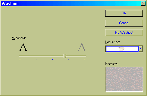
Fortunately, NetStudio has a WASHOUT
![]() feature that you can apply to an image
to make it look...washed out. This is really useful for backgrounds when you
want to use a photo, but you don't want your text to be overpowered. You can
either use the icon, or choose FORMAT > WASHOUT from the menu.
Choosing it from the latter option opens up a box which allows you to dial in
the amount of washout desired, like so:
feature that you can apply to an image
to make it look...washed out. This is really useful for backgrounds when you
want to use a photo, but you don't want your text to be overpowered. You can
either use the icon, or choose FORMAT > WASHOUT from the menu.
Choosing it from the latter option opens up a box which allows you to dial in
the amount of washout desired, like so:
| By applying the WASHOUT effect to the bricks, we get a background that stays in the background, and the text is much more legible. |
By putting together the lessons you've learned in this tutorial you ought to be able to create some awesome backgrounds now!

![]()