At King Features, the sales team is closely consulted
about the strips that are being considered for syndication. These
people best know the newspaper and cartoon market and if they
aren't confident they can sell something it isn't going to fly.
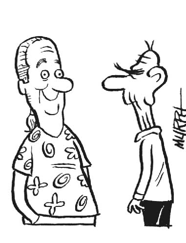
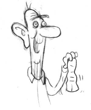
The sales gurus at King really liked Hippy and Pop when asked
about it but did have one small reservation: Pop's head! Most
of them found it's original lumpy shape "disturbing"
and requested that I change it. You can see this unnerving design
in the character sheet below.
|
|
|
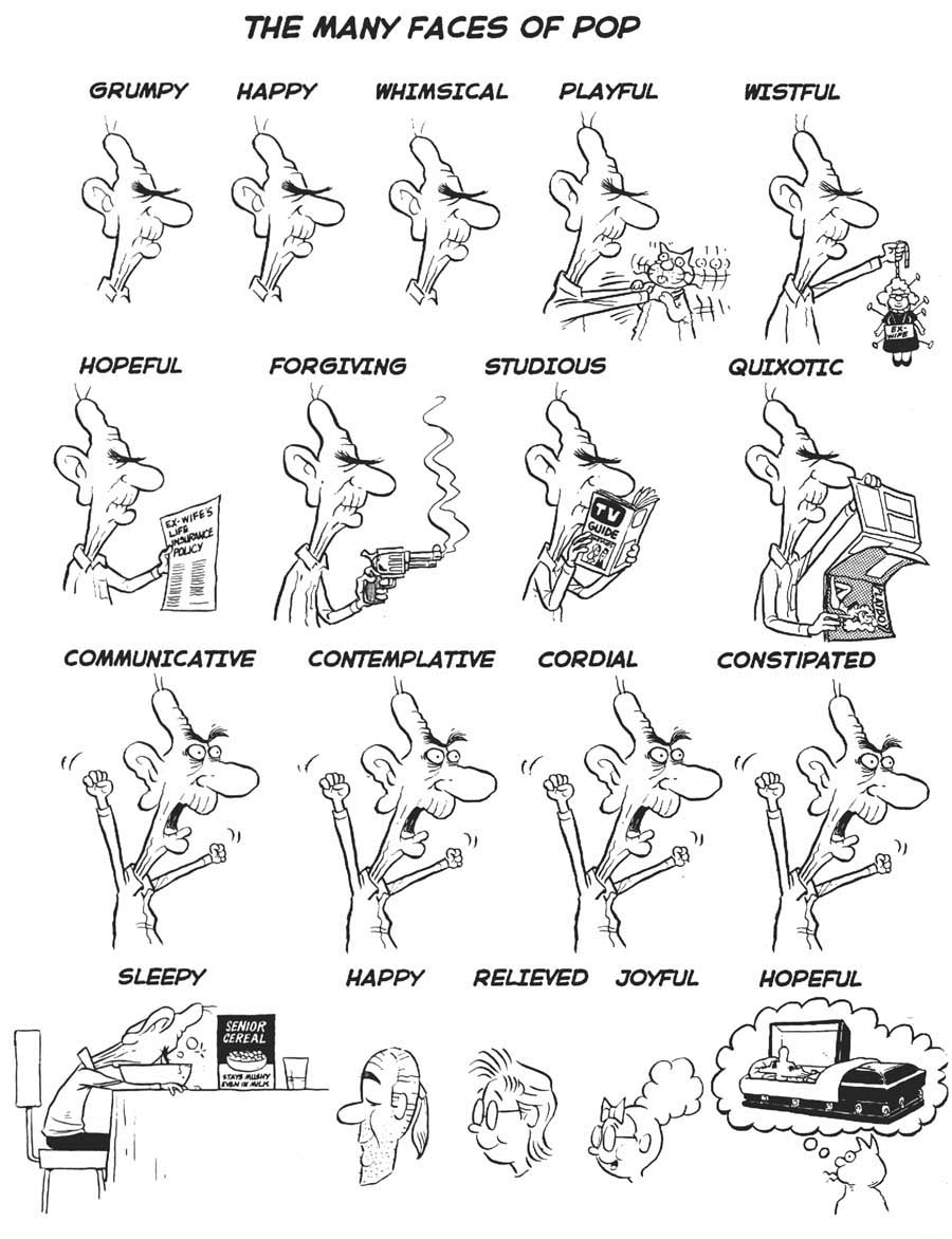
| Since I was not wedded to Pop's head design ( it sort of evolved
into it's shape over many drawings) and felt uncomfortable "disturbing"
the people responsible for my livelihood, I subtly changed his design
(see sketches below). |
|
|
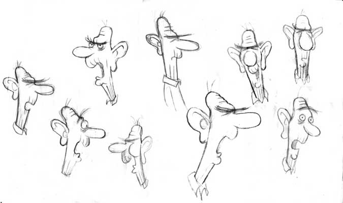
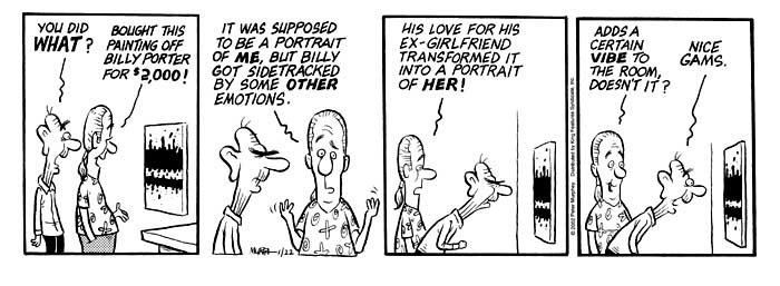
Here is the happy new cartoon character with
the remains of his old head!
|
|
|
|
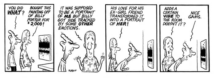
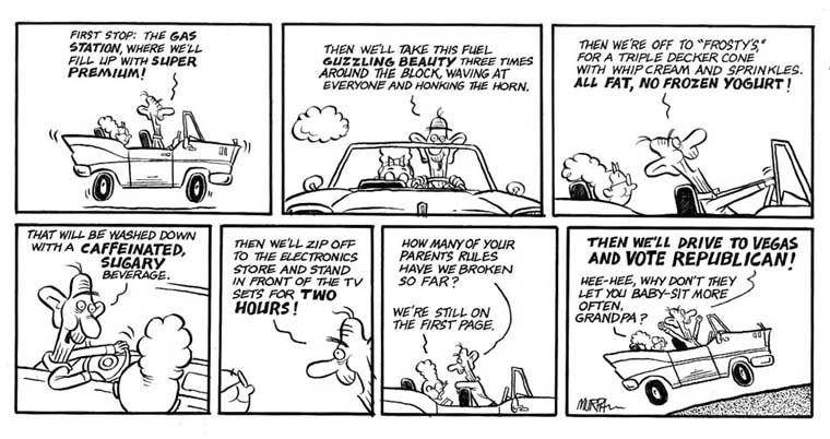
You can what a difference it makes in the ambiance
of the cartoon by comparing the two strips below.
|
|
|
|
Hippy's eyes were also opened up in the adjusted
strip.
|
|
|
|
THE
MAKING OF A SUNDAY
|
I've always been a sucker for the "How To" section
of any publication.This makes it impossible for me not to inflict
one on you, here. What follows is my chaotic process for the
creation of a Sunday strip.
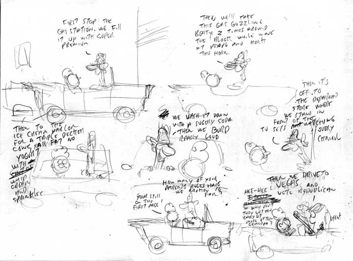
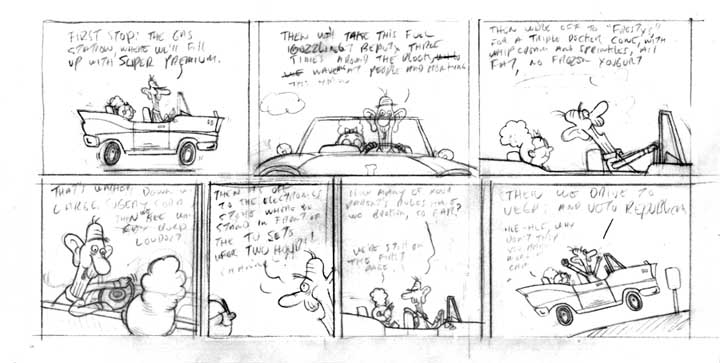
I always keep a pile of paper scraps in my studio
with ideas scribbled on them.I arrange the pile in bins with the
roughest ideas kept in the lowest level. If a scrap makes it to
the top of the pile it means it's ready to try as a sketch. Below
is one of those sketches in it's first stage.
|
|
|
| I usually go through many refining sketches to find the right rhythm,
layout and dialog. At this point, if I was satisfied with it, I'd
move on to a completed pencil drawing on tracing paper.If I wasn't
happy I'd put it aside for awhile and come back to it later with fresh
eyes. |
|
|
Here I might still play with the dialog until it was just so.
I would then scan it into my computer and add a cartoon font
to make sure the type would fit comfortably. This composite
would be printed out at the size I wanted to draw the final
cartoon ( about two times larger than it's print size). Next
I would trace it on to a vellum Bristol board and do the lettering
with a Rapid-o-graph ink pen and Micron markers. The final inks
were done with a crow quill pen and sable haired brush.
|
|
|
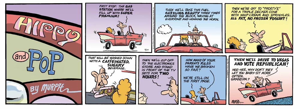
| The ink drawing would then be scanned in at 600 to 800 DPI. One
copy would left at that size another scaled down to 200 DPI. The smaller
version would be taken into Photoshop and colored in a CYMK palette
using layers. A final layer with just the colors would be saved as
a JPEG. Two files would then be e-mailed to the syndicate. One, the
original ink, saved as a TIFF at 800 DPI, and the other the 200 DPI
color layer, saved as a JPEG. Below the final cartoon, in all it's
glory, with the header panel added on. |
 |