

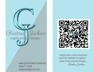
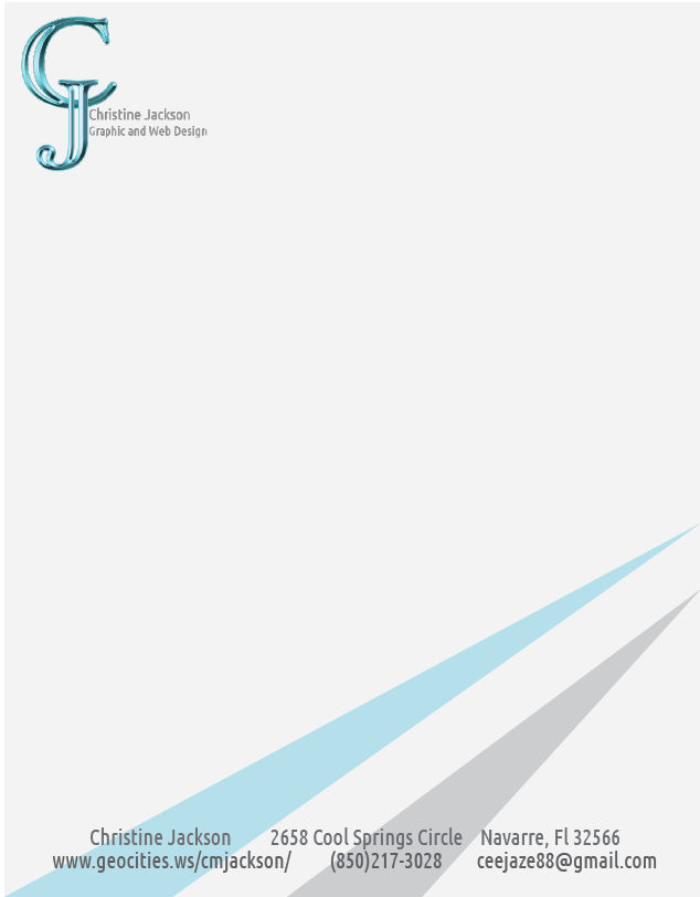
This complete branding suite provides a cohesive look throught all pieces. The bright blue aqua color represents confidence and trust and I balanced this with a light grey/white palette. The font for the logo is AdornS Engraved, which has a bold geometric shape to help my initials stand out, and I complimented this bold font with Ubuntu condensed, that is a sans serif font. Using my initials for my logo reinforce my name as my brand. By using photoshop to create my logo I was able to add depth and dimension through beveling, embossing and gradient shading. The rest of the pieces were created with Illustrator, InDesign and Photoshop.
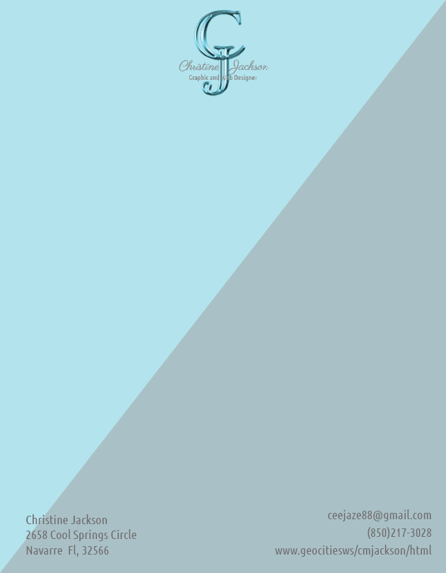
This design is an alternative to my original business card, letterhead and logo. The geometric block shapes balance the curves in the C & J.
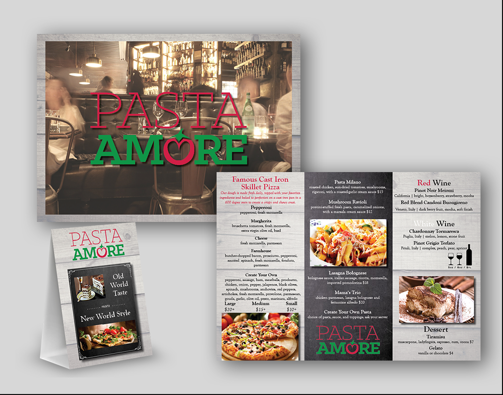
This set was created for a fictitious Italian restaurant combining old world style with a modern Italian menu. I applied a rustic light grey wood background to all the pieces as the base. From there I built up the pieces around the branding guide with the restaurant’s logo, color palette and font choices. The restaurant was focusing on families gathering over traditional Italian food but with a modern twist. I thought the woodgrain would relate to a rustic farmhouse table and the crisp clean photos would balance out the modern feel. I also added in a chalkboard effect to a section of each piece to create a touch of old-world charm. I utilized photos focusing on the food with a shallow depth of field to really make them pop. Since the red and green color palette was so rich and deep, the lighter grey wood tone would help to balance it out. The photos are staggered across the menu to draw your eye across it.
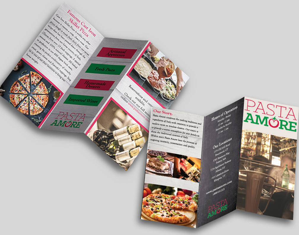
I utilized InDesign for the layout of all three pieces. The photos were enhanced and cropped in Photoshop first. The three-column grid was used for the brochure and menu for an easy to read item. Headlines were in a bold font style while descriptions were in the regular font style.
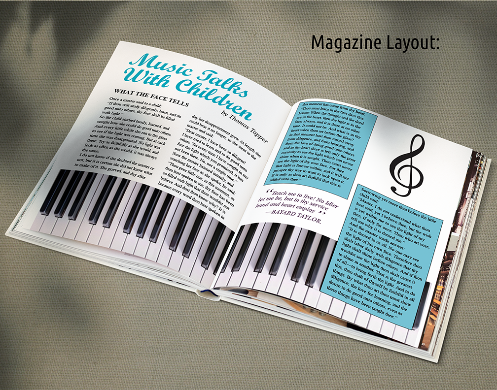
The goal of this project was to design the layout for a magazine article called “Music Talks with Children”. I chose to have the piano keys along the bottom of the page to draw your eye across the article spread. Both pages have a two column grid with a consistent font for easy reading. The title stands out in a soft blue color utilizing a contrasting script font with a larger point size. Since the photos and the text are black and white, I chose to add interest and depth with two blocks of color under the text on the right side. The design communicates to the audience that this is an article about music and children through the photo of the piano keys, the treble clef music symbol and the title. I utilized photoshop to crop the photo of the piano keys. I also utilized illustrator to create the vector of the music symbol. The layout was created in InDesign utilizing a two column grid.
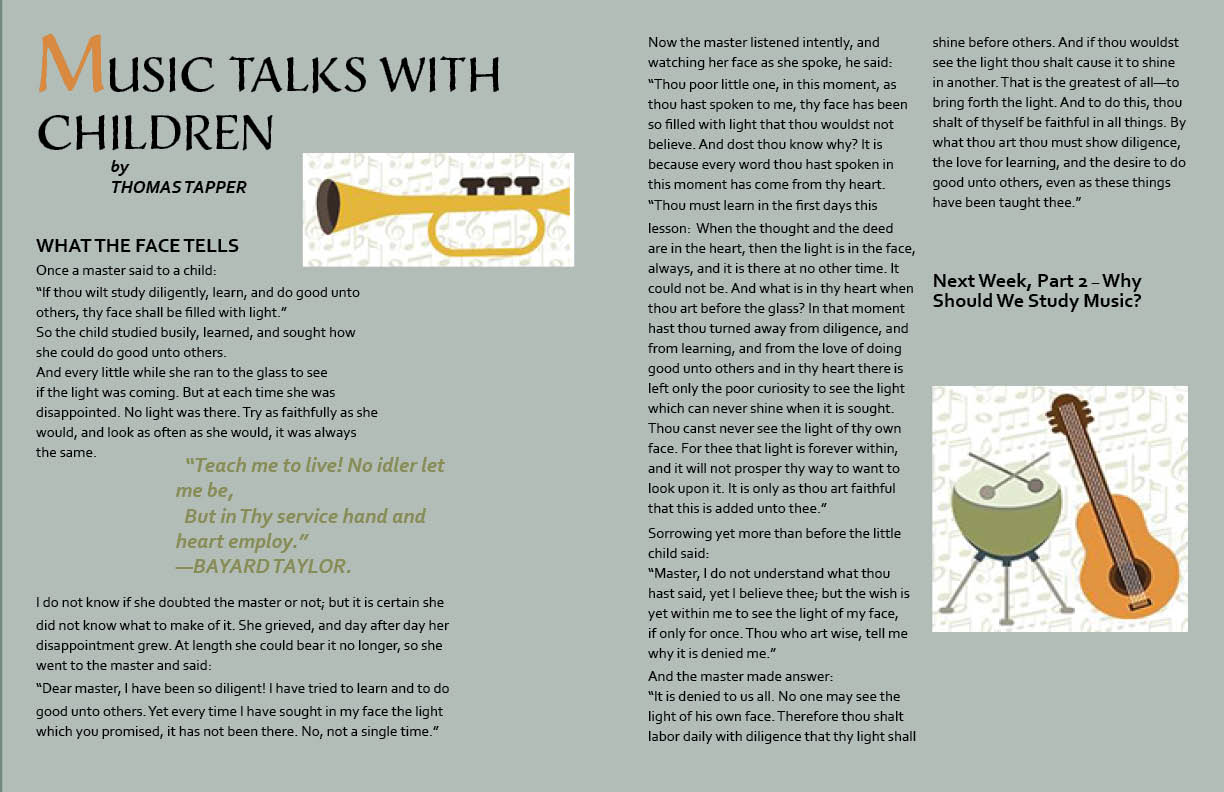
This layout is an alternative to the same, Music Talks, article. In contrast to the bright white with a soft blue palette, I chose a sage green and earth tone hues for this layout. In comparison, this layout has a more traditional feel with child like photos and a basic two column grid layout.
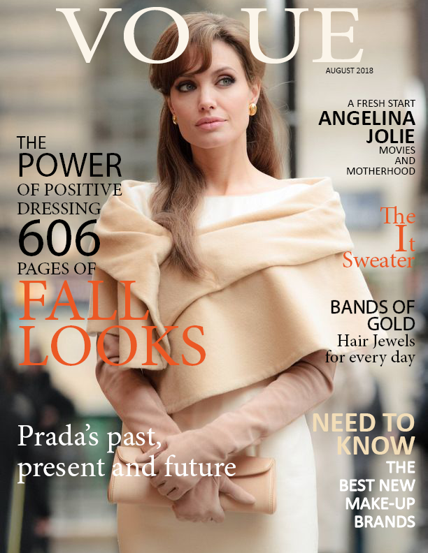
This project was to take the same photo and create two completely different magazine covers. The first is a fashion magazine’s fall issue. Using autumn colors, I created a soft color palette of neutrals with pops of orange. Hierarchy for the article topics are shown through font size and weight. Fonts used are Minion Pro and Calibri. It’s arranged in a three column grid with text/photo/text. I utilized Photoshop and Indesign to create this piece.

This second magazine, a political magazine, has a more conservative audience so I changed the photo to black and white. All text was alternated between a traditional Times New Roman and Arial font with not much change in size or weight for a conservative streamlined look. This piece helps show my ability to think in different directions and change with the client’s needs. I was able to design a fashion magazine and a political magazine using the same picture of Angelina Jolie. I was able to appeal to two different audiences with one photo, manipulated through color, placement and text.
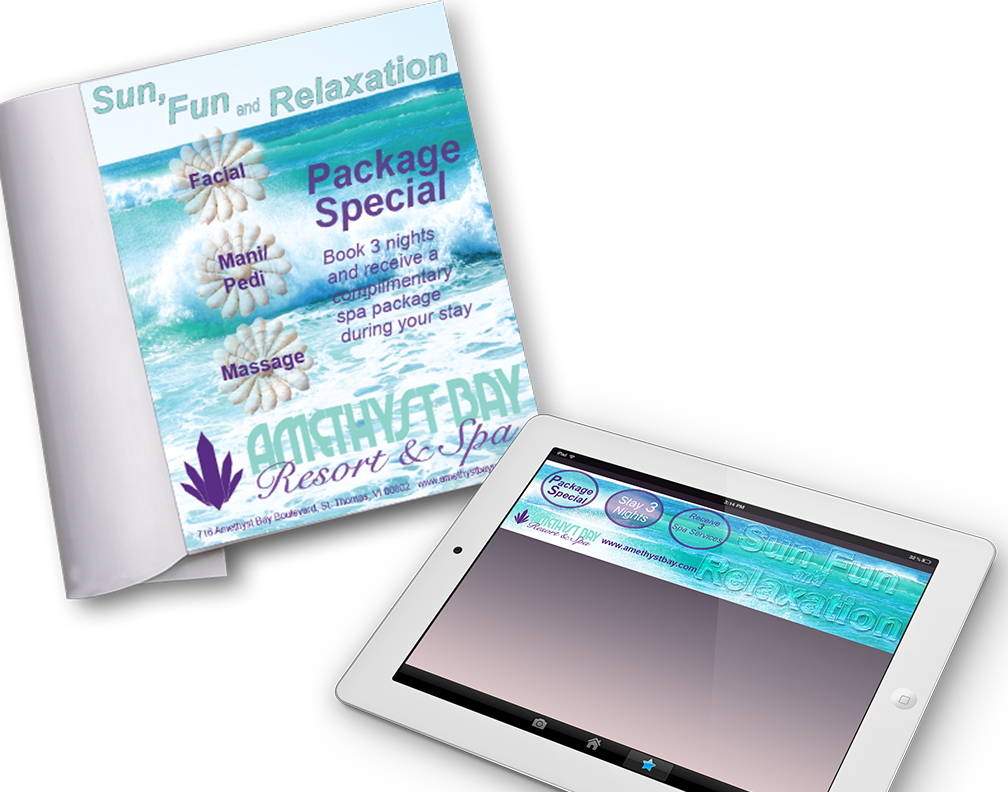
I was able to design a cohesive ad for a print magazine and an animated banner for a website. The photo used is one of my own, and the colors enhance the color palette from the design brief. The concept I created was Sun, Fun and Relaxation, and the ocean waves help to communicate this. The package special is the focal point for the ad, so I highlighted it in the animated circles on the banner for the web. I utilized Photoshop to enhance the main photo, as well as cutting out the sea shells and transferring them on top of the photo to be a backdrop for the spa treatments.
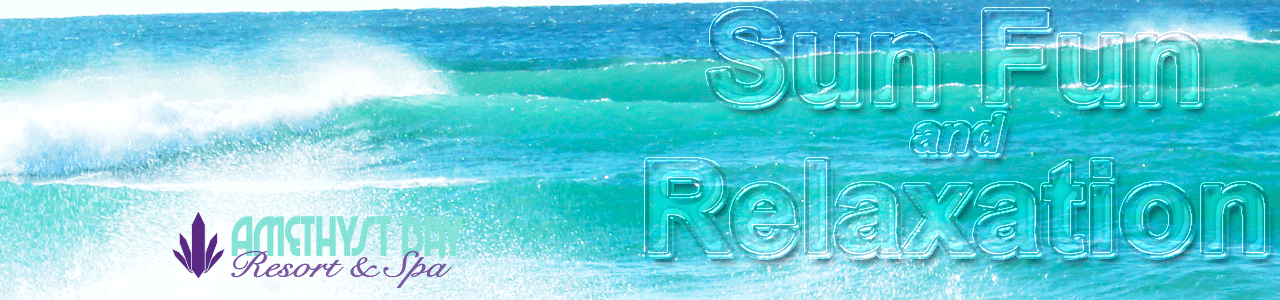
For this animated banner I utilized Photoshop to create a glass effect to the letters of Sun Fun & Relaxation. This helps to have the photo visible behind the large lettering. These pieces showcase my versatility between print and digital mediums.