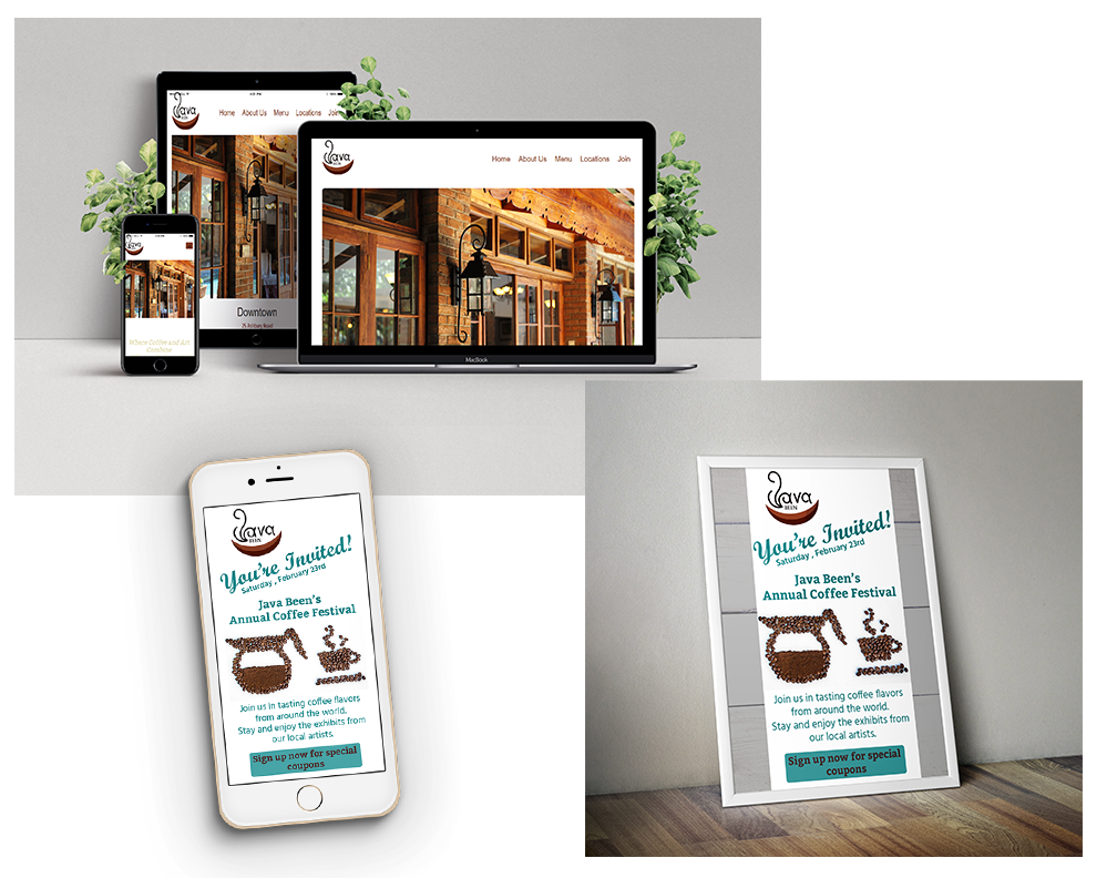
This site is designed for an upscale coffee house. I created it in Dreamweaver using html5, CSS and Bootstrap. I utilized the color palette and font styles from the provided design brief to keep with the company’s brand. All images were high quality to showcase the restaurant and their food/beverage products. Since the restaurant colors were darker, I chose to utilize the white space on the screen to add balance. This also helped the images stand out which would grab the users’ attention. The site is fully responsive, so it can be viewed consistently on any viewport size. The navigation bar is clearly located at the top of the screen to provide a positive UX. Under that is a jumbotron photo of the restaurant that will grab the user’s attention. I then designed a complimenting email blast and poster that are shown here.

Click the image above to view the sample issue. This small epub was designed for a spring/Easter theme. The color palette represents this with soft lavender, pink and blue. Each page offers animation to keep the digital reader engaged and interested to keep them viewing through the magazine. Videos were inserted to enhance the written recipe for users who enjoy visual learning as opposed to written instructions. The table of contents page has clickable links to sub pages and every page has a BH&G logo that takes them back to the table of contents. All this allows for a positive UX. Bright photos are used throughout to balance the black and white text. I created this piece using InDesign digital publishing, and photos were enhanced through Photoshop and then inserted through InDesign.

This was an existing website that needed improvement for a better user interface and experience.
The site originally had several navigation bars that I pared down into one at the top of the screen
that collapes on smaller viewports. I also pared down the images to cut down on visual overload.
I also made the images links to sub-pages for easy navigation and functionality. The site now has
a clean modern look that provides a positive user experience.