Planets Inhabited Magazine Layouts
_00001.jpg)
_00002.jpg)
_00001.jpg)
_00002.jpg)
These magazine layouts provide potential employers and clients with an example of effective layouts I have created in the past. These layouts were an assignment for a typography class I took at SNHU; we were asked to design two versions of a magazine layout for a story that was going to be published in a magazine. Once I read the proposed story and did a bit of research to identify the theme, everything began to fall into place. Since the topic was related to outer space, I included galaxy/universe like imagery in addition to colors like blue and purple for the background of the magazine’s pages. By keeping the consistency of imagery, color, and font choices as well as using an even amount of positive and negative space, I feel I was able to balance the aesthetic and functional needs well.
When I created the original version of these layouts in Adobe InDesign, the amount of space I could devote to imagery was limited due to the length of the story. In order to keep everything balanced and ensure the text remained readable, I limited my design to one image per page. I used the elements and principles of desgin called color, movement, balance, contrast, and proportion in order to successfully make certain parts of the layouts stand out and become vocal points for people (the images against the blue background, using visuals with a variety of colors, the movement of the viewer's eyes as they read the article flows smoothly, for example). I chose to use the font style called Source Sans Variable instead of a space like font because I wanted this article to appeal to a larger audience. A second look at the layouts prompted me to try adding a third image on one of the pages. After much consideration, I decided to insert the third image in the middle of the text. This worked out well as it gives the eye with a place to rest. The overall design of these layouts will be acceptable to any magazine name both large and small because it is professional yet fresh and modern which is a look that is easily adaptable to all facets of the business world.
After completing multiple classes at SNHU focusing on graphic design and digital imaging, I have a great appreciation for the advice I received from my peers and instructors. What they taught me has been invaluable. I feel this process really shows what people can accomplish when they listen to each other and work together as a team. As a result, I feel I have been able to create magazine layouts that represent my talent very well. As stated by Ben Davis, “The main purpose of Graphic design is to communicate” (Davis, 2021), and I am confident that I accomplished this with these magazine layouts.
When creating these layouts, ethical communications were considered. More specifically, in order to ensure the overall look and feel was professional yet fresh and modern, I focused the design on the story’s overall theme. Furthermore, I feel the message expressed in this story as well as the layouts are diverse enough that they are relatable to anyone worldwide. Plagiarism was also considered as the layouts were created from scratch in Adobe InDesign and the images were able to be used. These layouts were selected because when combined with the other pieces, I feel they represent my identity as well as showcase my abilities as a graphic designer and artist. Like magazine names who revisit their logos and other branding materials to keep them up to date and effective, I too will revisit these in the future and revise them as needed. As for now, I feel I created magazine layouts that successfully advertise my identity and my abilities. Since design is always changing and evolving, I welcome the opinions of others who may have ideas for improvement.
The Beyond Magazine Covers
.jpg)
2.jpg)
These magazine covers provide potential employers and clients with an example of effective covers I have created in the past. These covers were an assignment for a desktop publishing class I took at SNHU where we were asked to create two versions of a cover for a brand new, unique magazine name (my instructor at the time called the assignment Freaky Friday). Once I figured out what I wanted to do, I did a bit of research to identify the theme, and everything began to fall into place. Since the topic was related to outer space, I included galaxy/universe like imagery in addition to colors like blue, yellow, and white for the font on the cover and the magazine’s name. By keeping the consistency of imagery, color, and font choices as well as using an even amount of positive and negative space and making sure everything stood out on their own, I feel I was able to balance the aesthetic and functional needs well.
When I created the original version of these covers in Adobe InDesign, I wanted each of them to have a unique look. To achieve this, I created a different version of the magazine’s name and laid the subtext out differently (one was centered and the other went along the curved shape of the planet). To make the words stand out from the dark background, I chose the color white. For the font style, I chose to use A-Space Demo and Franklin Gothic Heavy because I wanted to stay true to the cover’s theme and try to appeal to a larger audience. After revisiting these covers, I decided to add more elements that normally appear on magazine covers such as a pug, barcode, strapline, skyline, and dateline. Doing this resulted in a much more effective design. For example, I decided to keep the name the same on both with its own font style (Space Ranger Expanded) and color (yellow) and used a different font style and color (Arial Rounded MT Bold, blue, and white) for things like the strapline. In addition, the subtext was also given its own font style (Eras Demi ITC). The overall design of these layouts will be acceptable to any magazine name both large and small because it is professional yet fresh and modern which is a look that is easily adaptable to all facets of the business world.
After completing multiple classes at SNHU focusing on graphic design and digital imaging, I have a great appreciation for the advice I received from my peers and instructors. What they taught me has been invaluable. I feel this process really shows what people can accomplish when they listen to each other and work together as a team. As a result, I feel I have been able to create magazine covers that represent my talent very well. As stated by Ben Davis, “The main purpose of Graphic design is to communicate” (Davis, 2021), and I am confident that I accomplished this with the magazine covers.
When creating these covers, ethical communications were considered. More specifically, in order to ensure the overall look and feel was professional yet fresh and modern, I focused the design on the magazine’s overall theme. Furthermore, I feel the message expressed in these covers are diverse enough that they are relatable to anyone worldwide. Plagiarism was also considered as the layouts were created from scratch in Adobe InDesign and the images were able to be used. These covers were selected because when combined with the other pieces, I feel they represent my identity as well as showcase my abilities as a graphic designer and artist. Like magazine names who revisit their logos and other branding materials to keep them up to date and effective, I too will revisit these in the future and revise them as needed. As for now, I feel I created magazine covers that successfully advertise my identity and my abilities. Since design is always changing and evolving, I welcome the opinions of others who may have ideas for improvement.
Lil Guppies Business Card & Letterhead (Mockups)
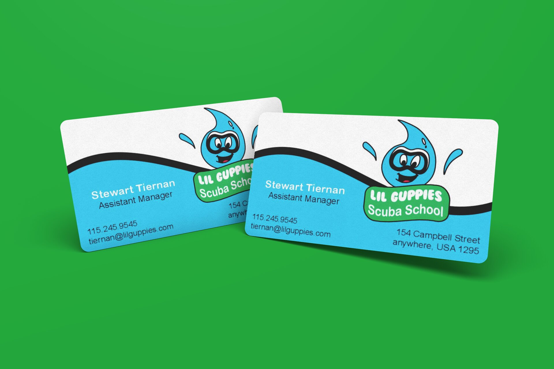
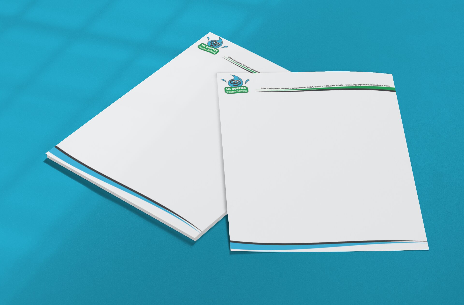
These business card and letterhead designs provide potential employers and clients with an example of an effective branding package I created in the past. These branding materials were an assignment for a graphics media class I took at SNHU; we were asked to create a branding package for our chosen business (these pieces were part of a final project). Once I came up with the logo, everything began to fall into place. Since these pieces are part of a branding package, I ensured that the colors, fonts, and pattern styles, which were created using Adobe Illustrator, remained consistent. This consistency in addition to using an even amount of positive and negative space and making sure everything stood out on their own, I feel I was able to balance the aesthetic and functional needs well. I feel I was able to balance the aesthetic and functional needs well.
When I created the original version of these branding materials in Adobe Illustrator, I wanted to create a design that was not only simple, but timeless. In the end, I came up with a wave like shape. In my opinion, this works because it represents water. To keep the designs consistent, I used the blue and green colors as well as the font style (Arial Rounded MT Bold) from the logo throughout each of the branding materials. I also used the font style, Arial, in order to make the text in the other font style stand out from the rest of it. As a result I feel these materials will appeal to a larger audience. After a second look at these materials, I decided to revise the wave-like shapes by adding a drop shadow effect which adds dimension and depth to the design. The overall design of these branding materials will be acceptable to any business both large and small because it is professional yet fresh and modern which is a look that is easily adaptable to all facets of the business world.
After completing multiple classes at SNHU focusing on graphic design and digital imaging, I have a great appreciation for the advice I received from my peers and instructors. What they taught me has been invaluable. I feel this process really shows what people can accomplish when they listen to each other and work together as a team. As a result, I feel I have been able to create branding materials that represent my talent very well. As stated by Ben Davis, “The main purpose of Graphic design is to communicate” (Davis, 2021), and I am confident that I accomplished this with these pieces.
When creating these branding materials, ethical communications were considered. More specifically, in order to ensure the overall look and feel was professional yet fresh and modern, I focused the design of the business’s overall theme. Furthermore, I feel the message expressed in these pieces are diverse enough that they are relatable to anyone worldwide. Plagiarism was also considered as the layouts were created from scratch in Adobe Illustrator. These pieces were selected because when combined with the other pieces, I feel they represent my identity as well as showcase my abilities as a graphic designer and artist. Like other businesses who revisit their logos and other branding materials to keep them up to date and effective, I too will revisit these in the future and revise them as needed. As for now, I feel I created a business card and letterhead that successfully advertise my identity and my abilities. Since design is always changing and evolving, I welcome the opinions of others who may have ideas for improvement.
Amethyst Bay Magazine Ad
.jpg)
This magazine ad provides potential employers and clients with an example of an effective magazine advertisement I created in the past. This advertisement was an assignment for a digital imaging class I took at SNHU where we were asked to create a magazine ad for our chosen business (this was the final project). Once I did a bit of research on how to create advertisement designs for a business like Amethyst Bay and figured out which images I was going to use, everything began to fall into place. Since this ad was for Amethyst Bay, I ensured colors and font styles I chose would work with the brand. As a result of using the proper imagery, color, and font style in addition to using an even amount of positive and negative space and making sure everything stood out on their own, I feel I was able to balance the aesthetic and functional needs well. I feel I was able to balance the aesthetic and functional needs well.
When I created the original version of this magazine ad in Adobe Illustrator and Photoshop (the main background image was created using Photoshop), I wanted to create an ad that would appeal to a large audience. To do this, I used the font style, Arial, with a bold effect to ensure the text was easy to read. I also added captions detailing discounts available to brides who book a date at the resort, a slogan on the top, and contact information below the logo. In order to make the text stand out from the background image, I applied a glow effect and inserted blue, purple, and white rectangles with a low opacity behind them. After a second look at this ad, I decided to apply a glow effect to the teal color of the logo to make it stand out more. I also revised the hierarchy of the text by removing the bold effect from some of the captions (some were changes to regular and bold italic) and changed the font style on the slogan to Rage Italic. The overall design of this magazine ad will be acceptable to any business both large and small because it is professional yet fresh and modern which is a look that is easily adaptable to all facets of the business world.
After completing multiple classes at SNHU focusing on graphic design and digital imaging, I have a great appreciation for the advice I received from my peers and instructors. What they taught me has been invaluable. I feel this process really shows what people can accomplish when they listen to each other and work together as a team. As a result, I feel I have been able to create branding materials that represent my talent very well. As stated by Ben Davis, “The main purpose of Graphic design is to communicate” (Davis, 2021), and I am confident that I accomplished this with this magazine ad.
When creating this magazine ad, ethical communications were considered. More specifically, in order to ensure the overall look and feel was professional yet fresh and modern, I focused on the overall theme of Amethyst Bay. Furthermore, I feel the message expressed in these pieces are diverse enough that they are relatable to anyone worldwide. Plagiarism was also considered as the layouts were created from scratch in Adobe Illustrator and the image and logo were able to be used. This ad was selected because when combined with the other pieces, I feel it represents my identity as well as showcases my abilities as a graphic designer and artist. Like other businesses who revisit their ads and other branding materials to keep them up to date and effective, I too will revisit this ad in the future and revise it as needed. As for now, I feel I created a magazine ad that successfully advertises my identity and my abilities. Since design is always changing and evolving, I welcome the opinions of others who may have ideas for improvement.
Pasta Amore Table Tent & Tri-Fold Giveaway/Leave-Behind Piece (Mockups)
.jpg)
.jpg)
This table tent and trifold provide potential employers and clients with an example of effective branding materials I have created in the past. These materials were an assignment for a desktop publishing class I took at SNHU where we were asked to create a branding package for our chosen business (these pieces were part of the final project). Once I did a bit of research to learn what restaurants like Pasta Amore offer and acquainted myself with the client’s style guide, everything began to fall into place. Since these materials are part of a branding package, I carefully chose the colors, font, and pattern styles I used in Adobe InDesign ensuring they were used in each piece. As a result of the consistency throughout the imagery, color and font selection in addition to using an even amount of positive and negative space and making sure everything stood out on their own, I feel I was able to balance the aesthetic and functional needs well. I feel I was able to balance the aesthetic and functional needs well.
When I created the original version of these branding materials in Adobe InDesign, I wanted to keep them simple, yet timeless. To achieve this I decided to use a black wood image as the background (to keep that modernistic feeling) and imagery that connected to what Pasta Amore would offer on their menu. While creating these materials, I stayed true to the client’s style guide by using only approved font styles such as Klinic Slab and ensured the logo was always used appropriately. After revisiting these materials, I decided the text on the table tent seemed a little crowded. To correct this, I placed half of the text on one side and the rest on the other, included a different image on each side, and placed the logo at the bottom of each side. The overall design of these branding materials will be acceptable to any business both large and small because it is professional yet fresh and modern which is a look that is easily adaptable to all facets of the business world.
After completing multiple classes at SNHU focusing on graphic design and digital imaging, I have a great appreciation for the advice I received from my peers and instructors. What they taught me has been invaluable. I feel this process really shows what people can accomplish when they listen to each other and work together as a team. As a result, I feel I have been able to create a table tent and trifold that represent my talent very well. As stated by Ben Davis, “The main purpose of Graphic design is to communicate” (Davis, 2021), and I am confident that I accomplished this with these pieces.
When creating these branding materials, ethical communications were considered. More specifically, in order to ensure the overall look and feel was professional yet fresh and modern, I focused on the business’s overall theme. Furthermore, I feel the message expressed in these pieces are diverse enough that they are relatable to anyone worldwide. Plagiarism was also considered as the layouts were created from scratch in Adobe InDesign and the images and logo were able to be used. These branding materials were selected because when combined with the other pieces, I feel they represent my identity as well as showcase my abilities as a graphic designer and artist. Like other businesses who revisit their logos and other branding materials to keep them up to date and effective, I too will revisit these pieces in the future and revise them as needed. As for now, I feel I created a table tent and trifold that successfully advertise my identity and my abilities. Since design is always changing and evolving, I welcome the opinions of others who may have ideas for improvement.
Lego World Magazine Cover
.jpg)
This magazine cover provides potential employers and clients with an example of an effective cover I have created in the past. This cover was part of a project I completed for a graphic design portfolio class I took at SNHU. The assignment asked students to select five graphic design pieces to include in a portfolio. When designing this cover I relied on the experience I gained while designing other covers and combined it with my love of Legos. Since the topic was related to Lego and Star Wars, I carefully chose to use elements that reflected the topic’s imagery. By keeping the consistency of color and font choices as well as using an even amount of positive and negative space, I was able to successfully balance the aesthetic and functional needs of the piece.
When I originally created this cover in Adobe Illustrator, the size of the template limited the amount of space I could devote to the imagery and text of the piece. In order to keep everything balanced and ensure the text remained readable, I limited my design to one image. Furthermore, after doing some research on text combinations and considering feedback, I ultimately chose to use the font styles Haettenschweiler, Impact, and Verdana because I felt they would appeal to Wars and Lego fans alike. After a second look, I felt the hierarchy of the cover could use some work. In the end, I feel the changes implemented help create an overall design that is acceptable to any magazine name both large and small because it is professional yet fresh and modern which is a look that is easily adaptable to all facets of the business world.
After completing multiple classes at SNHU focusing on graphic design and digital imaging, I have a great appreciation for the advice I received from my peers and instructors. What they taught me has been invaluable. I feel this process really shows what people can accomplish when they listen to each other and work together as a team. As a result, I feel I have been able to create magazine covers that represent my talent very well. As stated by Ben Davis, “The main purpose of Graphic design is to communicate” (Davis, 2021), and I am confident that I accomplished just that with this magazine cover.
When creating this cover, ethical communications were considered. More specifically, in order to ensure the overall look and feel of the piece appeared to have been created around 2008 while also remaining professional yet fresh, and modern, I focused the design on what it was advertising. Furthermore, I feel the message expressed in this cover is diverse enough that it’s relatable to anyone worldwide. Plagiarism was also considered as the cover was created from scratch in Adobe Illustrator and the images were able to be used. This cover was selected because when combined with the other pieces, I feel it represents my identity as well as showcases my abilities as a graphic designer and artist. Like magazine names who revisit their logos and other branding materials to keep them up to date and effective, I too will revisit these in the future and revise them as needed. As for now, I feel I created a magazine cover that successfully embraces my identity and showcases my abilities. Since design is always changing and evolving, I welcome the opinions of others who may have ideas for improvement.
Inspired Designs Logo
.jpg)
This logo provides potential employers and clients with an example of an effective business logo I have created in the past. This logo was part of a project I completed for a photography class I took at SNHU. The assignment asked students to create a logo and name for a photography business. Once I did some research and decided on what I wanted the logo to look like, everything began to fall into place. Since the logo is specifically tied to photography, I chose elements such as colors like red and black, and text/font styles that really represented the company. When designing the photography logo, I wanted to make sure it was a design that is simple yet modern and professional. By keeping the consistency of color and font choices as well as using an even amount of positive and negative space, I was able to successfully balance the aesthetic and functional needs of the piece.
When I originally created the logo in Adobe Illustrator, the amount of space I could devote to imagery and text was unlimited. In order to keep everything balanced and ensure the text remained readable, I limited my design to have only two lines of text and a simple symbol made out of the owner's initials. I chose to use font styles like Fast Hand, Agency FB, and Myriad Pro because I feel the styles work well together, do a good job of representing the company, and are able to appeal to a larger audience. The overall design of the logo is acceptable because it is professional yet fresh and modern which is a look that is easily adaptable to all facets of the business world.
After completing multiple classes at SNHU focusing on graphic design and digital imaging, I have a great appreciation for the advice I received from my peers and instructors. What they taught me has been invaluable. I feel this process really shows what people can accomplish when they listen to each other and work together as a team. As a result, I feel I have been able to create branding material that represents my talent very well. As stated by Ben Davis, “The main purpose of Graphic design is to communicate” (Davis, 2021), and I am confident that I accomplished this with this photography logo.
When creating the logo, ethical communications were considered. More specifically, in order to ensure the overall look and feel was professional yet fresh and modern, I focused the design on their purposes and themes. Furthermore, I feel the message expressed in the logo are diverse enough that they are relatable to anyone worldwide. Plagiarism was also considered as the logo was created from scratch in Adobe Illustrator. This logo was created and selected because when combined with the other pieces, I feel it represents my identity as well as showcase my abilities as a graphic designer and artist. Like many other businesses who revisit their logos and other branding materials to keep them up to date and effective, I too will revisit this in the future and revise it as needed. As for now, I feel I created a logo that successfully embraces my identity and showcases my abilities. Since design is always changing and evolving, I welcome the opinions of others who may have ideas for improvement.
Little Tike's Logo
.jpg)
This art logo provides potential employers and clients with an example of an effective logo I have created in the past. This logo was part of an assignment for an advanced digital imaging class I took at SNHU. The assignment was to design three versions of a logo to be used for a portfolio showcasing artwork. Once I identified what my logo was going to look like, everything began to fall into place. Since the topic was related to art, I incorporated a paint pallet, paint brush, and camera into the design. I also used a rainbow-like effect to keep the design more light-hearted and colorful. By keeping the consistency of color and font choices as well as using an even amount of positive and negative space, I feel I was able to successfully balance the aesthetics and functionality of the design.
When I created the original version of the logo in Adobe Illustrator, I had to find a way to represent the pieces in my portfolio while keeping the overall design simple and light-hearted. In order to keep everything balanced and ensure the text remained readable, I made everything stand out on their own through hierarchy and color. I chose to use the font style called TW Cen MT Condensed Extra Bold because I wanted this logo to appeal to a larger audience. A second look at the logo prompted me to come up with another company that would embrace the child-like lightheartedness of the piece. After doing some research, I finally decided on an art academy for children. I changed the name but left the rest of the design untouched. In the end, I feel the overall design of the logo is acceptable because it is professional yet fresh and modern which is a look that is easily adaptable to all facets of the business world.
After completing multiple classes at SNHU focusing on graphic design and digital imaging, I have a great appreciation for the advice I received from my peers and instructors. What they taught me has been invaluable. I feel this process really shows what people can accomplish when they listen to each other and work together as a team. As a result, I feel I have been able to create a unique branding material that represents my talent very well. As stated by Ben Davis, “The main purpose of Graphic design is to communicate” (Davis, 2021), and I am confident that I accomplished this with this logo for the art academy.
When creating this logo, ethical communications were considered. More specifically, in order to ensure the overall look and feel was professional yet fresh and modern, I focused the design on its main purpose and concept. Furthermore, I feel the message expressed in this logo is diverse enough that it’s relatable to anyone worldwide. Plagiarism was also considered as the layouts were created from scratch in Adobe Illustrator. This logo was selected because when combined with the other pieces, I feel it represents my identity as well as showcases my abilities as a graphic designer and artist. Like many other portfolio creators who revisit their logos and other branding materials to keep them up to date and effective, I too will revisit these in the future and revise them as needed. As for now, I feel I created a logo that successfully embraces my identity and showcases my abilities. Since design is always changing and evolving, I welcome the opinions of others who may have ideas for improvement.
Clone Wars Action Figure Line Promotional Poster
%202.jpg)
This poster provides potential employers and clients with an example of an effective poster I have created in the past. The poster was part of an assignment I was working on in a graphic design portfolio class I took at SNHU. In the portfolio class, students were asked to select five graphic design pieces to be revised and implemented into a portfolio. Once I did some research, figured out what kind of statements and images I was going to use, and decided what the final piece would look like, everything began to fall into place. Since the topic of the poster was related to Star Wars and Clone Wars action figures, I included imagery that included a galaxy/universe like environment and action figures from The Clone Wars TV series. In addition, I included colors that matched the visuals. I also used font styles that I felt would make the text a vocal point when people looked at it (really grabbed their attention). By keeping the consistency of color and font choices as well as using an even amount of positive and negative space, I feel I was able to successfully balance the aesthetic and functional needs of the piece.
When I created the original version of the poster in Adobe Illustrator and Photoshop, I wanted to ensure the piece did not become overcrowded with content. To do this I kept everything balanced which allowed the text to remain readable and I limited my design to one image and statement. I chose to use the Impact font style instead of a space like font because I wanted this poster to appeal to a larger audience. After much consideration and a second look, however, I decided to add some more context to what the poster's purpose is (to promote Star Wars The Clone Wars action figures). While adding this text, I went ahead and decided to include a font style called Bahnschrift in order to create some sort of contrast between the two font styles and make one be able to stand out from the other. I also chose to use colors that went with the image with the characters in it to create some consistency throughout. In addition to that, I used those specific colors to make specific sets of words that were very important to the poster's purpose (the clone wars, available now, etc.) stand out. The overall design of the poster is acceptable because it is professional yet fresh and modern which is a look that is easily adaptable to all facets of the business world.
After completing multiple classes at SNHU focusing on graphic design and digital imaging, I have a great appreciation for the advice I received from my peers and instructors. What they taught me has been invaluable. I feel this process really shows what people can accomplish when they listen to each other and work together as a team. As a result, I feel I have been able to create a truly unique piece of graphic art that represent my talent very well. As stated by Ben Davis, “The main purpose of Graphic design is to communicate” (Davis, 2021), and I am confident that I accomplished this with this poster.
When creating this poster, ethical communications were considered. More specifically, in order to ensure the overall look and feel was professional yet fresh and modern, I focused the design on the piece’s main purpose and what it represents. Furthermore, I feel the message expressed in this design is diverse enough that they are both relatable to anyone worldwide. Plagiarism was also considered as the design was created from scratch in Adobe Illustrator and Photoshop and the images were able to be used. The poster was selected because when combined with the other pieces, I feel it represents my identity as well as showcases my abilities as a graphic designer and artist. Like businesses who revisit their logos and other branding materials to keep them up to date and effective, I too will revisit this in the future and revise them as needed. As for now, I feel I created a poster that successfully embraces my identity and showcases my abilities. Since design is always changing and evolving, I welcome the opinions of others who may have ideas for improvement.
Public Event Flyer
%20(2).jpg)
This public event flyer provides potential employers and clients with an example of an effective design I have created in the past. This public flyer is part of an assignment for a graphic design portfolio class I took at SNHU. The assignment asked students to select five graphic design pieces to revise and implement into a portfolio. Once I decided what to promote and did a bit of research to help identify and understand the topic, everything began to fall into place. Since the topic is related to Star Wars, I included galaxy/universe like imagery as well as a custom photo featuring Star Wars vehicles for the background. I also carried out the theme by using colors like yellow and white for the text. By keeping the consistency of imagery, color, and font choices as well as using an even amount of positive and negative space, I feel I was able to successfully balance the aesthetic and functional needs of the piece.
When I created the original version of this public event flyer in Adobe Illustrator, the size of the template limited the amount of space I could devote to imagery. In order to keep everything balanced and ensure the text remained readable, I limited my design to one image and 3 statements. I also chose to use the font styles, Eras Bold ITC and Calibri, instead of a sci-fi/space like font because I wanted this article to appeal to a larger audience. After taking another look at the layouts, I decided to give the entire design an overhaul. I adjusted the hierarchy a bit and added more information about the event. After much consideration, I also decided to add an outer space image in the background, change the font styles to Agency FB and Bahnschrift, and use more colors synonymous with Star Wars. This worked out well as the piece now feels balanced even though it contain a good amount of content. The overall design of this public event flyer is acceptable to any company both large and small because it is professional yet fresh and modern which is a look that is easily adaptable to all facets of the business world.
After completing multiple classes at SNHU focusing on graphic design and digital imaging, I have a great appreciation for the advice I received from my peers and instructors. What they taught me has been invaluable. I feel this process really shows what people can accomplish when they listen to each other and work together as a team. As a result, I feel I have been able to create public event poster that represents my talent very well. As stated by Ben Davis, “The main purpose of Graphic design is to communicate” (Davis, 2021), and I am confident that I accomplished this with this public event flyer.
When creating this flyer, ethical communications were considered. More specifically, in order to ensure the overall look and feel was professional yet fresh and modern, I focused the design on its main purpose. Furthermore, I feel the message expressed in this flyer is diverse enough that it’s relatable to anyone worldwide. Plagiarism was also considered as the flyer was created from scratch in Adobe Illustrator and the images were able to be used. This public event flyer was selected because when combined with the other pieces, I feel it represents my identity as well as showcases my abilities as a graphic designer and artist. Like companies who revisit their logos and other branding materials to keep them up to date and effective, I too will revisit these in the future and revise them as needed. As for now, I feel I created a public event flyer that successfully embraces my identity and showcases my abilities. Since design is always changing and evolving, I welcome the opinions of others who may have ideas for improvement.
Reference
Davis, B. (2021, February 20). How does culture influence graphic design? MVOrganizing. Retrieved October 31, 2021, from https://www.mvorganizing.org/how-does-culture-influence-graphic-design/.