Complementary colors
Chevreul's 1855 "chromatic diagram" based on the RYB color model, showing complementary colors and other relationships
For the mixing of colored light, Newton's color wheel is often used to describe complementary colors, which are colors which cancel each other's hue to produce an achromatic (white, gray or black) light mixture. Newton offered as a conjecture that colors exactly opposite one another on the hue circle cancel out each other's hue; this concept was demonstrated more thoroughly in the 19th century.
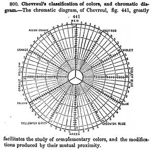
A key assumption in Newton's hue circle was that the "fiery" or maximum saturated hues are located on the outer circumference of the circle, while achromatic white is at the center. Then the saturation of the mixture of two spectral hues was predicted by the straight line between them; the mixture of three colors was predicted by the "center of gravity" or centroid of three triangle points, and so on.


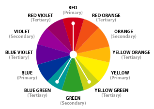
Primary, secondary, and tertiary colors of the RYB color model
According to traditional color theory based on subtractive primary colors and the RYB color model, which is derived from paint mixtures, yellow mixed with violet, orange mixed with blue, or red mixed with green produces an equivalent gray and are the painter's complementary colors. These contrasts form the basis of Chevreul's law of color contrast: colors that appear together will be altered as if mixed with the complementary color of the other color. Thus, a piece of yellow fabric placed on a blue background will appear tinted orange, because orange is the complementary color to blue.
Unfortunately, the artists' primary colors are not the same as complementary colors defined by light mixtures. This discrepancy becomes important when color theory is applied across media. Digital color management uses a hue circle defined around the additive primary colors (the RGB color model), as the colors in a computer monitor are additive mixtures of light, not subtractive mixtures of paints.
One reason the artist's primary colors even work at all is that the imperfect pigments being used have sloped absorption curves, and thus change color with concentration. A pigment that is pure red at high concentrations can behave more like magenta at low concentrations. This allows it to make purples that would otherwise be impossible. Likewise, a blue that is ultramarine at high concentrations appears cyan at low concentrations, allowing it to be used to mix green. Chromium red pigments can appear orange, and then yellow, as the concentration is reduced. It is even possible to mix very low concentrations of the blue mentioned and the chromium red to get a greenish color. This works much better with oil colors than it does with water colors and dyes.
So the old primaries depend on sloped absorption curves and pigment leakages to work, while the new scientifically derived ones depend solely on controlling the amount of absorption in certain parts of the spectrum.
Another reason the correct primary colors were not used by early artists is that they were not available as durable pigments. Modern methods in chemistry were needed to produce them.
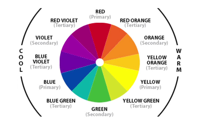
Warm vs. cool colors
Warm Colors: Colors such as red, yellow, and orange. These colors evoke warmth because they remind us of things like the sun or fire.
The distinction between warm and cool colors has been important since at least the late 18th century. It is generally not remarked in modern color science or colorimetry in reference to painting, but is still used in design practices today. The contrast, as traced by etymologies in the Oxford English Dictionary, seems related to the observed contrast in landscape light, between the "warm" colors associated with daylight or sunset and the "cool" colors associated with a gray or overcast day. Warm colors are often said to be hues from red through yellow, browns and tans included; cool colors are often said to be the hues from blue green through blue violet, most grays included. There is historical disagreement about the colors that anchor the polarity, but 19th century sources put the peak contrast between red orange and greenish blue. Cool Colors: Colors like blue, green, and purple (violet). These colors evoke a cool feeling because they remind us of things like water or grass.
Color theory has ascribed perceptual and psychological effects to this contrast. Warm colors are said to advance or appear more active in a painting, while cool colors tend to recede; used in interior design or fashion, warm colors are said to arouse or stimulate the viewer, while cool colors calm and relax. Most of these effects, to the extent they are real, can be attributed to the higher saturation and lighter value of warm pigments in contrast to cool pigments. Thus, brown is a dark, unsaturated warm color that few people think of as visually active or psychologically arousing.
Compare the traditional warm–cool association of color with the color temperature of a theoretical radiating black body, where the association of color with temperature is reversed. For instance, the hottest stars radiate blue light (i.e., with shorter wavelength and higher frequency) and the coolest radiate red.
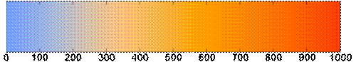

The hottest radiating bodies (e.g. stars) have a "cool" color while the less hot bodies radiate with a "warm" color. (Image in mired scale.)
Achromatic colors
Any color that lacks strong chromatic content is said to be unsaturated, achromatic, or near neutral. Pure achromatic colors include black, white and all grays; near neutrals include browns, tans, pastels and darker colors. Near neutrals can be of any hue or lightness.
Neutrals are obtained by mixing pure colors with either white, black or grey, or by mixing two complementary colors. In color theory, neutral colors are colors easily modified by adjacent more saturated colors and they appear to take on the hue complementary to the saturated color. Next to a bright red couch, a gray wall will appear distinctly greenish.
Black and white have long been known to combine well with almost any other colors; black increases the apparent saturation or brightness of colors paired with it, and white shows off all hues to equal effect.
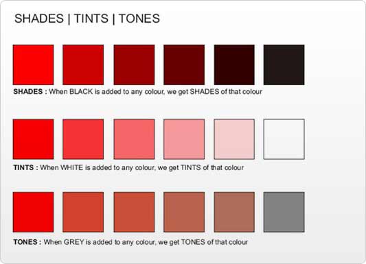
Tints and shades
When mixing colored light (additive color models), the achromatic mixture of spectrally balanced red, green and blue (RGB) is always white, not gray or black. When we mix colorants, such as the pigments in paint mixtures, a color is produced which is always darker and lower in chroma, or saturation, than the parent colors. This moves the mixed color toward a neutral color—a gray or near-black. Lights are made brighter or dimmer by adjusting their brightness, or energy level; in painting, lightness is adjusted through mixture with white, black or a color's complement.
It is common among some painters to darken a paint color by adding black paint—producing colors called shades—or lighten a color by adding white—producing colors called tints. However it is not always the best way for representational painting, as an unfortunate result is for colors to also shift in hue. For instance, darkening a color by adding black can cause colors such as yellows, reds and oranges, to shift toward the greenish or bluish part of the spectrum. Lightening a color by adding white can cause a shift towards blue when mixed with reds and oranges. Another practice when darkening a color is to use its opposite, or complementary, color (e.g. purplish-red added to yellowish-green) in order to neutralize it without a shift in hue, and darken it if the additive color is darker than the parent color. When lightening a color this hue shift can be corrected with the addition of a small amount of an adjacent color to bring the hue of the mixture back in line with the parent color (e.g. adding a small amount of orange to a mixture of red and white will correct the tendency of this mixture to shift slightly towards the blue end of the spectrum).
Split primary colors
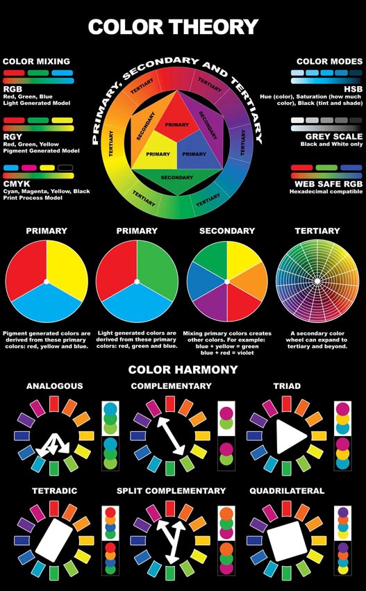
In painting and other visual arts, two-dimensional color wheels or three-dimensional color solids are used as tools to teach beginners the essential relationships between colors. The organization of colors in a particular color model depends on the purpose of that model: some models show relationships based on Human color perception, whereas others are based on the color mixing properties of a particular medium such as a computer display or set of paints.
This system is still popular among contemporary painters, as it is basically a simplified version of Newton's geometrical rule that colors closer together on the hue circle will produce more vibrant mixtures. However, with the range of contemporary paints available, many artists simply add more paints to their palette as desired for a variety of practical reasons. For example, they may add a scarlet, purple and/or green paint to expand the mixable gamut; and they include one or more dark colors (especially "earth" colors such as yellow ochre or burnt sienna) simply because they are convenient to have premixed Printers commonly augment a CYMK palette with spot (trademark specific) ink colors.
There are plenty of other names and titles that refer to different aspects of color, but this is where it starts getting complex. If you want to know more about color, read on.
Neutral Colors: Gray, Brown. These aren't on most color wheels, but they're considered neutral because they don't contrast with much of anything. They're dull and uneventful.
Value: Usually refers to the amount of black in a color. The more black a color has, the darker its value.
Brightness: Refers to the amount of white in a color. The more white a color has, the brighter it is.
Saturation: Refers to the amount of a color used. When a color is at full saturation, it is extremely vibrant. When a color is "desaturated," a large amount of color has been removed. Desaturated colors tend to be close to being neutral because there is so much gray in them. |