| A COMPREHENSIVE GUIDE | By: Rodelio D. Balagot
| ARCHIVE DIRECTORY | CMYK & RGB COLOR SYSTEM | HISTORY OF COLOR THEORY | TRADITIONAL COLOR THEORY | COLOR HARMONY | COLOR WHEEL CHART |
 |
||
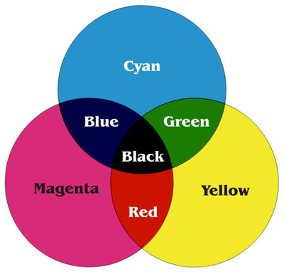
| The CMYK Process Color System |
 |
||
| The CMYK Process & RGB Color System |
 |
||
| Pantone Matching System |
|
CMYK - RGB - SPOT COLOR |
The CMYK Color System The color systems used by scientists and artists are entirely different. An artist will mix blue and yellow paint to get a shade of green; a scientist will mix green and red light to create yellow. The printed page in a magazine is yet another system. First, there's the color you can touch, such as the skin of an apple or a painted wall. These colors are part of the surface of an object. Next, there's the color you can't touch, such as a beam of red light and the colors produced by your computer monitor. Colors generated by light are part of one color system. The tangible colors which are on the surface of objects or on the printed page are another color system. A common color mode, RGB stands for the colors of Red, Green, Blue. Add red, green, and blue light to create white light. Because you ADD the colors together to get White, we call these RGB colors the addtive primaries. Colors on screen are displayed by mixing varying amounts of red, green, and blue light. As you might suspect, there are different types of color. Now is when you can throw the color wheel out the window. This is color based upon light. Your computer monitor and television use RGB. The name "RGB" stands for Red, Green, Blue, which are the 3 primaries (with green replacing yellow). By combining these 3 colors, any other color can be produced. Remember, this color method is only used with light sources; it does not apply to printing. This is the color method based upon pigments. "CMYK" stands for Cyan, Magenta, Yellow, and Black (its what the K stands for). Using these 4 colors, most other colors can be achieved. Unfortunately, CMYK cannot reproduce the same amount of colors as RGB can, which is why yellow-greens sometimes look a bit muddy when printed. This is yet another printing color method. PMS stands for "Pantone Matching System," and is a large list of specially mixed colors made by the Pantone Corporation. Instead of using CMYK to create colors, the pigments are created individually for purity. In offset printing, a spot color is any color generated by an ink (pure or mixed) that is printed using a single run. The Pantone Color Matching System is largely a standardized color reproduction system. By standardizing the colors, different manufacturers in different locations can all refer to the Pantone system to make sure colors match without direct contact with one another. |

