|
Another way to get acquainted with the data set is plotting. In
order to see the relationship (or lack thereof) between the
dependent and explanatory variables. Since Sex is a dummy
variable (meaning not a genuine variable), we will ignore it for
the moment and go on plotting Income and Education.
The most useful way to detect a relationship is to plot the data
in a scatter plot diagram. In order to do this with Excel, select
the data range and select Chart... option from Insert
menu. You will be directed to step 1 of the chart wizard. Do the
following:
- Click on Standard Types tab.
- Chart type:
 XY (Scatter) XY (Scatter)
- Chart sub-type:
Scatter
- Click
 to move on to step 2. to move on to step 2.
- Click on Series tab.
- Series
Click on Sex
Click

- X Values:
Click on
 right next to the text box for X Values. The dialogue box shrinks
to facilitate the selection of data range.
right next to the text box for X Values. The dialogue box shrinks
to facilitate the selection of data range.
- Select the
Education column excluding the label this time.
- Click on
 to return to the normal view.
- Y Values:
Rightarrow Similar
to X Values: This time, select Income column. You may wish to
change the name of the series to Income. This is nonessential,
but it can be done by typing Income in the text box to the right
of Name:
- Click
and then
 to exit
the wizard. to exit
the wizard.
- Make changes the features of the chart if
you will.
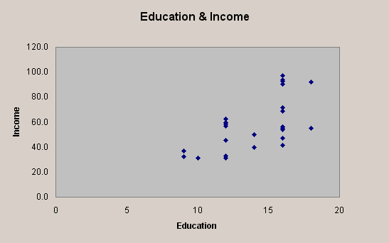
The end result should look something like the one shown
below:
You may detect a positive relationship between Education and
Income, which may or may not be statistically significant.
|