A. Documentation of the Development Procss
The purpose of my website is to provide consumers the ability to purchase the yarn my uncle is selling, as well as other fiber related products, such as hooks and needles, while also providing tutorials and pattern information. To ensure the audience had the best experience, I broke down the site in the most logical order for a crafter. They would need supplies to create their project and need tutorials and patterns for inspiration. To meet these objectives, I utlized the skills gained in this class to create an easy to use, meaningful website for the audience. It was necessary for me to utilize a .css file to allow me to easily format each page with ease, in the event changes to the styles were needed. I also had to utilize different pages to be able to properly link each page on the website.
B. Defense of the Final Product
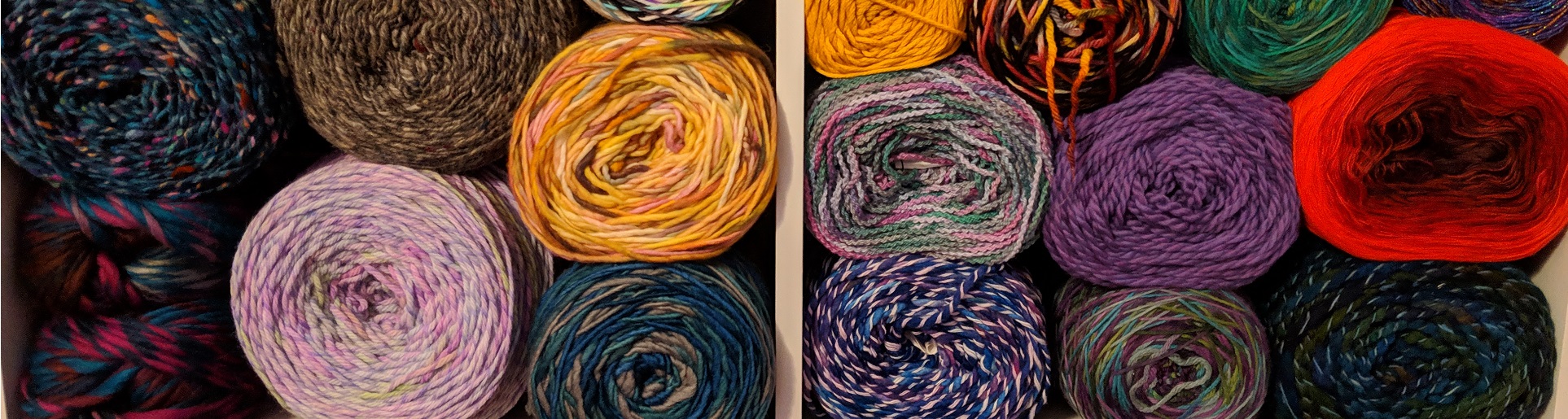
A hierarchical structure was the best fit for my website. I kept the background white, because my header included colorful yarns, from which I didnt want users to be distracted from. I put the links to the different pages of the site below the header image and made that format consistent throughout the site. My goal was to keep the site as clean as possible, without a bunch of distracting background images or bright colors.
Home: For this page, I chose to display images of different knit and crochet item photos to engage the user. The point of the home site was to draw the audience into clicking on the other links. Just to note, all projects and yarn photos on this page are my own.
Fiber Art Supplies: I utilized a table on the Fiber Art Supplies page, in order to best communicate the available products, the quantities available, and each items price. Had we delved into creating shopping carts and allowing the users to complete purchases and transactions, this page would look much differently. Honestly, it probably would be broken down into many sections for each type of yarn available, each color available, etc.
Tutorials and Patterns: The Tutorials and Patterns page was my favorite to do, by far! Expression Fiber Arts is my favorite website for hand-dyed yarn, as well as knitting and crochet tutorials, so I utilized the YouTube videos Chandi had made to provide beginner information to the audience. I chose to use the feedback you provided in the Module 6 discussion post and broke out the columns by Knit and Crochet. Below the tutorials is where I linked the audience to different patterns on the Ravelry website. I chose many of the patterns, based off the projects on the home page, but also added some others that I thought were interesting.
Contact Information: The Contact Information page is to solely provide the consumer with the phone number and address of the physical location of the business, along with a photo of the building.
Owner Bio: The Owner Bio pages was created in order to give the consumer an idea of why the owner is creating these products and wanting to share them with the fiber art community. I hoped that this would help steer the consumer into purchasing from this site vs. the big box stores.
C. Opportunities for Improvement and Growth
There is quite a bit of room for improvement with my site. I had some issues with formatting and layout, especially with my header and links. I would've liked to have gotten a better photo that actually spanned the whole top of the webpage, without stretching. As far as future updates, I previously mentioned wanting to expand the Fiber Arts Supplies page and allow the consumers to perform purchase transactions. I also would have expanded the tutorials and patterns page to include more tutorials than just the basics. There are some pretty advanced knitting and crochet skills that video tutorials make a huge difference.