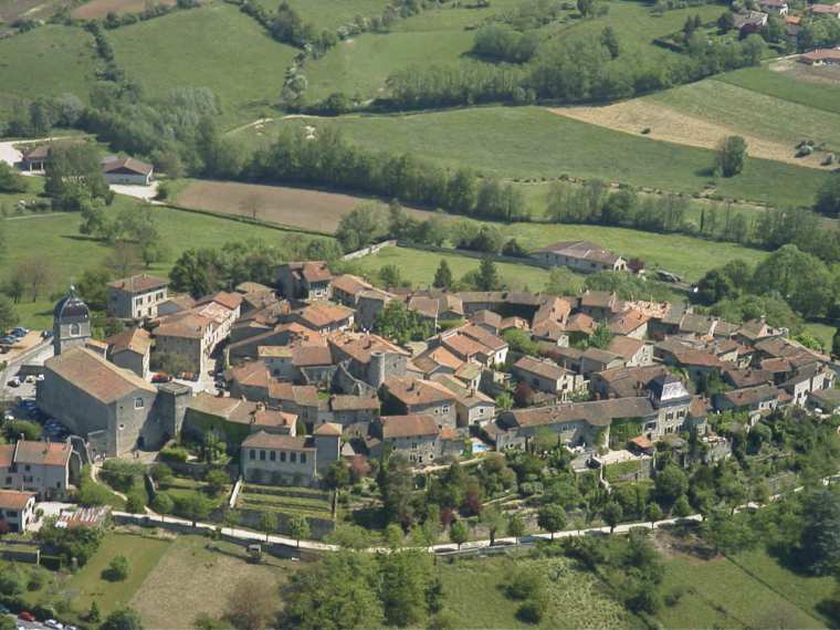
Touring the Medieval City
Home Members Brainstorming Storyboarding Features User Profiles Development Cycle Flash Prototype
This webpage contains the follopwing contents:
1. Changes made 2. Heuristic evaluation 3. Design principles implemented 4. Challenges faced 5. User Testing
Changes made after Storyboarding:
In the story-boarding we had two scenarios. In one scenario it was like our user would click the important event and it would display the current important event happening in the city. But our user asked when is the important event taking place i.e whether he would have enough time to go to that place and whether the finished events would also be displayed and what happens if he had missed a important event. So he asked whether he might commit a mistake by not looking at it early. So we thought that instead of having that as a separate menu we could have that as a pop-up menu and by this way we could make the user to make a note of the important events at the right time. Also the user could have a option of enabling and disabling the pop-up menu and if enabled he can also set the priority such as, before how many days the pop-ups should appear and how many times it should appear etc.,
In our other scenario it was like our user doesn’t know where he is in the city and we had a option of having the map with the position of the user on it as a screen saver and seeing that he comes to know where he is in the city. Our user asked, when the screen saver would run?. So we thought that it is better to have the map as our opening screen because the user might not see the screen saver and also till the screen saver comes he has to be in a uncomfortable position.
Changes made after paper prototype:
When users saw our paper prototype the common question they asked was what is the difference between a ordinary website and your application. They asked in what ways it helps more than a website. So we decided to include features like Translator and recorder, Digital camera, Freenet Phone, voice mode transport etc., Also when the user was navigating into the features after sometime they said that they forgot why they came into that feature because the navigation was long. So we made the navigation to be short and narrow. These changes are due to the flaws in our design. Then we thought that we could concentrate only on certain features and hence we left out certain features such as Hotel, Restaurants, Stay etc., Also we had several menus concerning with transport and map. So we defined a structure such that there is only one menu for Transport and it would be very easy to retrieve the information. Also in the paper prototype we had a dot blinking to show to the user where actually he is in the city. But we thought that instead of having a dot blinking, we could have a man in the map. Because if the user sees a dot blinking he might think that it is something else. i.e he might think that he has to go to the blinking place or he might think that a danger is going to happen because of the blinking and so on. All these changes were made because of our heuristic evaluation.
Heuristic Evaluation
Jayaraj: I personally feel that the application is very simple to use considering the fact that it has many features. Most of the rules and laws(Golden rules, Gestalt law etc.,) were followed and appropriate changes were made. The only problem that I had was to demonstrate to the user what the map mode and the voice mode of the transport does. If I had known better flash it would have been easy for me to convey to the user what is actually does. Also it is very difficult to leave that feature as it is one of the important feature of our design. But the user would feel very comfortable and easy using this feature, after he uses this feature once.
Ebenezer: I feel that the application is very user friendly because from one feature the user can jump to any other feature, as the feature combo box appears in each screen. Also I can go from any feature to the home screen. Also the language and translator of our design would help in a lot of ways.
Bharath: I feel that the application is very useful for travelling in the medieval city. By just looking at the first screen you can identify the features the application contains. Also I feel that that the application has addressed the main problems that the user will face while going to a foreign(medieval ) city. i.e., language and transport problems. Also the user will feel comfortable using the device although it has many features.
Dhanaasekar: All the commands are in such a language that everybody can understand. It is not in any technical term that anybody can’t understand. The navigation through the system is also easy. I need not press a lot of buttons to get an application activated. It is sufficient that I press a few number of buttons and get an application activated. Also I feel it easy to get an application. Every command is just easy to activate. Everything is in the form of buttons or Combo Box. So I need not have the stress of typing for a particular application and end up in a situation where I may have committed a spelling error. Also the application has the voice-mode, which helps me to go anywhere. I feel it easy to understand when I can see a map and also hear the route told to me by the product. And the updated pop-ups about the events help me to get myself updated about the events in the city.
Design principles implemented:
Visibility: All the features are visible(eg: digital camera, translator and recorder etc., in the opening screen).
User’s Language: Everywhere simple language is used. No technical word is used and hence those who does not have computer knowledge can also use our application.
Consistency and Predictability: We have used the combo box almost everywhere. Also we have used same fonts everywhere and our features are predictable from the name itself.
Feedback: We have used message boxes as a feedback.
Less Memory Load: Our application has a very narrow and short navigation. This helps the user to remember less information.
Avoidance of Errors: As we have used the combo box in most of the screens, the possibility of error making becomes very less. Also the user can go from one screen to any other screen if he feels that he is lost someway. Also every screen has the home screen. Hence this helps the user to recover and go back to the stable state.
Clear Exits: Our application has a clear exit with the exit button in all the screens.
Help: We have included the help in every screen although most of the features does not require any help because of the simplicity of our application.
We have used the digital camera icon for digital camera, telephone icon for calling etc (Gestalt law of experience) also in all the places similar shaped buttons are used(Gestalt law of similarity).
Challenges that we faced:
User Profile:
Senthooran Subramaniam: Senthooran is a very energetic young boy. He is doing his 11th standard in Bonn. He is 16 years old. He is actually from Srilanka but has settled here in Germany. He has very limited knowledge about computers. He uses computer only for hearing music and for playing games. He is very good at playing football and basketball. He is very curious and usually probes at any new device that he comes across which is typical for a young boy. As he is naughty, enthusiastic and intelligent, he takes every task assigned to him as a challenge and performs a good job. Probably he will tell all the pros, cons and changes required for the Odyssey.
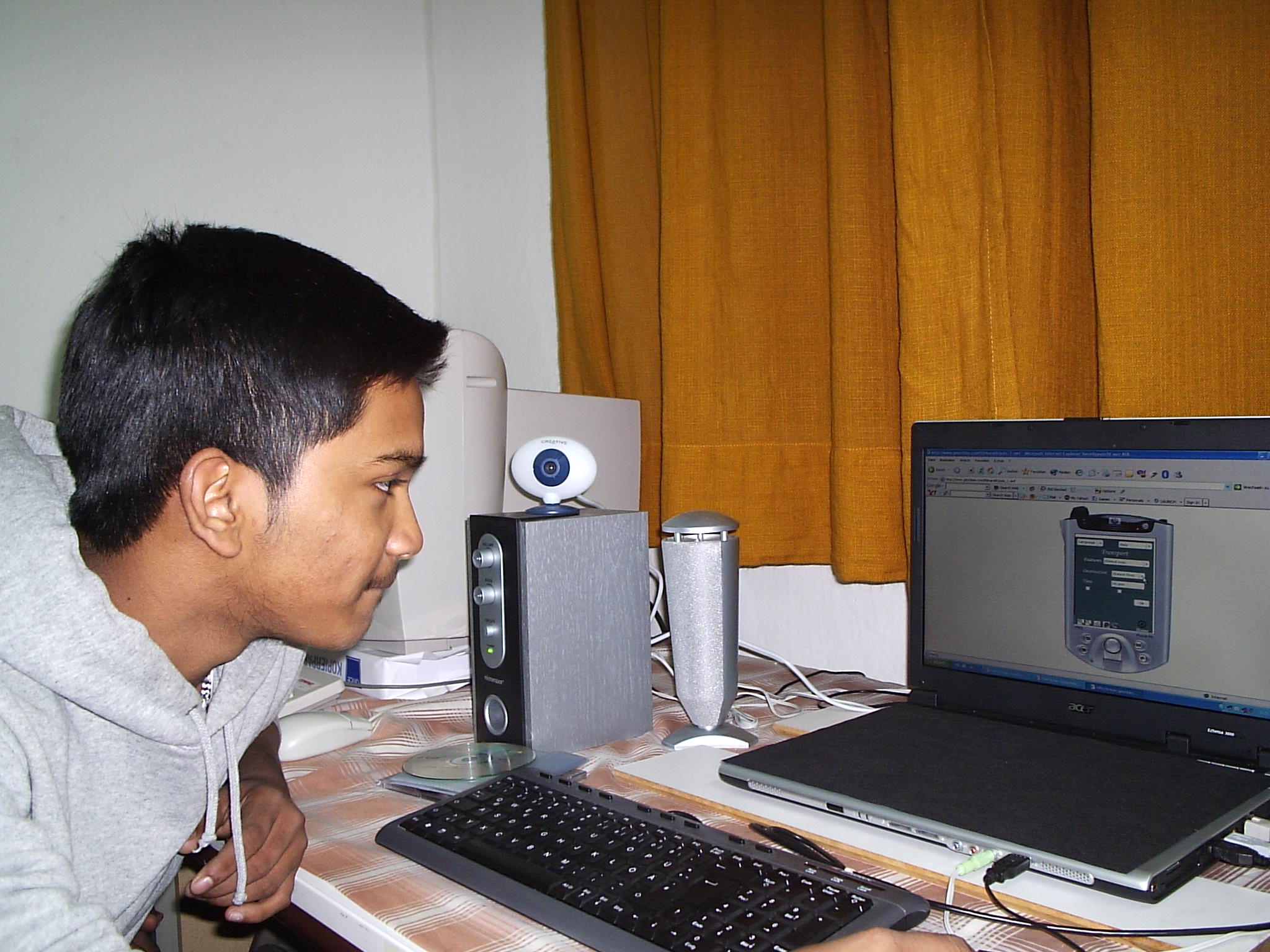
Tasks assigned to senthooran:
In the first task, senthooran had some problems finding the transport connections. We had a text box named as “time” in the transport screen. Our user doesn’t know whether the time is for arrival or departure. So we decided to change the name “time” as “departure time”. Then, our user gives a specific time and clicks “ok” for finding the appropriate transport connections. Then the transport connections are shown with the appropriate transport number named as “tr.no”. But our user asked whether tr.no is a tram number or a train number. We said to him it is neither a train nor a tram number, but it is the transport number.(in this case it was a bus number). So we thought it was better for us to keep the name as “transport number” which we thought is the users language.
Thomas Vergeese: Thomas is a 60 year old man. He is from India and he has also settled here. He is a retired embassy officer. He has no knowledge about computers. He is our house owner. He loves reading and travelling. As ours is a travelling application, he is very excited to try our application prototype.
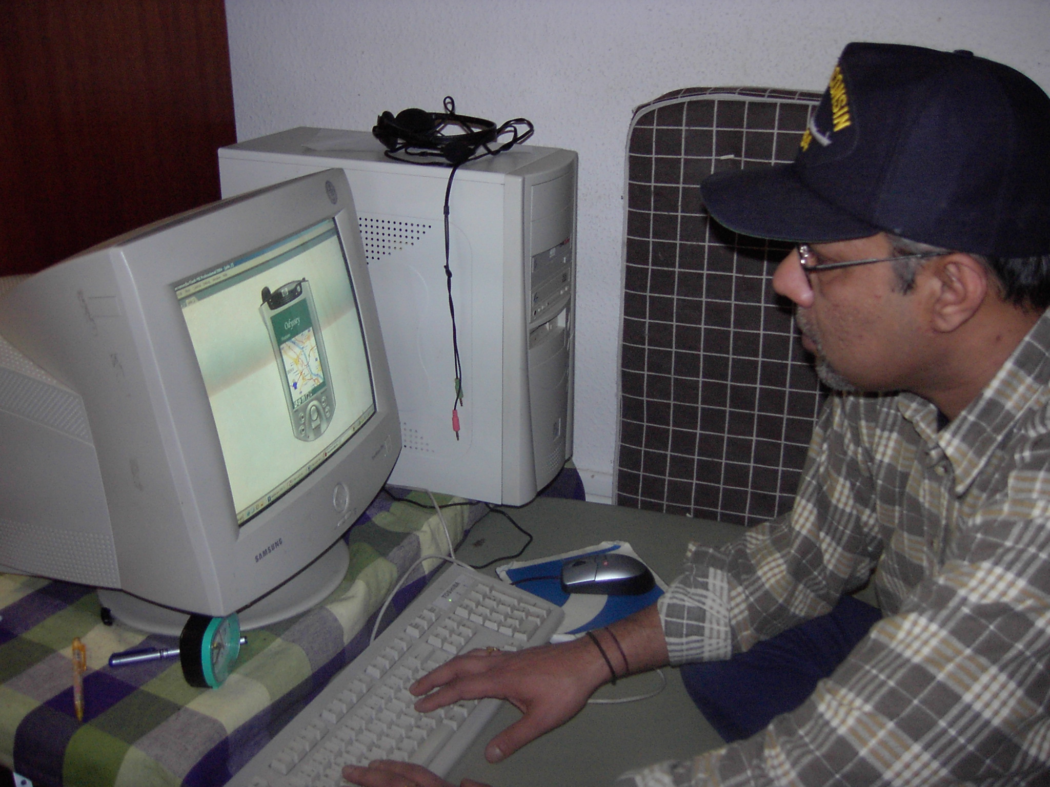
Tasks assigned to Vergeese: