


|
|
|
Above shown picture was the work I did for my web design module assignment 2B. The objective of the assignment, was to create an art piece influenced by the typographer and/or designer chosen by the student for assignment 2A. After doing research on my chosen designer and typographer, Neville Brody, one of his comments really struck me. He said that in this day and age, most designers are keen to know all about the newest technologies and ways to present their work. This is so much so that these designers have lost the real focus of creating a design. To Neville Brody, a good designer and a successful design must have a message to send across to the intended audience. The methods employed by the designer to convey this message need not utillize the latest technologies and trends. The purpose and message behind the design is thus far more important, then using the latest design tools.
For this assignment, we were required to do a design, based on the teachings and influences of our chosen designer. In my case, Neville Brody. We could not use any digital content creation tools of any kind. Instead, we were tasked to create the design using non-digital tools.
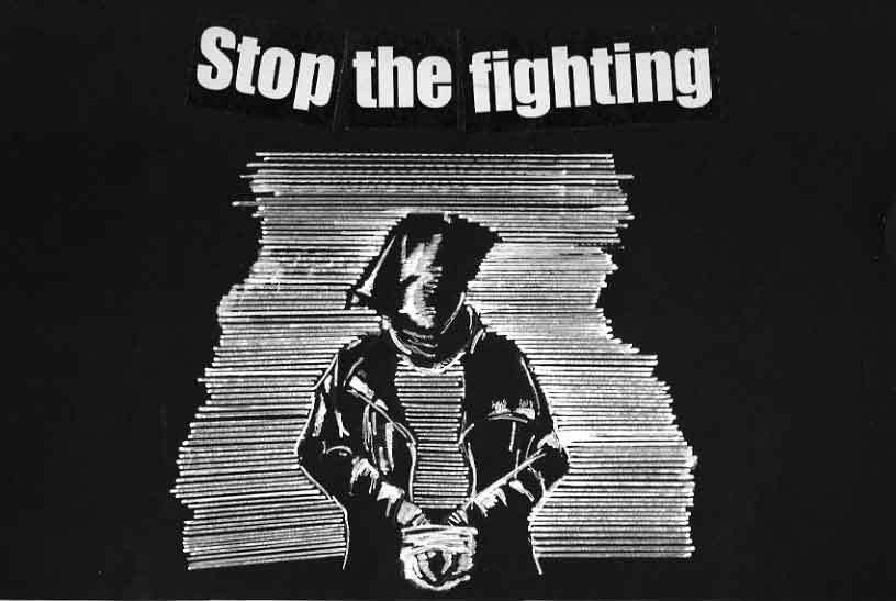
The requirements for this assignment posed a unique challenge. However, it also presented the opportunity to practise what Neville Brody felt. After looking at some of Neville Brody's works, I decided to create an art piece using as little raw materials as possible. However, the work should have a message to send across to the audience. In light of present world events, I decided to do something which addresses the increase in violence all around our world today.
The main influence towards the creation of this piece however was not Neville Brody's work. Instead, I remember chancing upon an art piece, where the artist drew a figure drawing using a techniceal pen and adding in the highlights using correction fluid. This form of rendering was very unique from my perspective and I decided to incorparate this into my art piece for this assignment.
Since I was using correction fluid as my main drawing and rendering tool, black construction paper was used as the background. I wanted the art piece to have no other colour except black and white. The main picture of the hostage man was drawn with the help of a steel ruler. The general shape of his body was made clearer by the use of positive and negative space. In fact, I decided to try and use positive and negative space to give a very stylised look to the whole piece.
The title for this piece took quite a good amount of thinking on my part. The title had to be simple, like the art piece, but has a significant message to put across to the audience. When I finally did come up with the title, I decided that it had to be in a heavy font, to give a subtle stress to the message being conveyed.