The Artistic Characteristics of
Russian Icons
Icon painters
never wanted copy nature or to show pictures of the world as it seems
to us. They wanted to use ideas about the
physical world to display spiritual truths.
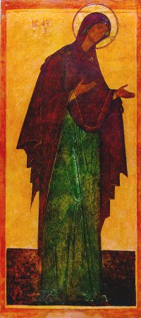
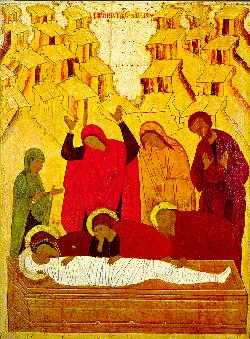
| The first icon shows the Virgin of Pskov; it was probably created in the early 16th century. The second icon shows the burial of Christ. It was created in the late fifteenth century. |
- Most icons show
only one or two persons. Landscaping and
background people were considered a distraction from the main idea(s).
- Reversible
perspective means that the lines of the painting converge (come
together) toward the viewer, not toward some point in the painting. The emphasis is on the experience the viewer
has in meditating on the icon.
- Icons do not show
shadows because they do not show natural lighting. The
only light shown in icons is spiritual power. Spiritual
power comes from inside a person. The
light from spiritual power was shown by halos and gold paint.
- Icons seem flat
and unreal to Western eyes because they do not try to show depth. Icons are supposed to be unrealistic because
they present a spiritual world.
- Figures in icons
always face front to emphasize their presence. They make the strongest
impact on the viewer this way.
- Facial expressions
do not show much about the feelings and attitudes of their figures. Prayer, reverence, silence, obedience,
preaching, fear, blame, surprise, lamentation, are shown just as much
(or more) by
the positions of the hands and of the heads.
- Saints portrayed in
icons have large, almond-shaped eyes, enlarged ears, long thin noses,
and small mouths. These differences in
size were
supposed to show that their senses had been purified and made holy.

| This icon shows the
Baptism of Jesus by his
cousin, John the Baptist. Notice the abundance of gold paint
symbolizing the presence and power of God. (This is the moment
when God the Father acknowledges Jesus as his Son, and Jesus begins
his public ministry. |
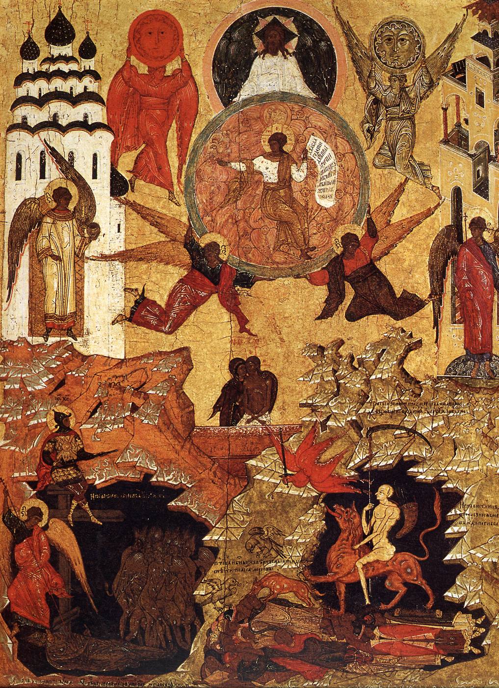
This icon, showing Jesus as the Only begotten Son of the Father and the Word of God (a reference to the start of John's gospel, which calls Jesus the logos or word as represented by the scroll), uses symbols to show that all creation reacts and responds to the divine presence. The heavens (angels, the sun, and the moon), the earth (two buildings, rocky ground, and the presence of Jesus in his earthly body standing with his mother), and under the earth (hell--demons and human souls condemned to eternal suffering) are all present.
Symbolism:
-
Religious symbols from the Bible or from religious tradition were often used. For example, a stole could symbolize the lost sheep carried by the Good Shepherd. A stole is a strip of cloth draped over the neck and hanging down the right and left sides of the chest. (The Good Shepherd is a character in one of Jesus’ stories. The Good Shepherd loves his sheep like God the Father loves his children.) Or three rays of light could represent the Trinity (three persons in one God).
- Architecture could also be used symbolically. For example:
- A
roof with a cupola (round dome) can symbolize
a church.
- A single can
symbolize an entire building.
- A building can
symbolize a city.
- Drapery (large
curtains) hanging from one wall to another stands for the inside of a
building.
- Colors:
- Gold
– holiness, divine presence
- Red
(scarlet) – life or blood. It symbolizes
Jesus’ suffering and death on a
cross as well as his victory over death in his resurrection.
- White
– purity, holiness, simplicity
- Blue
(sky blue) – the sky, eternity. Also
associated with Mary, Jesus’ mother.
- Green
– earth, the renewable cycle
of Nature.
- Brown – bare
earth, ashes, all that dies
- Black
– death, eternal damnation
(Hell). Also associated with mystery.
- Grey – a mixture of black and white that symbolizes confusion and emptiness. It was never used in icons.
It also discusses common themes by using individual icons.