|
Checking Out Photo Fixes
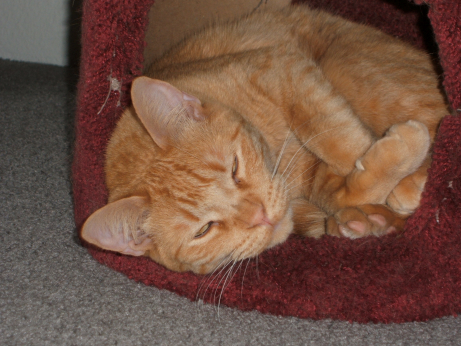
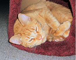
The subject of the photograph is Sunny (his formal name is Sun Tiger), our youngest cat, possibly the most intelligent cat we've ever had, the most athletic cat for sure, who has just turned two. He's figured out the electronic flash, reminds us that cats are twilight hunters, and prefers not to have his eyes assaulted. I'm starting out with a screenshot of what the current photograph looks like at 20% of its actual size, which is more than large enough for any web application. Among other things, I'm going to see how the different resizing algorithms compare...
|
|
|
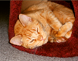
PIXEL RESIZE
|

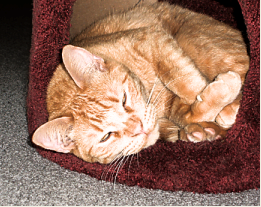
BICUBIC RESAMPLE
|
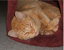
BILINEAR RESAMPLE
|

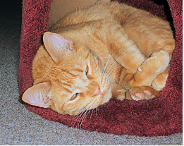
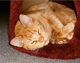
WEIGHTED AVERAGE
|

SMARTSIZE
|
(The resizing algorithms produced different file sizes when I exported the images and optimized them as PNGs. The first three are 29 KB, the latter two 26 KB.)
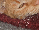
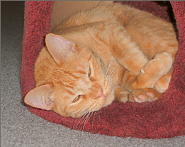
Pixel resize is pixellated (look at the fur in his ear, compare it with that in the large picture), looks almost grainy; whiskers aren't antialiased. Bicubic shows the same effects, only worse. Bilinear is about the same as pixel resize; I'm surprised, because bilinear is sometimes the best algorithm. (Or so I thought: one reason I decided to compare the algorithms' results.) Smartsize is ever so slightly sharper than weighted average; the place it shows most is the thread to the left of Sunny's (upper) ear.
Notice the little highlight in Sunny's eye, next to the lower eyelid: only in the bicubic and bilinear resamplings, and just barely suggested in weighted average. And the similar white specks that look like they're at the ends of two of his whiskers in the pixel resize. I don't know what they mean, but I mention them so I won't have to file away in my mind "possible artifacts caused by the algorithm's increasing contrast too much." Anyway, I'm going to use the smartsized-to-20% resizing to work on.
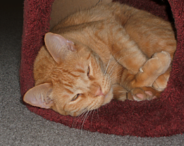
The first things I did were to remove the speck of dirt from the lower corner of Sunny's left eye (the eye on top) and repair the maroon material near his ear and near his feet... Typically, I cloned away some other nearly-nonexistent flaws as well. Then I used Unsharp Mask to sharpen the results of the resizing; the settings were 1.25-125%-4, less obvious and contrasty than the default. Then there was that light wall in the corner, and part of the left side had to be cropped...
|
|
I let the cropping be determined mostly by what I did to the wall (somewhat insane): copied a selection of the carpet where it began to darken, pasted it as a new layer and a second new layer, each of which I resized so the carpet-loops would match the others (growing-smaller-as-they-get-farther-from-the-camera); then merged the layers; then, with fastidious selections, got rid of the very dark shadow next to the maroon cat-tower; then (I said this was insane) made a selection of the area from about the middle of Sunny's head to the top, from left edge to the maroon, and made a mask so I could blend that corner into darkness. I cropped a little bit in from where the resized carpet-loops made their rectangles increasingly smaller. There! Now to see what the auto- and semi-auto-fixes can do to an image that's worth fixing.
| 
|
ONE-STEP FIX
|
SMARTFIX SET AT 'SUGGEST SETTING'
|
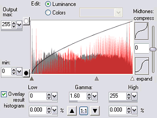
GAMMA SET TO 1.6
|
| The one-step fix is too much; the fur over Sunny's eyes is not white, but this fix makes it so. Can't use this one.
|
I clicked on the "reset to default" button, saw a "suggest setting" button, and clicked on that. This is the result. It's better (see how the pink in his ear is pinker than in the one-step result); it's acceptable, even, but...
|
I'm thinking "gamma." (Through PSP9 there was a separate gamma adjustment.) Now you do Adjust » Bright & Contrast » Histogram. I changed the gamma only, from 1.0 to 1.6: nice Sunny color, but maroon became red, things look blurry.
|
Wait! I changed the gamma in the absolutely simplest way; there ought to be a way to change the gamma for each color channel separately, as there is in PSP5. Yes: see "luminance" and "colors" up at the top? To fix up photographs digitally in the proper way, you're supposed to know about gamma. It and histograms stayed on my "learn about, really" list for years. This daunting set of controls shows why. Gamma has to do with brightness, but digital brightness comes from 3 channels (R+G+B), and when you change the gamma you change not just overall brightness but the relations among the three colors. When I made the gamma 1.6 I increased the visibility of red far more than of green or blue. I'm going to try to compensate for that by adjusting the color-channels individually.
In a minute. First, I'll write down all I know about histograms:
|
|
|
They are graphs that show how much brightness and how much darkness an image contains, with dark on the left and light on the right. The vertical aspect of the graph shows how much of the image area is taken up by a given degree of luminance. An empty stretch at either end of the histogram means that the picture is over- (empty at the left) or under- (empty at the right) exposed if there's a loss of detail in the not-empty area. It can also mean that film for slides and digital equipment will be able to reproduce the range of luminance in the picture. A histogram stretches for the equivalent of 8 f-stops on a lens, but slide film or digital-camera-sensors can record, and a monitor can reproduce, the equivalent of only 5 f-stops. Adjusting the values in a histogram usually means you're trying to get the range of brightness into the 5-f-stops "width" that a digital image can reproduce.
|
RGB INDIVID ADJUSTED + HISTOGRAM TWEAKED |
HISTOGRAM EQUALIZED
|
HISTOGRAM STRETCHED
|
REDUCED SATURATION OF PHOTO ABOVE THIS
|
The two effects immediately above are here for the record; "equalize"- and "stretch histogram" are separate, one-setting tools, of no use with this photo. (Confusing terms: "equalize" increases contrast—by making the amounts of very light and very dark colors the same?—while "stretch" stretches the plotted areas on the graph, not the color range.)
(Click here to compare these with the original photo.)
Above left is the best I could do with individual-channel gamma adjustments (they made sense: increase the setting when the drop-down is blue made the image bluer), and histogram changes that I kept undramatic and arrived at only after seeing the result (I don't understand enough to know what I'm doing as I do it). I'm hoping that this frustrating histogram stuff will make me appreciate the adjustments possible with the SmartFix (beyond the "suggest settings" that produced reasonable success).
The upper left result is reasonably successful, too, but I feel a bit uneasy with the very rich colors. "What if I reduce the saturation?" I thought, and, yes, that's better except for the too-light fur around Sunny's eyes and that tuft of light fur near his dewclaw.
Another thought— "What if I increase the saturation just locally?" Yes, but it's easier said than done. I made and saved selections of the too-light areas, used the HSL tool in steps (increase saturation by 5%; apply; feather selection by 1px; apply; etc), then decreased the lightness of the same areas, then smudged to blend them better, then used very slight (r=.55) Gaussian blur to blend further, and finally cloned his eyes back on (from RGB INDIV ADJ) because they had become literally ghastly. Some overkill here, but I do think the use of selections—rather than freehand use of the smudge and lighten tools—was the right choice for an image this small.
The last picture is the best so far. I can't do anything more to it.
|

RESTORE SATURATION, ETC. AROUND EYES
|
This is what I love about the digital manipulation of photographs: I can go back and fix what I overdid, try new adjustments, undo them if necessary (in extremis, "Revert" if necessary), until the image looks like what I think it should. (It sure beats dodging and burning in a print while squinting in safelight dimness, developing, fixing, washing, drying, then, while spotting some dust specks away, ruining the whole thing and tearing it up in a self-directed rage.) Something I just realized about my rejection of the OneStep PhotoFix result: it looks like an indoor-flash snapshot. What I ended up with doesn't. It looks like a cat scrunched up into a too-small-for-him cubbyhole, just a little bit brighter than what I'd see looking down at him on floor level, the "little bit" corresponding to how I'd interpret it after the image left my retina and moved farther into my head.
|
| NEXT: THE SMARTFIX DIALOG BOX AND HOW MUCH WORK IT COULD HAVE SAVED ME.
|
|
|