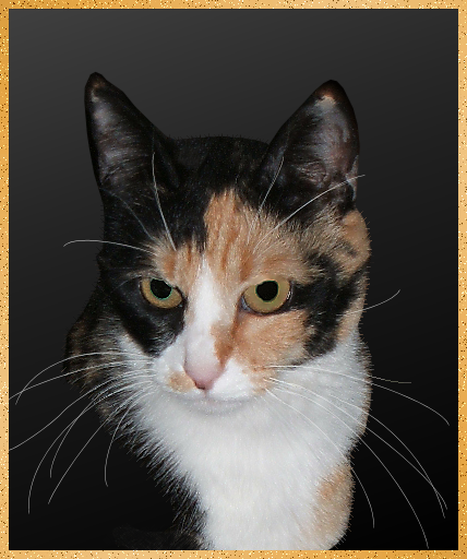
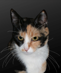
This is about cat portraits and, except for vector-layer whiskers and two delicate but not difficult bits of editing, very basic ways to process a photograph in a digital darkroom. It starts with an indoor picture of Mae. The photo is not too dark: look at her face, consider that much of her fur is black, and don't even think of what would have shown up behind her had the picture been lighter.
First thing: crop it. Since I cut off part of her tail, there's no reason to keep anything but her head and the white fur above her chest. And her whiskers. In the cropped photo, notice the shadow the flash made on the area behind Mae. It makes obvious the need to use a lighter, imported background and allow the shape of her head and ears to show. I'll take care of that after I restore Mae's striking whiskers (you can barely see them in the cropped photo, and you can see also that any resizing of this image will make them invisible). So I traced several of her whiskers on a vector layer using bezier lines. Then I duplicated that layer and merged them: nice bright white whiskers, on a vector—reliably resizable—layer, and I can adjust the exaggerated whiteness later.
|
|

|

|
|
|
With the whiskers safe on their own layer, I can tend to the removal of the background. Very basic: zoom in enough to be able to see the real line of her ears and head, use the lasso (point-to-point) tool set to give an antialiased edge, and with very short strokes give Mae her proper shape—and not worry about cutting her whiskers off or, horrors, having to outline them. Then (also very basic) use the clone tool to get rid of that speck in her ear and other, less obvious ones.
|
|
|
|
|
Here she is, cut out, de-specked, whiskers temporarily made less opaque so I could start visualizing the proper gradient background. I knew I wanted it light-at-top, darker at bottom to complement Mae's face-and-brisket coloring.
But dark enough as it goes up to disguise how I had cut away her shoulder. And probably not a straight-up-and-down 90° orientation (this is a portrait; I'm going to a lot of trouble with other things, so I may as well tilt the gradient, too). I have to edit the gradient, anyway; I keep one—"aadvark"—at the top of my gradient list just for this purpose, for fussing till it's right for the current project.
|
|
| The gradient above is too light, and it's too even: I need it to stay darker about halfway up; the little diamonds above the color bar in the gradient editor move back and forth obligingly. To determine the upper shade, I used the dropper tool on the inside of Mae's ear and got rid of the pinkish hue by reducing the saturation to zero. That was still a bit too light, so I darkened it by reducing the HSL lightness in steps of 10 (I don't think human eyes can differentiate smaller adjustments—I know I have to squint and imagine if I use steps of 5). This process required only about three or four editings of the gradient; the most pleasing tilt seems to follow the diagonal "line" made by Mae's ear, white fur on her nose and right side of her muzzle, and its continuation toward the lower right into the white fur to the left of the tan.
|
|
| Gradient-editing is a delicate but—once the controls on the gradient editor become familiar—essentially a basic process, too. One more of these remains: you can barely see the need for it in the small image here, but the border between Mae's light fur on the right and the dark background can stand a little enhancement. I make a new raster layer for it, since I'm not sure how it's going to look when I'm done: I want to add little "hairs" to regain the naturally uneven border I cut away with the old background. For this, I'll make a couple of new brushes.
|
FIGURES 1 (ABOVE), 2 (BELOW)
|
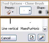
For me, the easiest way is to make a selection (see the coral-and-green rectangle in fig 3?), go to the Tool Options palette (fig 1) and click the little triangle to open the storehouse of brushes; in the lower right corner of that window (fig 2) is a "selection/brush" icon. I click it, name the brush, and I'm ready to restore some of Mae's fur. Figure 3 is a close-up of three of her new hairs—they're graduated in hue/opacity because my selection was of a graduated area.
|
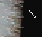
FIGURE 3 (ZOOMED 'WAY IN)
|
(The cyan rectangle shows what it looks like over a dark background.) Figure 3 also shows my second brush; I used the Magic Wand set at no tolerance and picked out 5 pixels in a diagonal line and added that to my brush collection. I used the rectangular brush wherever Mae's fur was horizontal or (rotated 90°) vertical, the diagonal brush where it was at a slant, and with the clone tool picked up the appropriate color for the area I was restoring. Making and using these brushes is also pretty basic: a bit exacting, but not difficult. It does take time, however, and not to waste any as I was giving back Mae some of her fur, I was also spying out other improvements the photograph could use.
|
|
|
Did you notice that light spot left of center on the top of her head? Well, aesthetics won out over realism: by cloning dark fur over it, I removed your excuse to be paying attention to it instead of to the essential cat I want you to see. I'll bet that most of my time working with photographs is devoted to this principle: get rid of the distractions that a camera can't help including but that digital processing can diminish or remove. Then there was that patch of tan fur at the bottom: I used my 5-px diagonal brush to make it darker as a time-out from reconstituting fur. Other little things: the outline of the top of her head, a much-too-bright spot on her nose, and then, when I was finally adjusting the opacity of the vector layer with Mae's whiskers, cloning over whiskers on the main layer with darker fur where they made the vector whiskers too bright or thickly white (I include things like these in "distractions").
Done!
|
|
|
Except for one new thing: using the Image Slicer for the first time on a web page. So you can see, without having to wait, what I saw as Mae the Cat with Luxuriant Vibrissae.
|
|
|