Print Works Subheading
In the print world, my work spans a few different arenas. Within print, I have designed posters, covers, tabs, logos, advertisements, page layouts and even portraits. We may live in a digital world, but print still offers a realm for creativity and exploration. Enjoy.
Poster Art
Poster art can be traced back for centuries, when the first advertising and informational broad sheets were collected and used as home decoration. Since then, many different styles and genres have developed. And while print may not be king of the mountain anymore, posters will always have a significant place in the world.
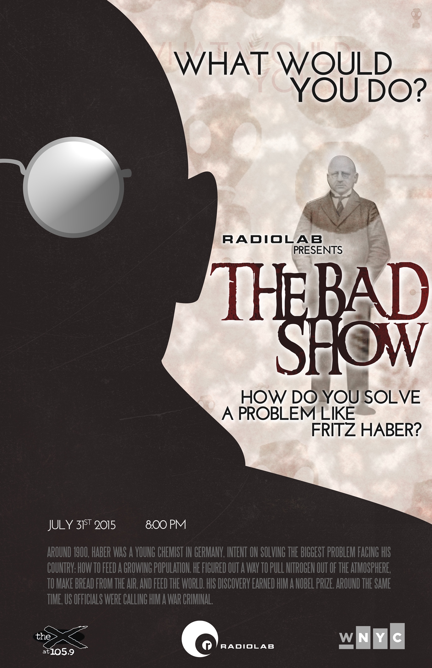
Radio Poster
One of my first scholastic projects, and still one of my favorite. The goal was to develop a poster for a radio show in the style of a movie poster, with influences of a famed designer. I'm not sure what was more fun, listening to the show for inspiration, or visually walking through the career of Milton Glaser.
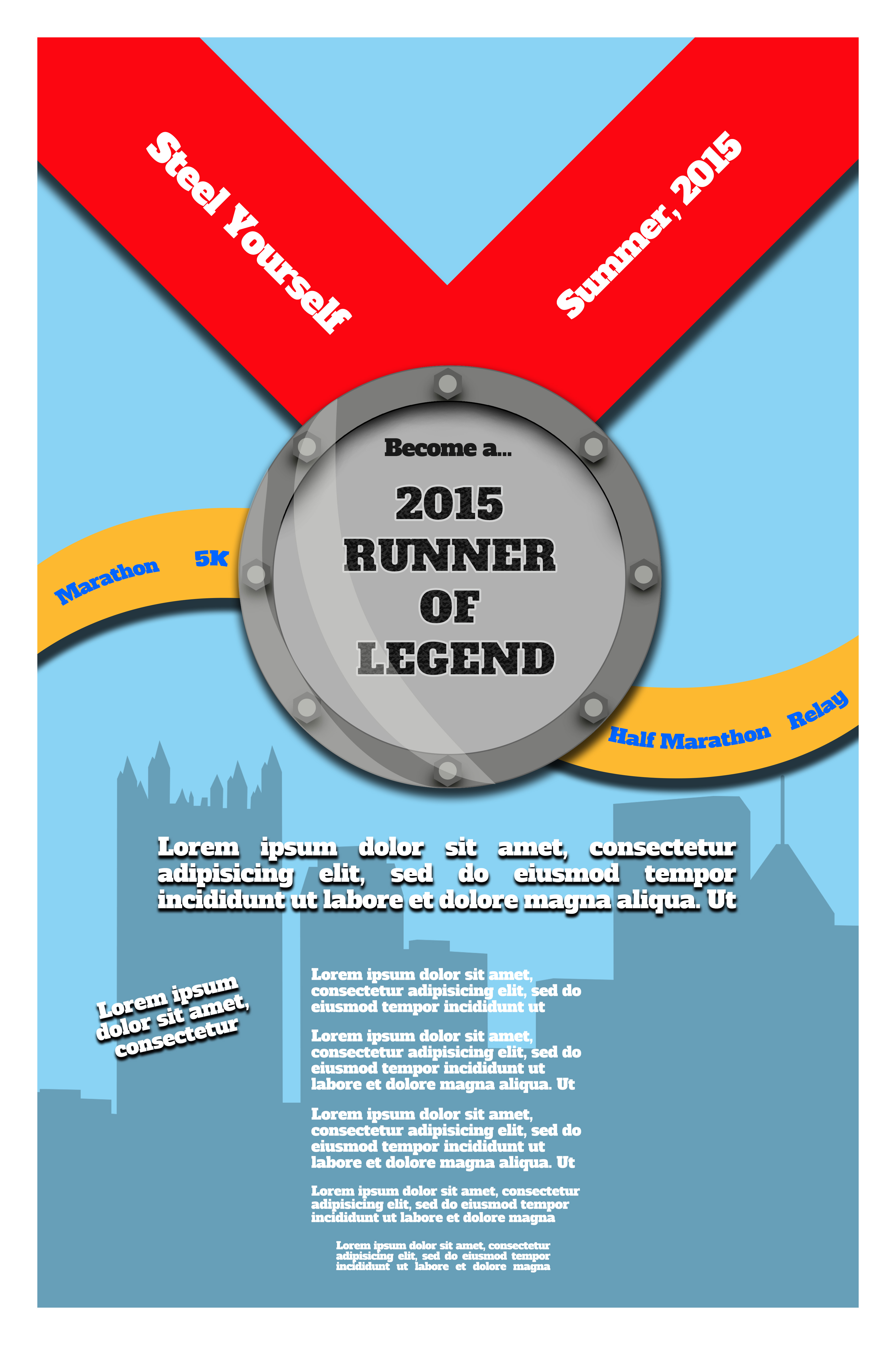
Race Poster
To advertise participation with our company for the annual marathon in Pittsburgh, some of the runners asked me to design a poster. While the specific text as been replace with Loren Ipsum, I really like the end result of the design and visuals. One of my first ventures with the scary pen tool!
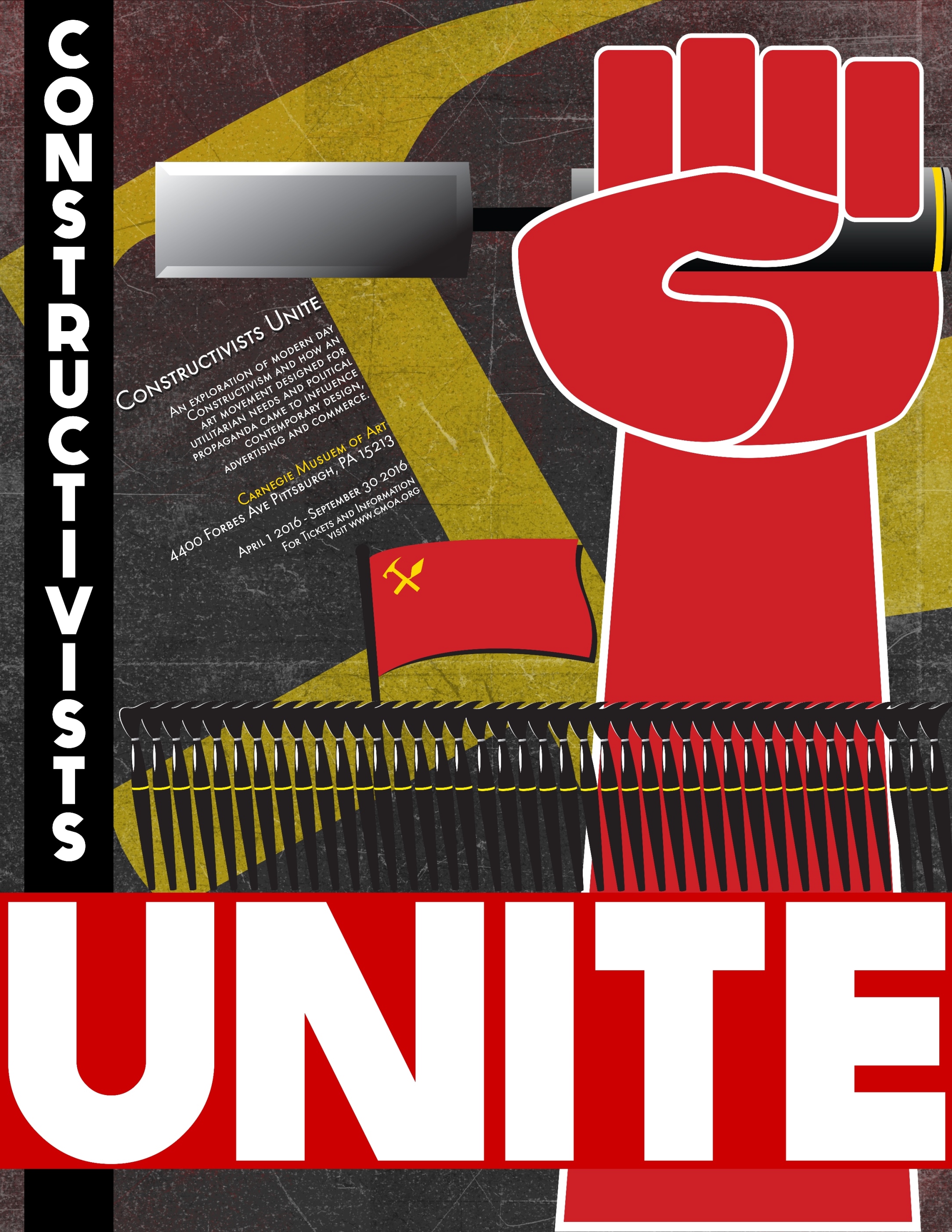
Constructivism Imagined
Develop a poster for a fictional art show based upon a particular style of art. I chose one of my favorites, Constructivism, and used a mix of Constructivist style imagery with art tools and bold typography. The results I still find enjoying, and this was another enjoyable trip with the pen tool.
Page Layouts and Artwork
Print can encompass more than just posters. It also includes page layout and design, advertising, desktop publishing, art and more. Here are a cross section of examples of the many types of print.
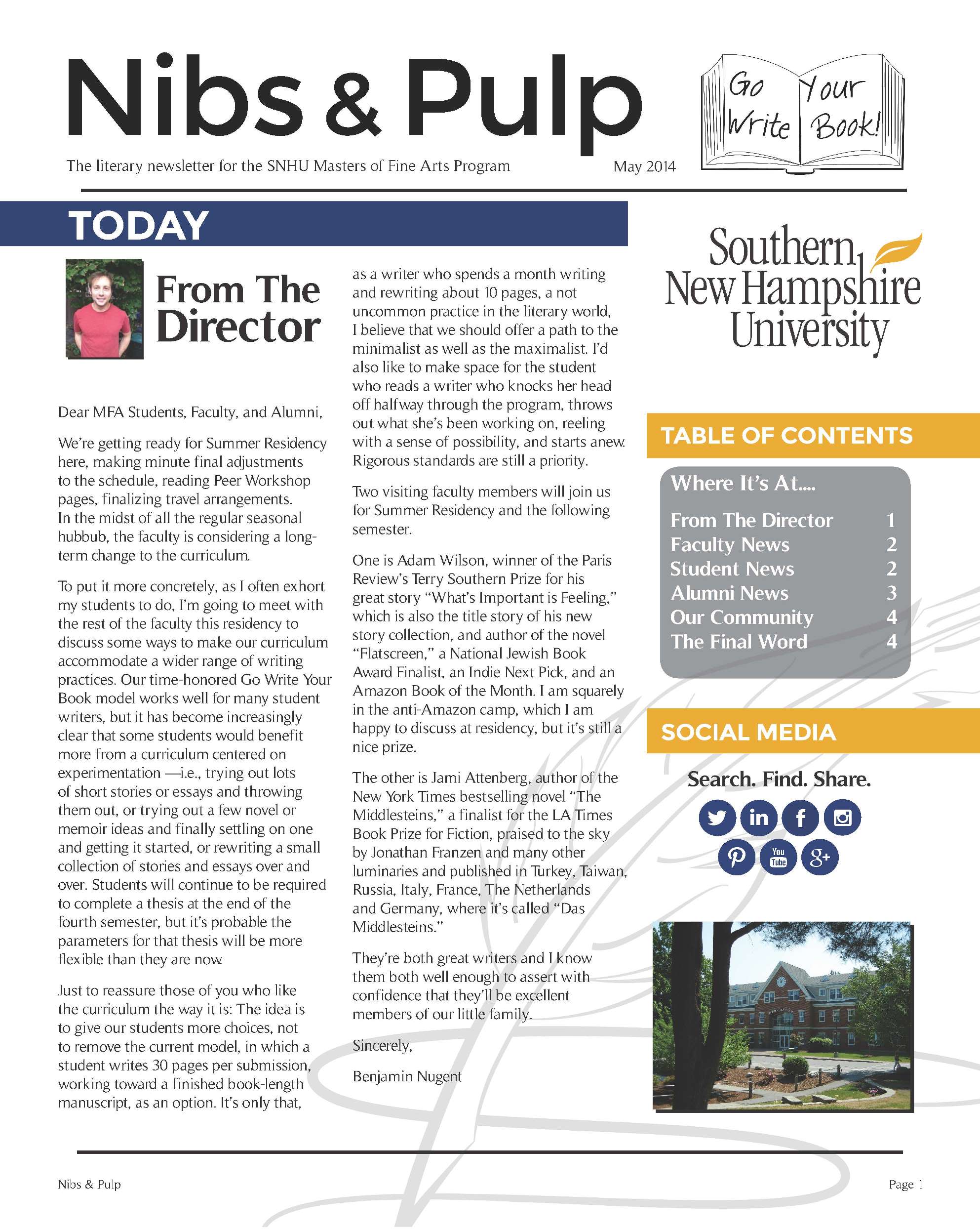
Newsletter
Typically I work often in page layout and design, but restricted to working in Microsoft Word, for ease of document sharing. This project, redesigning a newsletter, allowed me to branch out and get to know InDesign better. Not only did I learn more of the program, but improved my working with visual hierarchy and emphasis.
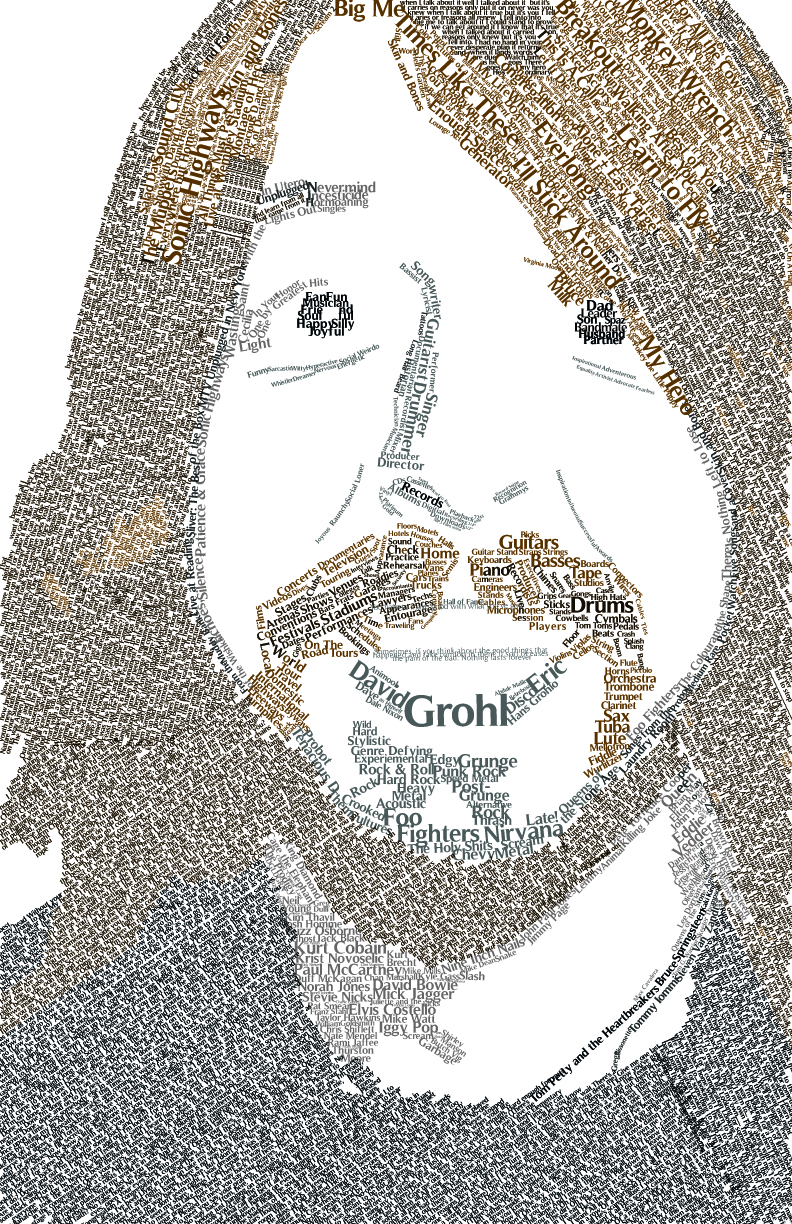
Dave Grohl
Typography portrait of a celebrity of my choosing. I chose Dave Grohl, who I find endlessly fascinating and talented. This was a really fun project, and gave me a new appreciation for typography. My lovely wife was so fond of the portrait, she had it framed. I call that a seal of approval.
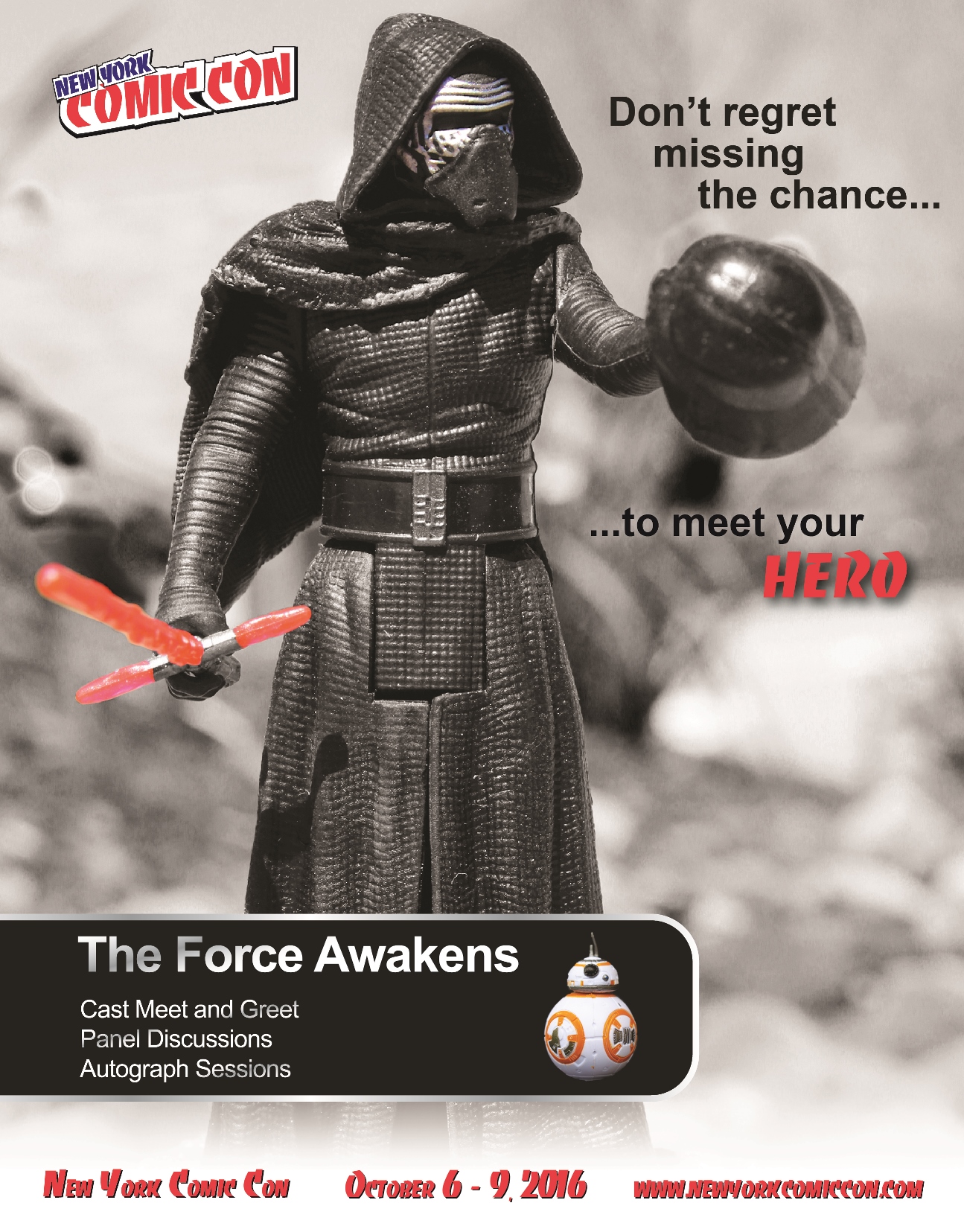
Sad Kylo
This developed from an assignment to create ficticious advertising for a real event. Comic conventions are much more than comics, so I parlayed this knowledge, and my love of Star Wars, into an advertisement meant to play on the emotions. I think it works, with a bit of tongue in cheek humor.
Logo Design
I love logos for the same reasons I love icons, they convey so much information with so little in a very short amount of time. And the best ones become iconic and memorable, part of the cultural fabric of society.
LAX
I created this logo for a potential partnership. I liked using the iconic imagery from the Los Angeles Airport, and really liked the use of color to connect LA and LINX and allow the audience to pick up the visual cue this is a partnership and product for LAX.
Partnership
This logo was developed to indicate a partnership, but also show a respect and care for the region and community. Using the blue graphics, I made a simple look of two components coming together for the Great Lakes, but positioned them to be cradling the image of the region, showing the concern needed to be conveyed for the customer.
Interlocking Imagery
This logo was much more simplistic, and I think works well. Each word in the partnership name began with a T, and the focus of the partnership was transportation. I created a pattern that shows interlocking T's, and looks like pairs of train tracks, conveying the name and purpose using negative space.