123 Main Street * Anytown, NH 03000 * 555-123-4567
Wednesday – Friday 9:00 am – 5:00 pm
Saturday and Sunday – 8:00 am – 5:00 pm
Wednesday – Friday 9:00 am – 5:00 pm
Saturday and Sunday – 8:00 am – 5:00 pm


The very first thing that you need to know about this site is that, the web site creator does play golf, but, the only way I would stay in double digits is to stop after around 10 holes. Do not take any of the advice that I have written here as fact. The links do go to professional sites and, if you truly are interested, I do recommend that you check them out. With the right people, golf can be a great day, with the wrong people, it can be three hours of hell. So the best advice I can give that I stand by, chose the people you go golfing with carefully.
The feel that I wanted for this site was one of a "home-made" site. I had created a few fancier logos, but didn't like them for the context. Even with those logos, the layout of the site remained the same. The header area and the links on the left are the same on all pages in order to provide a continuity throughout the site. For the colors, in my mind, golf is green. So the background color is exactly what I wanted. For the logos and text blocks, I had tried a few differnt colors, but settled on the yellow as I thought that provided the easiest readability along with a nice compatability with the green.
The text font does have a slightly reduced readability compared to a sans-serif font, but it also keeps with the old-school look better. The script used in the logos, I just like. I can completely imagine a sign made to look like the main logo.
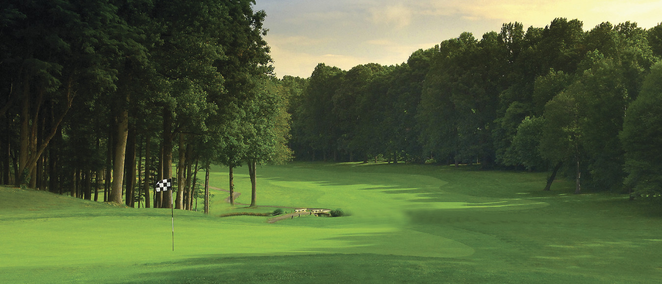
The image on the address is © https://www.restonnationalgc.com/ All other images were taken by the website creator and are © JWM