Graphic Designer
& Illustrator
Design Portfolio & Résumé
Transpose PDX: Logo
Logo Design
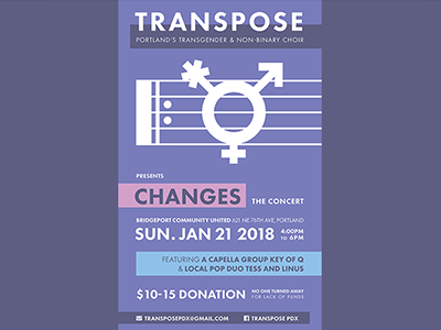
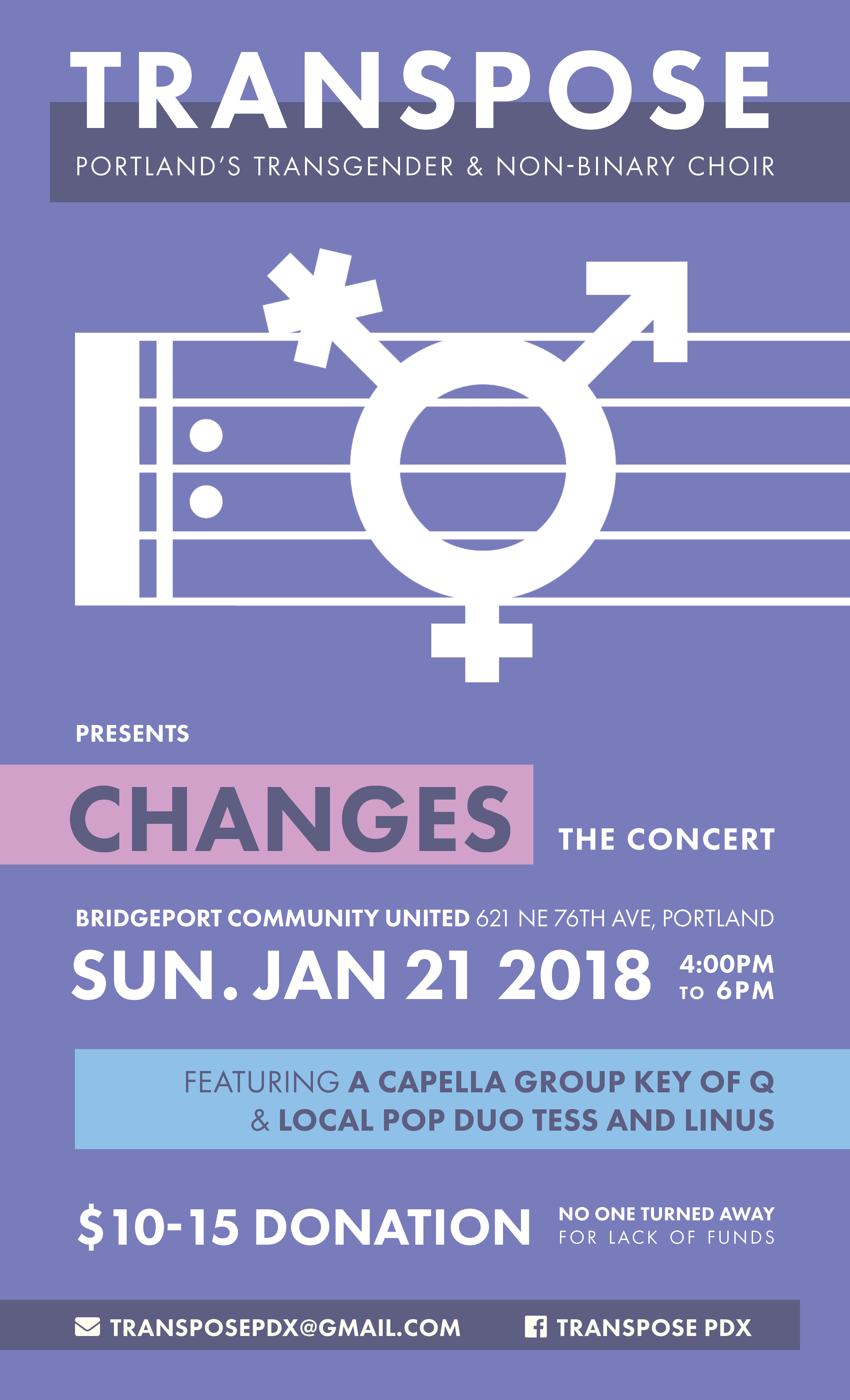
Transpose PDX: Changes
Print Design
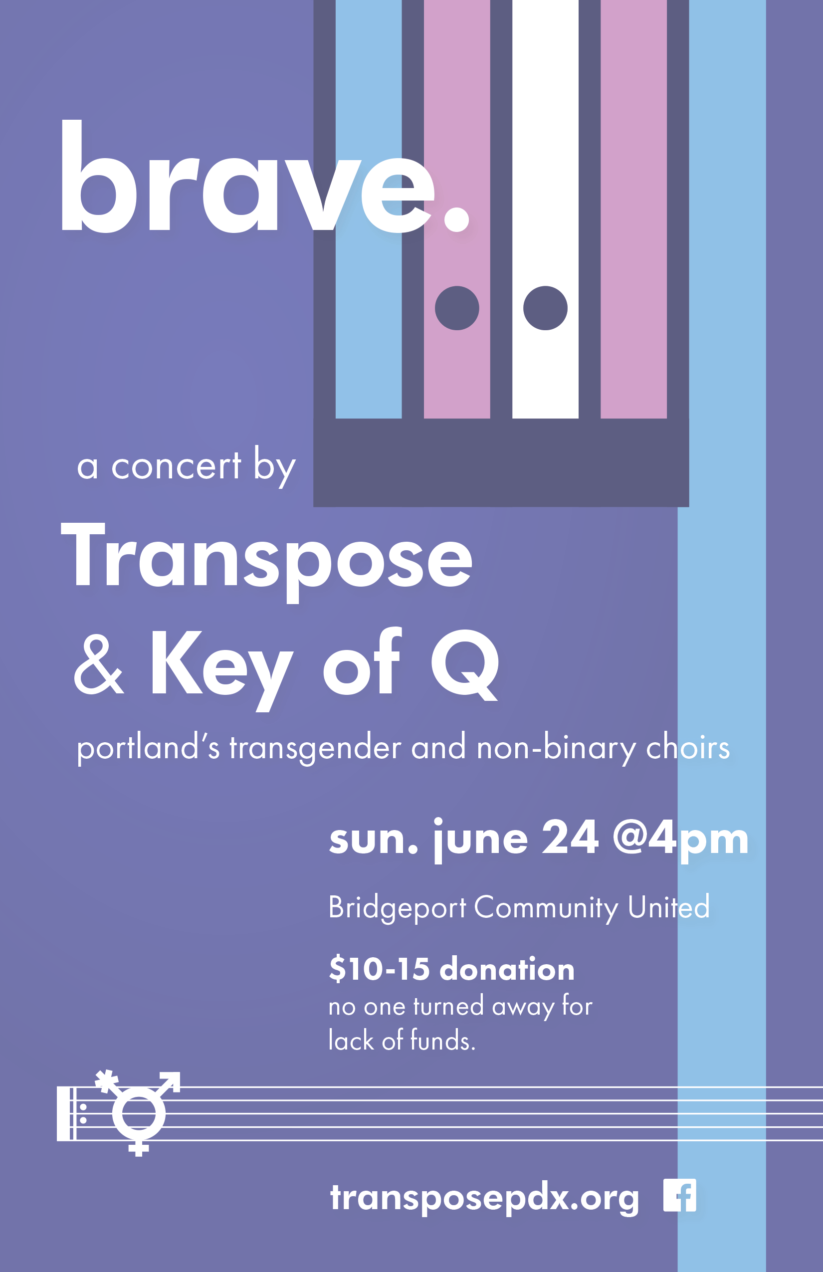
Transpose PDX: Brave
Print Design
Nothern Lights Studios: Logo
Logo Design
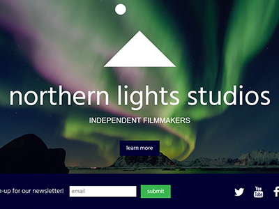
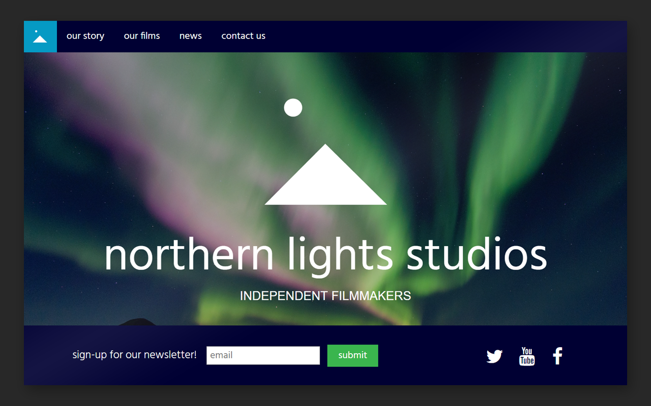
Northern Lights Studios: Website
Web Design

Nothern Lights Studios: Business Card
Print Design

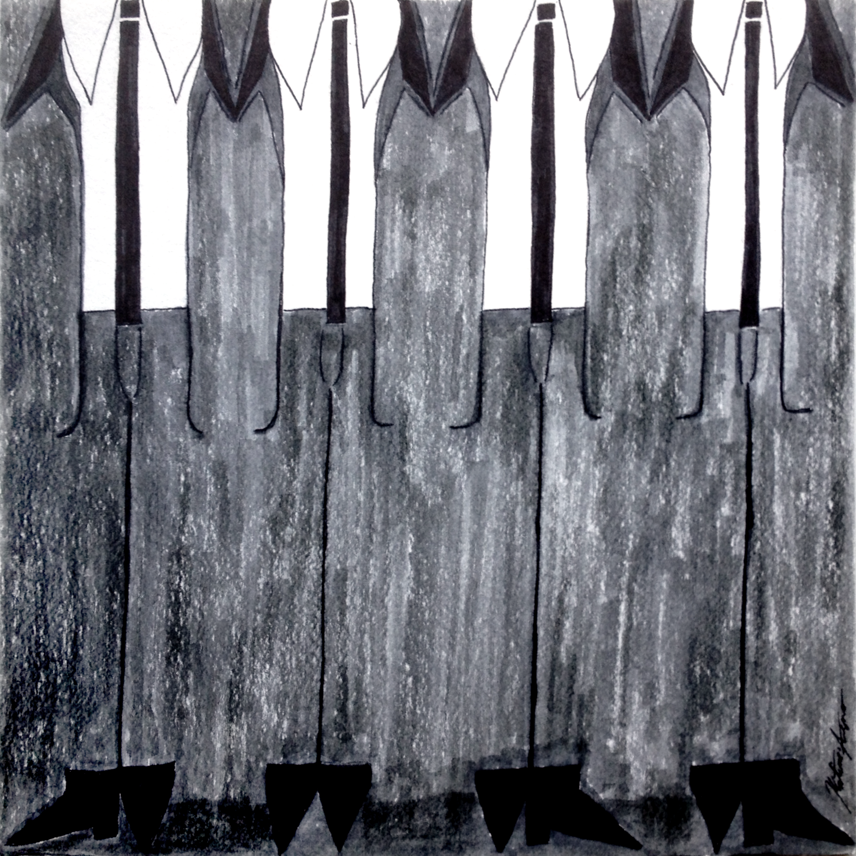
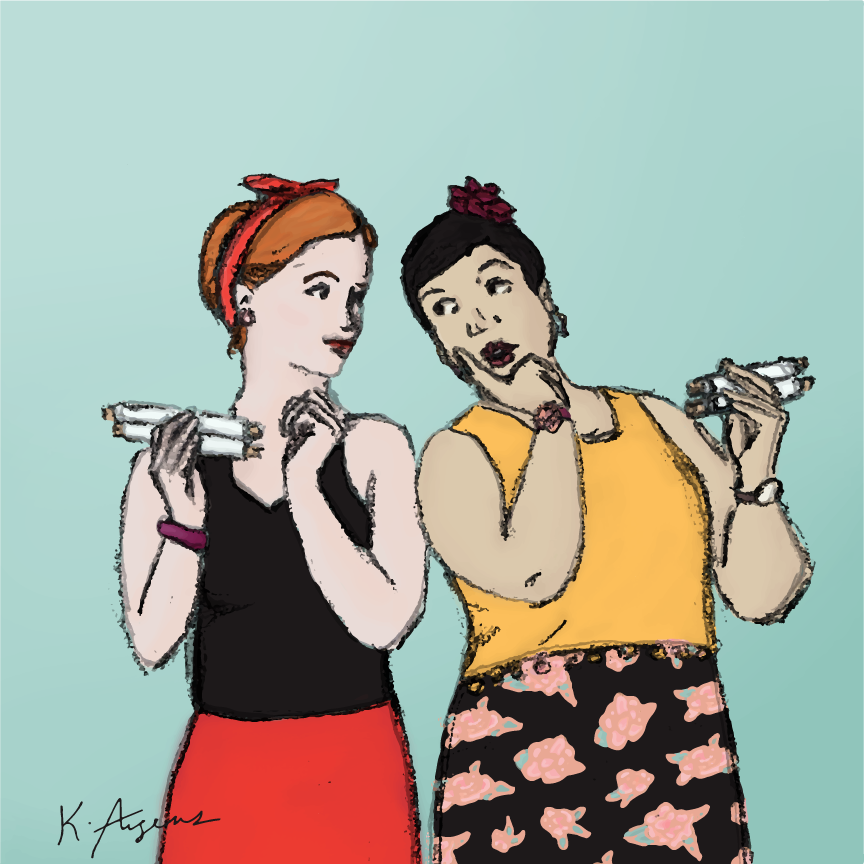
Boots and Suits
Illustration
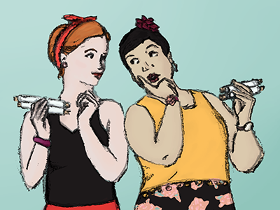
The Merry Wives of Windsor
Illustration

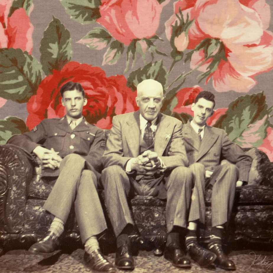
The Van Haaftens
Digital Collage