About
Documentation
I saw an opportunity to make a good website that was familiar to my area and was a good opportunity to possibly adapt to a real tavern in the future. There many Irish themed/style bars in Central Massachusetts and I had acces and permission to take a few photos of a bar and food. I first researched some Irish themes and how I could incorporate them into a website. Theere were a lot of themes that were either too cheesy or dated looking or just over the top. I wanted to make it apparent but not in your face. I decided to find some patterns and try to find a good balance of colors. Through the peer review in Module 6, I took some suggestions and changed a few of the colors to make text and other things a little easier to look at. I did a lot of research on CSS technigues on W3 Schools and on Pluralsight. I thought I should keep track of a few things in comments like the real colors instead of RGB or hex color code.
I wanted to make sure I had checked all the boxes on the final project so I followed carefully the requirements. To make sure I had a multimedia object, I embedded an Eddie Money video (originally a Sinead O'Conner but it was blocked from embedding by the record label), and put that on the Events page as I thought that was a good fit. Lastly, I wanted to go through my code to make sure there were not elements that were left over from building it, and stripped out old CSS elements not in use anymore.
Design Choices
I wanted to make it an Irish theme pub/tavern website, so I wanted to have a dark theme (for the nighttime crowd) with green and orange highlights. I did not want it to be a typical four leaf clover theme that would be tacky so I wanted to find a nice pattern to offset the green and orange. I changed the green text on the black background to make it easier to read but also decided to stroke some of the text to make it pop as I thought that looked nice. I did so using text-shadows with CSS. Lastly I wanted to make the menu pages to look a little more interesting so I put a border around the images. Also added a radius to the corners to clean things up further.

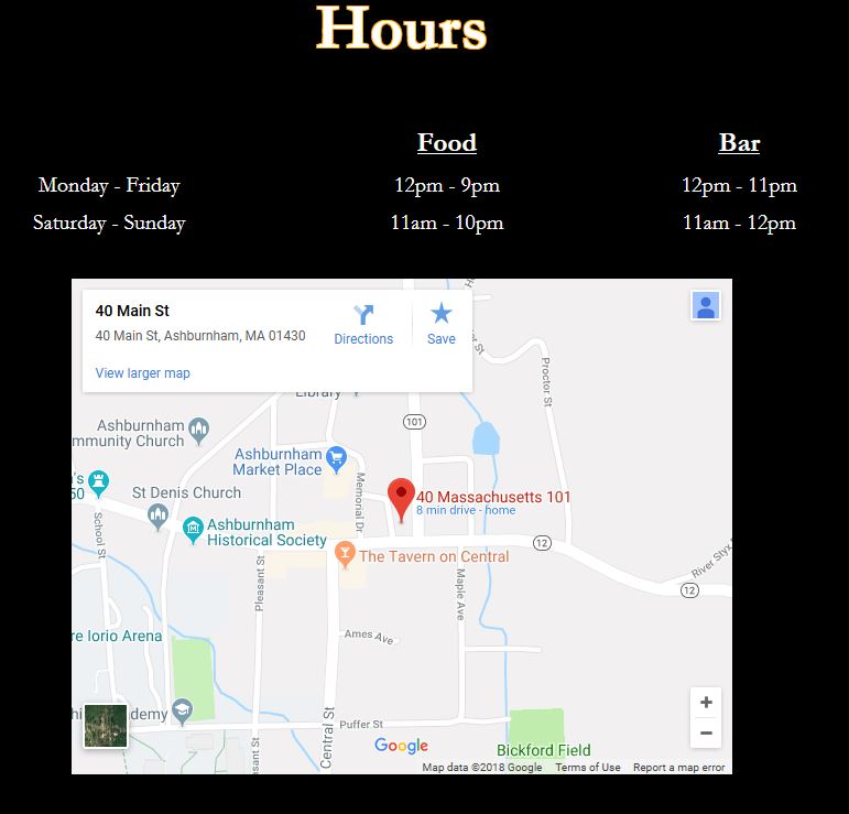
I wanted to have an embedded map on the contact us page so I found a non-descript address in my town as a fake address to use. I think it is always nice to have a map on websites, especially on mobile as it makes it really easy to get directions right from the embedded map.
I believe this is a good website for a small business and a good fondation to grow upon, I have seen many websites that are really cumbersome to use or do not give the information needed.
The Future
I plan to further test anything new I learn with HTML and CSS on this website. My wife knows the owner of a local bar that the site could be adapted to be used. While this is not the most advanced website, I think it looks nice and better than a lot of other published small business websites. With more time, I think I would have found a better way to display the menu items, a table works but I was never happy with it. I think some features in sites that are animated while you scroll work nicely, but would need to research how that works. While I knew HTML and CSS were not completely foreign to me, I always felt more comfortable with looking and combing through already built sites source codes than building something myself. Now I feel like I could make a real personal website in the future and not look like old 90s "ex-page" and Geocities pages. I know there are many services that will do it for you with just a few clicks but I feel like this is the way of the future for me, and it is more rewarding.