
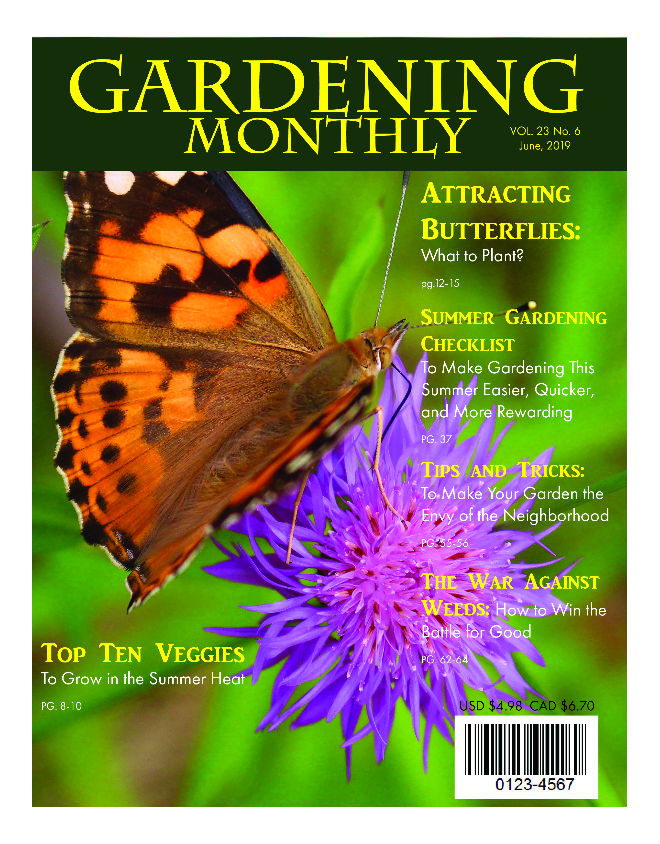
My goal for the Gardening Monthly magazine cover was to create realistic cover, using knowledge of color, typography and hierarchy. The target audience for the Gardening Monthly magazine cover are garden enthusiasts, those wanting to learn more about gardening, younger, older, male and female readers.
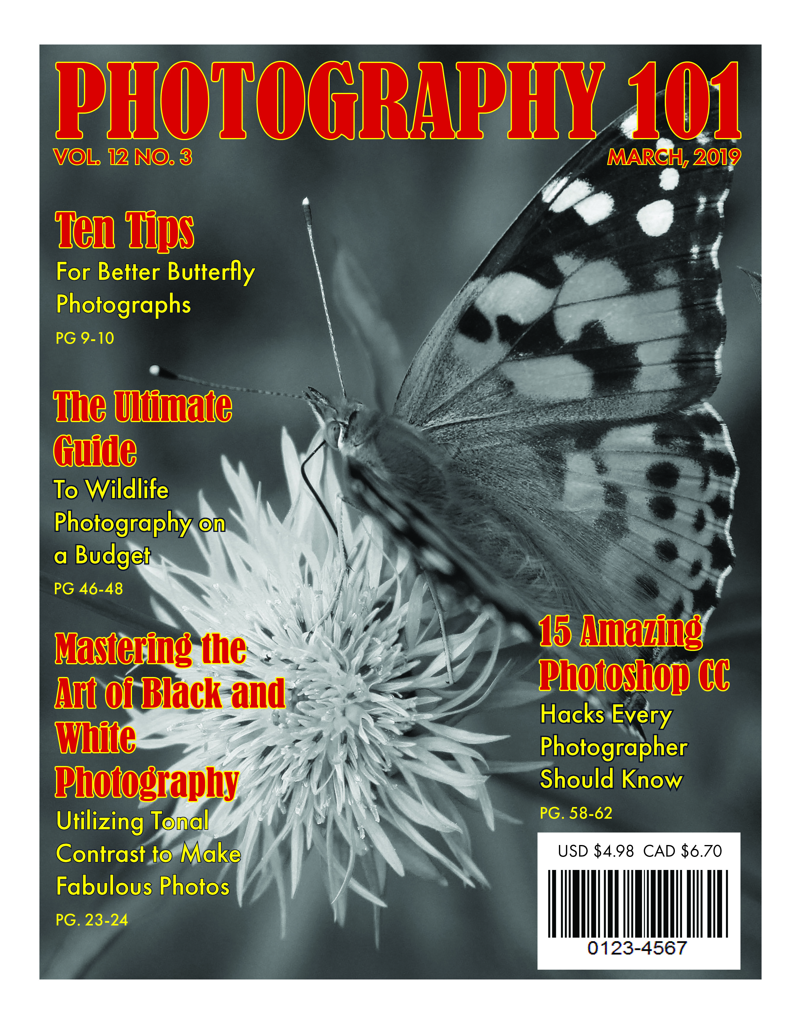
My goal for the Photography 101 magazine cover was to create realistic cover, using knowledge of color, typography and hierarchy. The target audience for the Photography 101 magazine cover are photographers, photo enthusiasts, those wanting to learn more about photography, younger, older, male and female readers.
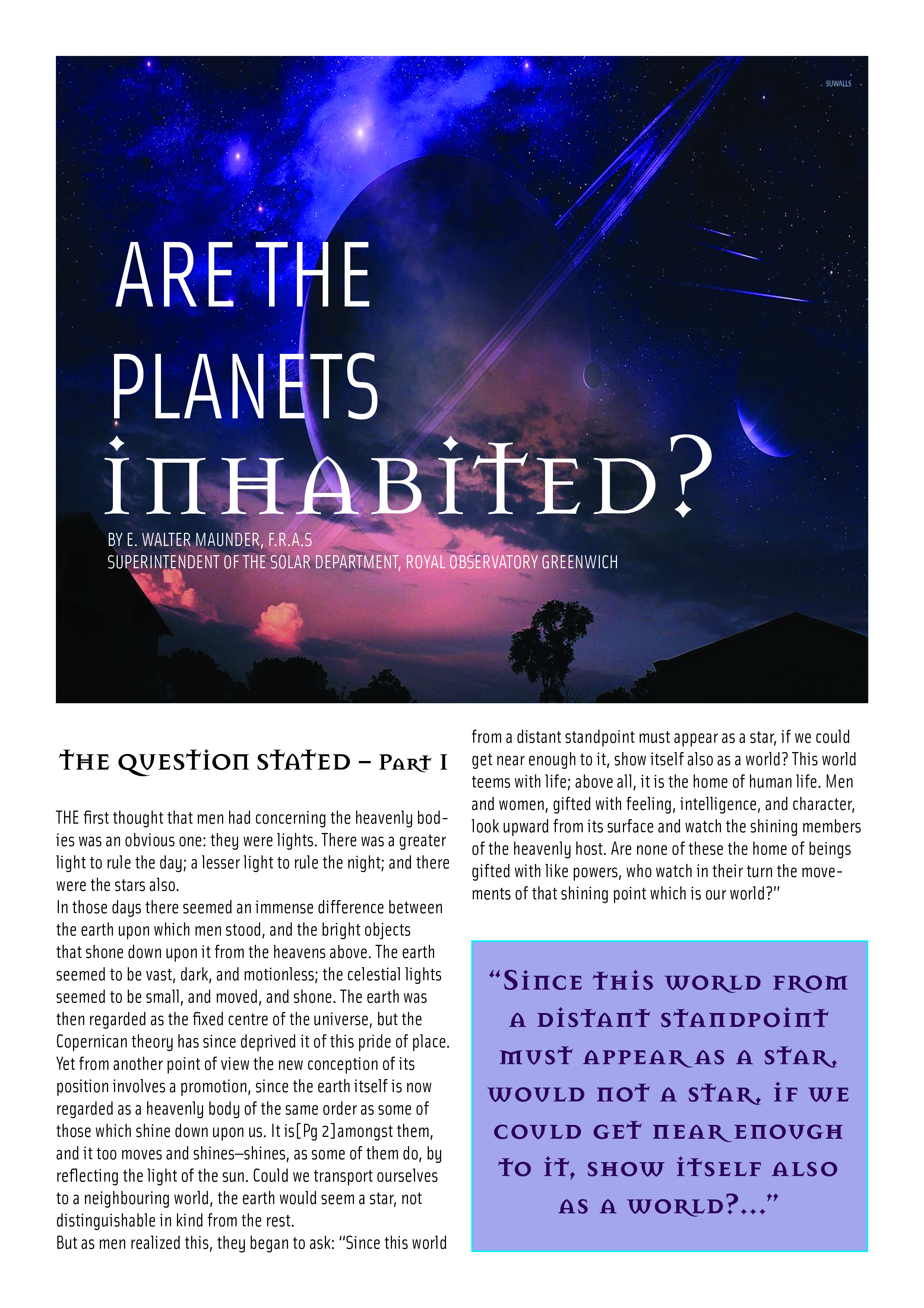
My goal for the “Are the Planets Inhabited?” purple article layout was to create realistic article layout, using knowledge of color, typography, balance, spacing and hierarchy.
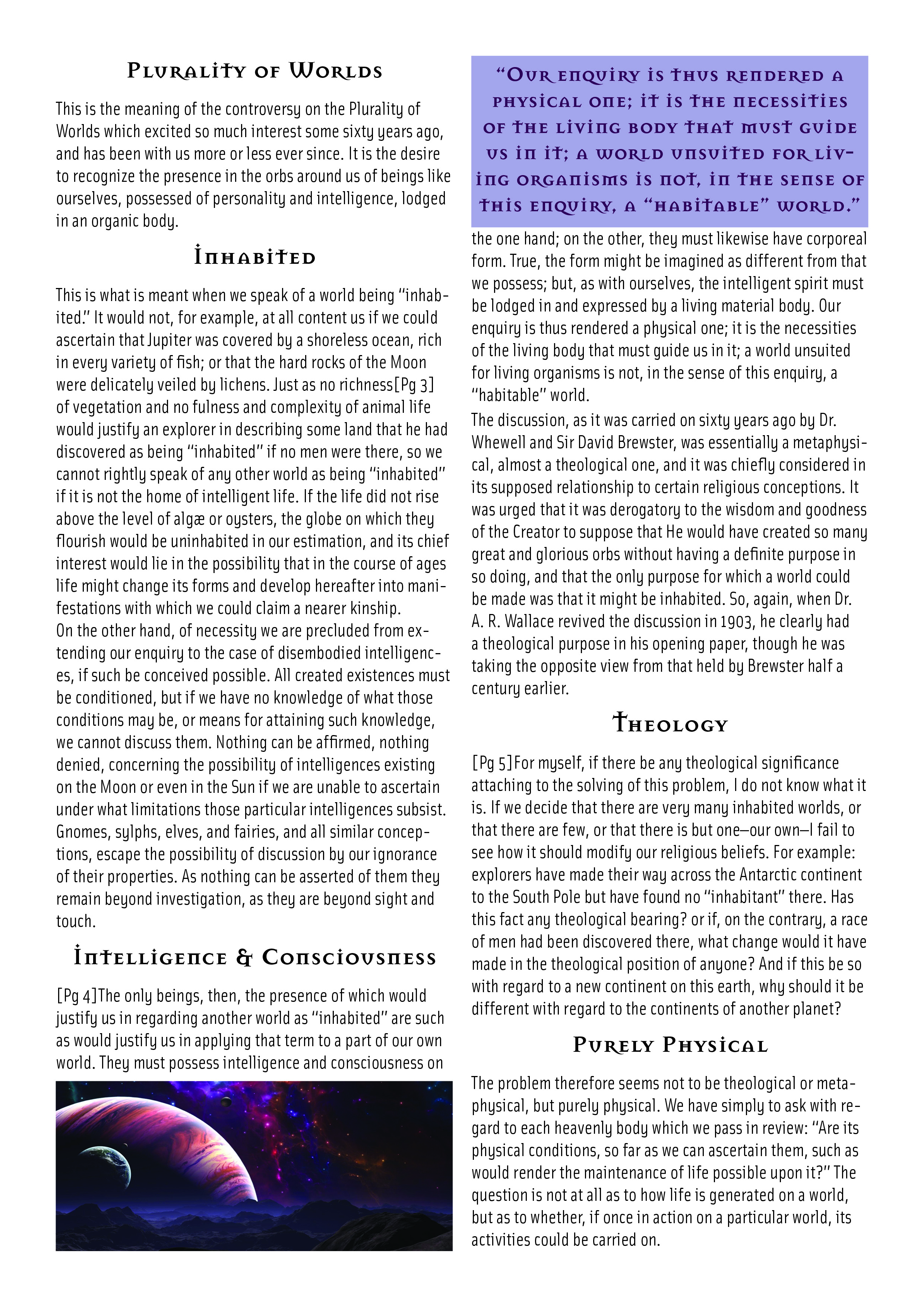
The target audience for the purple article layout cover are scientists, science enthusiasts, teachers, students and those wanting to learn more about the planets and their possible inhabitants.
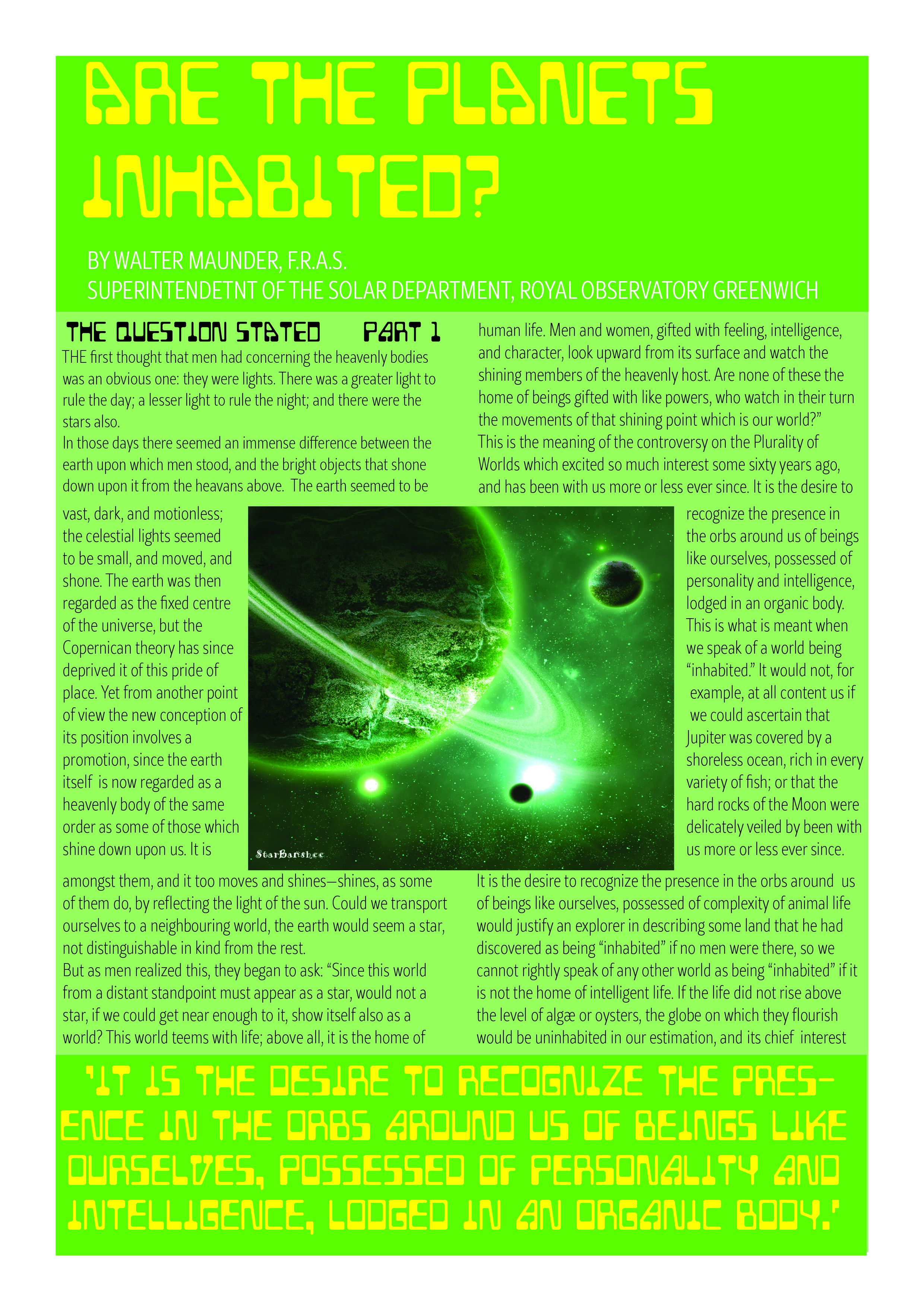
My goal for the “Are the Planets Inhabited?” green article layout was to create realistic article layout, using knowledge of color, typography, balance, spacing and hierarchy.
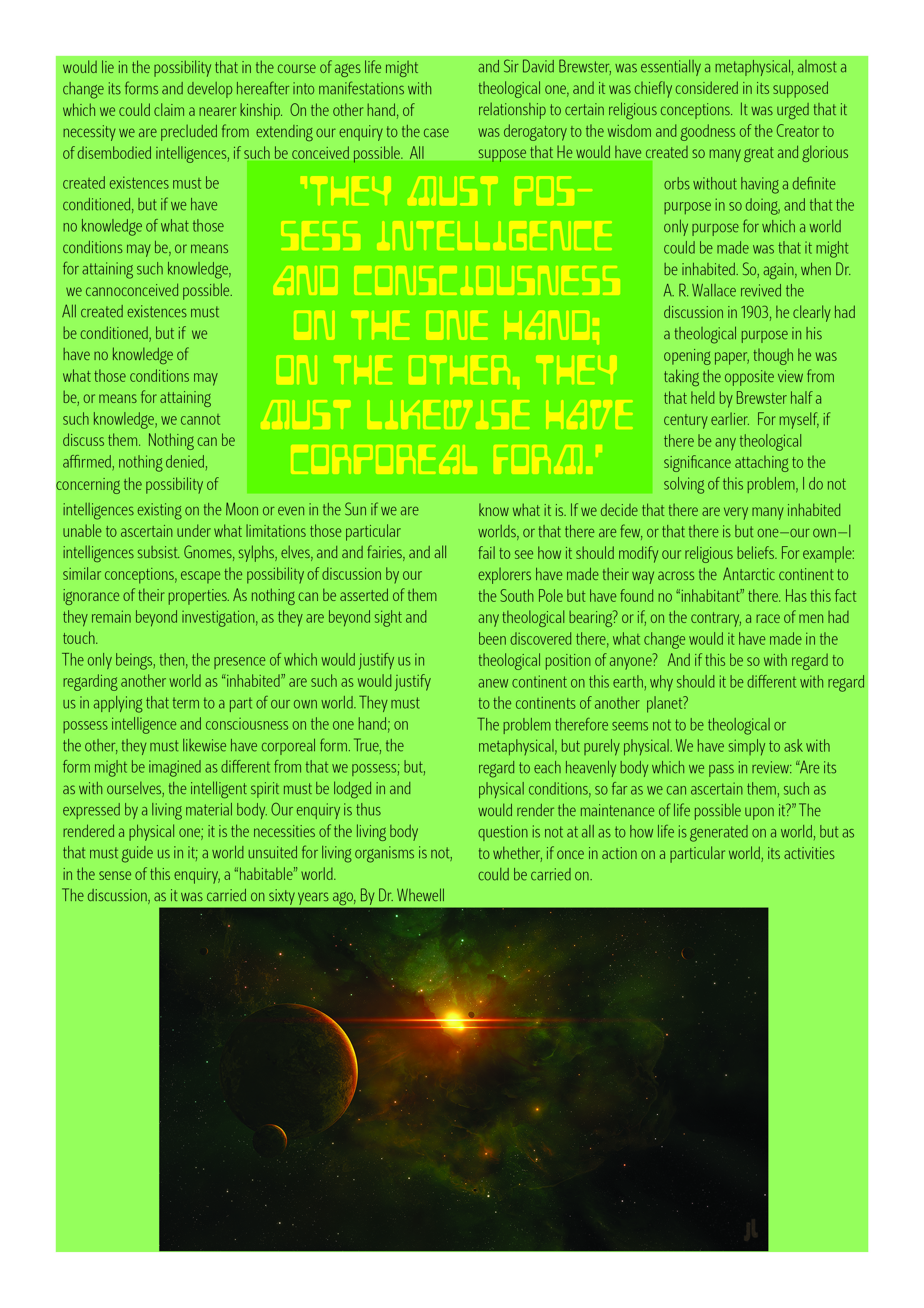
The target audience for the green article layout cover are scientists, science enthusiasts, teachers, students and those wanting to learn more about the planets and their possible inhabitants.
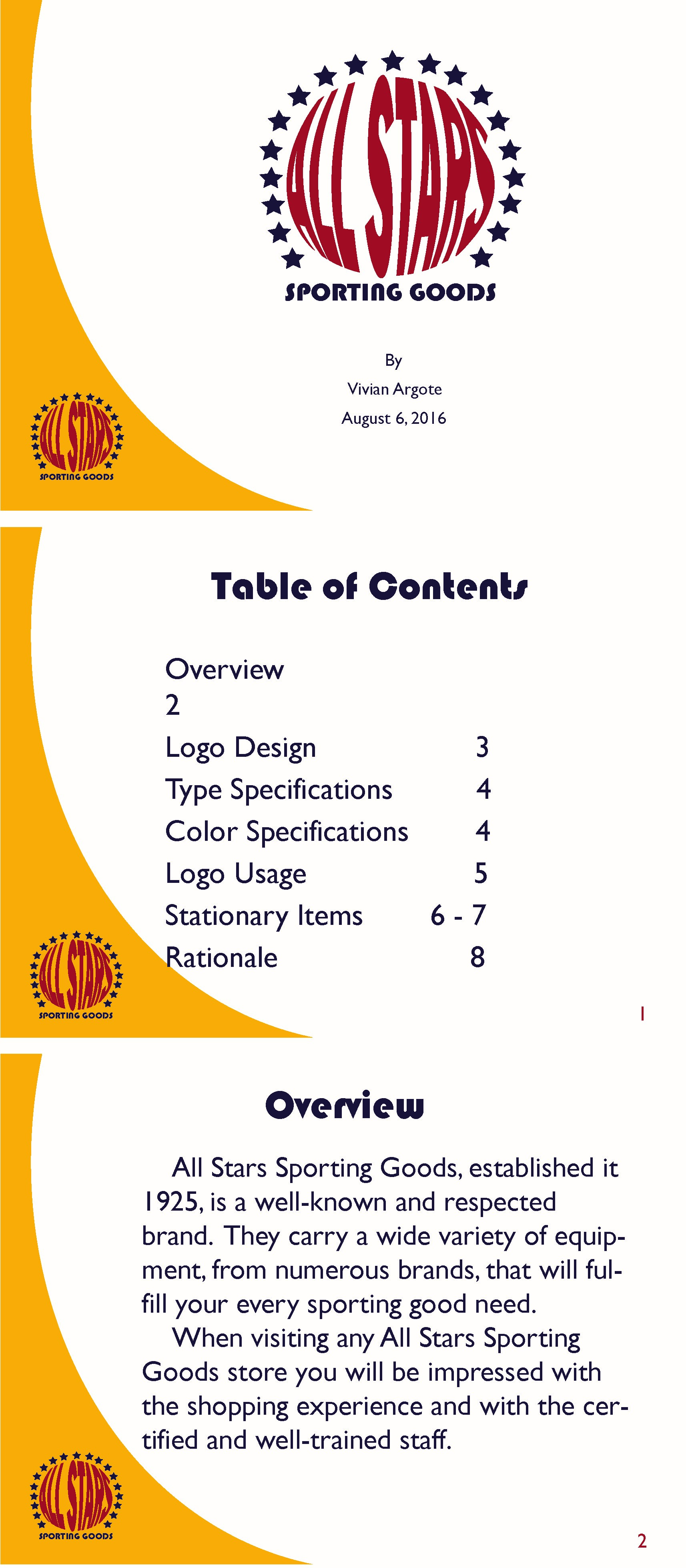
My goal for the All Stars Logo Portfolio was to create usable and cohesive brand guide or portfolio, by setting the parameters of the brand, and using knowledge of color, typography and hierarchy.
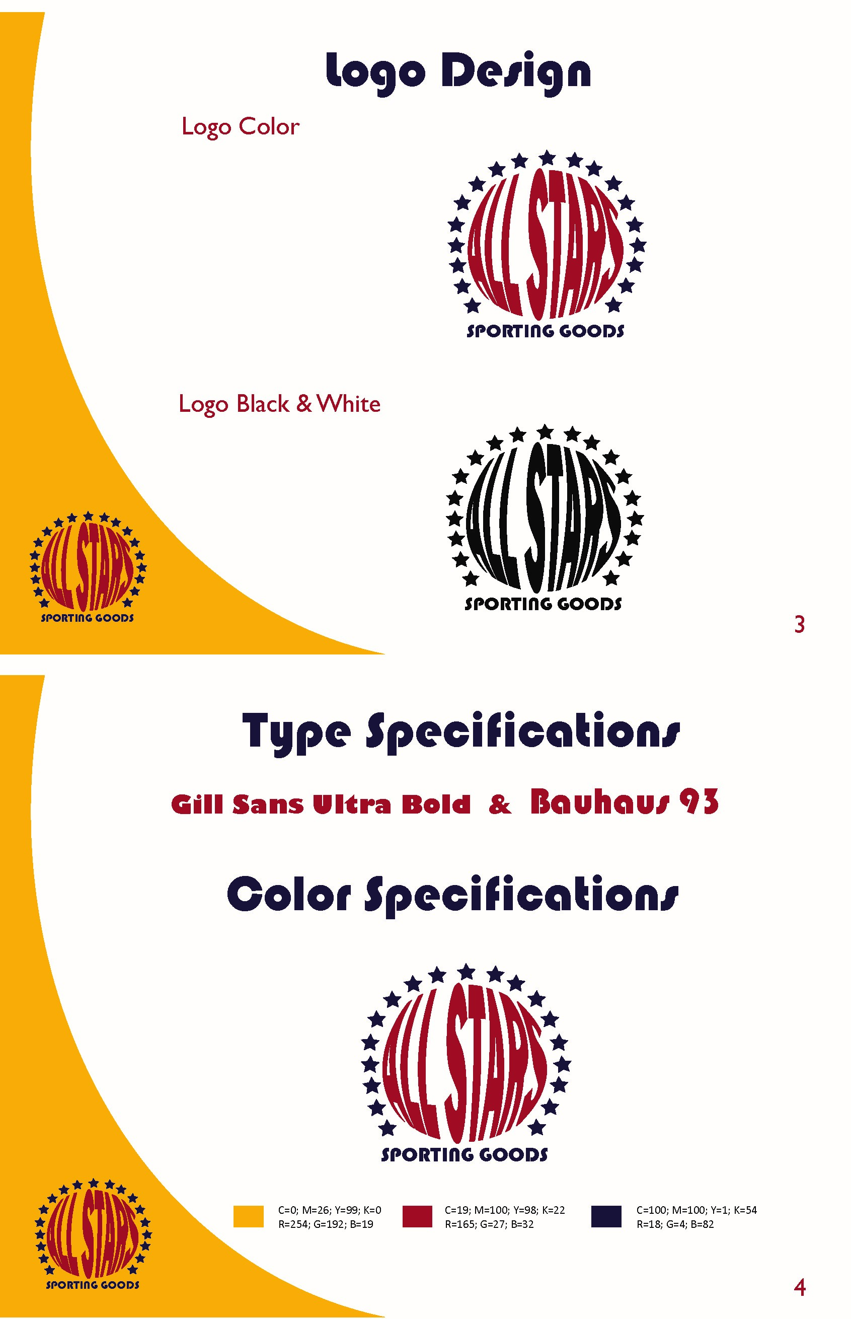
The target audience for the All Stars Logo Portfolio is the All Stars sporting goods company, any marketing firms they may use, and their customers.
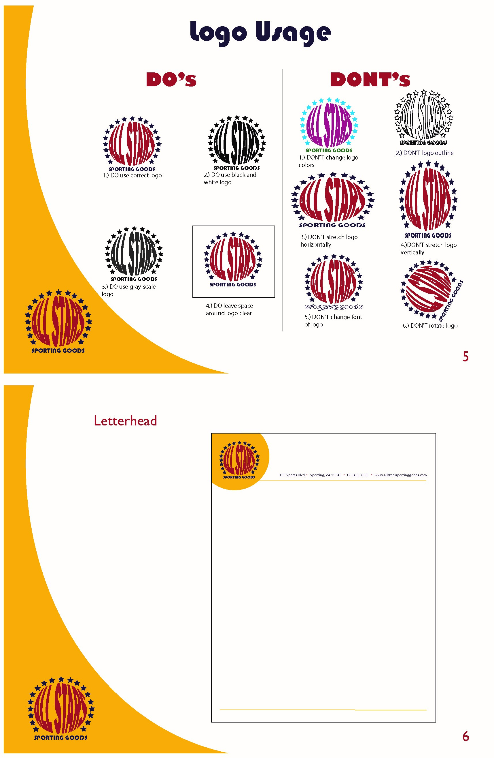
All Stars Sporting Goods a fun, quality, trustworthy, and family friendly sporting goods retail establishment.
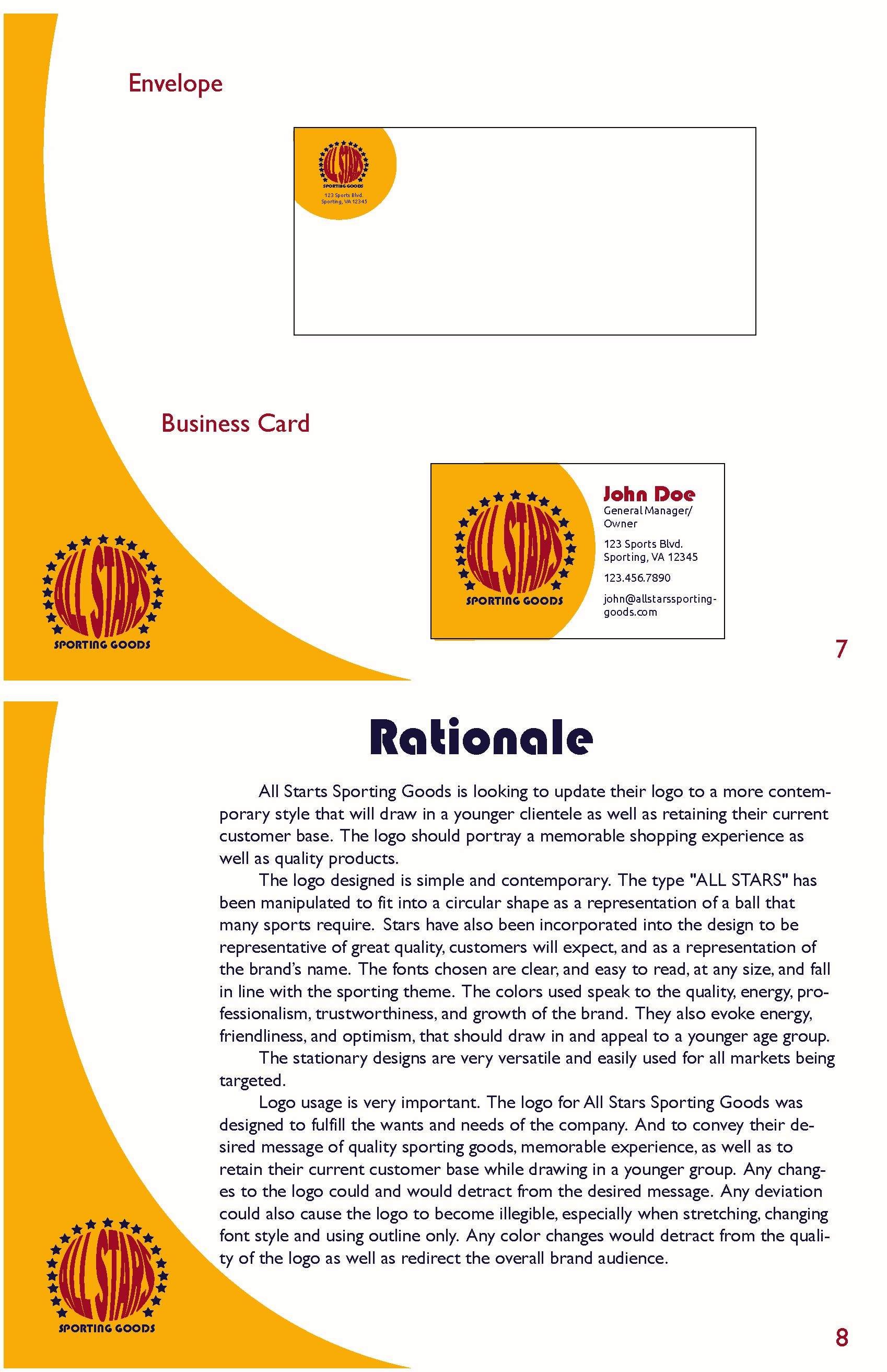
The portfolio displays cohesion, in color and balance, and creates a consistent and creative layout design, utilizing suitable spacing, balance, color contrast and continuity, that is relevant and impactful for the All Stars Sporting Goods brand and message.

My goal for the Amethyst Bay Ad was to create realistic magazine ad for destination weddings at the Amethyst Bay resort, using knowledge of color, typography and hierarchy. The target audience for the Amethyst Bay Ad are couples, young and old, that are planning a wedding or vow renewal. The couples may be looking for weddings outside of the traditional and love tropical weather and venues.
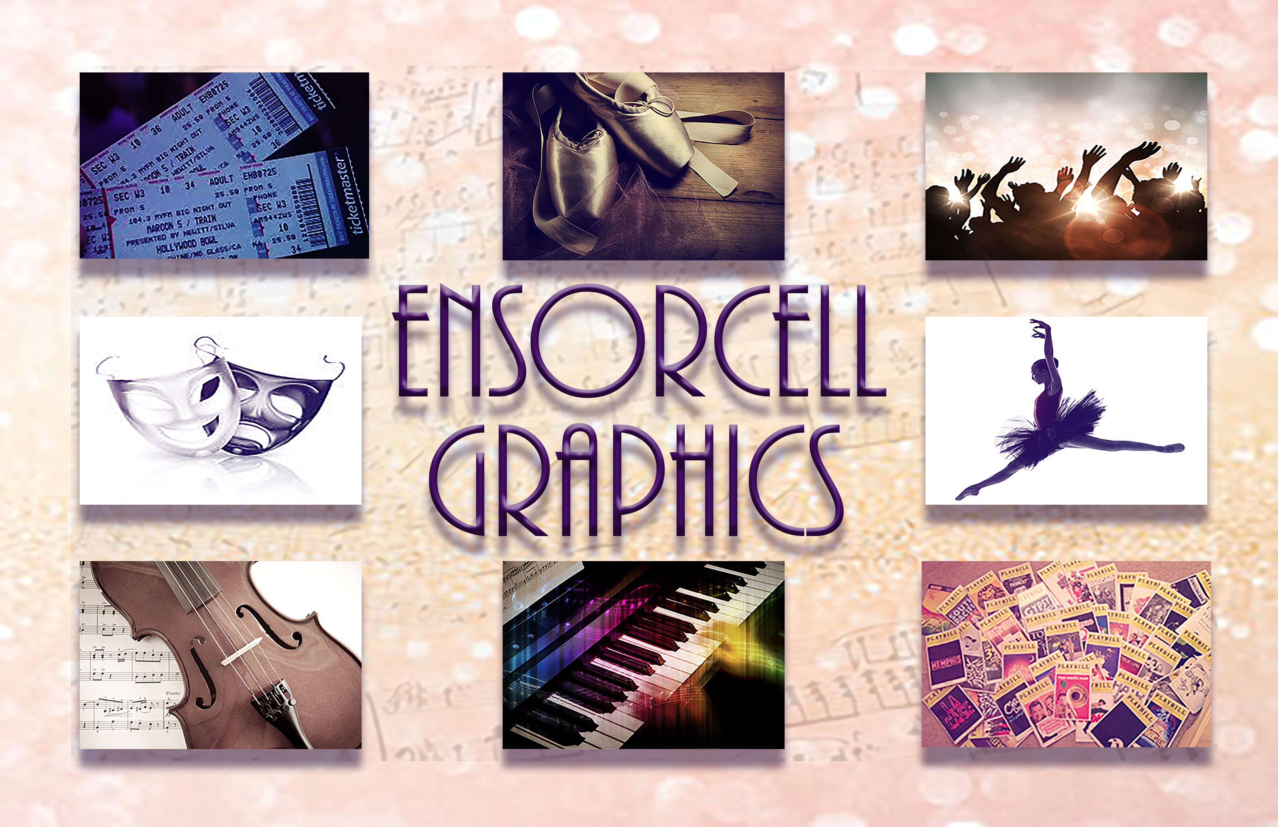
My goal for the Ensorcell Graphics Collage was to create a collage that displays the focus of Ensorcell Graphics, of the performing arts, using knowledge of color, typography and hierarchy, and dimension and layering. The target audience for the Ensocell Graphics collage are theater companies, music industries, performance venues, performers, that are looking to promote themselves.
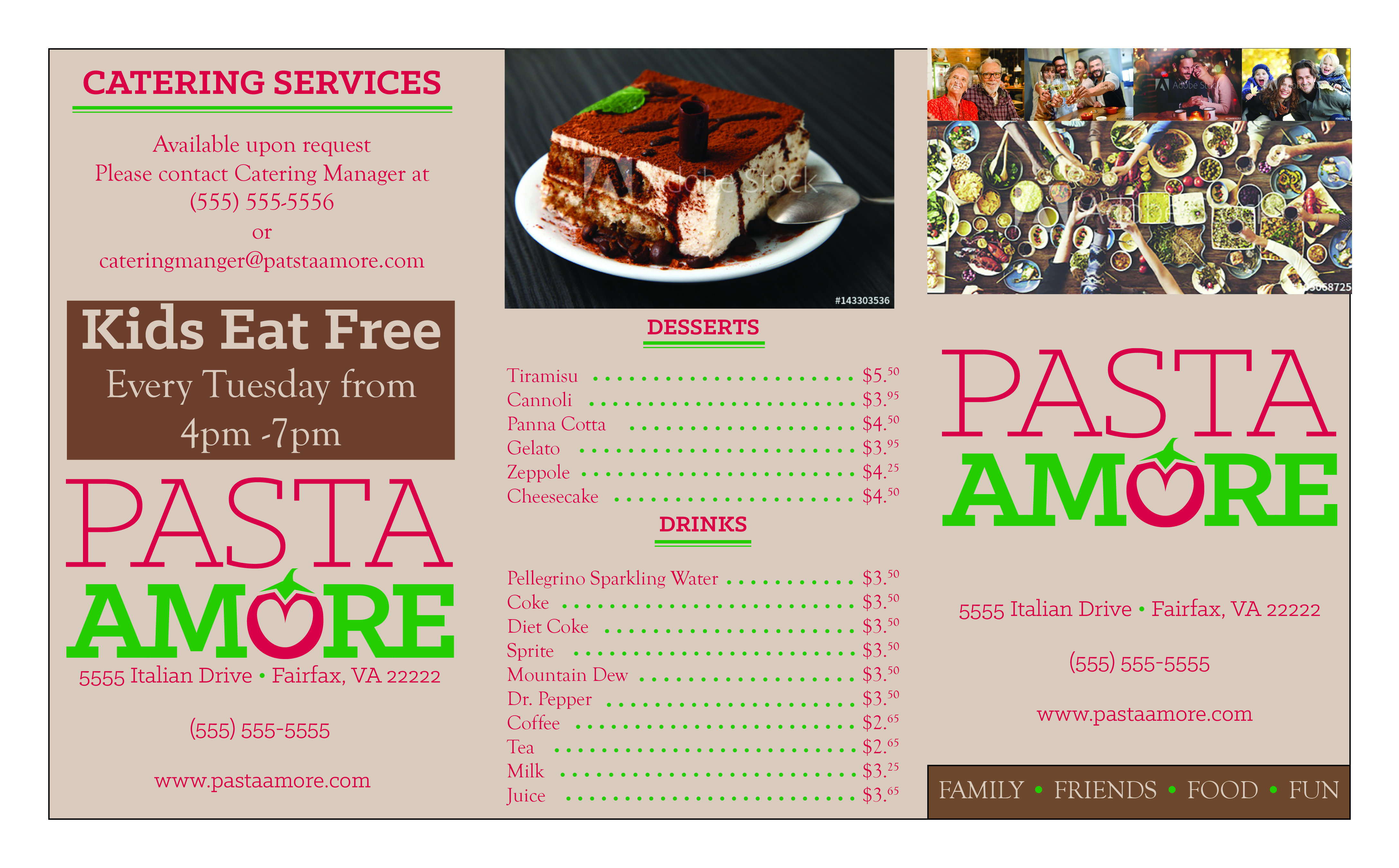
My goal for the Pasta Amore brochure was to create usable and cohesive brochure, using the parameters set by the brand and knowledge of color, typography and hierarchy.
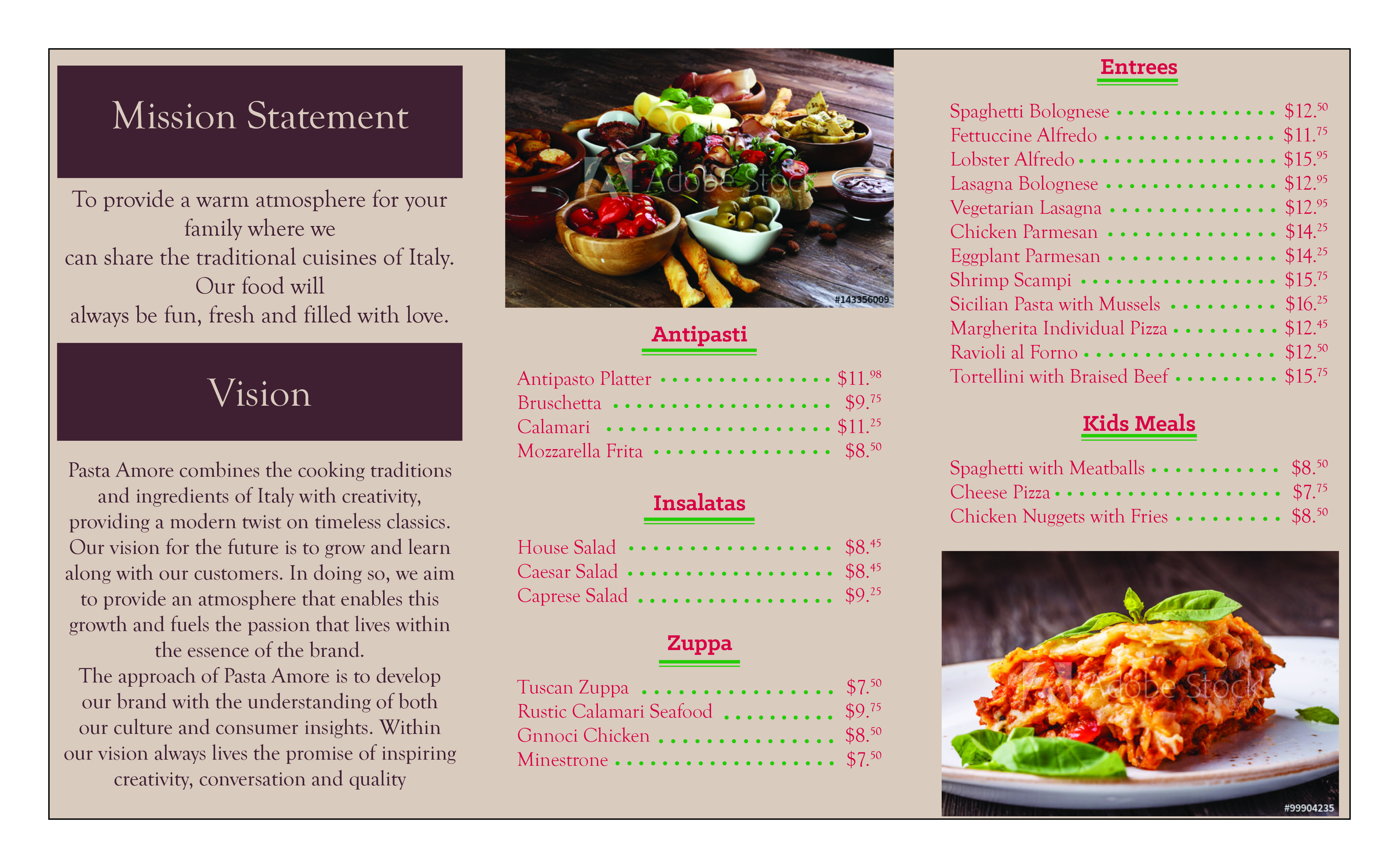
Pasta Amore had specific requests for logo usage, typography, colors, and audience. All these stipulations were considered and used thoughtfully without straying from their requests.
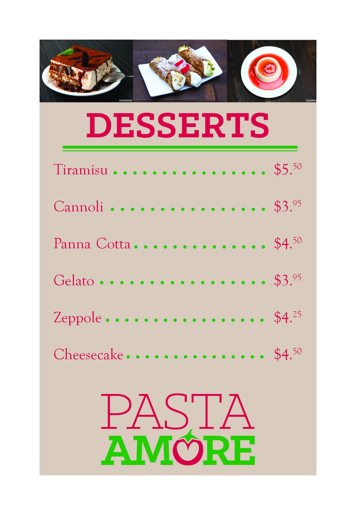
My goal for the Pasta Amore Tent Card was to create usable and cohesive piece, using the parameters set by the brand and knowledge of color, typography and hierarchy.
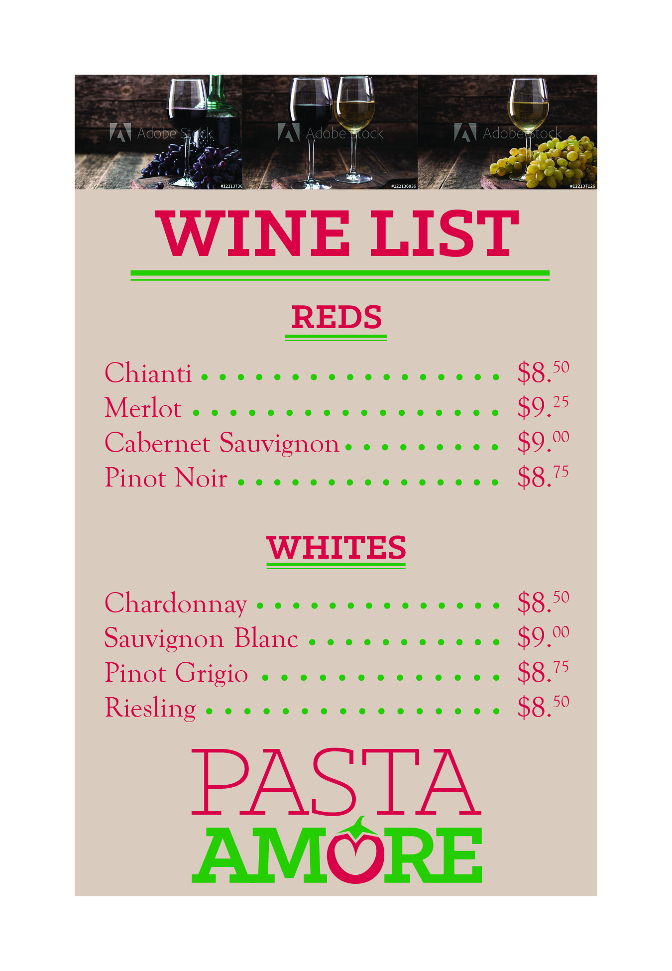
The tent card displays cohesion, in color and balance, and creates a consistent and creative layout design, utilizing suitable spacing, balance, color contrast and continuity, that is relevant and impactful for the Italian family restaurant theme and message.
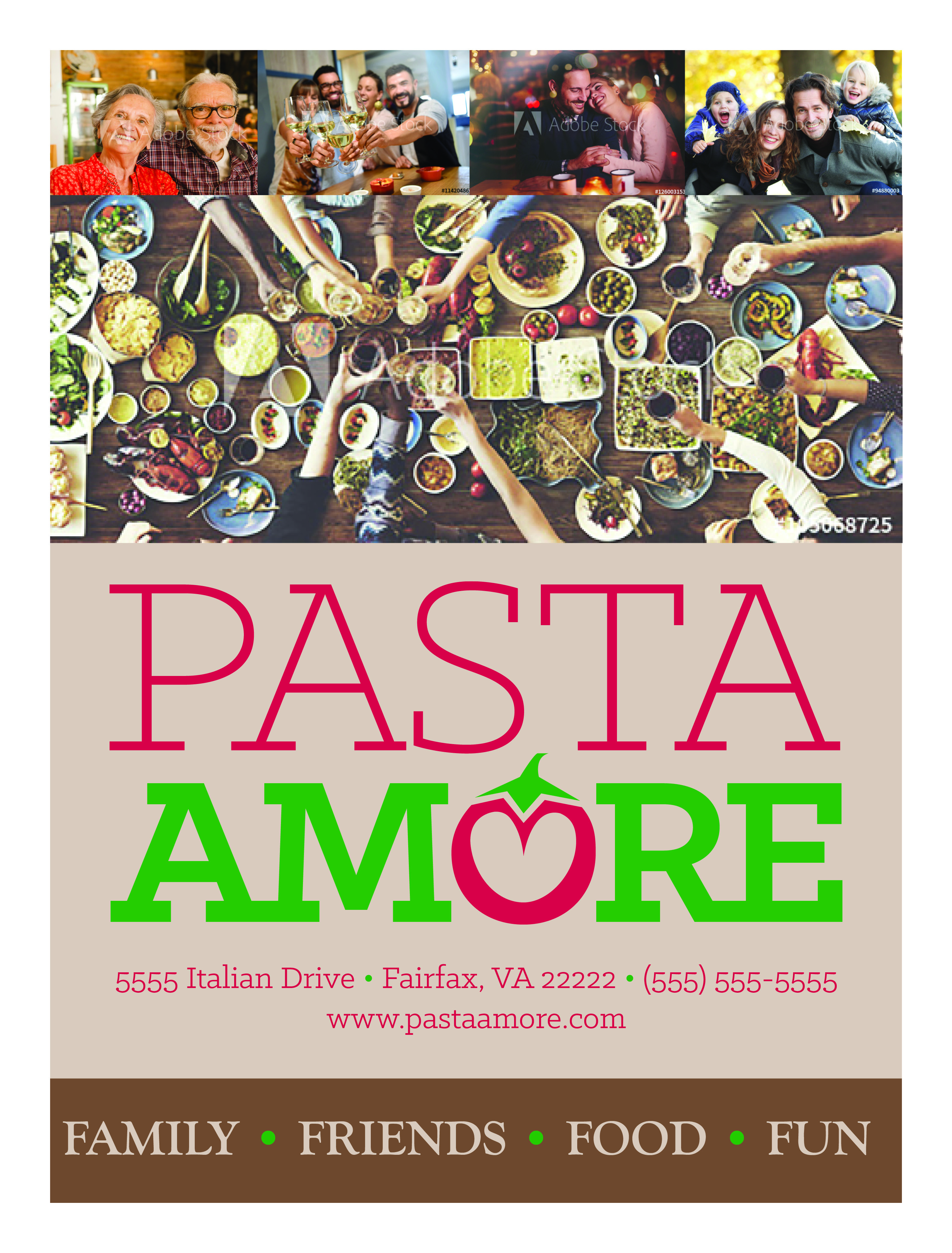
My goal for the Pasta Amore Menu was to create usable and cohesive menu, using the parameters set by the brand and knowledge of color, typography and hierarchy.
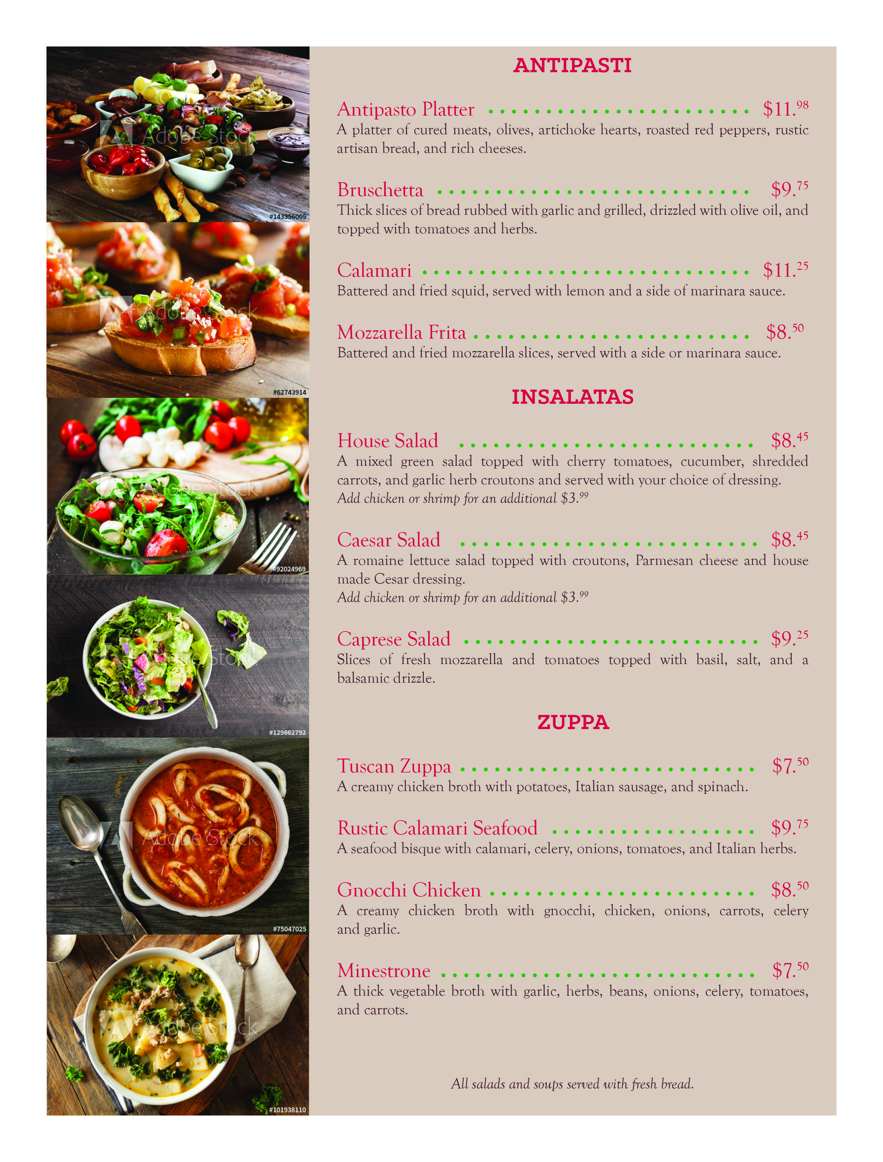
The menu has a cohesive color scheme, that was stipulated by the client, in their brand guide, is balanced, has complimentary typography, also stipulated in the brand guide, that demonstrates appropriate hierarchy, is aesthetically pleasing, and communicates effectively the purpose and goals of the Pasta Amore menu project.
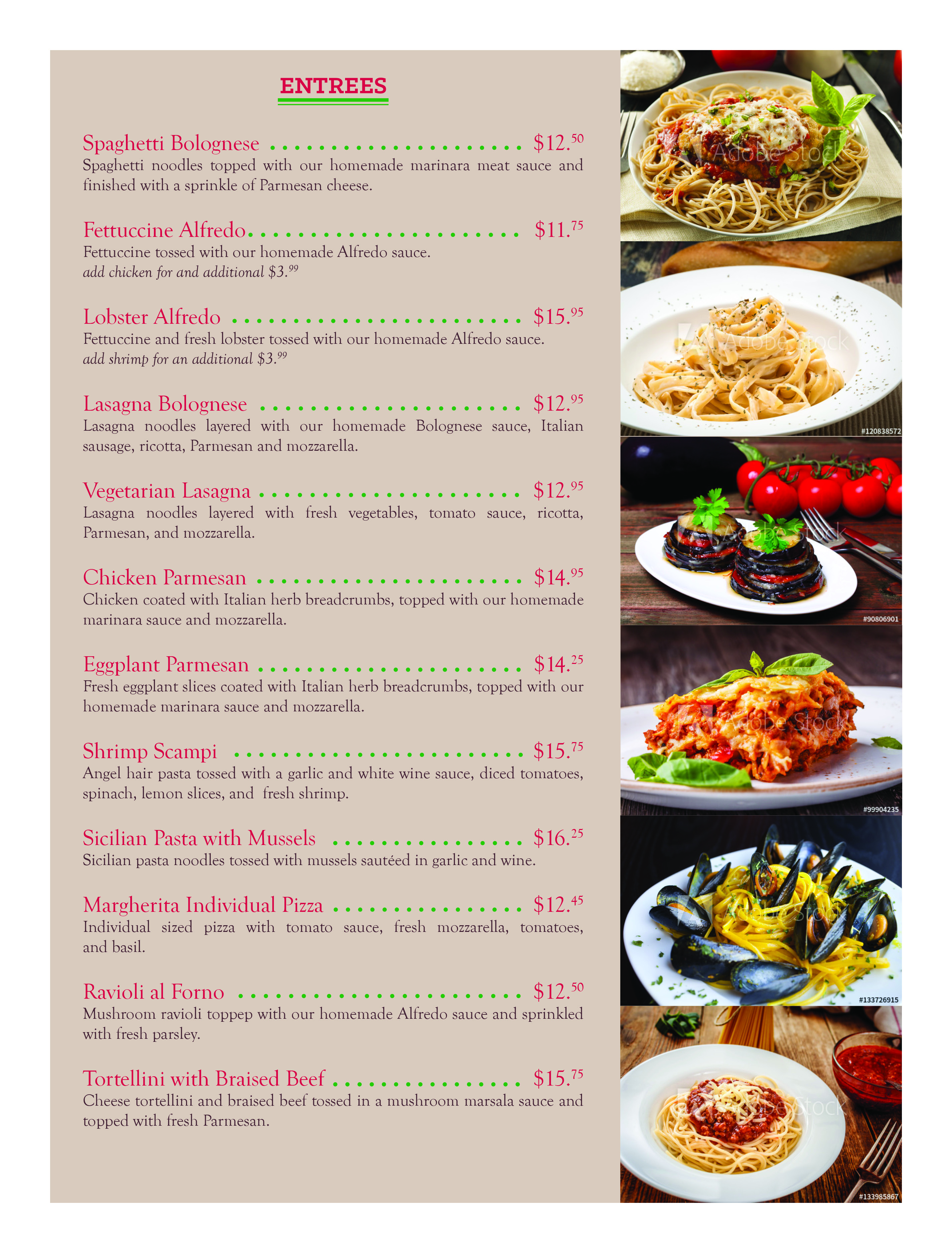
The target audience for the Pasta Amore menu are families, friends, couples, male and female, young and old, and all Italian food lovers.
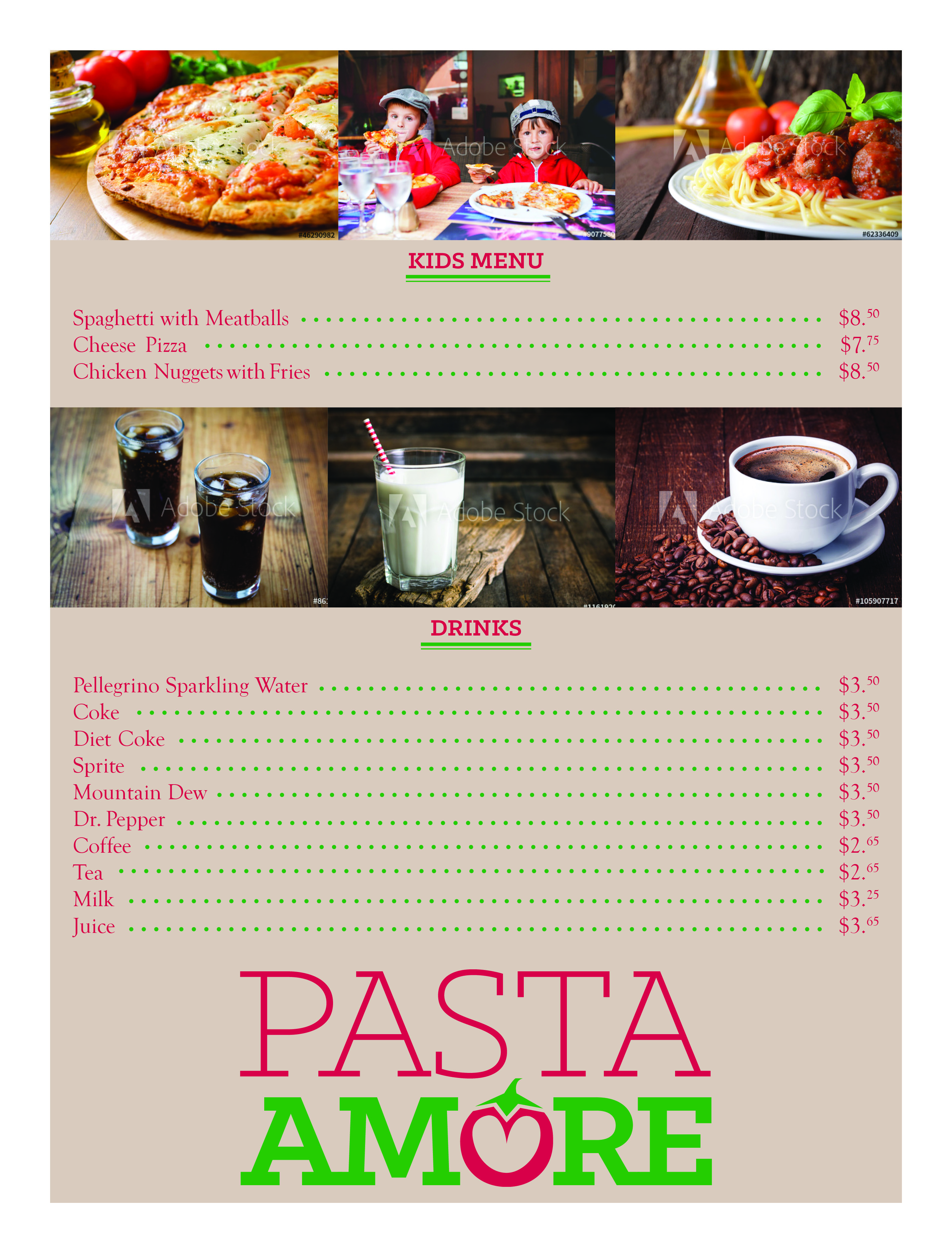
Pasta Amore had specific requests for logo usage, typography, colors, and audience. All these stipulations were considered and used thoughtfully without straying from their requests.
^ Top