Module 7:Final Project
IT270
Shea Fincher
Development Process & Final Product
Before starting to design this site, I spent a good amount of time asking myself what is not only visually pleasing in a site but what is functionally efficient. After visiting some of the site that I enjoy going to and really studying the visual and technical design and layouts I came to the conclusion the less was more. My site is a centered body with slightly darker html background color compared to the body background color. I used reds and greys to accent the white as well as some yellows and blues for link highlights. I tried out a whole bunch of fonts and decided on using Railway for the font text as it is a softer styled san-serif that is pleasing to the eyes and Arvo a san-slab that is a good bit chunkier for the headers that need to stand out. I tried to naturally include all elements that where required for this class into where I thought they would be on a website that was truly being designed for a customer.
Improvement and Growth
I admittedly did not furnish this website with complete content, as such would go above and beyond the time that I have available for this project. As such this is quite a bit that can be done to improve this website. First, I would probably add some JScript or PHP so that I can collect some of the information from the forms that are on the contact us page and repairs page. Second, I would add in some e-commerce options so that there could be sales done through the actually website for shirts, parts, and accessories. Third I would like to build a bike configuration site that would allow you to build the custom bike on the website a lot like what can be done on most car manufacturer's sites. Finally, I would add in a better blog system that would allow a customer to be able to update the blog without editing the html directly and could also allow multiple people to post.
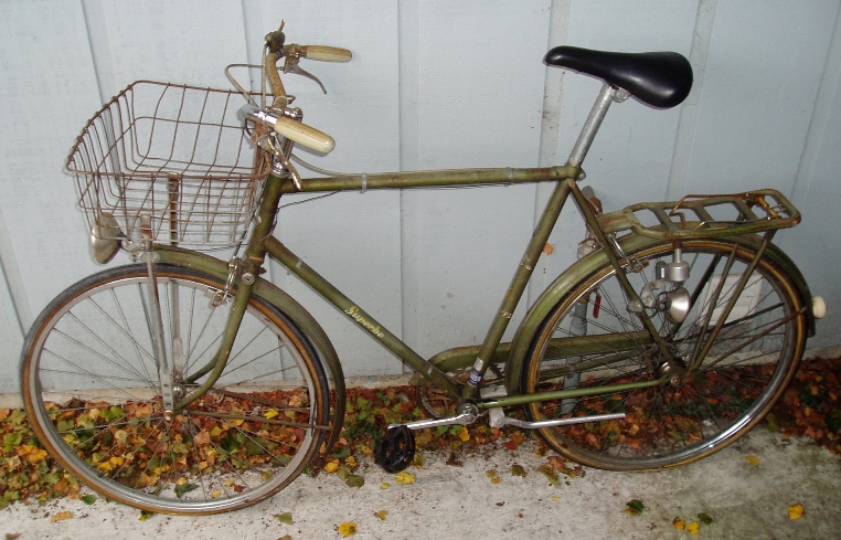
Click for before and after restore