The Process
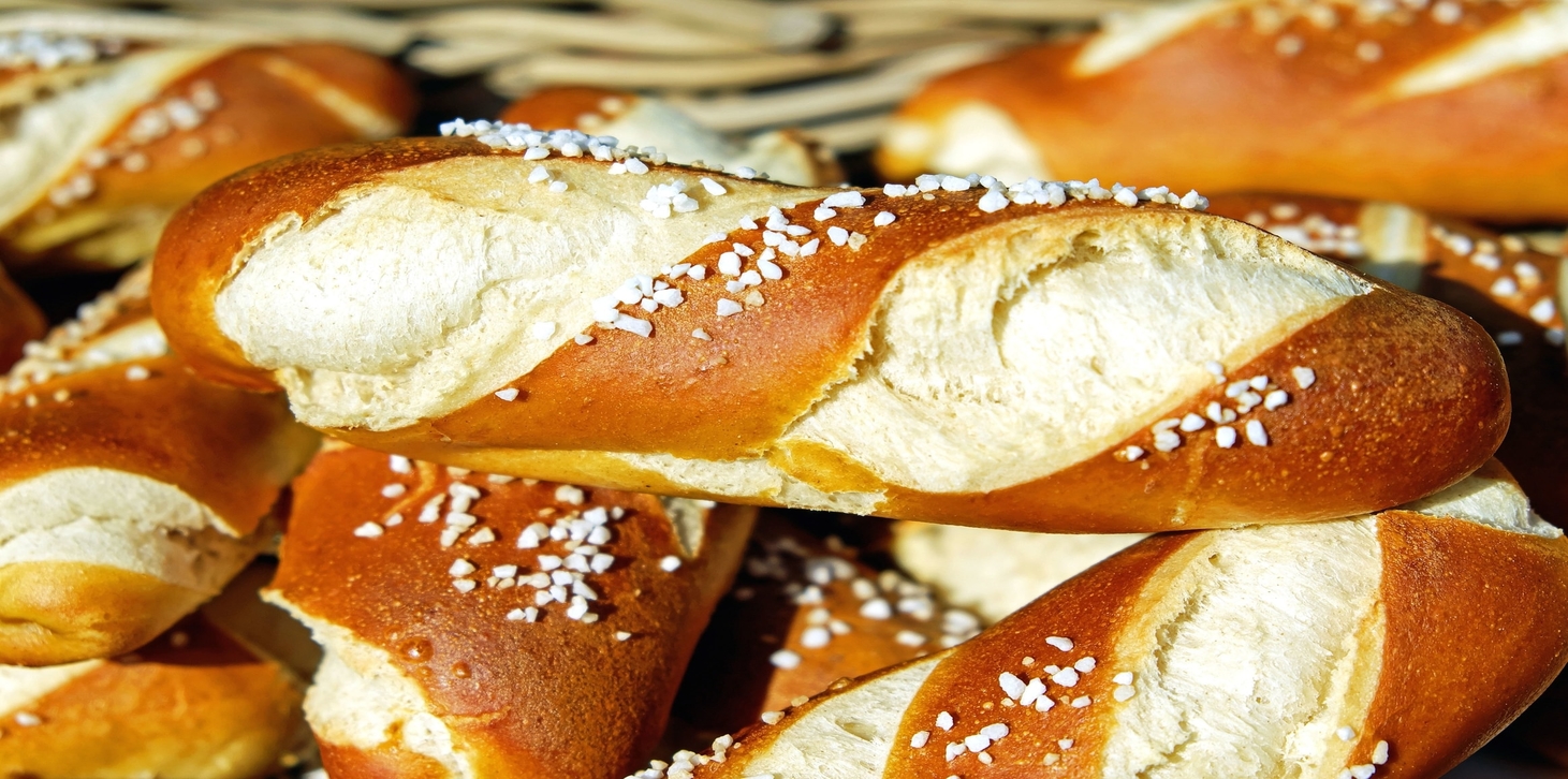
The scenario I was given when creating this site was that my (hypothetical) uncle wanted a website for his (fictional) small business. I decided that the business in question would be The Upper Crust, a small bakery with a focus on savory sandwich breads.
A small bakery with a large variety of menu options must, by necessity, rotate its offerings constantly. Certain breads would only be available on certain days. As a result, I knew the site would need to be accessible and informative, with a visible and robust menu. The website would need to be informative, yet tempting: informative, so customers looking for a specific item could find it straightforwardly and without inconvenience; tempting, so customers without a particular loaf in mind would be persuaded to visit regardless.
I also needed to keep my targed audience in mind. People buy pastries for a minor indulgence, but buy bread because the household is out of bread. While I wanted the photos to "wow" visitors, I needed to keep a certain level of practicality in mind as well.
All of this led to the adoption a simple hierarchical site structure with one hub "home" page and several clearly-labeled subcategories. Because the structure was so simple, I figured it would be most convenient to keep the site navigation uniform across the top of every page. Visitors to their website are going to be looking for certain categories of information: What's on the menu? How do I get there? This navigational structure was the most streamlined way of directing visitors to the answers they would be looking for.
The Product
Moving forward with the design, I decided to take my cues from other professional bakery websites: eye-catching splash pictures, bold typography, and tall footers all seemed appropriate. The Upper Crust is an elegant yet homey bakery, so I wanted the palette to be simultaneously warm and regal. I settled on warm cream and gold tones punctuated by rich red accents. I used a motif of an ear of wheat across the site to bring to mind not only flowing grains but also a crown of laurels.
For typography, I chose the Neuton font family for most text, with Tangerine as an accent at larger sizes. Both of these fonts are Google API web fonts. Embedding open-source fonts would guarantee that users on the vast majority of browsers will see the site as I designed it, regardless of what fonts they specifically have installed on their device. Neuton is a refined yet personable body text font, remaining screen-legible despite its serifs thanks to a high x-height. The calligraphic Tangerine stands out with its high degree of slant, low x-height, and dramatic flourishes. At smaller sizes, it might have been illegible, but as an accent Tangerine softens Neuton's intensity while maintaining a classical elegance.
On the code side of things, I wanted to learn more about responsive design, so I challenged myself to make every page scale by viewport width. Whether a customer is visiting the website from a desktop computer, a tablet, or a phone, the site will appear in a manner that is optimized to their available screen space.
The Future
Looking forward, I see that I have much still to learn about responsive web design. I hadn't anticipated the challenges I would face in designing the Upper Crust website to be responsive, especially when scaling more complex elements like navigational menus or tables. As it currently stands the site is functionally responsive, but less elegant about it than the standard set by the rest of the design.
If I had more time to work on the site, my first goal would be to eliminate the various minor bugs and display problems surrounding the site's responsive behavior. I still haven't figured out why the font in thet navigation menu is so disproportionatetly small in the narrowest configuration, for example, nor have I determined where the 'Saturday' column on the weekly menu vanishes when it reconfigures from a table to a vertical list.
The next item on my design to-do list - for this site or in general - would be to learn how to make the submission form functional. I'm moderately proficient at this point in both HTML and CSS, but Javascript remains a mystery to me.
If I had even more time than that, I'd like to 'beautify' the site further - add photos to more pages, perhaps, or break up larger blocks of text with pull quotes.