
Russell Milburn
31 July 2016
IT-270
Adjunct Professor Daniel Testerman
Southern New Hampshire University
This website was created to demonstrate the knowledge and proficiency of basic website design and development fundamentals that I have gained in this class. As the final project for this course, I was to create a functional website. The scenario for the final website was:
You have been approached by your uncle, who has requested your help in developing a website for his small business. He has asked for a visually appealing website that will need to have tables, forms, as well as a variety of multimedia elements. You will create at least five pages in total, including a home page and an About page where you will explain the intent of the website, defend your aesthetic decisions, and explain your future plans for the site.
The sections below will outline the details of the information requested.
The development process for this website followed the first four phases of the development process outlined in the Web Style Guide, including Site Definition and Planning, Information Architecture, Site Design, and Site Construction. The final two stages, including Marketing and Evaluation were not in the scope of this project.
Site Definition and Planning:
During the definition and planning stage of this project, the goal of the Milestone One exercise was to define the focus, purpose, desired results and target audience for my website. This initial definition would help me to lay out what the purpose of the website was, who would be using and what they, and my uncle would get out of it.
Given the broad nature of the prompt, the focus of the website could have been anything that I chose to do. At first I was overwhelmed by too many options, but the day before I started this assignment I had to help a friend find a cheap replacement part for his car. We wound up at a salvage yard and I remembered being interested by their search functionality, which was explained to us by the manager Jim. Jim had the most unfortunately odd demeanor and stereotypical southern accent, but he was memorable. So much so, that he became Uncle Touché's. This visit provided me with the focus for my website.
The purpose was found in the search system. The company does little inventory tracking, as it is hard to inventory every piece off of every vehicle, so they settled for the simplicity of inventorying the vehicles that they had. Customers are pointed to the vehicle location by mapping the yard into rows and car numbers. The purpose of the website would be to find all the vehicles that match the search criteria and display their location. In addition, the site will provide marketing for the business, directions to get to the business and a convenient location to place waiver, liability and regulation information to customers.
This website will be targeted to areas within driving distance of Nashville, TN. The majority of customers will be from the local area, however contact information should be provided for long distance customers. After feedback from the instructor, an order form was added to the plan, to provide a way for customers to order parts from outside of the service area.
This planning allowed me to start envisioning the end structure of the website and how a prospective visitor would interact with it.
Information Architecture:
During the Information architecture phase of the development process, I organized and refined the proposed site structure, and how the user would navigate through them.
After reviewing the information provided on Structural Themes, I decided that the most rational way to layout the website was in the hierarchical structure, due to the simplicity of the purpose. All site pages would be able to navigate to each other page directly. This was optimal due to the fact that each of the pages contained a distinct informational purpose.
This planning allowed me to determine the functionality and connection of each web page. By preplanning this architecture, it ensured that all needed content was present, while no extraneous pages were included unnecessarily and the user would be able to find the information that they needed.
Site Design:
During the Site Design phase of the development process, the way the website would look was determined. The first step in this was determining the layout of each page.
I decided early on that, all pages should flow seamlessly from one to the other, with only the individual content changing. The website for my uncle’s business would consist of multiple static elements that will be consistent throughout the site, with dynamic and local content confined to the main content column. The first static element would be the Header, which would consist of the company logo, a banner title and a site navigation bar. The second static element would be the footer, which would contain copyright and disclaimer information. The header and the footer would be locked to the top and bottom of the pages respectively, in order to always be visible regardless of resizing or scrolling. The third static element would be a localized search tool and multimedia content center, which will be placed in the left scan column. This will remain fixed, as it is the main function of the website and should be accessible at all times. The main content column will be located immediately to the right of the search tool. Both the search tool and the main content column will scroll as necessary. The layout of each section will be approximated to reflect the Rule of Thirds. These layouts were consistent with the reading on Interface Design Conventions which would reduce the learning curve for new users, as the design is laid out in an expected way, and matches throughout the site.
The next step was to choose the color pallet and typography. When choosing the sites color pallet, I used the advice from the recommended reading, An Introduction to Color Theory for Web Designers, which suggested that brighter colors lead the user to feel more energy. This caused me to change my original color palette with was darker and more relaxing then I wanted to sell car parts. For typography, I chose to keep a clean and simple font, sans-serif, for the titles. For the body, I decided to keep the serif on the font to make it more readable.
By deciding these aspects of the website during this phase, it made the final effort of site construction simply a matter of ensuring all of the elements are constructed to display correctly on each page.
Site Construction:
During the Site Construction phase of the website development the majority of the work was put into finding the best way to implement each of the elements that had been part of the design.
All of the static elements that would be the same from page to page were built on the homepage first, before being transferred to each of the additional site pages and modified as needed. This provided a sense of continuity throughout the site. The goal of the design I chose was that navigation would give you the impression that only the main content section was changing.
To achieve this end, all styling, with the exception on some site specific style is handled by a single external .css file. This ensures that there are no changes in style that will break the seamless user experience.
Most of the advanced .css concepts that are implemented were learned through a combination of online research and the use of browser development and troubleshooting tools. While troubleshooting the implementation of html and .css code, I found many websites which share best practices. By using these as instructional resources, I was able to fine-tune much of my site beyond the basic instruction.
While I also experimented with some JavaScript and JQuery programming for some parts of the website, that implementation was outside of the scope of this project. Unfortunately, the time to develop ran out before I could finalize some of the controls. The search filter functionality will be left incomplete for the submission.
Static Items
Color Palette:
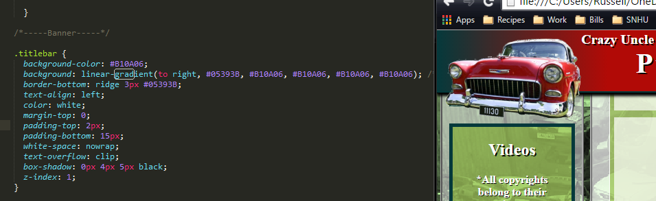
The color palette is consistently used throughout the website. It is based on primary color of the image that was chosen as the company logo which was a vibrant shade of red (B10A06). I used a variation of the Triadic color scheme to select complimentary colors that will allow for separate emphasis, while still remaining visually appealing. The main website colors will be variations of the color blue (05666B). Accents will be added for emphasis in shades of green (6EA506 and 058B0E). The soothing blue colors, which are designed to relax the user and create a sense of safety and trust, will be balanced with the vibrant reds and greens to create a sense of excitement for the shopping experience.
I made one change to my color palette after the draft critique exercise. It was noted that the company icon faded into the background color of the title bar. To rectify this and keep the user’s eyes from straining to see the difference, I instituted a gradient background. This allowed me to keep the color scheme, but make sure the colors were distinct.
Typography:
In the same way as the color palette, the Typography for the website is fixed throughout to provide a seamless viewing experience. The Times and Arial font families were used, as they presented the most professional look in my opinion. The differences that I chose were for the choice between Serif and Sans-Serif. The removal of the Serif flourishes from the font in the title bar makes it much more visible.
In addition to the basic styling option, text size is used to determine a visual hierarchy. The title bar will use the larges size to draw attention. Headings will be divided into h1 and h4 default sizes for main headings and sub-headings respectively. The smallest text, and therefore lowest hierarchy is reserved for the body text.
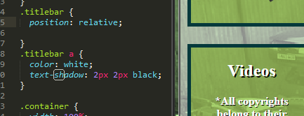
One thing I changed for my content when displayed over semi-transparent backgrounds was to add a text shadow to the font. This made it much easier for the user to read the white text.
Background:
For the background, I chose to copy the homepage image – found on the Creative Commons website – and use PowerPoint to modify it to fit the color pallet. This provides an interesting and intriguing background to my website, but might also make text on the screen difficult to read. For that reason, the backgrounds for all of the content sections are displayed with a semi-transparent white background. This increases the contrast between the background and the text which reduce eye strain for the user.
Header:
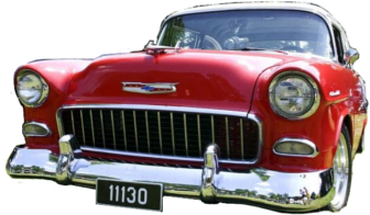
The header is used throughout the site for continuity and branding. It consists of a vibrant red banner, carrying the company name in white lettering. In order to maintain the height of the title bar the way I liked it, I used the white-space: nowrap; to keep the text from wrapping to the next line. While this allows the title to run off of the edge of the page on smaller displays, it maintains an overlapping effect with the company icon. The company icon is a picture pulled from the Creative Commons open source image search site, with the background removed using GIMP software. By floating the image to the left of the title bar I was able to achieve a semi-3d look, as if the Icon was jumping out at the user. In addition to being a visual element, the entire title bar and image are set up as a home page link. The final part of the header is the navigation menu, described below.
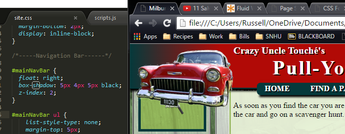
Navigation Bar:
The Navigation Bar is another static element to my page, providing continuity for the user and meeting the originally planned goal of being able to reach all pages within the site from any page. There are four top level sections exposed because they are the options that a user would navigate to the most. The remaining options are hidden in the INFO option. This includes the About Us, Find Us and Contact Us options. These menu options drop down when the user hovers over the option. Providing this option saves space on the screen for the user, while keeping all options available. Both the Navigation Menu and the Title bar have a drop shadow effect that makes them appear as though they are above the page and give the user the impression that other content is sliding up behind the menu.
Footer:
The footer is designed in the same way as the Title bar, in that it is set in a fixed position, and locked to the bottom of the page. It also uses the white-space: nowrap; command to ensure that the contents do not wrap, increasing the size of the footer and at the same time reducing the viewable area for the user.
Left Scan Column:
The Left Scan column is also fixed, with the exception of the changes noted on the Search Page. In order to make the content responsive to changes in displays, the column is set to take up 20% of the screen space, rather than a specific number of pixels. In turn each of the elements within the column is set up the same way. This allows the content of the Left Scan column to readjust themselves dynamically based on the width of the screen. This should ensure better display on smaller screens.
I changed the content of the left scan column after the draft critique when I could not make the functionality of the search box work from different pages, without the use of server side scripting. Instead, on all pages with the exception of the search page, users will see a custom icon link that will take them to the search page.
Below the search icon, I added a “Related Videos” section. The videos are embedded from YouTube, but are modified to fit into a dynamically adjusting div element that allows the videos to resize with the column. This ensures that the videos always display within the column, and the aspect ratios are maintained.
Main Content Column:
The Main Content column varies from page to page in the content that is displayed on it, but to maintain the same continuity across the site, the design is consistent. The column has a semitransparent white background to match the other sections. Over that background, content is divided into semitransparent green div elements. By separating the elements, I provide a mental break for the user when I provide white-space separations.
While the titles of each section are centered and include the previously noted text shadow, to increase contrast for the user while they are reading the body of the text, another semitransparent white background is added. This allows for easier reading.
Page Specific Items
Home Page:
For the content of the Home page, a brief welcome section with an accompanying image is provided in the first section. The image is designed to resize with the size of the monitor in order to maintain position.
Below the intro section, two sub-content sections are provided. Because the hierarchy of information places them equal, they are designed to display side by side. Two additional content displays are displayed below these. In the final case, I have used targeted styling to change the background colors of each to reflect their warning and cautions states as red and yellow respectively.
I made small changes to the home page after the draft review. While I kept the colloquial jargon intact, as it matches in with my vision of the business, I removed the curse words. A valid business would have to be careful about the way that it communicated for fear of offending possible customers.
Search Page:
The unique content of the search page includes the required table, containing a list of available vehicle at the business. The goal of this table was to make it searchable and filterable using the filters in the left scan column, however I was not able to complete the required scripting in time for submission, so this is an informational only table.
The Table consists of 20 rows and six columns, with associated header elements and a footer element that spans the table. Images taken from Creative Commons are used in place of text in the style column to present a more stylish view to the user and the Row column contains a link to a custom map of the business on the Find Us page.
To present a sleek, modern look, only the bottom border is displayed and every other row is highlighted using the :nth-child option.
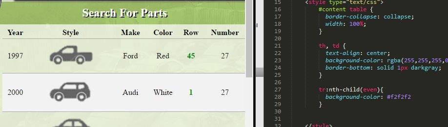
In the left scan column, the filter control is enhanced with JQuery scripting that allows each group of options to be opened or closed on click. This is accomplished by tying into the attached scripts.js file and importing a JavaScript definitions source within the header of the page. On click, the toggle script allows the user to change the .css display property, which will hide or show the div element respectively.
Order Page:
The order page follows the same layout for the main content column as the home page. Using the same .css as the home page price and hours display allows the form and its description to be laid out side by side.
The order form is a standard contact form, with an additional list control that allows the user to select the way they would like to receive the order. Because I do not have the resources to tie this control into an actual ecommerce ordering system, this form would simply send a request form to the company with the users Name, Email, Delivery Preference and a message describing what they need. When the submit button is pressed, all of the information in the form is sent to a server page using the POST method. For the sake of this project, as there is nothing on the server side to receive the information, the action is stubbed to send to the current page using the #.
To provide help to the user, I have added a placeholder value to each of the fields. This will give the user an example that will be removed automatically when they start entering their own values.
Contact Us Page:
The contact page is formatted and designed in the exact same way as the order page. The only difference between the two forms is the lack of a shipping option in the contact box.
Find Us Page:
The Find Us page uses the same layout design as the home page. I have embedded a google map into the content box, with a notional location selected for the user to review. Links to the Find Us page navigate the user to the location map, rather than to the site map which is placed at the top of the page to avoid overlapping the embedded google map over the title bar. This is one issue that I have not found a satisfactory solution to. Embedded objects display above local objects. This also comes up with the embedded YouTube videos and is something that I will address in the next section.
About Page:
Finally, the About page utilizes many of the same style and layout designs described above. Each section of the required information is included within collapsible sections, using the same JavaScript coding as the Filter control on the search page. This is designed to limit the amount of text displayed on the screen and avoid content overload.
While I enjoyed completing this project and was able to incorporate much of the information that I learned while I was researching best practices for website development, there were some areas that I were not able to complete or explore because of the time constraints of the project and the resources that I had available. If I had more time and resources I would like to incorporate the following aspects into my web design.
Create Vehicle Inventory Table from Database:
Rather than having to individually enter vehicle data into an html table and then use JavaScript to search the client side table, I would like to incorporate PHP to build the table from MySQL. From what I gather, this will allow me to build a searchable table from a database that will be more easily manipulated.
Build in a Media Query to Support Smaller Devices
I really wanted to do this when I researched the option during the last weeks of class, but I could not find the time. By entering a media query into the html code, separate .css files can be used based on the size of the display. This would allow me to display more appropriate content layouts on mobile devices. This is not difficult to do; it simply requires time to rebuild the design.
Incorporate Modern Design Elements using JQuery
My website was laid out in a functional way, to take advantage of what users were expecting to see. I have viewed many more modern layout designs that I believe would be good to experiment with, if I had the time, including creating a Scrolling Layout, Parallax, Ghost Buttons, Ribbons and more.
Ecommerce Payment Gateway
This is well beyond my current skillset, but if I were actually designing this website for my “uncle”, then I would be looking into a way to actually process orders for part and take payment for them, rather than simply using a contact form.
Fix Z-order Issues with Embedded Objects
To be honest, I should have been able to fix this. The problem is that it would take a redesign of the titlebar and I did not have the bandwidth.