
|
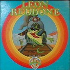
Artist: Redbone, Leon Title: On the Track Company: Warner Brothers Catalog: BS 2888 Year: 1976 Photographer: not applicable Designer: Chuck Jones
|
Nothing to explain here. Simply a classic cover. As for the music, Redbone's croaking baritone and musical history lessons are just too weird for our tastes. |
|
|
|
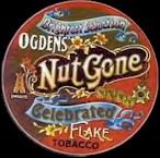
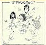
Artist: Small Faces, The Title: Ogden Nut's Gone Flat Company: Immediate Catalog: 12 52008 Year: 1968 Photographer: not applicable Designer: P. Brown
|
The LP cover's round !!! The darn thing's circular !!! Have you ever seen a round cover ? Look, it isn't square !!! (Anyone know the story behind the oddball title?) |
|
|
||
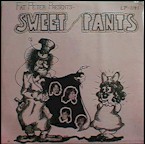 |
Artist: Sweet Pants Title: Fat Peter Presents - Sweet Pants Company: Barclay Catalog: LP-1141 Year: 1972 Photographer: not applicable Designer: MCM
|
In this day and age of political correctness, it's unlikely that a cover like this would have ever seen the light of day. Geez, let's see, a flasher and racial and sexual stereotypes in one place. Times have changed ... |
|
|
||
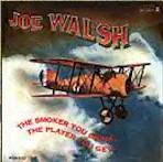 |
Artist: Joe Walsh Title: The Smoker You Are the Player You Get Company: Dunhill Catalog: DSX-50140 Year: 1973 Photographer: not applicable Designer: Jimmy Wachtel
|
Joe Walsh has always been one of rock's oddballs. Besides being one of our favorite mid-'70s rock album, we've always been fascinated by old biplanes. How in the world did something made largely of canvas and wood ever get off the ground? By the way, anyone know the story behind the odd album title? |
|
|
||
|
|
Artist: War Title: Why Can't We Be Friends? Company: United Artists Catalog: UALA 441G Year: 1976 Photographer: not applicable Designer:
|
Like the accompanying album, the cover drawing simply radiates "good time" ... It's hard not to look at his one and not smile. Besides, it's possibly the best LP War ever recorded. |
|
|
||
 |
Artist: West Coast Pop Art Band Title: A Child's Guide To Good & Evil Company: Reprise Catalog: RS 6298 Year: 1968 Photographer: not applicable Designer: John Van Hamersveld
|
One of those bands that virtually nobody ever heard of (even when they were in existence), the stark black and white cover is exceptionally eye grabbing. Must have something to do with the damn butterfly. |
|
|
||
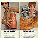 |
Artist: The Who Title: The Who Sell Out Company: Decca Catalog: DL 7-4950 Year: 1967 Photographer: Dave Montgomery Designer: David King and Roger Law
|
Comedy usually doesn't transfer itself well to LP covers. British humor even less so when it comes to most American audiences. It may have been meant as a social commentary, but who cares. It was funny !!! |
|
|
||
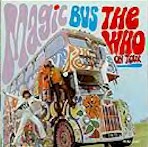 |
Artist: The Who Title: Magic Bus Company: Decca Catalog: DL 7-5460 Year: 1968 Photographer: Designer:
|
You'd be hard pressed to come up with a cover that better captured mid-'60s English style ... By the way, the album's a classic. |
|
|
||
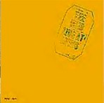 |
Artist: The Who Title: Live At Leeds Company: Decca Catalog: DL 79175 Year: 1971 Photographer: not applicable Designer:
|
Talk about simplicity in design ! The Who unknowingly set the standard for the entire bootleg industry ... |
|
|
||
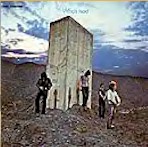 |
Artist: The Who Title: Who's Next Company: Decca Catalog: DL 79182 Year: 1972 Photographer: Ethan Russell Designer: John Kosh, Richard Evans
|
We know,
we've selected a disproportionate number of Who covers here ... First,
we've always wondered where they
took the picture, as well as wondered what the giant concrete slab was
for. The band's personalized signatures were crude, but funny.
Besides, isn't that one cool looking sky?
|
|
|
||
 |
Artist: The Who Title: By Numbers Company: MCA Catalog: MCA 3026 Year: 1975 Photographer: not applicable Designer: John Enwistle
|
Sure,
Entwistle's draw-by-numbers cover wasn't the most original design.
Neil Diamond had a similarly themed cover nearly a decade earlier.
On the other hand, you couldn't help but laugh at Enwistle's childlike
drawings. Amazing how many of these covers have the
connect-the-dots filled in !!!
|
| NEXT PAGE |