|
|
Artist: AC/DC Title: For Those of You About To Rock Company: Atlantic Catalog: SD 11111 Year: 1981 Photographer: not applicable Designer:
|
Any time you put the image of a cannon on an album cover, it's cool !! (Must be one of those weird phallic things that Freud always talked about.) Besides, could you think of a more apt cover for one of rock's powerhouse acts and LPs??? | |
|
|
|||
|
|
Artist: AC/DC Title: Back In Black Company: Atlantic Catalog: 16018 Year: 1980 Photographer: Robert Ellis Designer: Bob Defrin
|
Always thought Atlantic executives deserved recognition for having spent a fortune on this design. To our eyes it's a perfect example of the often forgotten adage "less is more". | |
|
|
|||
|
|
Artist: Afterglow Title: Afterglow Company: MTA Catalog: MTS-5010 Year: 1968 Photographer: not applicable Designer: Jack Ervin
|
Okay, there are dozens of covers with the same line-up-the-band-in-silhouette design (Buffalo Springfield, Byrds, etc.). Accordingly we'll readily admit this isn't the most original cover you've ever seen. On the other hand, the day-glo color combinations are eye catching. The lite psych music isn't bad either. | |
|
|
|||
|
|
Artist: Alice In Chains Title: Alice In Chains Company: Sony Catalog: 62748 Year: 1995 Photographer: Rocky Schneck Designer: Doug Erb, Mary Maurer
|
Admittedly this is one of the more disturbing selections we've made. Disturbing need not be bad. Know how there's something fascinating about the carnage surrounding a traffic accident - you can't take your eyes of the damage and devastation? Same thing here. Sad, but fascinating cover ... Good album to boot. | |
|
|
|||
|
|
Artist: Atomic Rooster Title: Atomic Rooster Company: B&C (UK import) Catalog: CAS 1070 Year: 1970 Photographer: not applicable Designer: unknown
|
There's really no deep or resonant reason for having selected this cover, other than the fact we liked the chicken cover ... | |
|
|
|||
|
|
Artist: Average White Band Title: The Best of the Average White Band Company: Catalog: Year: Photographer: unknown Designer: unknown
|
Admittedly, we're not big AWB fans. On the other hand, the cover almost makes up for the lame Scottish funk that populates these grooves. Whoever the model was, she certainly had one of the nicest butts to ever grace a rock album. | |
|
|
|||
| NEW |

|
Artist: Be Bop Deluxe Title: Axe Victim Company: Harvest Catalog: SHVL 813 Year: 1975 Painting: John Holmes Designer: Mick Rock
|
We usually try to avoid macabre covers, but this is one of the exceptions. Bill Nelson's always been recognized as different and here's a perfect example. Wonder if he actually owned a guitar that looked like this ... Turns out he did. The late Stuart Adamson (see Big Country below) bought the guitar from Nelson. |
|
|
|||
| NEW |
|
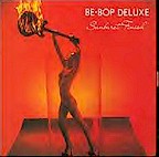
Artist: Be Bop Deluxe Title: Sunburst Finish Company: Harvest Catalog: ST 11478 Year: 1976 Photographer: John Thornton Designer: Bill Nelson, Mike Doud
|
Damn, a naked model wearing high heels and holding a burning guitar ... Life don't get much better than that !!! |
|
|
|||
|
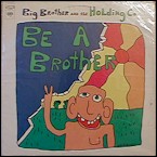
Artist: Big Brother and the Holding Co. Title: Be a Brother Company: Columbia Catalog: C 30222 Year: 1970 Photographer: not applicable Designer: Bob Seidemann
|
Why this one? The bright color scheme and the simplistic, child-like drawing - geez, Seidemann doesn't draw any better than you or I and yet he did an album cover. Maybe there's hope for the rest of us.. | |
|
|
|||
| NEW |
|
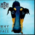
Artist: Big Country Title: Why the Long Face Company: Pure Catalog: 2200 Year: 1994 Photographer: unlisted Designer: unlisted
|
I'm adding this cover the day after learning Big Country front man Stuart Adamson committed suicide (12/18/2001). My wife will readily tell you I have the sensitivity of a truck and she's normally right. That said, I feel a deep sadness at Adamson's passing. Such a talented guy - he was a great writer; a passionate singer (one of the best concerts I've ever seen). As for the cover, what a face ... how can ya' not love that look ??? |
|
|
|||

|
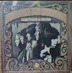
Artist: Big Star Title: #1 Record Company: Ardent Catalog: Year: 1972 Photographer: Designer:
|
Some might argue that this cover isn't anything special, but in our humble opinions they'd be wrong. Neon lights are always cool. Add the fact this is a classic slice of Memphis rock and roll (all hail Alex Chilton) and you have the makings of a classic cover that widespread recognition (like the band itself).. | |
|
|
|||
| NEW |
|
Artist: Buffalo Springfield, The Title: Last Time Around Company: ATCO Catalog: SD 33-256 Year: 1967 Photographer: Designer:
|
These guys set the standards in so many ways ... Sure they weren't the first band to use a group profile picture for a cover (see the Aftermath LP above), but their cover served as an inspiration for a slew of imitators, including The Byrds. Besides, I always thought it was cool to see Neil Young facing the other way ... |
|
|
|||
|
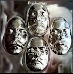
Artist: The Byrds Title: Byrdsmaniax Company: Columbia Catalog: KC 30640 Year: 1971 Photographer: Don Jim Designer: Virginia Team & John Berg
|
This is simply one of the most stunning covers in our collection (though musically it's a middling Byrds offering). The inner sleeves show the process for making the face casts. Doesn't look like McGuinn and company were having much fun. Regardless, the glossy, space age result is just too cool ! | |
|
|
|||
|
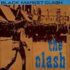
Artist: The Clash Title: Black Market Clash Company: Epic Catalog: 4E 36846 Year: 1980 Photographer: Rocco Redondo Designer: Paul and Jules
|
We're not particularly political and understand next to nothing about late-'70s English interracial policies and issues. That said, there's something striking about Rocco Redondo's image of a lone Rastafarian facing a street full of English bobbies (police). Sorry, the picture didn't replicate with more clarity. It just so happens this stands as one of The Clash's best recordings ... | |
|
|
|||
|
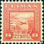
Artist: Climax Blues Band, The Title: Stamp Album Company: Sire Catalog: SASD-7507 Year: 1975 Photographer: not applicable Designer: J. Flournoy Holmes
|
Okay, we haven't been able to decipher what makes this one so attractive to us. Could be the fact we were briefly interested in collecting stamps ... That, or the fact it's so different compared to the usual band photo that tends to grace so many collections. | |
|
|
|||
|
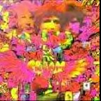
Artist: Cream Title: Disraeli Gears Company: ATCO Catalog: 33232 Year: 1967 Photographer: Bob Whitaker Designer: Martin Sharp
|
Even though I bought my copy years after the LP's original release (hum, I would have been eight in 1967), "Disraeli Gears" stands as one of my favorite slices of '60s rock. The awesome psych cover certainly adds to the overall appeal ! | |
|
|
|||
|
|
Artist: The Embers Title: Burn You a New One Company: EEE Catalog: No. 1069 Year: 1967 Photographer: not applicable Designer:
|
Cheesy you say ! Sure it is. But in that cheap mid-'60s fashion that we think is so nifty. (Besides, the title's great and the LP offers up a great slice of Carolina beach music.) | |
|
|
|||
|
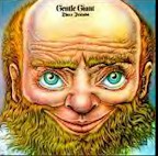
Artist: Gentle Giant Title: Friends Company: Columbia Catalog: KC 31649 Year: 1972 Photographer: not applicable Designer: Rick Breach
|
Something about the character just makes you smile. Must be the big ol' blue eyes. By the way, it's also a great progressive LP. Worth buying if you don't already own it. | |
|
|
|||
|
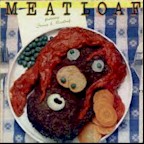
Artist: Meatloaf Title: Meatloaf - Featuring Stoney & Meatloaf Company: Prodigal Catalog: P7-10029R1 Year: 1979 Photographer: unknown Designer: unknown
|
Why you might ask is this one on the list? We've always been amazed that Motown managed to put out such great music and crap artwork. Here's a perfect example. In 1971 Stoney and Meatloaf put out an instantly forgotten 1971 LP on Rare Earth. A couple of years later Meat Loaf enjoyed massive success with "Bat Out of Hell". Motown jumped at the opportunity to profit from Meatloaf's success, clearly spending a large sum on the classic cover. | |
|
|
|||
|
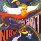
Artist: Nirvana Title: The Story of Simon Simopath Company: Bell Catalog: 6015-S Year: 1967 Photographer: not applicable Designer: David Browning
|
Okay, from a musical and creative standpoint this LP has a special place in our hearts. Dating from 1967, it's probably the first stab at a rock concept piece, opening the door for "Tommy" and all the others that were to come. David Browning's cover art is grabbing and serves as kind of a neat overview of the plotline (at least we think it does). | |
|
|
|||

|
Artist: Oldfield, Mike Title: Tubular Bells Company: Virgin Catalog: VR 13 105 Year: 1974 Photographer: Brian Aris Designer: Trevor Key
|
If you're a certain age (let's say you were in your teens of twenties during the mid-'70s), the opening notes to Mike Oldfield's "Tubular Bells" are bound to send a chill up your spine. This is simply one of the all time classic slices or progressive music. The fact it was part of the soundtrack for The Exorcist only makes it cooler and spookier ... talk about a creepy flick. | |
|
|
|||
|
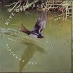
Artist: Oldfield, Mike Title: The Complete Mike Oldfield Company: Virgin Catalog: 233518 Year: 1988 Photographer: Stephen Dalton Designer: Steven Appleby
|
This is one of those covers that needs to be seen in full size to be fully appreciated. I'm not a major nature photography freak, but this shot is just amazing. Taken with an extremely high speed camera, it captures a swallow taking a sip of water in mid-flight ... beyond description !!! It's something you can stare at for hours, wondering how did they do that? | |
|
|
|||

|
Artist: Persuasions, The Title: Chirpin' Company: Elektra Catalog: 7E-1099 Year: 1977 Artist: Gary Meyer Designer: Tony Lane
|
This is one you probably have to hold in your hand to really enjoy. To our eyes, the attraction is Gary Meyer's neat use of perspective (an aerial shot of four guys singing on a dark, rainy street corner). It just looks way cool ! | |
|
|
|||
|
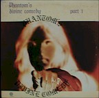
Artist: Phantom's Divine Comedy Title: Part 1 Company: Capitol Catalog: ST-11313 Year: 1974 Photographer: unknown Designer: unknown
|
Musically this set's pretty funny. Capitol apparently almost got sued by Elektra Records for their ill advised effort to market this outfit as The Doors in disguise - Jim Morrison lives !!!. We've always through the cover was cool in that it was one of the first uses of a negative image we'd seen. (Okay, okay, Todd Rungren's "Nazz" came out five years earlier.) | |
| NEXT PAGE |