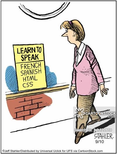
I was excited to see what this class would be like, but it intimidated me. I have never taken a web page programming class before. The first important lesson I learned from our beginning videos was to not be scared, anyone can do this! Starting the videos off from the first basic steps and stages of file opening and organizing helped build my confidence.
Starting and Ending Tags
Once watching the videos, I learned that one of the most necessary things to creating a program is ensuring one has beginning and ending tags between the content and commands. Without these, the computer will be unable to read and run the web page correctly. Additional tags in the head can help one add specifics to their page: color, font, boarders and spacing.
Headings and Hierarchy
One of the lessons that was difficult for me to understand at first was headings. These must be the main topics of the articles placed before and larger than the article text to catch the reader's attention. Hierarchy is the placement of these according to importance. The web page title would be the largest, near the top. The titles of the articles would come next, smaller and placed below. One can add additional sub-sections under these headings.
Time and Date
Although not included in all web page articles, time and date stamps can be essential to the modern world of blogging. To keep the reader informed on the creation date of a piece of information in the blog, or of the blog itself, the time and date posted on an article will let one know if this information is current or not. This is essential for scholarly articles. Users may also be able to be navigated to ones page if the right tag is used.
Viewer's Perspective
I love the concepts of design and organization. The importance of the viewer's perspective of a web page is great. If a web page has minimal or no spacing, headings in different colors, fonts or sizes, or background colors in hard to read hues, it is unenjoyable to read. This will cause the user to leave the page and seek out one that is easier to navigate and/or read. Simple color pallets, even fonts and sizes, and keeping articles spaced out by color can ensure that the viewer has a pleasant experience using ones web page!