Fantasy Baseball 2003 Graphical Wrap-Up
I track my standings every Sunday morning (sometimes off by a few days if I'm out of town) to see how my teams progress through the year. It is pretty interesting to me. I'm sure anyone else who reads this will think I'm a freak though.
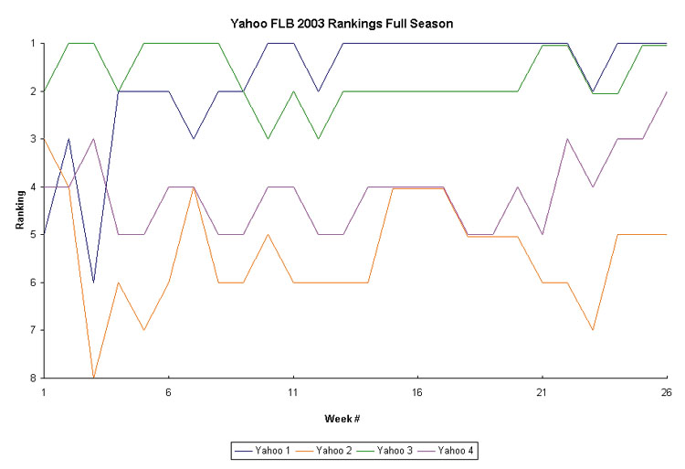
In #1, I was in 1st almost every week after Week 10. Even when I slipped a little, I was very close.
Except for Week 1, #2 was never higher than 4th, which is pretty sad. Probably my worst team.
#3 is similar to #1 except that I was in 2nd for a large chunk after having a nice lead around May.
I made a nice comeback in #4 to make my team respectable over the six weeks.
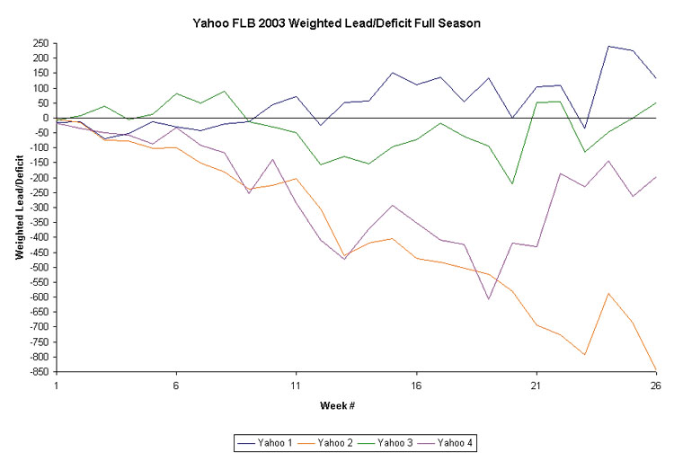
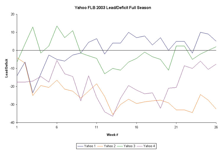
Weighted deficit is the deficit (or lead) multiplied by the Week #. It shows that a deficit is harder to overcome as the season progresses. This makes #2 looks really pathetic, while the others look about the same as the regular deficit graph.
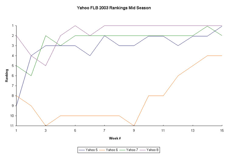
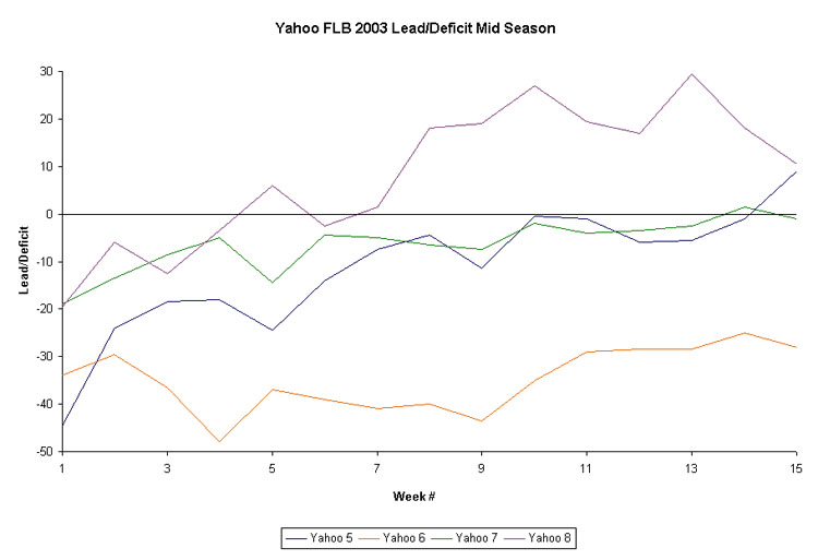
Team #5 has a great upward trend throughout most of the season. Of course, I'd prefer to be #1 all year, but this is the next best thing.
In #6, I was very near the bottom for the first 9 weeks. My improvement is mainly due to moving to the top of a pack of mediocore teams. My deficit was still nearly 30 points at the end.
I was a very close 2nd most of the season in #7. I snuck up to 1st during the next-to-last week and just barely missed the championship by having a bad final day.
My shrinking lead in #8 is really a reflection that my team was nearly perfect at times. The guy in 2nd just improved enough to make my lead smaller.
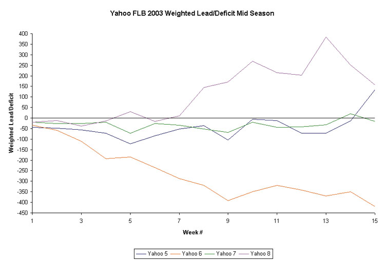
Here, you can see how #5 was making great progress due to the fact that I was holding steady or gaining in Weighted Deficit. That means I was gaining just enough ground each week to keep myself in it. In #6, you really see how my improvement was really nothing to be proud of and more a reflection of guys getting healthy.