|
|
Goal:
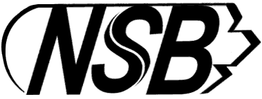
Design a logo symbol
for NSB that would look modern today.
|
Concept:
As in the past, the NSB logo has to consist of
a wheel, a pair
of feathered wings and the NSB initials. The design should contain two colors only.
These elements should above all communicate "modern and
efficient."However, since NSB involves national cultural
heritage, the new logo shouldn't hastily throw away historic values.
This is a classic conflict between the fashionable and the timeless.
Rather than separate the logo and the initials, I decided to
blend them together. I have also combined the "S" with the
wheel and used black as basic color.
The illusion of this new NSB logo is "High speed
train".
|
Background:
NSB, being the only railway company in Norway for
over 100 years, is part of their national cultural heritage, with a proud
history, holding a unique position in people's hearts and minds.
NSB is short for Norges Statsbaner (Norwegian State Railway).
The Norwegian economy was on its way up. People had more money, and
they were eager to spend it. Car sales went up, as well as air
travel. NSB saw the competition and realized that it was of vital
importance to keep up with this.
|
Techniques:
Logo design skill.
Adobe Photoshop and Illustrator. |
|
Click for a larger size
NSB Logo
|