![]() REVIEWS
REVIEWS
![]() REVIEWS
REVIEWS
28 May 2000
review-by: Les Pearson
country: USA
divulge-mail: NO
acquaintance: LINK IN ANOTHER ROCK PAGE
comments:
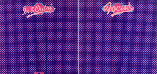 This album cover IMHO is one of THE best covers for an album ever - even without my natural bias as a huge Focus fan. The cover was produced as a bi-fold, as for a double album of that (vinyl) period. The outside artwork consisted of a purple background with rows and rows of pink spots which at first glance appear rather boring. The neat part is that if viewed at an angle, subtle variations in the sizes of the pink spots spelled out the word 'Focus' in a cool logo. This was decades before the 'Magic eye' 3-D computer generated pictures that were popular in the early '90s. I have no idea who was responsible for producing that cover, my vinyl collection was left in England when I moved here to the States, and it's likely more of a credit to the Polydor marketing team than the band. When I finally! got the CD version, which is an import here in the U.S. I was dissapointed that it did not have the purple and pink psychedelic Polydor album art.
P.S. After years of Focus withdrawl here in the U.S., one day I came across the cassette 'Focus' by Thijs van Leer and Jan Akkerman. It sounded great! Admitedly the synth drums seemed very strange, but to hear something new from Thijs and Jan together after all those years was a real treat. O.K., it's not the Focus of the good old days but this is still a favorite of mine.
Les Pearson - USA
Picture sent by Tom Watson