


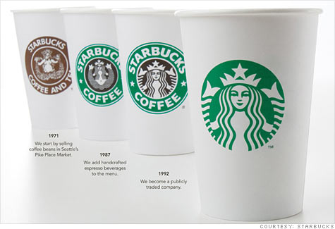
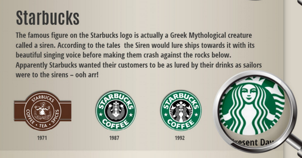

In 2006, Valerie O'Neil, a Starbucks spokeswoman, said that the logo is an image of a "twin-tailed mermaid, or siren as she's known in Greek mythology".The logo has been significantly streamlined over the years. In the first version,the Starbucks siren was topless and had a fully visible double fish tail.The image also had a rough visual texture and has been likened to a melusine.The image is said by Starbucks to be based on a 16th-century "Norse" woodcut, although other scholars note that it is apparently based on a 15th-century woodcut in J.E. Cirlot's Dictionary of Symbols.
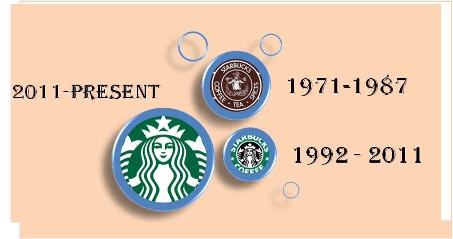
In the second version, which was used from 1987–92, her breasts were covered by her flowing hair, but her navel was still visible.The fish tail was cropped slightly, and the primary color was changed from brown to green, a nod to the Alma Mater of the three founders, the University of San Francisco.In the third version, used between 1992 and 2011, her navel and breasts are not visible at all, and only vestiges remain of the fish tails. The original "woodcut" logo has been moved to the Starbucks' Headquarters in Seattle.
At the beginning of September 2006 and then again in early 2008, Starbucks temporarily reintroduced its original brown logo on paper hot-drink cups. Starbucks has stated that this was done to show the company's heritage from the Pacific Northwest and to celebrate 35 years of business. The vintage logo sparked some controversy due in part to the siren's bare breasts,but the temporary switch garnered little attention from the media. Starbucks had drawn similar criticism when they reintroduced the vintage logo in 2006.The logo was altered when Starbucks entered the Saudi Arabian market in 2000 to remove the siren, leaving only her crown,as reported in a Pulitzer Prize-winning column by Colbert I. King in The Washington Post in 2002. The company announced three months later that it would be using the international logo in Saudi Arabia.
In January 2011, Starbucks announced that they would make small changes to the company's logo, removing the Starbucks wordmark around the siren, enlarging the siren image, and making it green.