| Home | About | Commercial Services | Residential Services | Contact |
|---|
This website makes finding a landscaping company easy. With straight to the point information and navigation. Some sites offer too many things to look at and look through. Here, everything is simplistic and easy to find. By making these choices, you can find the information you need without having to spend a lot of time on the site.
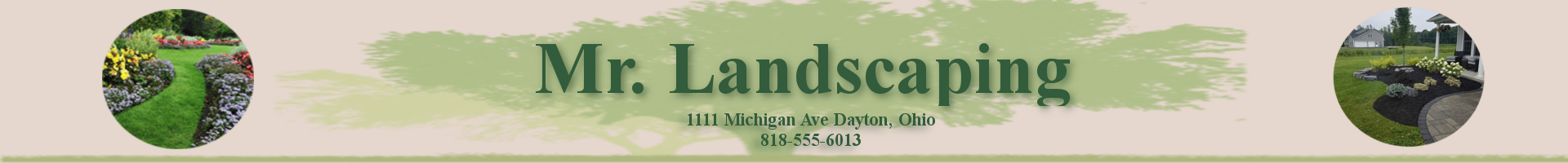
For the About page, this will only contain information about the company and how it started. All the pages look the same in terms of color, font, and overall layout. This choice was made to make the entire website look cohesive. If each page were to look entirely different, the website would not look nice.
One thing I look for when going to websites is how the websites look and if they're easy to look at. It always bothers me when a website has a color set thats hard on the eyes. For example, a bright white background with neon color text. That combination can cause a lot of eye strain. That's why I chose colors that are easy on the eyes and complement each other.
Since websites take a while to build and complete there are a few things that I would add in the future. One thing, that I even tried to add this time around but just couldn't figure out, was an image slideshow. This would show customers examples of previous work that has been done, in an easy format. I would also change how the navigation looks.