Well creating this website, I wanted something that was user friendly. When a user goes to the website, I want to allow them to go through the website as effeciently as possible. I know when I go to a website, I like a website that is quick, functional and doesn't take my long to navigate through. I feel this website is something that I would visit frequently and my hopes is the customers feel the same way. I wanted to have consistency with my website and when someone goes to a new page, it would feel like the same website. Personally, I have gone to websites and click on a page and got lost as to where I am. I built the function into the logo, so if someone needs to go back to the homepage they could click that instead of the navigation tabs.
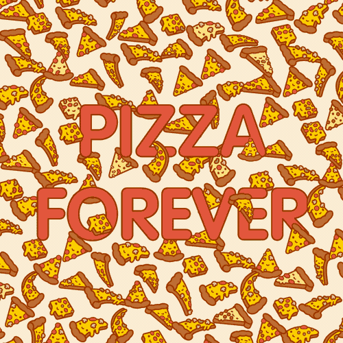
My thought process when going through fonts, colors, and overall feel of the website is I wanted something that wasn't to outside of the box and consistency throughout the website. I figured with the colors of orange, on a pizza website would tie into each other. The pictures added to website are simple and supposed to catch the eyes of the users. On the homepage, we have the logo which represents the company. On the menu page, three different pictures to represent our food and customers can get a visual of our food.
In the future what I would like to add to this website, is the option to be able to order online. Adding the option to order online could possibly increase sales for the store. I would also like to add more pictures, to where the user can select the image and be directed to our pizza page, or someone can hit an image of the appetizers and be directed to our appetizers.