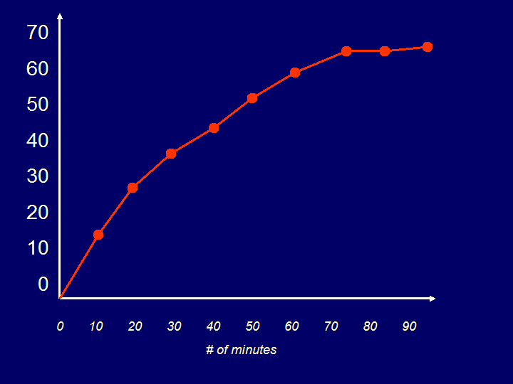
The top left graph represents the total change in temperature over the 90 minute interval
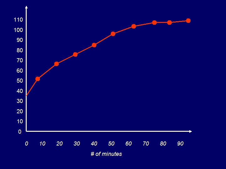
The top right graph is a temperature versus time graph
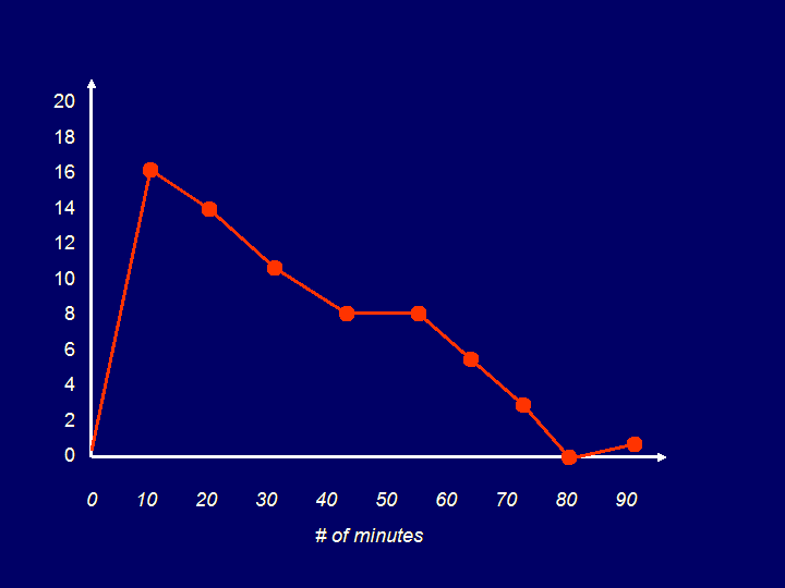
The bottom graph plots the net change over time
How many did you get correct????
Let's look at the total change versus time graph:
Looking at the graph above, we can visualize how the temperature changed over the time period of 90 minutes. The slope of the line connecting consecutive points represents the average rate of change for that time interval. The greater the slope, the greater the average change.
DURING THE FIRST TEN MINUTES, WHAT WAS THE AVERAGE RATE OF CHANGE?
change in temperature = 16 degrees
change in time = 10 minutes
So, the average rate of change for that interval was 1.6 degrees per minute
That quantity is represented by the slope of that line segment.
DURING THE LAST TEN MINUTES, WHAT WAS THE AVERAGE RATE OF CHANGE?
change in temperature = 1 degree
change in time = 10 minutes
So, the average rate of change for that interval was 0.1 degrees per minute
That quantity is represented by the slope of that line segment.
QUESTIONS TO CONSIDER
What was the average change in temperature over the entire interval?
Was there an interval whose average change matched that of the entire interval? If not, which came closest?
Draw a segment connecting the initial point to the last point. Is there an interval whose segment is parallel to that segment?
When creating this graph, could a segment's slope be negative? Explain.
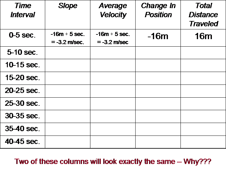
GRAPHICALLY REPRESENTED RATES OF CHANGE
Shown below is a graph of an object's position over a specific interval of time:
At which point did the object begin its travel?
At which pointdid the object end its travel?
What was the object's net change in position? Is this equal to the total distance the object traveled? Explain.
Fill in the approximate values in the table below:
How would you describe the 45 second journey of the object?
If the change in position [slope] is negative, the object moved backwards
If the change in position [slope] is zero, the object stayed at rest
If the change in position [slope] is positive, the object moved forwards
The slope of a graph at any given point is equal to the rate of change at that point
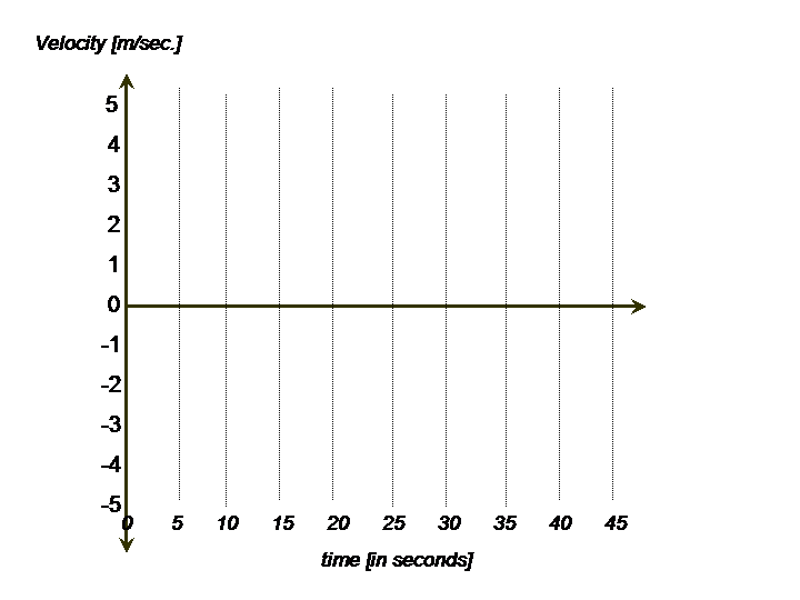
Use the values in your table to create a velocity versus time graph below:
QUESTIONS TO CONSIDER
Is this a continuous graph? If you were to trace the graph with a pencil would you need to lift the pencil at any point?
Does a horizontal line on your graph indicate the object is at rest?
If the object's position was reprted every second [instead of every five], would that affect the graph? If so, in what way?
Could this data reflect a realistic travel of an object? Why or why not?