This illustration is called "An Evening in the Desert"; I created it for an art contest during my senior year when I attended the Berks Career & Technology Center. The thought that went into creating; this piece was to create scenery and a way to have outside elements like mountains, vegetation, and texture from the sky. The best way I got to show the texture by using the sky is when the sun is setting in the desert.
Light the Night was created from a tutorial I found on Youtube by using Adobe Illustrator. I loved being able to use more of the tools that Illustrator offers and adding in the different elements involved in the illustration. My favorite part of this entire piece is the cursive font I used because it ties the whole thing together while bringing out the other elements like the stars, clouds, and the moon shining brightly.
This magazine ad that I created that I envisioned would be an example of an ad; for Apple. I like the idea of Apple having this promotion around Valentine's Day where a person can get two iPhones for the price of one; which is why the tag line is One for you, One for your sweetheart. The simplicity of it is great in this piece as there is enough for it to be eye-catching, but not a lot for it to be overdone.
Space Magazine Spread 1: This is part one of two space magazine spreads for one of my graphic design courses. It is a two-part project because both spreads have the same body text but different designs.
Space Magazine Spread 2: This is part two of the space magazine spreads for one of my graphic design courses. I have kept the theme of being in outer space because that is what the article focuses on. However, the design is different but still captures the vital concept.
Magazine Cover 1: Similar to the Space Magazine Spreads, this was another assignment. It involved finding one picture to use for two different target audiences. In this case, I chose this one to be about African Safaris because it gave me room to use Photoshop to add elements and connected well with the theme.
Magazine Cover 2: The second magazine cover concentrated on an audience that wanted to read about a magazine centered on Photoshop. It wasn't my initial idea but was given to me by my Professor for the course, and I decided to adapt and change my initial thought to this one. It helped more because there is a clear distinction between the two audiences while using the same photo.
This project was created during my junior year when I attended the Berks Career & Technology Center. In this project, we were creating newspaper ads for a (fictitious) local art store called Artists Loft. I love how I designed mine to look like a spiral-bound sketchbook and subtly like a pencil and paintbrush in the background. It brings together the theme of an art store even more. The purpose was to make this simple with very few creative elements because vital information like the sale, hours, address, and website needed to be added.
This was a magazine ad that I made in a graphic design course several terms back. The project was creating a magazine and web banner ad for a resort. For me as the designer of this, a goal I set for myself was to make the ad look appeal because if this would be in real life magazine, the appeal of where the picture is what will draw people into considering taking a vacation at Amethyst Bay. The other aspect was adding accommodations to the ad that will bring in an audience as well. It is very consistent, eye-catching, and to the point for a vacation spot advertisement.
This was a billboard project that solely focused on creating one for the technical school that I attended, Berks Career & Technology Center. It was also a project that I created in a group, which I did not get to do a lot. It was a fun experience to have the input of other peer designers because it was some techniques that I could apply to future projects that I work on with clients. The purpose of this billboard was to draw more students to study at Berks Career & Technology Center while in high school. This message is very present on the billboard, and I can envision this advertised on a billboard around the area of the school.
This logo was created from a real client that the juniors had the opportunity to work with at Berks Career & Technology Center. The purpose was to create a new and improved logo for the Berks County Association for Graveyard Preservation. I tried to go with objects that are usually in cemeteries like, flags posted with soldiers that have died in combat or black roses that serve as symbols for the dead. This would probably be a little much for a logo, but I believe it captures the message that this association is for keeping and maintaining cemeteries around Berks County.
The story behind this logo was that my senior class at BCTC, was learning how to make beverage labels, and this was a logo I designed for a fake ice tea beverage that is supposed to correlate to the British royals. It was a skillful way to relate both the subject of tea and British royals because this being a staple beverage that they drink in the afternoon. The purple is to represent the nobility, and the gold is to show the luxury that this fake brand would have. Overall, it would have audiences feel like they are the Queen of England, drinking her afternoon tea in the palace.
The logo correlates with the business card and envelope I added into the layout section of my portfolio. Since this was for a pet hospital that specializes in holistic treatments, I wanted to keep it easy but, I also wanted to use colors that would make the experience of going into this type of environment a little easier on the owner. The maroon red is to symbolize love, while the cursive font is to exhibit friendliness, and the font that looks like non-fancy handwriting is to show personalization for each owner that would be coming in for their pet to seek treatment.
The final logo piece I created was from my senior project that was a requirement from the program that I was in at BCTC. My senior project was building an imaginary greenhouse that was inspired by my mom because she loves plants. The logo's purpose was to capture the aspect of nature while also being to the point in fonts and colors. The green was to capture the nature factor, while the yellow-gold was for showing the variety of wealth in the plants. After all, I named the greenhouse Green Thumb because it was for plant lovers to expand their collector or for people that are not so good at keeping vegetation alive to learn how and build a green thumb.
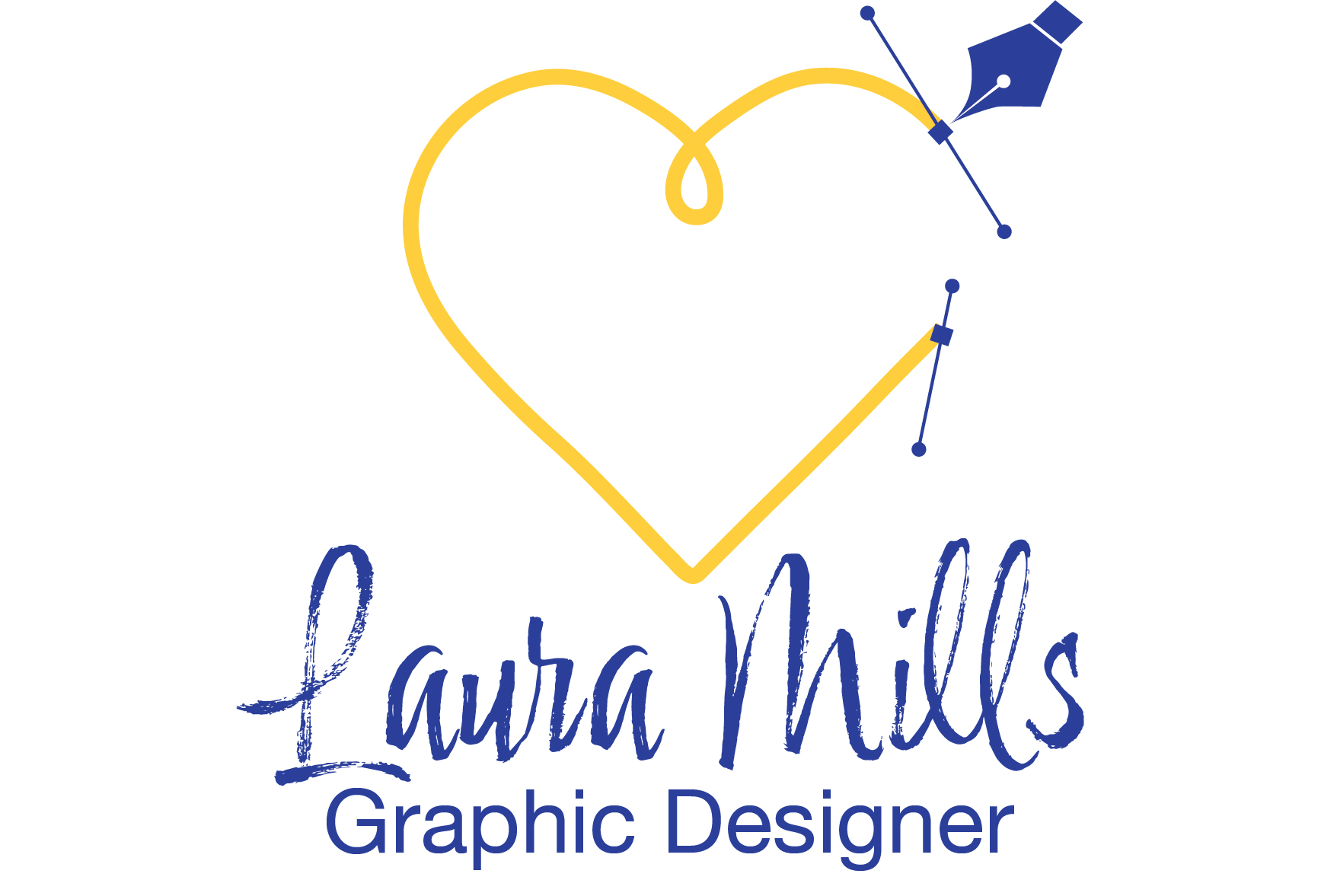
This logo is from my Advanced Digital Imaging course during last year studying with Southern New Hampshire University. I wanted to make it personalized to how I am as a person and a designer since this is the first introduction that an employer and client will have to me and my work.
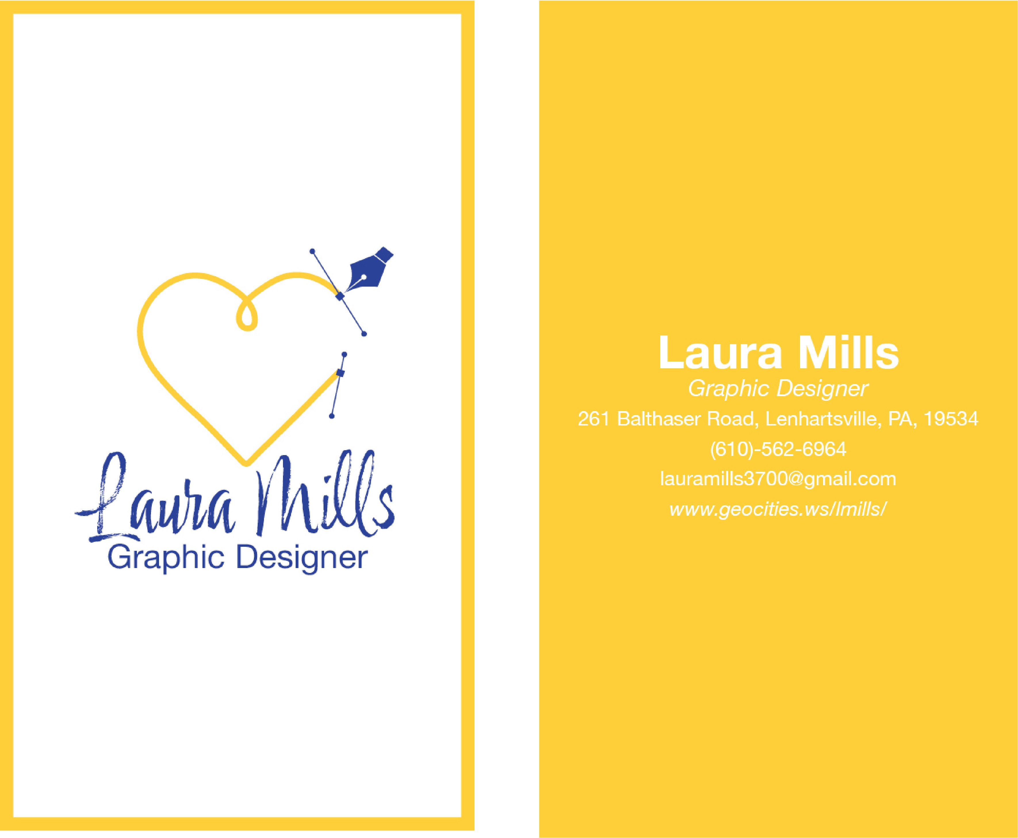
Another piece we created was a business card. I wanted to go with something simple and adheres to the branding color and fonts I used in my logo.
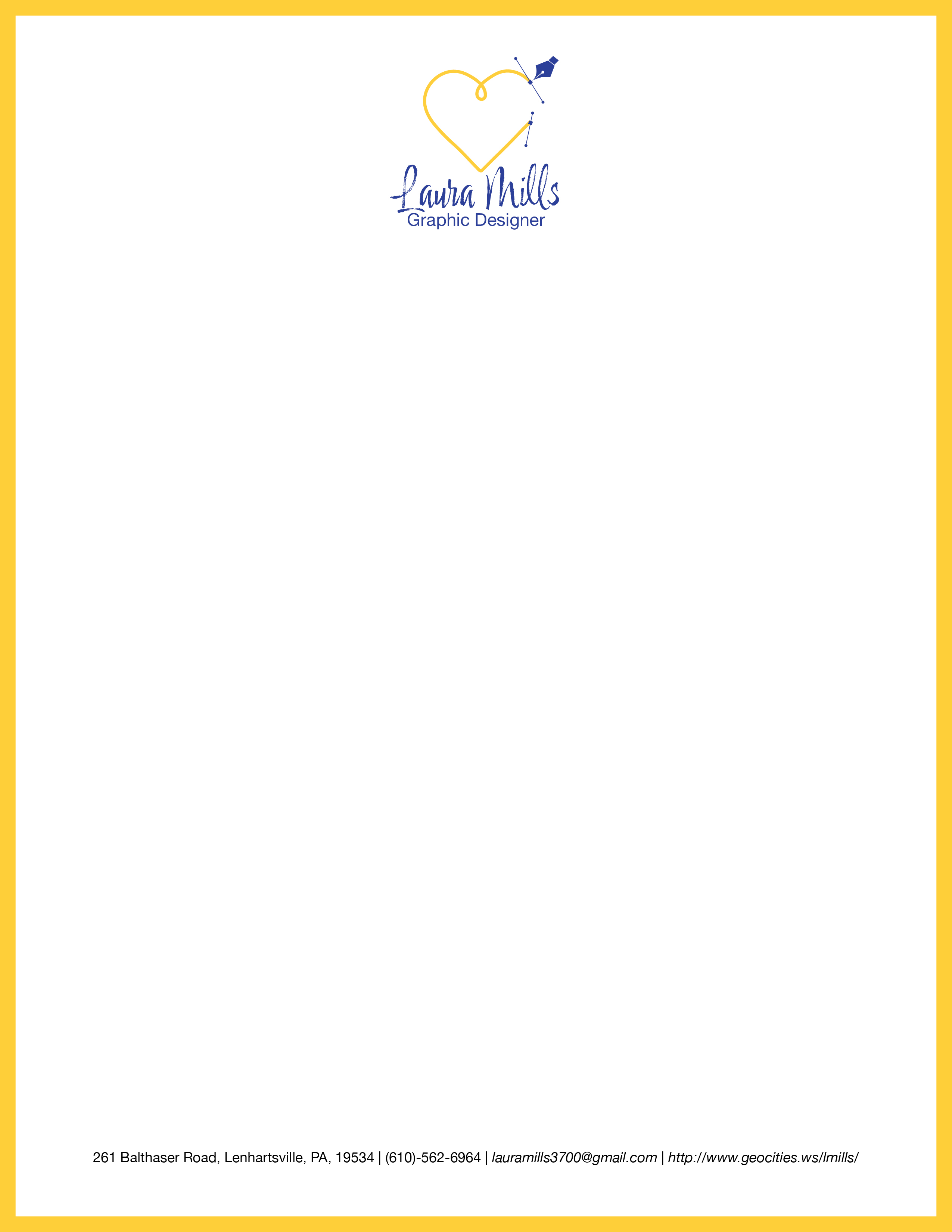
This goes with the logo I designed for my Advanced Digital Design course. We created a branding package, and one of those pieces included a letterhead.
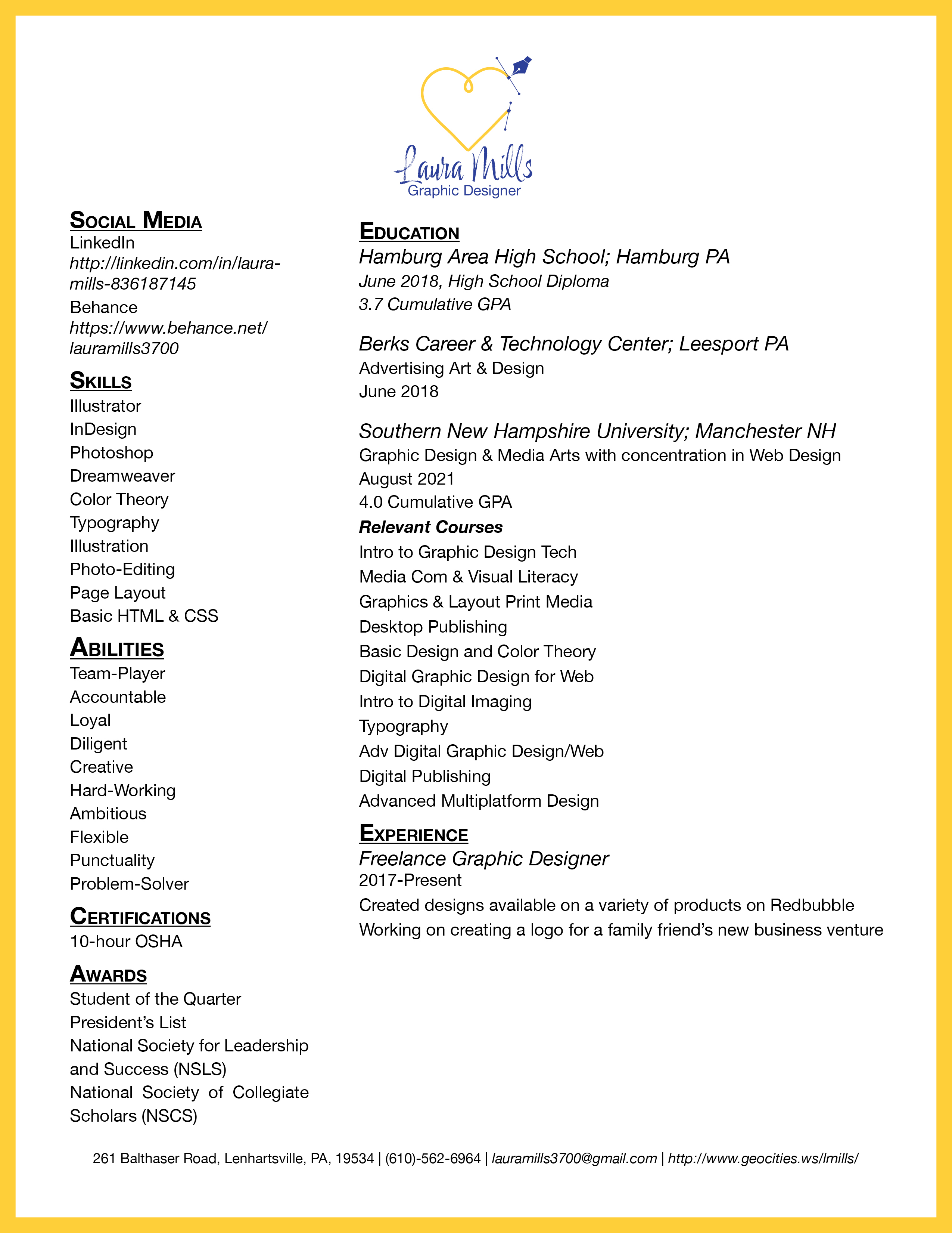
The resume connects to the letterhead because I put the letterhead elements onto the resume for cohesiveness.
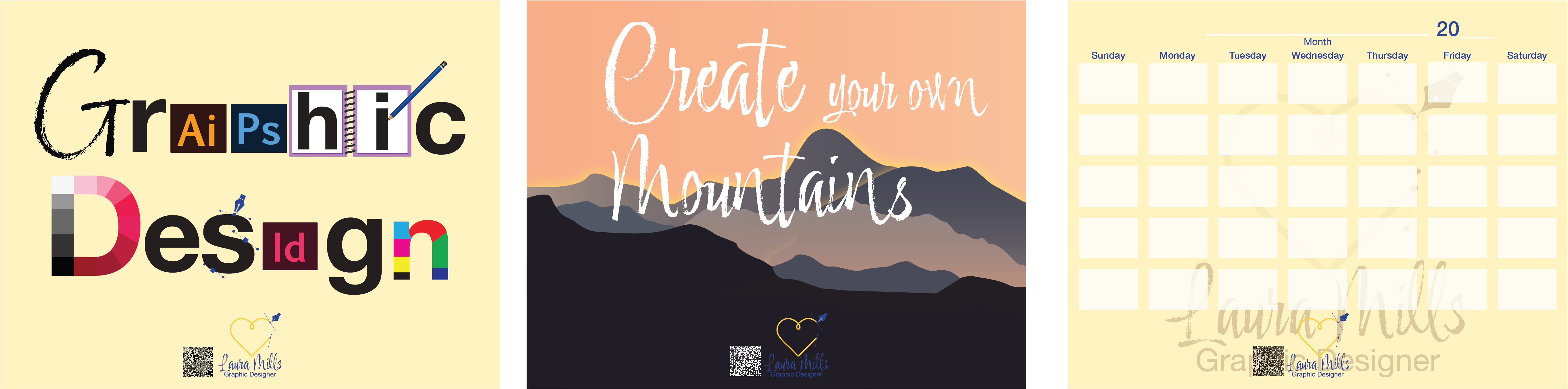
In the branding package, we also created leave-behind pieces to give after having an interview with an employer. I made three designs where two are for decoration, and the third is a universal calendar that can be placed on a refrigerator, filing cabinets, or another place that has a magnetic surface.
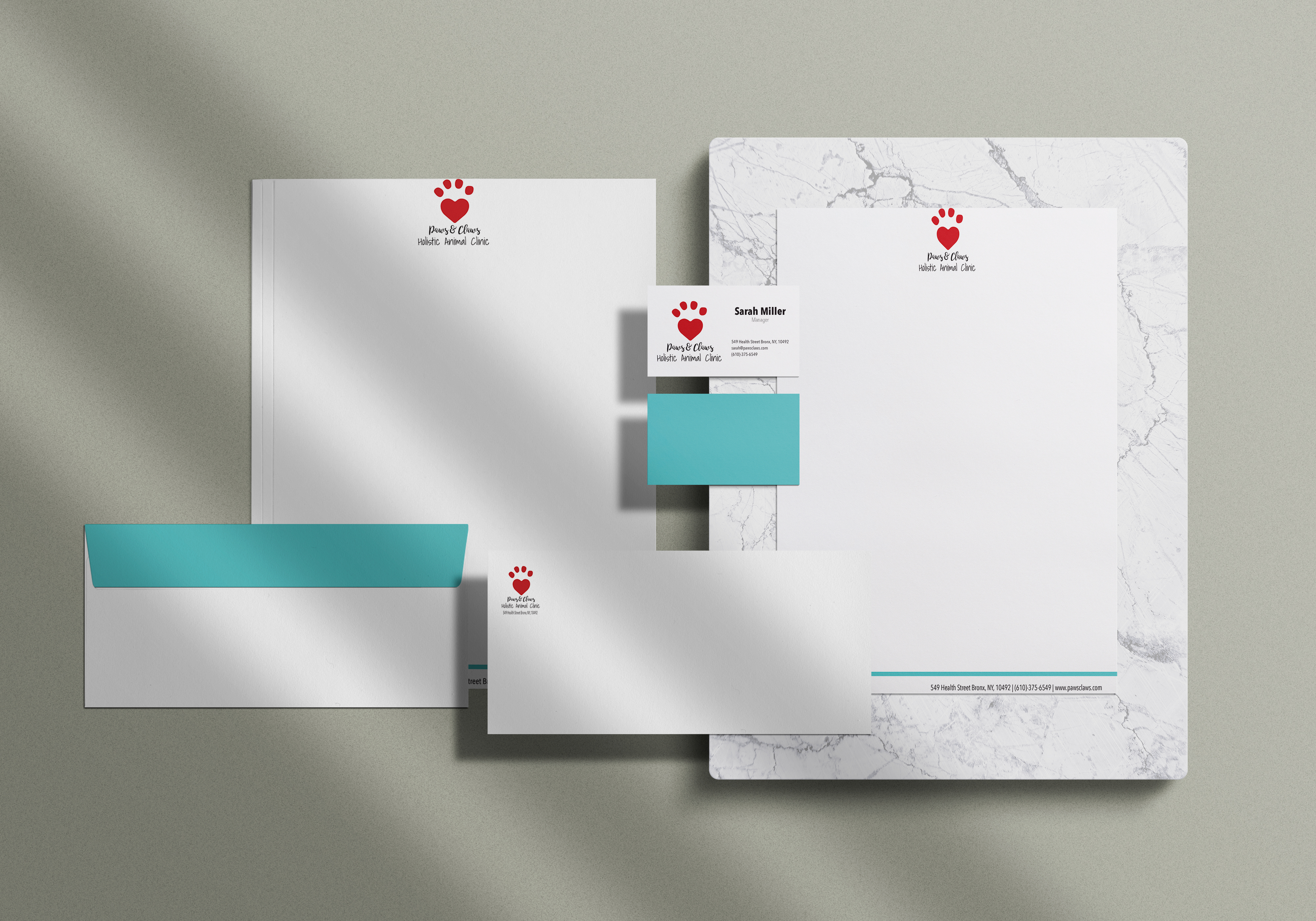
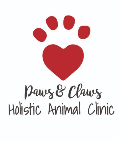
Paws and Claws Stationery Items: This is the Paws and Claws stationery pieces I created in another graphic design course, and it contains a business card, letterhead, and envelope. Technically the logo is part of it too, but it is not part of the stationery pieces I made for this bundle. Paws and Claws is a holistic animal hospital and is made sure to convey it through the color palette and typography choice.
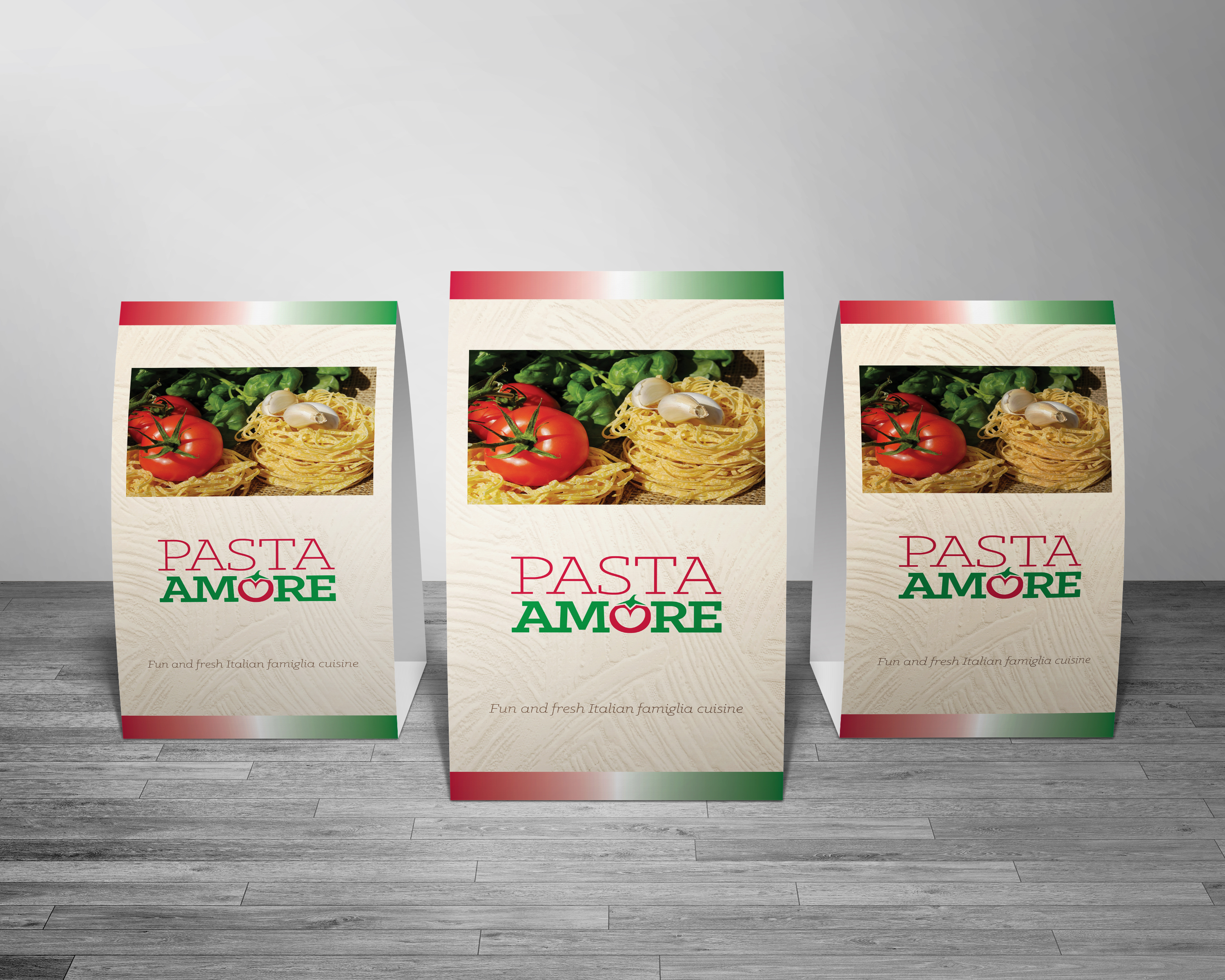
Pasta Amore Table Tent: This is the first part of the Pasta Amore branding package. This is a table tent part of the restaurant branding, with a menu, brochure, and website. The goal of this project was to capture authentic Italian culture but in a local setting. It is to give customers a taste of Italy but without the struggle of actually traveling to Italy.
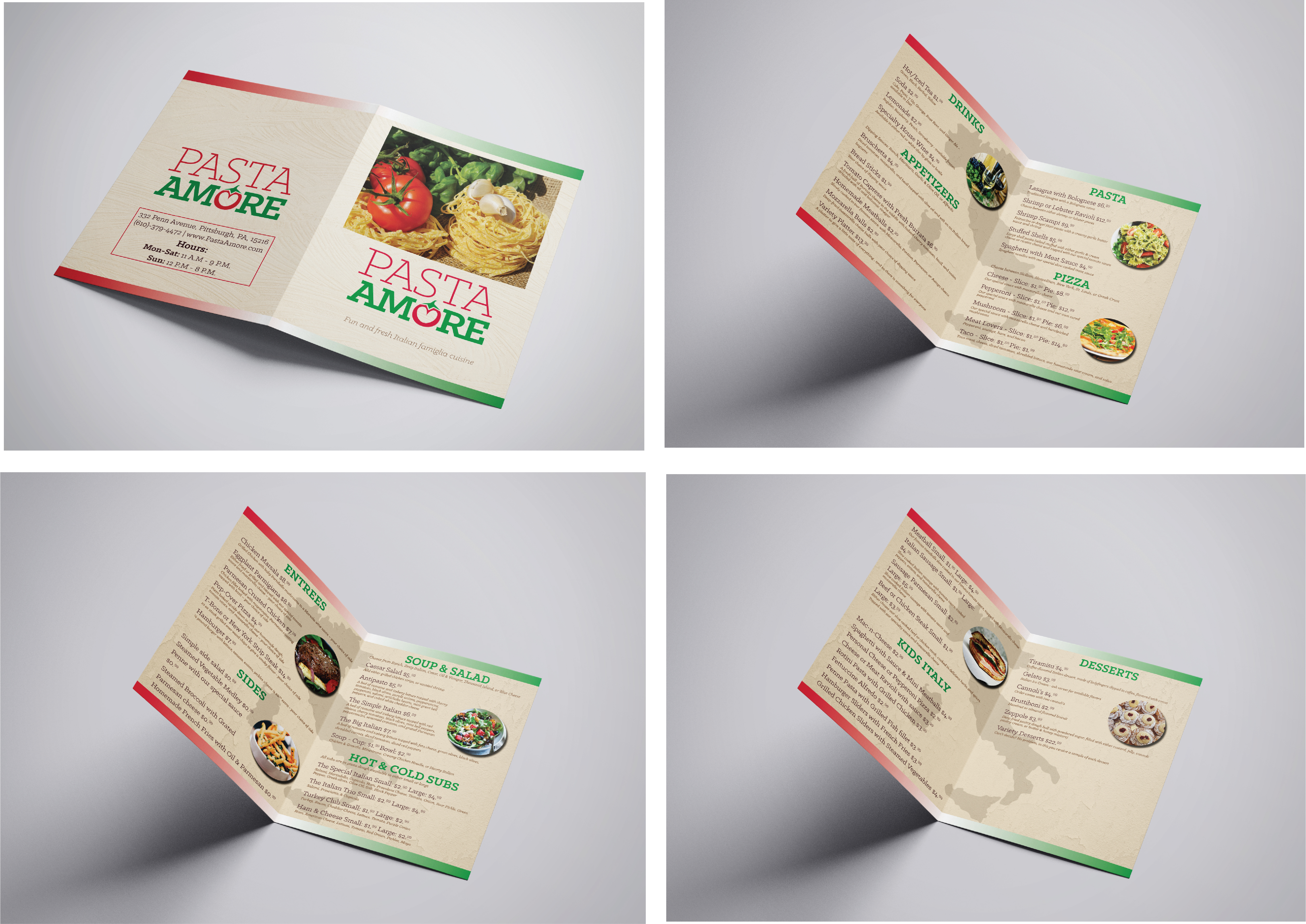
Pasta Amore Menu: This is the Pasta Amore menu with the front and back cover with the inner pages. I wanted to keep the unification from the table tent because it will look like it belongs together, and I believe it captures the feel of Italy very well.
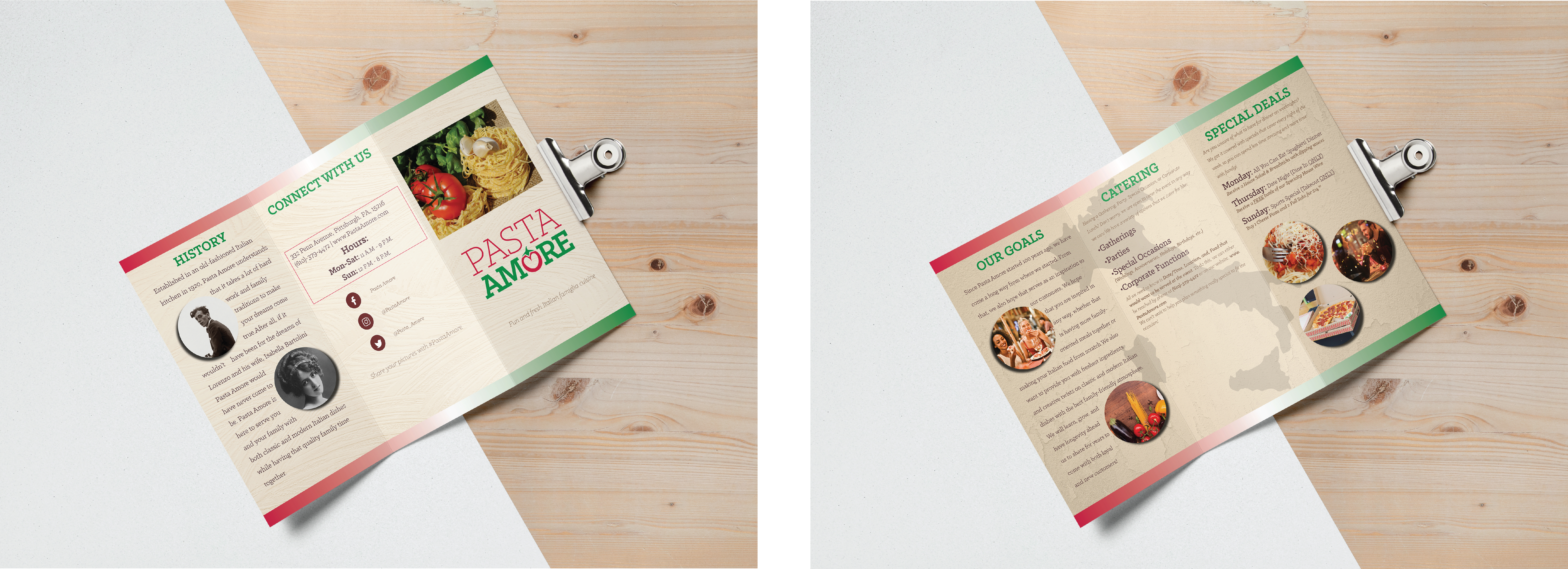
Pasta Amore Brochure: This is the Pasta Amore brochure, which is a tri-fold brochure. I chose a tri-fold brochure because it seemed like the right amount of space for all the information I wanted the audience to know about the Pasta Amore restaurant and brand. It goes well with the rest of the restaurant branding items because they are all unified, and it captures the feel of Italy very well.
Pasta Amore Website: 
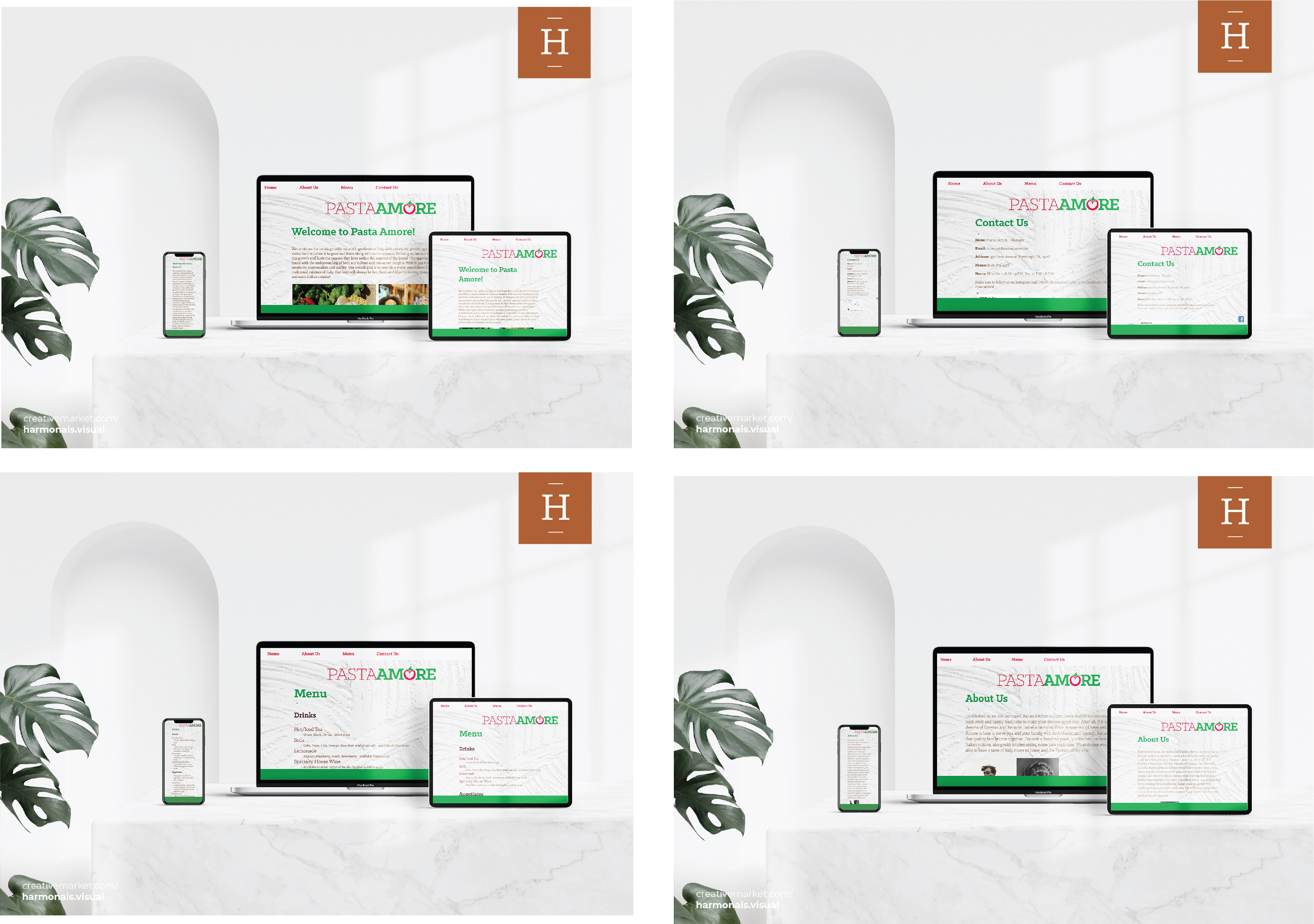
This is the last Pasta Amore restaurant and branding piece, which is a website. This design did not get made until my first web designing course with SNHU and I knew the perfect branding package to have a website is Pasta Amore. To keep this piece consistent with the others, I went back to when I built the restaurant pieces to gather the elements that I needed.
Java Been Website: 
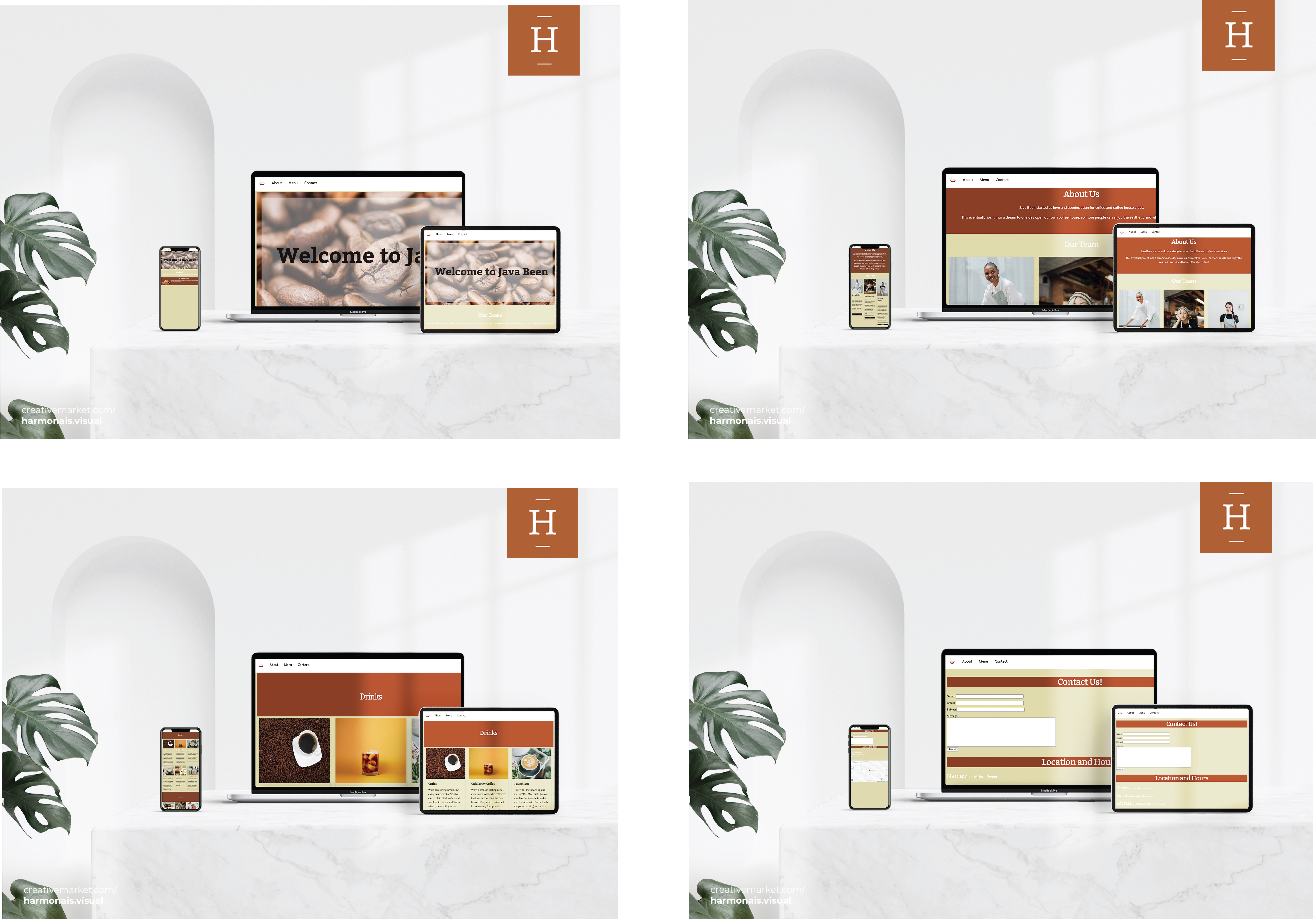
This is the Java Been website, which is a local coffee shop. It is the first website I created that I made responsive, which means that it can be on a mobile, tablet, or desktop device. The goal with this design was for it to have a cafe atmosphere for local communities to have access to a variety of food, drinks, and a quiet hangout spot to do work or read a book.
"Ut wisi enim ad minim veniam, quis nostrud exerci tation ullamcorper suscipit lobortis nisl ut aliquip ex ea commodo consequat. Duis autem vel eum iriure dolor in hendrerit in vulputate velit esse molestie consequat, vel illum dolore eu feugiat nulla facilisis at vero eros et accumsan et iusto odio dignissim qui blandit praesent luptatum zzril delenit augue duis dolore te feugait nulla facilisi."