Operating System
Programming Languages
Database
General
 Asp.Net - Introduction
Asp.net is the new offering for Web developers form the Microsoft. It is not simply the next generation of ASP. Because it has evolved from Asp, Asp.Net looks very similar to its predecessor. But concepts like web forms, Web Services, or server controls gives Asp.Net the power to build real Web application.
What is ASP.NET?
- ASP.NET provides services to allow the creation, deployment, and execution of Web Applications and Web Services
- Like ASP, ASP.NET is a server-side technology
- Web Applications are built using Web Forms. ASP.NET comes with built-in Web Forms controls, which are responsible for generating the user interface. They mirror typical HTML widgets like text boxes or buttons. If these controls do not fit your needs, you are free to create your own user controls.
- Web Forms are designed to make building web-based applications as easy as building Visual Basic applications
Features of ASP.NET.
- Separation of Code from HTML
To make a clean sweep, with ASP.NET you have the ability to completely separate layout and business logic. This makes it much easier for teams of programmers and designers to collaborate efficiently. This makes it much easier for teams of programmers and designers to collaborate efficiently. - Support for compiled languages
developer can use VB.NET and access features such as strong typing and object-oriented programming. Using compiled languages also means that ASP.NET pages do not suffer the performance penalties associated with interpreted code. ASP.NET pages are precompiled to byte-code and Just In Time (JIT) compiled when first requested. Subsequent requests are directed to the fully compiled code, which is cached until the source changes. - Use services provided by the .NET Framework The .NET Framework provides class libraries that can be used by your application. Some of the key classes help you with input/output, access to operating system services, data access, or even debugging. We will go into more detail on some of them in this module.
- Graphical Development Environment Visual Studio .NET provides a very rich development environment for Web developers. You can drag and drop controls and set properties the way you do in Visual Basic 6. And you have full IntelliSense support, not only for your code, but also for HTML and XML.
- State management To refer to the problems mentioned before, ASP.NET provides solutions for session and application state management. State information can, for example, be kept in memory or stored in a database. It can be shared across Web farms, and state information can be recovered, even if the server fails or the connection breaks down
- Update files while the server is running Components of your application can be updated while the server is online and clients are connected. The Framework will use the new files as soon as they are copied to the application. Removed or old files that are still in use are kept in memory until the clients have finished.
- XML-Based Configuration Files Configuration settings in ASP.NET are stored in XML files that you can easily read and edit. You can also easily copy these to another server, along with the other files that comprise your application.
Structure of Asp.Net
Directives
You can use directives to specify optional settings used by the page compiler when processing ASP.NET files. For each directive you can set different attributes. One example is the language directive at the beginning of a page defining the default programming language.
Code Declaration Blocks
Code declaration blocks are lines of code enclosed in <script> tags. They contain the runat=server attribute, which tells ASP.NET that these controls can be accessed on the server and on the client. Optionally you can specify the language for the block. The code block itself consists of the definition of member variables and methods.
Code Render Blocks
Render blocks contain inline code or inline expressions enclosed by the character sequences shown here. The language used inside those blocks could be specified through a directive like the one shown before.
HTML Control Syntax
You can declare several standard HTML elements as HTML server controls. Use the element as you are familiar with in HTML and add the attribute runat=server. This causes the HTML element to be treated as a server control. It is now programmatically accessible by using a unique ID. HTML server controls must reside within a <form> section that also has the attribute runat=server.
Custom Control Syntax
There are two different kinds of custom controls. On the one hand there are the controls that ship with .NET, and on the other hand you can create your own custom controls. Using custom server controls is the best way to encapsulate common programmatic functionality.Just specify elements as you did with HTML elements, but add a tag prefix, which is an alias for the fully qualified namespace of the control. Again you must include the runat=server attribute. If you want to get programmatic access to the control, just add an Id attribute.You can include properties for each server control to characterize its behavior. For example, you can set the maximum length of a TextBox. Those properties might have sub properties; you know this principle from HTML. Now you have the ability to specify, for example, the size and type of the font you use .The last attribute is dedicated to event binding. This can be used to bind the control to a specific event
Data Binding Expression
You can create bindings between server controls and data sources. The data binding expression is enclosed by the character sequences <%# and %>. The data-binding model provided by ASP.NET is hierarchical. That means you can create bindings between server control properties and superior data sources.
Server-side Object Tags
If you need to create an instance of an object on the server, use server-side object tags. When the page is compiled, an instance of the specified object is created. To specify the object use the identifier attribute. You can declare .NET objects using class as the identifier, and COM objects using either progid or classid.
Server-side Include Directives
With server-side include directives you can include raw contents of a file anywhere in your ASP.NET file. Specify the type of the path to filename with the pathtype attribute. Use either File, when specifying a relative path, or Virtual, when using a full virtual path.
Server-side Comments
To prevent server code from executing, use these character sequences to comment it out. You can comment out full blocks - not just single lines
Asp.Net - Framework
ASP.NET is based on the fundamental architecture of .NET Framework. Visual studio provides a uniform way to combine the various features of this Architecture. Architecture is explained form bottom to top in the following discussion.
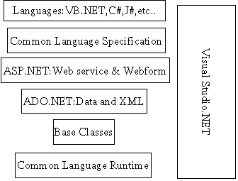
At the bottom of the Architecture is Common Language Runtime. NET framework common language runtime resides on top of the operating system services. The common language runtime loads and executes code that targets the runtime. This code is therefore called managed code. The runtime gives you, for example, the ability for cross-language integration.
1..NET Framework provides a rich set of class libraries. These include base classes, like networking and input/output classes, a data class library for data access, and classes for use by programming tools, such as debugging services. All of them are brought together by the Services Framework, which sits on top of the common language runtime.
2.ADO.NET is Microsoft's ActiveX Data Object (ADO) model for the .NET Framework. ADO.NET is not simply the migration of the popular ADO model to the managed environment but a completely new paradigm for data access and manipulation.
ADO.NET is intended specifically for developing web applications. This is evident from its two major design principles:
>>Disconnected DatasetsIn ADO.NET, almost all data manipulation is done outside the context of an open database connection.
>>Effortless Data Exchange with XMLDatasets can converse in the universal data format of the Web, namely XML
3.The 4th layer of the framework consists of the Windows application model and, in parallel, the Web application model.
The Web application model-in the slide presented as ASP.NET-includes Web Forms and Web Services. ASP.NET comes with built-in Web Forms controls, which are responsible for generating the user interface. They mirror typical HTML widgets like text boxes or buttons. If these controls do not fit your needs, you are free to create your own user controls.Web Services brings you a model to bind different applications over the Internet. This model is based on existing infrastructure and applications and is therefore standard-based, simple, and adaptable.Web Services are software solutions delivered via Internet to any device. Today, that means Web browsers on computers, for the most part, but the device-agnostic design of .NET will eliminate this limitation.
4.One of the obvious themes of .NET is unification and interoperability between various programming languages. In order to achieve this; certain rules must be laid and all the languages must follow these rules. In other words we can not have languages running around creating their own extensions and their own fancy new data types. CLS is the collection of the rules and constraints that every language (that seeks to achieve .NET compatibility) must follow.
5.The CLR and the .NET Frameworks in general, however, are designed in such a way that code written in one language can not only seamlessly be used by another language. Hence ASP.NET can be programmed in any of the .NET compatible language whether it is VB.NET, C#, Managed C++ or JScript.NET.
Page Life Cycle in Asp.Net 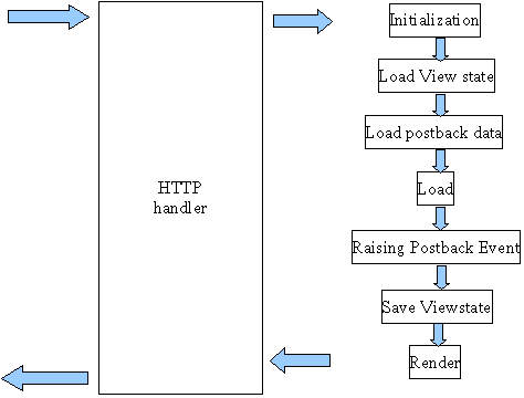
Stage-1 Initialization:
This stage is marked by having the Page and controls fire their Init events. At this point in the page life cycle, the control hierarchy has been constructed, and the Web control properties that are specified in the declarative syntax have been assigned.
Stage-2 Load view State:
The load view state stage only happens when the page has been posted back. During this stage, the view state data that had been saved from the previous page visit is loaded and recursively populated into the control hierarchy of the Page. It is during this stage that the view state is validated.
Stage-3 Load Post Back Data:
The load postback data stage also only happens when the page has been posted back. A server control can indicate that it is interested in examining the posted back data by implementing the IPostBackDataHandler interface. In this stage in the page life cycle, the Page class enumerates the posted back form fields, and searches for the corresponding server control. If it finds the control, it checks to see if the control implements the IPostBackDataHandler interface. If it does, it hands off the appropriate postback data to the server control by calling the control's LoadPostData() method. The server control would then update its state based on this postback data. To help clarify things, let's look at a simple example. One nice thing about ASP.NET is that the Web controls in a Web Form remember their values across postback. That is, if you have a TextBox Web control on a page and the user enters some value into the TextBox and posts back the page, the TextBox's Text property is automatically updated to the user's entered value. This happens because the TextBox Web control implements the IPostBackDataHandler interface, and the Page class hands off the appropriate value to the TextBox class, which then updates its Text property. To concretize things, imagine that we have an ASP.NET Web page with a TextBox whose ID property is set to txtName. When the page is first visited, the following HTML will be rendered for the TextBox: <input type="text" id="txtName" name="txtName" />. When the user enters a value into this TextBox (such as, "Hello, World!") and submits the form, the browser will make a request to the same ASP.NET Web page, passing the form field values back in the HTTP POST headers. These include the hidden form field values (such as __VIEWSTATE), along with the value from the txtName TextBox. When the ASP.NET Web page is posted back in the load postback data stage, the Page class sees that one of the posted back form fields corresponds to the IPostBackDataHandler interface. There is such a control in the hierarchy, so the TextBox's LoadPostData() method is invoked, passing in the value the user entered into the TextBox ("Hello, World!"). The TextBox's LoadPostData() method simply assigns this passed in value to its Text property.
Stage-4 Load:
This is the stage with which all ASP.NET developers are familiar, as we've all created an event handler for a page's Load event (Page_Load). When the Load event fires, the view state has been loaded (from stage 2, Load View State ), along with the postback data (from stage 3, Load Postback Data). If the page has been posted back, when the Load event fires we know that the page has been restored to its state from the previous page visit .
Stage -5 Raise Postback Event:
Certain server controls raise events with respect to changes that occurred between postbacks. For example, the DropDownList Web control has a SelectedIndexChanged event, which fires if the DropDownList's SelectedIndex has changed from the SelectedIndex value in the previous page load. Another example: if the Web Form was posted back due to a Button Web control being clicked, the Button's Click event is fired during this stage.
There are two flavors of postback events. The first is a changed event. This event fires when some piece of data is changed between postbacks. An example is the DropDownLists SelectedIndexChanged event, or the TextBox's TextChanged event. Server controls that provide changed events must implement the IPostBackDataHandler interface. The other flavor of postback events is the raised event. These are events that are raised by the server control for whatever reason the control sees fit. For example, the Button Web control raises the Click event when it is clicked, and the Calendar control raises the VisibleMonthChanged event when the user moves to another month. Controls that fire raised events must implement the IPostBackEventHandler interface. Since this stage inspects postback data to determine if any events need to be raised, the stage only occurs when the page has been posted back. As with the load postback data stage, the raise postback event stage does not use view state information at all. Whether or not an event is raised depends on the data posted back in the form fields.
Stage 6 - Save View State :
In the save view state stage, the Page class constructs the page's view state, which represents the state that must persist across postbacks. The page accomplishes this by recursively calling the SaveViewState() method of the controls in its control hierarchy. This combined, saved state is then serialized into a base-64 encoded string. In stage 7, when the page's Web Form is rendered, the view state is persisted in the page as a hidden form field.
Stage 7- Render:
In the render stage the HTML that is emitted to the client requesting the page is generated. The Page class accomplishes this by recursively invoking the RenderControl() method of each of the controls in its hierarchy.
Types of Controls:
- Web Controls
- Html Controls
- Validation Controls
- User Controls
1.Web Controls:
WebControls provide a more consistent object model and a higher level of abstraction than HtmlControls
Most HTML elements can also be represented as WebControls on the server
WebControl versions typically have a more consistent interface (background color is always BackColor property whereas in HTML it may be a style attribute (span) or a property (table) )
WebControls also provide higher-level controls with more functionality than primitive HTML elements (like the Calendar control)
WebControls may render themselves differently based on client browser capabilities
Hierarchy of Webcontrols
Hierarchy of Webcontrols
Web controls |
||||
|
AdRotator |
Listbutton |
Image |
|
|
DataGrid |
RadioButtonList |
ImageButton |
|
|
DataList |
CheckBoxList |
Label |
|
|
Button |
DropDownList |
|
|
|
Calendar |
ListBox |
|
|
|
CheckBox |
Panel |
|
|
|
RadioButton |
Table |
|
|
|
HyperLink |
TableRow |
|
|
|
Textbox |
TableCell |
|
|
A sample ASP.NET Page written with Webcontrols
<%@ Page Language="C#" %>
<html>
<body>
<form runat="Server">
<asp:RadioButton Text="Click me !" runat="server" ID="rb"/></br>
<asp:CheckBox Text="Click me !" runat="server" ID="ck"/></br>
<asp:Button Text="Click me !" runat="server" ID="btn"/></br>
</form>
</body>
</html>
HtmlControls are server-side representations of standard HTML elements
Any HTML element in an ASPX page marked with the runat=server attribute will become an HTML control on the server
All derive from HtmlControl class
HTML elements with no distinguished server-side functionality (like div, span, etc.) are all represented as HtmlGenericControl instances
Html Controls |
|
Html Image |
HtmlForm |
HtmlInputFile |
HtmlButton |
HtmlInputHidden |
HtmlSelect |
HtmlInputRadioButton |
HtmlTable |
HtmlInputText |
HtmlTableCell |
HtmlInputButton |
HtmlTableRow |
HtmlInputCheckButton |
HtmlTextArea |
HtmlInputImage |
HtmlAnchor |
A sample Code for HtmlControls
<%@ Page Language="C#" %>
<html>
<body>
<form runat="Server">
<input type=radio runat="server">Clickme</input></br>
<input type =text value = "type here!" runat="server"/></br>
<input type= button Text="Click me !" runat="server"></br>
</form>
</body>
</html>
ASP.NET server controls are reusable components that can perform the same work as traditional HTML controls, but have the additional benefit of being "programmable objects". In other words, they can be programmatically accessed, just like any other .NET object or class, respond to events, get/set properties, and do all the other things objects do. ASP.NET server controls use a tag-like syntax for declaring the various controls used on a web page -- for example:
<asp:button id="SampleButton" runat="server" text="I'm A Sample Button!"/>
One of the unique qualities of ASP.NET server controls is that, even though their tag syntax is different from HTML's, every ASP.NET server control is rendered to standard HTML after being processed on the server, thus abstracting the functionality of the entire HTML control set. Additional ASP.NET server controls, provide the ability to render rich web content
3. Asp.Net - Validation controls
The validator controls are the main elements of the solution. A validator is a visual ASP.NET control that checks a specific validity condition of another control. It generally appears to the user as a piece of text that displays or hides depending on whether the control it is checking is in error. It can also be an image, or can even be invisible and still do useful work. There are six types of validator controls that perform different types of checks.
Requiredfield validator:
The RequiredFieldValidator control validates input by verifying that the corresponding field isn't blank. It's perfect for TextBoxes representing required fields in a form, because if any of those TextBoxes is blank, the RequiredFieldValidator won't allow the form to be submitted to the server.
Here's an example that verifies a TextBox named EMail isn't blank:
<asp:TextBox ID="EMail" RunAt="server" />
<asp:RequiredFieldValidator
ControlToValidate="EMail"
ErrorMessage="Required field"
Display="static"
Color="red"
RunAt="server"
/>
Because required fields are so common in Web forms, RequiredFieldValidator has the potential to see more use than all the other validation controls combined. It's often used in conjunction with other validation controls because none of the others run their validation checks on blank fields.
RangeValidator
The RangeValidator control is the answer to the question How do I ensure that an input value falls within a specified range? Suppose you ask the user to type in a percentage, and that valid values range from 0 to 100, inclusive. Here's how to reject any numbers that fall outside that range:
<asp:TextBox ID="Percent" RunAt="server" />
<asp:RangeValidator
ControlToValidate="Percent"
MinimumValue="0"
MaximumValue="100"
Type="Integer"
ErrorMessage="Value out of range"
Display="static"
Color="red"
RunAt="server"
/>
The Type attribute tells a RangeValidator what type of data to use in the comparison. If you don't specify a type, Type defaults to String. Type=Integer performs a numeric comparison involving integers. Other valid Type attributes include Currency, Date, and Double. The following example displays an error message if the date typed into a
TextBox doesn't fall in the fourth quarter of 2002:
<asp:TextBox ID="MyDate" RunAt="server" />
<asp:RangeValidator
ControlToValidate="MyDate"
MinimumValue="10/01/2002"
MaximumValue="12/31/2002"
Type="Date"
ErrorMessage="Date out of range"
Display="static"
Color="red"
RunAt="server"
/>
In practice, a range-checking date with RangeValidator is of limited usefulness because well-designed sites permit users to pick dates from a calendar. Manually entered dates are problematic because they're culture-sensitive (many parts of the world put days before months, for example) and because RangeValidator understands a limited set of date formats.
Compare Validator
The CompareValidator control validates input by comparing it to a constant value specified with a ValueToCompare attribute or to a value in another control identified with a ControlToCompare attribute. ControlToCompare makes CompareValidator a valuable control for validating input based on other input. Suppose you invite the user to enter minimum and maximum values denoting both ends of a range. It doesn't make sense to accept a maximum that's less than the minimum, so you can use a CompareValidator to ensure the integrity of the input. In the following example, the validator signals an error if the maximum is less than the minimum. The Operator attribute specifies that the value entered in the TextBox named Maximum
must be equal to or greater than the value entered into the TextBox named Minimum. The Type attribute identifies the type of data involved in the comparison:
<asp:TextBox ID="Minimum" RunAt="server" />
<asp:TextBox ID="Maximum" RunAt="server" />
<asp:CompareValidator
ControlToValidate="Maximum"
ControlToCompare="Minimum"
Type="Integer"
Operator="GreaterThanEqual"
ErrorMessage="Invalid maximum"
Display="static"
Color="red"
RunAt="server"
/>
Other supported values for Operator are Equal, NotEqual, GreaterThan, LessThan, LessThanEqual, and DataTypeCheck. The last of these validates the type of data entered by verifying that it matches the type specified in the Type attribute. If you simply wanted to verify that the user input an integer, for example, you could set Type to Integer and Operator to DataTypeCheck.
RegularExpressionValidator
The most versatile validation control by far is the RegularExpressionValidator, which validates input by verifying that it conforms to a format specified in a regular expression. You can use RegularExpressionValidator to perform a variety of common validation chores, from verifying that an input value contains only numbers to ensuring that e-mail addresses, zip codes, and credit card numbers are well-formed. Here's a very simple exampleone that uses a RegularExpressionValidator to reject input containing non-numeric characters:
<asp:TextBox ID="Quantity" RunAt="server" />
<asp:RegularExpressionValidator
ControlToValidate="Quantity"
ValidationExpression="^\d+$"
ErrorMessage="Digits only"
Display="static"
Color="red"
RunAt="server"
/>
In a regular expression, \d represents the digits 0-9 and + means one or more of. The expression \d+ means one or more characters that are digits. If the user tries to slip in a string with a letter in it, the validator will reject it.
ValidationSummary
ValidationSummary is a different sort of validation control. It doesn't perform any validation of its own. It does, however, offer an alternative method for displaying other validators' error messages by batching them up and displaying them as a group. The following example uses a ValidationSummary control to summarize all the validation errors encountered on the page. Note that the other validator controls' Display attributes are set to None, which prevents them from displaying error messages on their own. Before the page is submitted to the server, the ValidationSummary control checks the other validators. If any of the validation checks failed, the ValidationSummary control displays the corresponding error messages in a bulleted list:
<asp:TextBox ID="UserName" RunAt="server" />
<asp:RequiredFieldValidator
ControlToValidate="UserName"
ErrorMessage="The user name can't be blank"
Display="none"
RunAt="server"
/>
<asp:TextBox ID="Password" TextMode="Password" RunAt="server" />
<asp:RequiredFieldValidator
ControlToValidate="Password"
ErrorMessage="The password can't be blank"
Display="none"
RunAt="server"
/>
<asp:RegularExpressionValidator
ControlToValidate="Password"
ValidationExpression=".{8,}"
Display="static"
ErrorMessage="The password must contain at least 8 characters"
RunAt="server"
/>
<asp:ValidationSummary
DisplayMode="BulletList"
HeaderText="This page contains the following errors"
Display="static"
RunAt="server"
/>
The ValidationSummary control's DisplayMode attribute can be set to BulletList, which displays error messages in a bulleted list; List, which displays error messages in a list without bullets; or SingleParagraph, which displays error messages without bullets or line breaks. HeaderText specifies the text, if any, that appears above the error messages. A ValidationSummary control's ShowMessageBox and ShowSummary properties can be used to further customize the control's output. By default, ShowMessageBox is false and ShowSummary is true, meaning that error messages are displayed in the Web page. However, setting ShowMessageBox to true and ShowSummary to false displays the error messages in a pop-up message box (what JavaScript programmers refer to as an alert box because of the JavaScript command used to display it: alert):
<asp:ValidationSummary
DisplayMode="BulletList"
HeaderText="This page contains the following errors"
ShowMessageBox="true"
ShowSummary="false"
RunAt="server"
/>
Setting both ShowMessageBox and ShowSummary to true causes the validation summary to appear in a message box and in the Web page.
CustomValidator
When none of the other validators fits the bill, CustomValidator will do the job that no others can. As its name implies, CustomValidator validates input using an algorithm that you supply. If you want CustomValidator to check input on the client side, you provide a JavaScript function to do the checking and identify the function with a ClientValidationFunction attribute. (You can use VBScript if you'd like, but realize that doing so sacrifices compatibility with browsers other than Internet Explorer.) If you want the input checked on the server as well, you provide the validation function and identify it with an OnServerValidate attribute. The following example uses CustomValidator to
verify that an input value is an even multiple of 10:
<asp:TextBox ID="Amount" RunAt="server" />
<asp:CustomValidator
ControlToValidate="Amount"
ClientValidationFunction="__validateAmount"
OnServerValidate="ValidateAmount"
ErrorMessage="Amount must be a multiple of 10"
Display="static"
Color="red"
RunAt="server"
/>
.
. .
<script language="JavaScript">
<!--
function __validateAmount (source, args)
{
args.IsValid = (args.Value % 10 == 0);
}
-->
</script>
<script language="C#" runat="server">
void ValidateAmount (Object sender, ServerValidateEventArgs e)
{
try {
e.IsValid = (Convert.ToInt32 (e.Value) % 10 == 0);
}
catch (FormatException) {
// In case a non-numeric value is entered
e.IsValid = false;
}
}
</script>
The key is to set args.IsValid to true or false on the client side and e.IsValid to true or false on the server side to indicate whether the input is valid. CustomValidator can be used to apply any validation algorithm you want as long a you're willing to write the code to back it up.
4. Asp.Net - Web User Controls
An ASP.NET user control is a group of one or more server controls or static HTML elements that encapsulate a piece of functionality. A user control could simply be an extension of the functionality of an existing server control(s) (such as an image control that can be rotated or a calendar control that stores the date in a text box).
User controls are those controls which we create and add to Web pages. Creating a user control for Web Application is very similar to creating a user control in Windows Application.
To start, add a user control file to the project selecting from Project->Add Web User Control and drag five hyperlink server controls from the toolbox on to the user control file (WebUserControl1.ascx). We are designing the user interface for the user control at this time. Select each hyperlink control and set it's NavigateUrl to a site of your choice and Target property to "_parent". The HTML view of this file looks like this:
<%@ Control Language="vb" AutoEventWireup="false" Codebehind="WebUserControl1.ascx.vb"_
Inherits="asp.WebUserControl1" TargetSchema="http://schemas.microsoft.com/intellisense/ie5" %>
<asp:HyperLink id="HyperLink1" runat="server" Target="_parent"_
NavigateUrl="http://www.startvbdotnet.com">Startvbdotnet</asp:HyperLink>
<asp:HyperLink id="HyperLink2" runat="server" Target="_parent"_
NavigateUrl="http://www.microsoft.com">Microsoft</asp:HyperLink>
<asp:HyperLink id="HyperLink3" runat="server" Target="_parent"_
NavigateUrl="http://www.msdn.microsoft.com">MSDN</asp:HyperLink>
<asp:HyperLink id="HyperLink4" runat="server" Target="_parent"_
NavigateUrl="http://www.msdn.microsoft.com/vbasic">VisualBasicHome</asp:HyperLink> <asp:HyperLink id="HyperLink5" runat="server" Target="_parent"_
NavigateUrl="http://www.msdn.microsoft.com/net">.NET Home</asp:HyperLink>
Notice the code above, the code doesn't have any HTML elements like, <HEAD>, <BODY>, etc. By default Web user controls cannot contain the HTML tags that inlcude the <HTML>, <HEAD>, <BODY> and <FORM> tags.
Once you are finished designing the user interface it's now time to use the control. To use the newly created user control, in the Web Forms Designer, open the Web Forms page you want to add the control to, and make sure that the page is in Design View. Select the user control's file in Solution Explorer, and drag it onto the page. That add's the user control to the form. Note that because the Web User Control has not been compiled, VB doesn't know what it will look like at run time, so it gives it a generic apperance at design time. The image below displays that.
Adding a User Control Manually
We also can add a user control to a Web Forms page in HTML view. The procedure above demonstrated creation of a user control and adding it to a Web form by drag and drop feature. The following two steps will show you how to add it in code.
Register the user control
The first step in the process is to register the user control which we created. To do so, open the Web forms page to which you want to add the user control. Go to design view and switch to HTML view and at the top of the page, before the <HTML> tag, you need to add a directive that registers this control so that it will be recognized when the page is processed. You should use the directive to associate a name and a namespace with the Web user control by specifying TagPrefix, TagName, and Src location values. The line of code for that looks like this:
<%@ Register TagPrefix="uc1" TagName="links" Src="WebUserControl1.ascx" %>
The values for each attribute mentioned on the above line of code are as follows:
TagPrefix: The TagPrefix determines a unique namespace for the user control. If multiple user controls on the page happen to have the same name, they can be differentiated from each other using this
TagName: The TagName is the name for the user control. This name is used along with the tag prefix to uniquely identify the namespace for the control
Src: Src attribute is the virtual path to the user control
Adding the User Control
The next step is to add the user control to the page. To add the user control to a page use the following line of code:
<uc1:links id="links1" runat="server"/>
The above line of code should be placed in the <BODY> region of the page and within the <FORM> element. You can place the line code where you want the control to appear on the page. When you run the application the Web User control will be displayed on the page.
Converting a Web Forms Page to a User Control
We also can convert a normal Web forms page to a user control with minor alterations. Web user controls are very similar to Web Forms pages and they are created using the same techniques. When you convert a Web Forms page to a Web user control, you are creating a reusable UI component that can be used on other Web Forms pages.
Select the Web Forms page which you want to convert to a user control, go to design view. Add some controls to the form if you do not have any. Say, you added two labels and two textboxes to create a log-in/password style boxes. To convert a Web page to a user control you need to modify the HTML code of the ASPX file. To do that, switch to HTML view and remove the <HEAD>, <BODY>, <HTML and <FORM> tags. By default, user controls are designed not to contain any HTML tags. Also, you need to change the @Page directive to @ Control directive. After removing the HTML tags the page should look like this:
<%@ Control Language="vb" AutoEventWireup="false" Codebehind="WebForm7.aspx.vb"_
Inherits="asp.WebForm7"%>
<asp:TextBox id="TextBox1" style="Z-INDEX: 101; LEFT: 179px; POSITION: absolute;_
TOP: 112px" runat="server"></asp:TextBox>
<asp:TextBox id="TextBox2" style="Z-INDEX: 102; LEFT: 181px; POSITION: absolute;_
TOP: 152px" runat="server"></asp:TextBox>
<asp:Label id="Label1" style="Z-INDEX: 103; LEFT: 84px; POSITION: absolute; TOP:_
114px" runat="server">Username<asp:Label>
<asp:Label id="Label2" style="Z-INDEX: 104; LEFT: 89px; POSITION: absolute; TOP:_
152px" runat="server">Password</asp:Label>
After you are done with the code, save and close it.
Changing the extension of the file
This step involves changing the extension of the file from "aspx" to "ascx". The Web forms page which we want to convert to a user control has an "aspx" entension. Say, the Web forms page file is WebForm7.aspx. You need to change the extension of WebForm7.aspx to WebForm7.ascx. To do that, open Solution Explorer window, select WebForm7.aspx, right-click on it and select rename from the menu. Change the extension of WebForm7.aspx tp WebForm7.ascx. Now, your web page is ready to be used as a user control.
Using the user control
You can use the user control which you created above in two ways. First method is to drag the user control file and drop it on a Web forms page in which you want to use the newly created control. The second method is a bit different and involves a two step process. The following two steps explains that.
Register the user control
The first step in the process is to register the user control which we created. To do so, open the Web forms page to which you want to add the user control. Go to design view and switch to HTML view and at the top of the page, before the <HTML> tag, you need to add a directive that registers this control so that it will be recognized when the page is processed. You should use the directive to associate a name and a namespace with the Web user control by specifying TagPrefix, TagName, and Src location values. The line of code for that looks like this:
<%@ Register TagPrefix="login" TagName="logss" Src="WebForm7.ascx" %>
Adding the User Control
The next step is to add the user control to the page. To add the user control to a page use the following line of code:
<uc1:login id="logs" runat="server"/>
The above line of code should be placed in the <BODY> region of the page and within the <FORM> element. You can place the line code where you want the control to appear on the page. When you run the application the Web User control will be displayed on the page.
Asp.Net - Data Binding
When you develop a database-driven Asp.Net application you need to ding the data stored in a database table to one or more controls on the page so that it can be displayed to the user and manipulated programmatically.
Da5ta binding refers to the process of dynamically assigning a value to a property of a control at runtime. You can bind the properties of a control not only to database data but also to expressions, properties, methods, collections, and the properties of another controls. The data you bind is not important, but the way you bind is. Data binding enables you to controls when a value is bound to a property.
Using Asp.net controls bind with the database. Based on the binding we can split in to two types one is simple binding and another one is complex binding.In simple binding we can retrieve data from database and bind with textbox and label controls that type of binding is called simple binding.In complex binding we can bind the data from the database with data grid, Datalist, repeater and dropdown list, listbox, checklistbox, radiobuttonlist This is called complex binding.
Simple binding:
Example for simple data binding.
<% Import Namespace=System.Data.SqlClient %>
<% Import Namespace=System.Drawing %>
<script runat=server >
sub button_click(s as object, e as eventargs)
label1.Databind()
end sub
function getrandomNum()
Dim rnd as new Random
Return rnd.Next(1,100)
End function
</script>
<body>
<form runat=server>
<b>Random number between 1 and 100: </b>
<asp:Label Id=label1 text='<%# getrandomNum()%>' runat=server />
</form>
</body>
</html>
In this example, a value is assigned to the Text propery of the Label control in the following manner:
Text=' <%# getrandomNum()%>'
Complex binding:
In complex binding bind with repeater,datalist,datagird,dropdownlist etc., now we can see step by step process bind with each and every controls.
Databind to a list controls:
List controls include DropDownList,CheckBoxList,RadiobuttonList, and the listbox contiols. These controls having datatextfield and data source property. In datatextfield property you want to assign, which column name you want to bind to the list controls.
Example data binding list controls
Drag one drop down list and then add following code in code behind window
Imports system.data.sqlclient
Sub page_load()
If Not IsPostBack Then
sub page_load
dim con as sqlconnection
dim command as sqlcommand
dim dataread as sqldatareader
con=new sqlconnection(server=localhost; database=Northwind; user id=sa; pwd=)
con.Open()
command=new(select * from employees,con)
dataread=command.executereader()
dropdownlist1.datasource=dataread
dropdownlist1.datatextfield=FirstName
dataread.Close()
con.Close()
</body>
</form>
This codes same for all list controls. You just change the name for instead of drop down list you add listbox or checklistbox or radiobuttonlist.
In list control only Selected index changed event available. If you set autopostback is true then only this event will fire.Conrols such as inage,hyperlink,button, and linkbutton do not have a datasource property. If you wish to bind them to data, you must place them in a repeater control. It has been mentioned earlier that when you call the databind() method on a control,data is bound to the control and all its child controls, hence, if you place such controls in a repeater control and call its DataBi9nd() method,the data is associated with the child controls too.
- DataBind in Repeater
- DataBind in DataList
- DataBind in DataGrid
- Asp.Net - Data Binding DataBind in Repeater
he Repeater control displays data items in a repeating list. Similar to DataList, the content and layout of list items in Repeater is defined using templates. At a minimum, every Repeater must define an ItemTemplate; however, the following optional templates may be used to customize the appearance of the list.
|
ItemTemplate |
Defines the content and layout of items within the list. Required. |
|
|
Alternate Item Template |
If defined, the AlternatingItemTemplate determines the content and layout of alternating items. If not defined, ItemTemplate is used. |
|
|
Separator Template |
If defined, the SeparatorTemplate is rendered between items (and alternating items). If not defined, a separator is not rendered. |
|
|
Header Template |
If defined, the HeaderTemplate determines the content and layout of the list header. If not defined, header is not rendered. |
|
|
Footer Template |
If defined, the FooterTemplate determines the content and layout of the list footer. If not defined, footer is not rendered. |
|
Unlike Datagrid, Repeater has no built-in layout or styles. You must explicitly declare all HTML layout, formatting, and style tags within the templates of the control. For example, to create a list within an HTML table, you might declare the <table> tag in the HeaderTemplate, a table row (<tr> tags, <td> tags, and data-bound items) in the ItemTemplate, and the </table> tag in the FooterTemplate.
Binding data in Repeater:
1.First open new project in vs.net 2003.
2.Create new project give the name for the project is bind_repeater.
3.Open the tool bar then select and drag the repeater control in form.
4. go to the html view the with the (<asp:repeater>
</asp:repeater>) open close tag add following code:
<asp:Repeater id=repeater1 runat=server>
<table>
<HeaderTemplate>
<table border=1>
<tr>
<td><b>Company</b></td>
<td><b>Symbol</b></td>
</tr>
</HeaderTemplate>
<ItemTemplate>
<tr>
<td> <%# DataBinder.Eval(Container.DataItem, "Name") %> </td>
<td> <%# DataBinder.Eval(Container.DataItem, "address") %> </td>
</tr>
</ItemTemplate>
<AlternateItemTemplate>
<tr bgcolor=Red>
<td> <%# DataBinder.Eval(Container.DataItem, "FirstName") %> </td>
<td> <%# DataBinder.Eval(Container.DataItem, "address") %> </td>
</tr>
</AlernateItemTemplate>
<FooterTemplate>
</table>
</FooterTemplate>
</asp:Repeater>
In the html code we are design the repeater what we are required format.
In header templates assign the heading for table and footer template, we closed only table. In the item template we need to bind the data using binder tag (<%#...%>) and databinder method. Name and address are database table column name.
Here we are design in table form but we can also define in some other format.
<asp:Repeater id=Repeater2 runat="server">
<HeaderTemplate>
My Name and Address is:
</HeaderTemplate>
<ItemTemplate>
<%# DataBinder.Eval(Container.DataItem, "FirstName") %> (<%# DataBinder.Eval(Container.DataItem, "Address") %></br>
</ItemTemplate>
<SeparatorTemplate>, </SeparatorTemplate>
</asp:Repeater>
then write following in code behind window in page load event
imports system.data.sqlclient
sub page_load
dim con as sqlconnection
dim command as sqlcommand
dim dataread as sqldatareader
con=new sqlconnection(server=localhost; database=Northwind; user id=sa; pwd=)
con.Open()
command=new(select * from employees,con)
dataread=command.executereader()
repeater1.DataSource=dataread
repeater1.DataBind()
dataread.Close()
con.close()
end sub
- Asp.Net - Data Binding DataBind in DataList
Use the DataList control, drag and drop the DataList control from the Toolbox in Visual Studio .NET.
You can specify the formatting of the DataList control by right-clicking on the control and selecting Properties. In the Properties window, click on the Auto Format... link at the bottom:
Choose the color scheme that you like. When you are done, switch to HTML view mode. You should see something like this:
<asp:DataList id="DataList1"
style="Z-INDEX: 101;
LEFT: 16px;
POSITION: absolute;
TOP: 16px"
runat="server"
BorderColor="#DEBA84" BorderStyle="None"
CellSpacing="2" BackColor="#DEBA84"
CellPadding="3" GridLines="Both" BorderWidth="1px">
<SelectedItemStyle Font-Bold="True" ForeColor="White"
BackColor="#738A9C">
</SelectedItemStyle>
<ItemStyle ForeColor="#8C4510" BackColor="#FFF7E7">
</ItemStyle>
<FooterStyle ForeColor="#8C4510" BackColor="#F7DFB5">
</FooterStyle>
<HeaderStyle Font-Bold="True" ForeColor="White"
BackColor="#A55129">
</HeaderStyle>
</asp:DataList>
The DataList control contains seven templates and seven styles:
The DataList control works quite similar the Repeater control however, it also supports the Edit, Update, and Cancel features found in the DataGrid control.
Let's modify the HTML code for our control, and I will explain each addition along the way.
<asp:DataList id="DataList1"
style="Z-INDEX: 101;
LEFT: 16px;
POSITION: absolute;
TOP: 16px"
runat="server"
CellPadding="3" BackColor="#DEBA84" BorderWidth="1px"
CellSpacing="2" BorderStyle="None" BorderColor="#DEBA84"
GridLines="Both"
Add the following attributes to the <asp:DataList> element:
OnEditCommand="Edit_Command"
OnCancelCommand="Cancel_Command"
OnUpdateCommand="Update_Command"
OnDeleteCommand="Delete_Command"
DataKeyField="title_id">
Later, we will add a few LinkButton controls to our DataList control to perform the functions of Edit, Update, Delete, and Cancel. The above attributes specify the methods to invoke when such LinkButton controls are clicked. I have also defined the key of this control to be the field title_id.
Next we add a <HeaderTemplate> element. The text within this element will be displayed as the title of the table.
<HeaderTemplate>
Titles
</HeaderTemplate>
The <ItemTemplate> element allows you to display records from a database by binding them to the control. Here, I am displaying three fields (title_id, title, and price) from the Titles table (we will see this shortly).
<ItemTemplate>
<table border=1>
<tr><td><b>ID : </b></td>
<td>'<%# DataBinder.Eval(Container.DataItem, "title_id") %>'
</td></tr>
<tr><td><b>Title : </b></td>
<td>'<%# DataBinder.Eval(Container.DataItem, "title") %>'
</td></tr>
<tr><td><b>Price : </b></td>
<td>'<%# DataBinder.Eval(Container.DataItem, "price") %>'
</td></tr>
</table>
I have also added two LinkButton controls so that the user can edit or delete the record:
<asp:LinkButton Text="Edit" CommandName="Edit"
Runat="server" ID="edit" />
<asp:LinkButton Text="Delete" CommandName="Delete"
Runat="server" ID="delete" />
</ItemTemplate>
Next, add in the <EditItemTemplate> element so that textboxes can be displayed when the Edit button is clicked. I have also added two LinkButton controls to display the Update and Cancel buttons:
<EditItemTemplate>
<table border=1>
<tr><td><b>ID : </b></td>
<td>'<%# DataBinder.Eval(Container.DataItem, "title_id") %>'
</td></tr>
<tr><td><b>Title : </b></td>
<td><asp:TextBox
Text='<%# DataBinder.Eval(Container.DataItem, "title") %>'
runat=server ID="title"/>
</td></tr>
<tr><td><b>Price : </b></td>
<td><asp:TextBox
Text='<%# DataBinder.Eval(Container.DataItem, "price") %>'
runat=server ID="price"/></td></tr>
</table>
<asp:LinkButton Text="Cancel" CommandName="Cancel"
Runat="server" ID="cancel" />
<asp:LinkButton Text="Update" CommandName="Update"
Runat="server" ID="update" />
</EditItemTemplate>
That's it! We now turn our attention to writing the code to perform the data binding as well as the editing of the records.
First, import the relevant namespace for data access:
Imports System.Data.SqlClient
When the page is loaded for the first time, load the records from the database:
Private Sub Page_Load(ByVal sender As System.Object, _
ByVal e As System.EventArgs) _
Handles MyBase.Load
'Put user code to initialize the page here
If Not IsPostBack Then
LoadData()
End If
End Sub
The LoadData() method binds the records from the Titles table (from the Pubs database) to the DataList control. Be sure to add a SqlDataAdapter control to your project.
Public Sub LoadData()
Dim con as new sqlconnection(server=localhost;database=pubs;user id=sa;pwd=)
Dim da as new sqldataadapter(select * from titles,con)
Dim ds As New DataSet
da.SelectCommand.CommandText = _
"SELECT * FROM Titles"
da.Fill(ds, "titles_record")
DataList1.DataSource = ds
DataList1.DataBind()
End Sub
When the Edit link is clicked, you need to set the index for the record to be edited:
Sub Edit_Command(ByVal sender As Object, _
ByVal e As DataListCommandEventArgs)
' to rebind the DataList to the data source to
' refresh the control.
DataList1.EditItemIndex = e.Item.ItemIndex
LoadData()
End Sub
When the Cancel link is clicked, reset the edit index to -1:
Sub Cancel_Command(ByVal sender As Object, _
ByVal e As DataListCommandEventArgs)
DataList1.EditItemIndex = -1
LoadData()
End Sub
When the Update link is clicked, you need to update the relevant record. Here I am extracting the key of the control (which is the title_id) and the values in the edit textbox:
Sub Update_Command(ByVal sender As Object, _
ByVal e As DataListCommandEventArgs)
Dim tbox As TextBox
Dim title_id, title As String
Dim price As Single
'---retrieves the key for the row---
title_id = DataList1.DataKeys(e.Item.ItemIndex)
'---find the textbox control containing the title
tbox = CType(e.Item.FindControl("title"), TextBox)
title = tbox.Text
'---find the textbox control containing the price
tbox = CType(e.Item.FindControl("price"), TextBox)
price = tbox.Text
'---updates the database---
Dim sql As String = "UPDATE titles SET title='" & _
title & "' , price=" & price & _
" WHERE title_id='" & title_id & "'"
Dim conn As New SqlConnection("server=localhost; " & _
"user id =sa; password=;database=pubs")
Dim comm As New SqlCommand(sql, conn)
conn.Open()
comm.ExecuteNonQuery()
conn.Close()
DataList1.EditItemIndex = -1
LoadData()
End Sub
Finally, you need to add the code for deleting a record. I will leave this as an exercise to the reader:
Sub Delete_Command(ByVal sender As Object, _
ByVal e As DataListCommandEventArgs)
'---retrieves the key for the row---
Response.Write(DataList1.DataKeys(e.Item.ItemIndex))
'---codes to delete row here----
'
'-------------------------------
End Sub
Press F5 and run the application. You should see something like this:
Temples for datalist
header template
footer template
item template
edit template
selected item template
alternating item template
separator template
Events for data list
Item create event
Item command
Edit command
Update command
Cancel command
Delete command
- Asp.Net - Data Binding DataBind in DataGrid
This datagrid control is the most feature-rich control provided with the Asp.Net framework. You can use this control to format and display records from a data source. It also has advanced features such as support for paging, and sorting through records.You can display in this control without using any template. Just bind a data source to the control it automatically displays the data in a grid format.
Import system.data.sqlclient
Sub page_load()
Dim con as sqlconnection
Dim command as sqlcommand
Con=new sqlconnection(server=localhost;user id=sa;database=pubs;pwd=)
Con.Open()
Command=new sqlcommand(select * from authors ,con)
Datagrid1.datasource=command.ExecuteReader()
Datagrid1.DataBind()
Con.Close()
End Sub
You can modify the gridlines by setting the gridlines property to one of four values: horizontal, vertical, both, and none.
You can display or hide headers and footers for the columns by enabling or disabling the showheader and showfooter properties. By default, the showheader property is true, and the show footer property is false.
Adding columns:
By default the datagrid control shows all the columns form its data source.You can prevent this by setting the autogeneratecolumns property to false. You can instead create each column individually and have more control over formatting.
You can create columns of specific types to control how records are formatting or to display links for editing records. The datagird control supports five types of columns:
Boundcolumn: default column, display records.
Hyperlinkcolumn: displays records as hyperlinks.
Template column: display a record using a template.
Button column: display button controls.
Editcommandcolumn: display edit commands such as edit,update,cancel.
Adding a boundColumn to a datagrid
The default column type of a datagird control is the bound column type. If you whis to display specific columns form the data source, or specify the order in which the coumns are displayed, you can explicitly one or more boundcolumn controls.
To display only the au_fname and au_lname columns in the datagrid control Example , modify the declaration the declaration of the datagrid control in the follwing way:
<asp:datagrid id=datagrid autogeneratecolumns=false Runat=server>
<columns>
<asp:boundcolumn datafield=au_fname/>
<asp:boundcolumn datafield=au_lname>
</columns>
</asp:datagrid>
Adding a template column to a datagrid
This column provides more control over the formatting of a column through the use of the following templates:
Header template: formats the text that appears at the top of the template columns
Item template: formats each item displayed by the templatecolumn.
Edit item template: formats an item selected for editing.
Footer template: formats the text that appears at the bottom of the template column.
Template column supports the following properties:
Footer text: text displayed at the bottom of the template column.
Header text: text displayed at the top of the template column.
Header image url: image displayed at the top of the template column.
Example
<%@ Imports Namespace=system.data.sqlclient%>
<script runat=server>
Sub page_load()
Dim con as sqlconnection
Dim command as sqlcommand
Con=new sqlconnection(server=localhost;user id=sa;database=pubs;pwd=)
Con.Open()
Command=new sqlcommand(select * from titles,con)
Datagrid1.datasource=command.ExecuteReader()
Datagrid1.DataBind()
Con.Close()
End Sub
</script>
<body>
<asp:datagrid id=datagrid1 AutoGeneratecolumns=False Runat=server>
<columns>
<asp:Boundcolumn headertext=title datafield=title/>
<asp:Templatecolumn headerText=Details>
<itemtemplate>
<font size=4 color=blue>
<%# container.DataItem(notes)%>
</font>
<br>
<font size=3>
$ <%# Container.DataItem(price) %>
</font>
</itemtemplate>
</asp:templatecolumn>
</column>
</asp:datagrid>
</body>
Adding button column to datagrid:
You can use the button column to add command buttons to a datagid. The buttons can be used perform any action.
The button column object supports the following properties.
Button type: the type of button to display. Possible values are linkbutton, and pushbutton.
Command name: a string that enables you to differentiate between events raised by different button columns.
Datatextfield; a filed from the datagrid's data source used for the label of the button.
Datatextformatstring: a format string that formats the values for the text displayed on the button.
Footer text: text displayed at the bottom of the column.
Header text: text displayed at the top of the column.
Text: text displayed as the label of the button.
Example
<%@ Imports Namespace=system.data.sqlclient%>
<script runat=server>
Sub page_load()
Dim con as sqlconnection
Dim command as sqlcommand
Con=new sqlconnection(server=localhost;user id=sa;database=pubs;pwd=)
Con.Open()
Command=new sqlcommand(select * from titles,con)
Datagrid1.datasource=command.ExecuteReader()
Datagrid1.DataBind()
Con.Close()
End Sub
Sub datagird1_Itemcommand(s as object, e as datagridcommandeventargs)
If e.Commandname=buy then
Label1.text=Thank you for buying <b> & e.item.cells(0).Text & </b>
Else
Lable1.text=good day
</script>
<body>
<form runat=server id=datagrid1 onItemCommand=datagrid1_Itemcommand >
<columns>
<asp:boundcolumn headertext=title' datafield=title/>
<asp:boundcolumn text=buy headertext=add to shopping cart commandname=buy/>
</column>
</asp:datagrid>
<asp:label id=label1 runat=server/>
</form>
</body>
Adding an EditCommand Column to a Datagrid:
The EditCommand column can be used to display common edit command such as edit,update, and cance buttons. It does not do any actual editing. It just displays the user interface for editing a row.
The Edit command column supports the following properties:
Button type: the type of link or push button to be displayed for the command buttons.
Edit text: text displayed by edit button.
Update text: text displayed by update button.
Cancel text: text displayed by cancel button.
<%@ import namespace=System.Data.Sqlclient>
<script runat=server>
Sub page_load()
If not page.ispostback then
binddatagrid()
End if
End sub
Sub binddatagird()
Dim con as sqlconnection
Dim command as sqlcommand
Con=new sqlconnection(server=localhost;user id=sa;database=pubs;pwd=)
Con.Open()
Command=new sqlcommand(select * from titles,con)
Datagrid1.datasource=command.ExecuteReader()
Datagrid1.DataBind()
Con.Close()
End Sub
Sub datgrid1_EditItemCommand(s as object, e as datagridcommandeventargs)
Datagrid1.EditItemIndex=e.Item.ItemIndex
Binddatagrid()
Sub datagird1_CancelCommand(s as object, e as datagridcommandeventargs)
Datagrid1.EditItemIndex=-1
Binddatagrid()
End sub
Sub datagird1_UpdateCommand(s as object, e as datagridcommandeventargs)
Dim con as sqlconnection
Dim strupdate as string
Dim cmdupdate as sqlcommand
Dim strtitleid as string
Dim txttitle as textbox
Strtitleid=datagrid.DataKeys(e.Item.ItemIndex)
Txttitle=e.ite.cells(0).controls(0)
Con=new sql(server=localhost;user id=sa;database=pubs;pwd=)
Strupdate=update titles ser title=@title where title_id=@titleid
Cmdupdate=new sqlcommand(strupdate,con)
Cmdupdate.Parameters.Add(@titleid,strtitleid)
Cmdupdate.parameters.Add(@title,txttitle.Text)
Con.Open()
Cmdupdate.ExecuteNonQuery()
Con.Close()
Datagrid1.EditItemIndex=-1
Binddatagrid()
End sub
<body>
<form runat=server>
<asp:datagird id=datagrid1 onEditCommand =datagrid1_Editcommand OnUpdatecommand=datagrid1_updatecommand OnCancelCommand=datagrid1_CancelCommand runat=server>
<columns>
<asp: boundcolumn headertext=titles datafield=Title/>
<asp:EditCommandColumn headertext=Edit EditText=Edit! Update=Update! CancelText=Cancel!/>
</columns>
</asp:datagrid>
</form>
</body>
</html>
In this example, the datagrid control a bound column that show the book titles from the titles table of pubs database, and an EditcommandColumn that enables users to edit the book titles, and either update the changes to the database or cancel them.
The value of the title_id field of the titles table is assigned to the DataKeyField property of the datagrid. The OnEditCommand, onUpdateCommand, and onCancelCommand properties of the datagird have been associate for handling the EditCommand, UpdateCommand, and CancelCommand events.
Initially, the page shows the book titles and the Edit command. When the user clicks the Edit Command, the EditCommandColumn shows the Update. And Cancel Commands. The Editcommand event handler of the datagird is fired, it sets the Edititem index property of the datgird to the selected item index. The user can edit the data in the selected item. Hw can either update the changes by clicking the update command or cancel the changes by clicking the cancel command. In the update command event handler, the page retrieves the title_id of the selected item form the datakeys collection. It uses the field to update the correct row in the titles table.
Observe how the edited date is retrieved
Txttitle=e.item.cells(0).controls(0)
Each row of a datagrid consists of cells and each cell contains controls. The textbox control named txttitle is retrieved by grabbing the first control located in the first cell of the datagrid. The text property of the textbox control is used to set the value of the parameter passed to the sql update command.
Asp.Net - XML File Handling
- The System.XML Assembly
- The XmlTextReader Class
- The XmlTextWriter Class
- The XmlDocument Class
- NET Classes Involved in Transforming XML
The .NET Framework is the foundation of Microsoft's Next generation of development tools. Given the increasing importance of XML in all areas of programming and data processing, the inclusion of powerful, Integrated XML support in .NET is not surprising. This chapter provides a brief details the XML tools that are provided by The Framework and the Visual Studio .NET development environment.
The System.XML Assembly
XML support in .NET is provided by the classes in the System.XML namespace,
or assembly. An assembly is a collection of related classes. In the case of
System.XML, the classes are related by having to do with XML processing.
The primary classes are as follows:
- XmlTextReader: Provides forward-only, fast, noncached access to XML
data - XmlValidatingReader: Used in conjunction with the XmlTextReader class
to provide the capability for DTD, XDR, and XSD schema validation - XmlDocument: Implements both level 1 and level 2 of the W3C Document
Object Model specification - XmlTextWriter: Permits generation of XML documents that conform to
The W3C XML 1.0 specification - XmlNavigator: Supports evaluation of XPath expressions Note that the Simple API for XML (SAX) is not supported in .NET. Similar functionality is provided by the XmlTextReader class, although there are significant differences, which are detailed later in the chapter.
The XmlTextReader Class
The XmlTextReader class is designed for fast, resource nonintensive access to The contents of an XML file. Unlike the XmlDocument class, the XMLTextReader Class does not create a node tree of the entire document in memory. Rather, it Processes the XML as a forward-only stream. The entire XML document is Never available at the same time (as is the case with the XmlDocument class) Your code can extract individual items from the XML file as they stream by.The XmlTextReader class operates by stepping through the nodes of an XML document, one at a time, under the control of the host program. At any given time, there is a current node. For the current node, the host program can determine the type of the node, its attributes (if any), its data, and so on. Once the needed information about the current node has been obtained, the program will step to the next node. In this manner the entire XML file can be processed. The XmlTextReader class has a large number of public properties and
methods.
Property- Description
AttributeCount- Returns the number of attributes of the current node
Depth -Returns the depth (nesting level) of the current node
EOF - Returns True if the XML reader is at the end of the file
HasAttributes- Returns True if the current node has attributes
HasValue- Returns True if the current node can have a value
IsEmptyElement- Returns True if the current node is an empty element (for example, <ElementName/>)
Item - Returns the value of an attribute
LocalName - Returns the name of the current node without any namespace prefix
Name-Returns the name of the current node with any namespace prefix
NodeType- Returns the type of the current node as an XmlNode- Type
Value- Returns the value of the current node
Method -Description
Close()- Closes the XML file and reinitializes the reader.
GetAttribute(att) -Gets the value of an attribute. Att is a number specifying the position of the attribute, with the first attribute
being 0, or a string specifying the name of the attribute.
IsStartElement() -Returns True if the current node is a start element or an empty element.
MoveToAttribute(att)- Moves to a specific attribute. Att is a number specifying the position of the attribute, with the first attribute being 0, or a string specifying the name of the attribute.
Method Description
MoveToElement()- Moves to the element that contains the current attribute.
MoveToFirstAttribute()- Moves to the first attribute.
MoveToNextAttribute() -Moves to the next attribute.
Read() -Reads the next node from the XML file. Returns True on success or False if there are no more nodes to read.
Value Meaning
Attribute- An attribute
CDATA -A CDATA section
Comment -A comment
Document -The document node (root element)
DocumentType -A DOCTYPE element
Element -An element (opening tag)
EndElement- The end of an element (closing tag)
EntityReference- An entity reference
ProcessingInstruction- An XML processing instruction
Text -The text content of an element
XmlDeclaration -The XML declaration element
The basic steps required to use the XmlTextReader class are as follows:
1. Create an instance of the class, passing the name of the XML file to process as an argument to the class constructor.
2. Create a loop that executes the Read() method repeatedly until it returns False, which means that the end of the file has been reached.
3. In the loop, determine the type of the current node.
4. Based on the node type, either ignore the node or retrieve node data as needed.
Example Using the XmlTextReader Class to Read Data
from an XML File
<%@ Import Namespace="System.Xml" %>
<script language="C#" runat=server>
public class DisplayXmlFile
// This is the class that reads and processes the XML file.
{
StringBuilder result = new StringBuilder();
public string ReadDoc(String XmlFileName) {
XmlTextReader xmlReader = null;
try
{
// Create an instance of the XMLTextReader.
xmlReader = new XmlTextReader(XmlFileName);
// Process the XML file.
ProcessXml(xmlReader);
}
catch (Exception e)
{
result.Append(The following error occurred: " +
e.ToString());
}
finally
{
if (xmlReader != null)
xmlReader.Close();
}
return result.ToString();
}
private void ProcessXml(XmlTextReader xmlReader) {
// This method reads the XML file and generates the output HTML.
while (xmlReader.Read())
{
// Process a start of element node.
if (xmlReader.NodeType == XmlNodeType.Element) {
result.Append(spaces(xmlReader.Depth*3));
result.Append("<" + xmlReader.Name);
if (xmlReader.AttributeCount > 0)
{
while (xmlReader.MoveToNextAttribute())
{
result.Append(" " + xmlReader.LocalName +
"=<font color=#0000ff>" + xmlReader.Value +
"</font> ");
}
}
result.Append("><br>");
// Process an end of element node.
}
else if (xmlReader.NodeType == XmlNodeType.EndElement)
{
result.Append(spaces(xmlReader.Depth*3));
result.Append("</" + xmlReader.Name + "><br>");
// Process a text node.
}
else if (xmlReader.NodeType == XmlNodeType.Text)
{
The XmlTextReader Class 297
if (xmlReader.Value.Length != 0)
{
result.Append(spaces(xmlReader.Depth*3));
result.Append("<font color=#0000ff>" + xmlReader.Value +
"<br></font>");
}
}
}
}
private string spaces(int n)
{
// Returns the specified number of non-breaking
// spaces ( ).
string s = "";
for (int i=0; i < n; i++)
{
s += " ";
}
return s;
}
}
//End DisplayXmlFile Class
private void Page_Load(Object sender, EventArgs e){
// Create a class instance.
DisplayXmlFile DisplayXmlFileDemo = new DisplayXmlFile();
// Add the HTML generated by the class to the HTML document.
show.InnerHtml =
DisplayXmlFileDemo.ReadDoc(Server.MapPath("list1506.xml"));
}
</script>
<html>
<head>
</head>
<body>
<font size="4">Using the XmlTextReader Class</font><p>
<div id="show" runat="server"/>
</body>
</html>
The XmlWriter Class
The XmlTextWriter class provides the ability to write properly formed XML to a file or other stream. The XML created conforms to the W3C XML specification Version 1.0, and also to the Namespaces in XML specification. Using this Class is straightforward:
1. Create an instance of the class, passing the name of the file to be used For output and the type of encoding to use. Pass a null reference for the Encoding argument to use UTF-8 encoding.
2. Set objects properties as needed to control the formatting of the output.
3. Call object methods to write elements and attributes to the file.
4. Close the file.
Commonly Needed Properties of the XmlTextWriter Class
Property- Description
Formatting - Specifies the formatting of the output. Possible settings are Formatting.Indented to indent child elements with respect to their parents. Set to Formatting.None for no indentation (the default).
Indentation - Specifies how many characters to indent by for each level in the element hierarchy when Formatting is set to indented. The default is 2.
IndentChar - Specifies the character to use for indenting when Formatting is set to indented. The default is the space character. Must be a valid white space character.
Namespaces - Set to True to enable namespace support, and set to False for no namespace support. The default is True.
QuoteChar - Specifies the character to use for quoting attribute values. Must be either the double quote (") or the single quote ($). The default is the double quote.
Method Description
Close () -Closes the output stream or file.
Flush () -Flushes the writer buffer to the output file or stream.
WriteAttributeString- Writes an attribute with the specified local name (localName, value) and value. Use the other forms of the method to include as namespace URI and a prefix.
WriteCData(text)- Writes a CDATA section containing text.
WriteComment(text)- Writes an XML comment containing text.
Example Console Application Demonstrating the XmlTextWriter
Class
using System;
using System.IO;
using System.Xml;
class XmlWriter
{
private const string m_FileName = "XmlOutput.xml";
static void Main()
{
XmlTextWriter w = null;
XmlTextReader rdr = null;
try
{
w = new XmlTextWriter(m_FileName, null);
w.Formatting = Formatting.Indented;
w.Indentation = 4;
//Start the document.
w.WriteStartDocument();
//Write the root element.
w.WriteStartElement( "contacts" );
Method Description
WriteStartElement(localName) Writes a start element with the specified local name. Use the other forms of the method to include a namespace WriteStartElement URI and a prefix in the element.
(localName, ns)
WriteStartElement
(prefix, localName, ns)
WriteWhitespace(string)
// Start a "person" element.
w.WriteStartElement( "person" );
//Write a "category" attribute.
w.WriteAttributeString("category", "personal");
//Write a "name" element.
w.WriteElementString("name", "John Adams");
//Write a "phone" element.
w.WriteElementString("phone", "555-555-1212");
//Write an "email" element.
w.WriteElementString("email", "[email protected]");
//Close the "person" element.
w.WriteEndElement();
//Write another "person" element.
w.WriteStartElement( "person" );
w.WriteAttributeString("category", "business");
w.WriteElementString("name", "Mandy Pearson");
w.WriteElementString("phone", "555-444-3232");
w.WriteElementString("email", "[email protected]");
w.WriteEndElement();
// Close the root element.
w.WriteEndElement();
//Flush and close.
w.Flush();
w.Close();
//Read the file back in and display it.
rdr = new XmlTextReader( m_FileName );
XmlDocument xmlDoc = new XmlDocument();
// Preserve white space for readability
xmlDoc.PreserveWhitespace = true;
xmlDoc.Load( rdr );
// Write the content to the console
Console.Write( xmlDoc.InnerXml );
}
catch (Exception e)
{
Console.WriteLine( "Exception: ", e.ToString() );
}
finally
{
Console.WriteLine();
Console.WriteLine( "Processing completed." );
if ( rdr != null )
rdr.Close();
if ( w != null )
w.Close();
}
}
}
XmlDocument Class
The XmlDocument class provides support for the Document Object Model (DOM) levels 1 and 2, as defined by W3C. This class represents the entire XML document as an in-memory node tree, and it permits both navigation and editing of the document. The DOM implemented by the XmlDocument class is essentially identical to the DOM implemented by the MSXML Parser
When do you use the XmlDocument class in preference to the XmlTextReader class? The criteria are similar to those for deciding between using the MSXML DOM and the Simple API for XML. Use XmlTextReader when
1. Memory and processing resources are a consideration, particularly for large documents.
2. You are looking for specific pieces of information in the document. For example, in a library catalog, use XmlTextReader when you need to locate all works by a specific author.
3. You do not need to modify the document structure.
4. You want to only partially parse the document before handing it off to another application.
Use XmlDocument when
5. You need random access to all of document's contents.
6. You need to modify the document structure.
7. You need complex XPath filtering.
8. You need to perform XSLT transformations.
There are various ways to use the XmlDocument class. You can use it alone, applying the class methods and properties to walk the tree and make changes. You can also use the XmlDocument class in conjunction with the XPath- Navigator class, which provides more sophisticated navigational and editing capabilities as well as XPath support. The following sections look at both. The first section presents a C# demonstration of using the XmlDocument class to modify the contents of an XML file. The second section explains how to use the XPathNavigator class.
Example: Using the XmlDocument Class to Modify an XML Document
The first demonstration of the XmlDocument class shows how to use it to modify the contents of an XML document. In this case the task is to add a new <person> element to the XML file shown in Listing and save the modified file under the name OutputFile.xml.
<?xml version="1.0"?>
<contacts>
<person category="personal">
<name>John Adams</name>
<phone>555-555-1212</phone>
<email>[email protected]</email>
</person>
<person category="business">
<name>Mandy Pearson</name>
<phone>555-444-3232</phone>
<email>[email protected]</email>
</person>
<person category="family">
<name>Jack Sprat</name>
<phone>000-111-2222</phone>
<email>[email protected]</email>
</person>
</contacts>
using System;
using System.IO;
using System.Xml;
class Class1
{
private const string m_InFileName = "InputFile.xml";
private const string m_OutFileName = "OutputFile.xml";
static void Main()
{
bool ok = true;
XmlDocument xmlDoc = new XmlDocument();
try
{`
//Load the input file.
xmlDoc.Load( m_InFileName );
//Create a new "person" element.
XmlElement elPerson = xmlDoc.CreateElement( "person" );
//Add the "category" attribute.
elPerson.SetAttribute( "category", "family" );
//Create "name," "phone," and "email" elements.
XmlElement elName = xmlDoc.CreateElement( "name",
"Ann Winslow" );
XmlElement elPhone = xmlDoc.CreateElement( "phone",
"000-000-0000" );
XmlElement elEmail = xmlDoc.CreateElement( "email",
"[email protected]" );
//Add them as children of the "person" element.
elPerson.AppendChild( elName );
elPerson.AppendChild( elPhone );
elPerson.AppendChild( elEmail );
//Get a reference to the document's root element.
XmlElement elRoot = xmlDoc.DocumentElement;
//Add the "person" element as a child of the root.
elRoot.AppendChild( elPerson );
//Save the document.
xmlDoc.Save( m_OutFileName );
}
catch ( Exception e )
{
ok = false;
Console.WriteLine( "Exception: " + e.Message );
}
finally
{
if (ok)
Console.WriteLine( "Element added successfully." );
else
Console.WriteLine( "An error occurred." );
}
}
}
.NET Classes Involved in Transforming XML
Now that you've seen the different XSLT elements and functions that are at your disposal, it's time to learn about what classes in the .NET framework can be used in your ASP.NET applications when XSL transformations are necessary. After all, XSLT is simply a text-based language that is of little utility without an XSLT processor. Several classes built in to the System.Xml assembly can be used when transforming XML into other structures via XSLT. a preview of a few of these classes interacting with each other was given that demonstrated how to transform an XML document into HTML. In this section you'll learn more about these classes and a few others so that you are fully armed with everything you need to know to use XSLT in your ASP.NET applications.
XmlDocument
The XmlDocument class implements the IXPathNavigable interface and extends the XmlNode class, which provides the capability to create nodes within a DOM structure.Because the XmlDocument class provides node-creation capabilities, it will not provide the fastest throughput in XSL transformations. However, in cases where a DOM structure must be edited first before being transformed, this class can be used.
XmlDataDocument
The XmlDataDocument class extends the mlDocument class. The XmlDataDocument class can be used when working with DataSets in ADO.NET.
XPathDocument
The XPathDocument class implements the IXPathNavigable interface like the XmlDocument class does. However, the XPathDocument class does not extend the XmlNode class (as the XmlDocument class does)and therefore provides the fastest option for transforming XML via XSLT. You'll see this class used in the examples that follow. Because the XPathDocument class implements the IXPathNavigable interface, it is able to leverage features built in to the abstract XPathNavigator class (which, in turn, uses the XPathNodeIterator abstract class for iteration over node-sets) to provide cursor-style
access to XML data, resulting in fast and efficient XSL transformations.
XslTransform
The XslTransform class is used to transform XML data into other structures. Using the XslTransform class involves instantiating it, loading the proper style sheet with the Load() method, and then passing specific parameters to its Transform() method. This process will be detailed in the next few sections.
XsltArgumentList
The XsltArgumentList class is used to provide parameter values to xsl:param elements defined in an XSLT style sheet. It can be passed as an argument to the XslTransform class's Transform() method.
The XmlTextReader Class
The XmlTextReader class is designed for fast, resource nonintensive access to The contents of an XML file. Unlike the XmlDocument class, the XMLTextReader Class does not create a node tree of the entire document in memory. Rather, it Processes the XML as a forward-only stream. The entire XML document is Never available at the same time (as is the case with the XmlDocument class) Your code can extract individual items from the XML file as they stream by.The XmlTextReader class operates by stepping through the nodes of an XML document, one at a time, under the control of the host program. At any given time, there is a current node. For the current node, the host program can determine the type of the node, its attributes (if any), its data, and so on. Once the needed information about the current node has been obtained, the program will step to the next node. In this manner the entire XML file can be processed. The XmlTextReader class has a large number of public properties and
methods.
Property- Description
AttributeCount- Returns the number of attributes of the current node
Depth -Returns the depth (nesting level) of the current node
EOF - Returns True if the XML reader is at the end of the file
HasAttributes- Returns True if the current node has attributes
HasValue- Returns True if the current node can have a value
IsEmptyElement- Returns True if the current node is an empty element (for example, <ElementName/>)
Item - Returns the value of an attribute
LocalName - Returns the name of the current node without any namespace prefix
Name-Returns the name of the current node with any namespace prefix
NodeType- Returns the type of the current node as an XmlNode- Type
Value- Returns the value of the current node
Method -Description
Close()- Closes the XML file and reinitializes the reader.
GetAttribute(att) -Gets the value of an attribute. Att is a number specifying the position of the attribute, with the first attribute
being 0, or a string specifying the name of the attribute.
IsStartElement() -Returns True if the current node is a start element or an empty element.
MoveToAttribute(att)- Moves to a specific attribute. Att is a number specifying the position of the attribute, with the first attribute being 0, or a string specifying the name of the attribute.
Method Description
MoveToElement()- Moves to the element that contains the current attribute.
MoveToFirstAttribute()- Moves to the first attribute.
MoveToNextAttribute() -Moves to the next attribute.
Read() -Reads the next node from the XML file. Returns True on success or False if there are no more nodes to read.
Value Meaning
Attribute- An attribute
CDATA -A CDATA section
Comment -A comment
Document -The document node (root element)
DocumentType -A DOCTYPE element
Element -An element (opening tag)
EndElement- The end of an element (closing tag)
EntityReference- An entity reference
ProcessingInstruction- An XML processing instruction
Text -The text content of an element
XmlDeclaration -The XML declaration element
The basic steps required to use the XmlTextReader class are as follows:
1. Create an instance of the class, passing the name of the XML file to process as an argument to the class constructor.
2. Create a loop that executes the Read() method repeatedly until it returns False, which means that the end of the file has been reached.
3. In the loop, determine the type of the current node.
4. Based on the node type, either ignore the node or retrieve node data as needed.
Example Using the XmlTextReader Class to Read Data
from an XML File
<%@ Import Namespace="System.Xml" %>
<script language="C#" runat=server>
public class DisplayXmlFile
// This is the class that reads and processes the XML file.
{
StringBuilder result = new StringBuilder();
public string ReadDoc(String XmlFileName) {
XmlTextReader xmlReader = null;
try
{
// Create an instance of the XMLTextReader.
xmlReader = new XmlTextReader(XmlFileName);
// Process the XML file.
ProcessXml(xmlReader);
}
catch (Exception e)
{
result.Append(The following error occurred: " +
e.ToString());
}
finally
{
if (xmlReader != null)
xmlReader.Close();
}
return result.ToString();
}
private void ProcessXml(XmlTextReader xmlReader) {
// This method reads the XML file and generates the output HTML.
while (xmlReader.Read())
{
// Process a start of element node.
if (xmlReader.NodeType == XmlNodeType.Element) {
result.Append(spaces(xmlReader.Depth*3));
result.Append("<" + xmlReader.Name);
if (xmlReader.AttributeCount > 0)
{
while (xmlReader.MoveToNextAttribute())
{
result.Append(" " + xmlReader.LocalName +
"=<font color=#0000ff>" + xmlReader.Value +
"</font> ");
}
}
result.Append("><br>");
// Process an end of element node.
}
else if (xmlReader.NodeType == XmlNodeType.EndElement)
{
result.Append(spaces(xmlReader.Depth*3));
result.Append("</" + xmlReader.Name + "><br>");
// Process a text node.
}
else if (xmlReader.NodeType == XmlNodeType.Text)
{
The XmlTextReader Class 297
if (xmlReader.Value.Length != 0)
{
result.Append(spaces(xmlReader.Depth*3));
result.Append("<font color=#0000ff>" + xmlReader.Value +
"<br></font>");
}
}
}
}
private string spaces(int n)
{
// Returns the specified number of non-breaking
// spaces ( ).
string s = "";
for (int i=0; i < n; i++)
{
s += " ";
}
return s;
}
}
//End DisplayXmlFile Class
private void Page_Load(Object sender, EventArgs e){
// Create a class instance.
DisplayXmlFile DisplayXmlFileDemo = new DisplayXmlFile();
// Add the HTML generated by the class to the HTML document.
show.InnerHtml =
DisplayXmlFileDemo.ReadDoc(Server.MapPath("list1506.xml"));
}
</script>
<html>
<head>
</head>
<body>
<font size="4">Using the XmlTextReader Class</font><p>
<div id="show" runat="server"/>
</body>
</html>
Asp.Net Statemanagement
Introduction of State management
Web form pages are HTTP-Based, they are stateless, which means they don't know whether the requests are all from the same client, and pages are destroyed and recreated with each round trip to the server, therefore information will be lost, therefore state management is really an issue in developing web applications
We could easily solve these problems in ASP with cookie, query string, application, session and so on. Now in ASP.NET, we still can use these functions, but they are richer and more powerful, so let's dive into it.
Attempting to manage state in Web applications goes against the fundamental design principles of the Web. One of the primary goals of the Web and its underlying protocol, HTTP, is to provide a scalable medium for sharing information. Adding user state inherently reduces scalability because the pages shown to a particular user will be different from those shown to another user and thus cannot be reused or cached.
In spite of this fact, many applications deployed on the Web require user-specific state to function properly. Applications ranging from e-commerce shopping sites to local company int rane t sites depend on the ability to track individual requests from distinct users and store state on behalf of each client, whether it's items in a shopping cart or which days were selected on a calendar as requested vacation days. Although maintaining client-specific state is not officially part of the HTTP protocol, there is a proposal in place for adding state management to HTTP. RFC 210914 defines a proposed standard for state management for HTTP also known as cookies. Although it is only a proposed standard and not yet an official part of the HTTP specification, cookies are in widespread use today in almost all browsers, and many Web sites rely on cookies for their functionality.
As a consequence, Web programmers must be very conscious about state management. Unlike traditional applications, Web applications must be very explicit about any state that is maintained on behalf of a client, and there is no one standard way to maintain that state.
1.this state management used for Maintain the page level information
2.Save repeatedly using data.
For this two reason we are go for state management
Type of state management:
There is two type of state management
- Client side state-managemen t
- Server side state-management