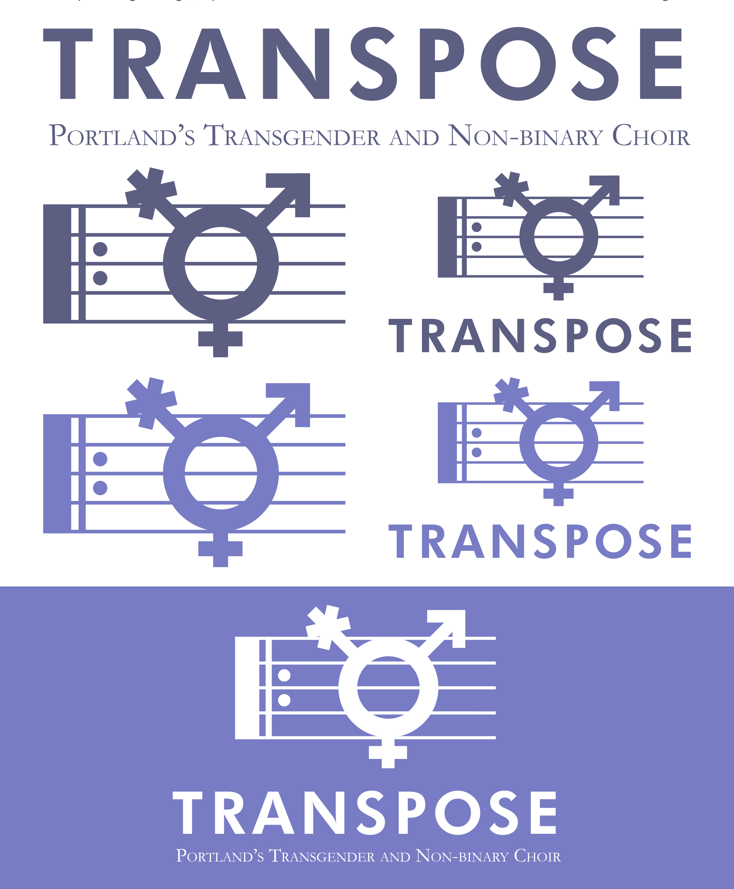
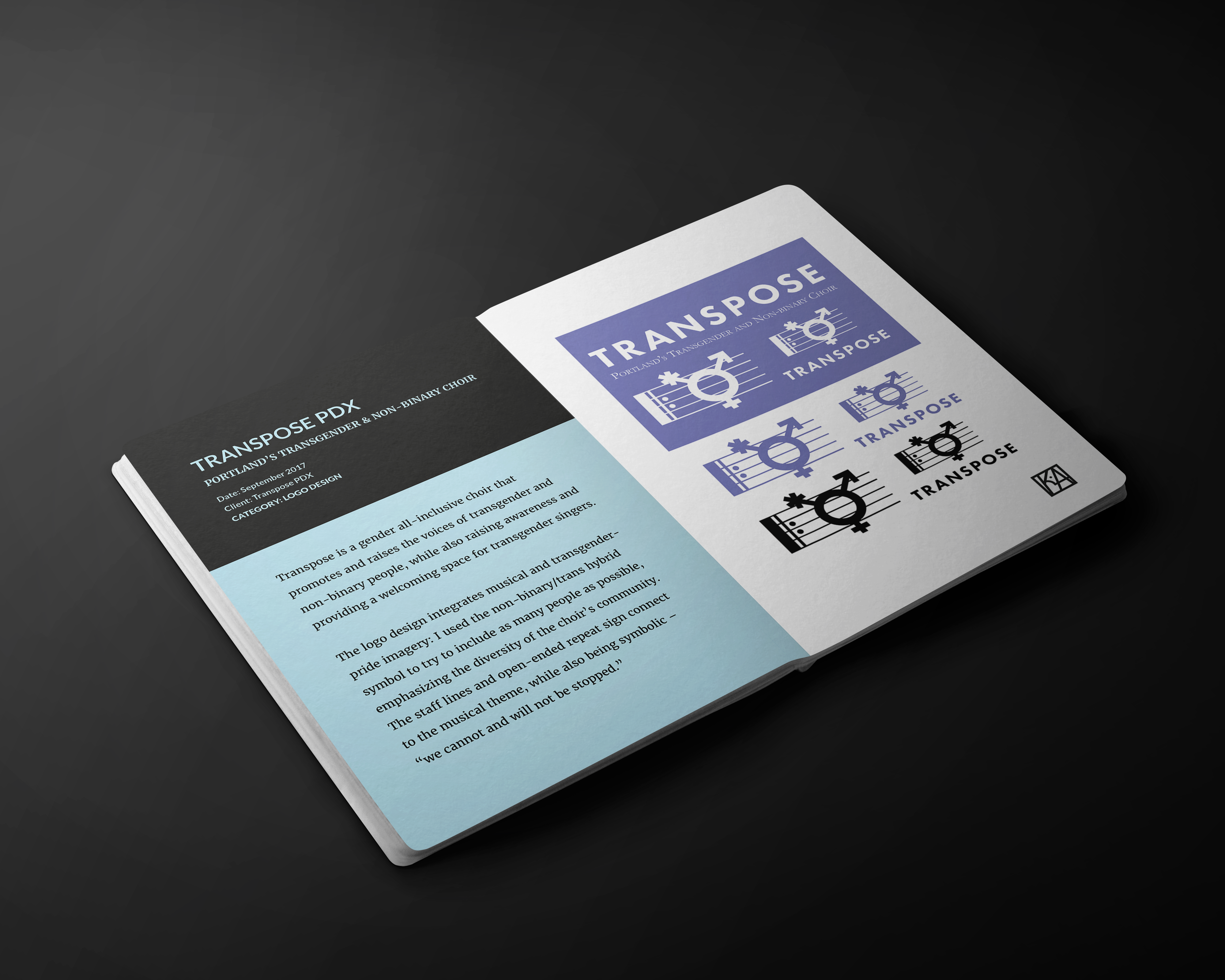
Transpose is a gender-affirming choir based in Portland, Oregon, that celebrates the community of transgender and non-binary singers. For the logo, the choir wanted something that combined the theme of music with the transgender symbol (specifically, the non-binary inclusive version of the trans symbol).
The choir was also interested in both a simple, silhouette version as well as a full color version, which is where the watercolor background comes into play. Using musical notation as a guide, along with the golden ratio, I drew the trans/non-binary symbol as if it were a music note on a repeating staff -- the repeating symbol paying tribute to our community's message: We cannot and will not be silenced.
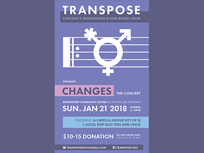
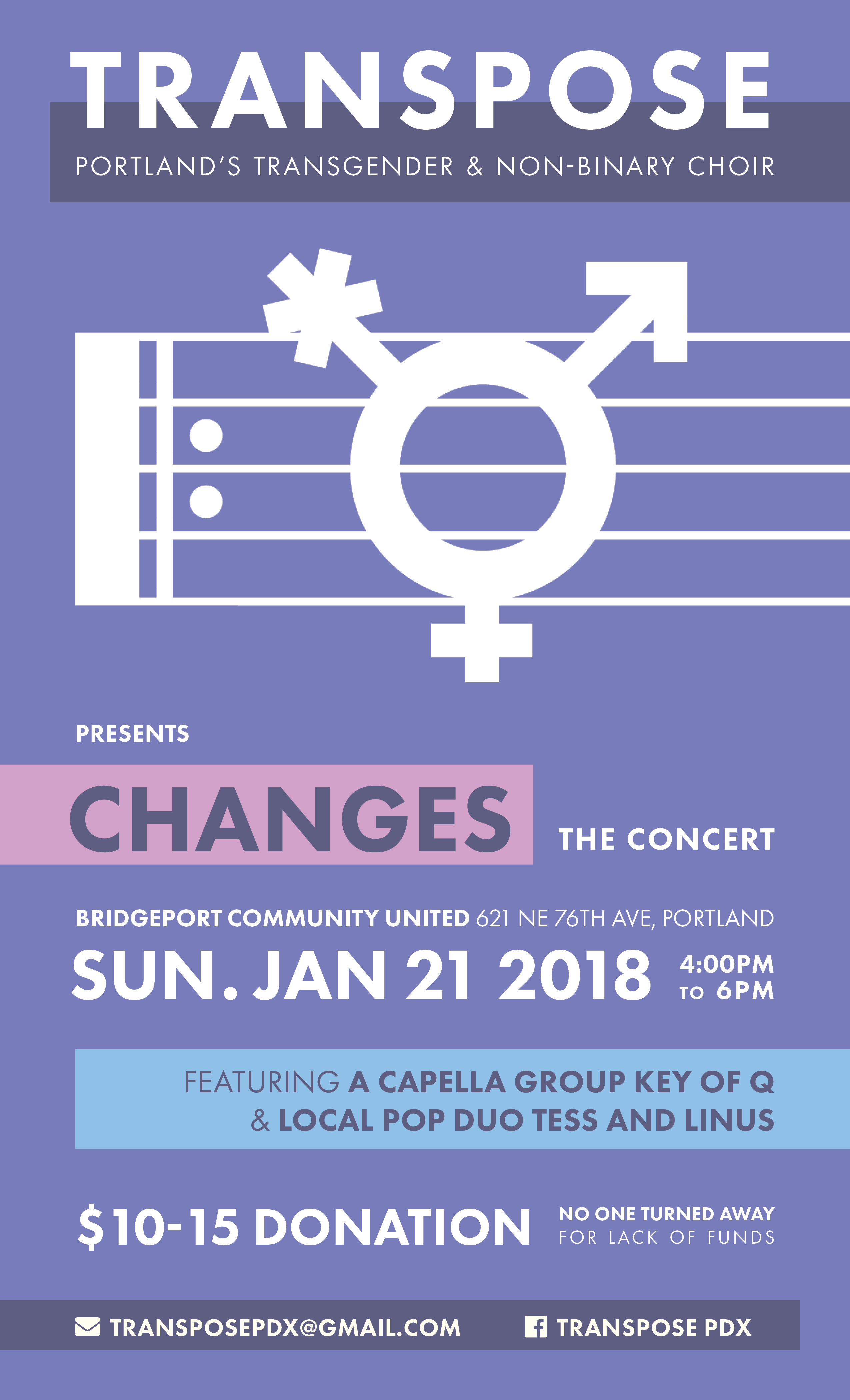
"Changes" is Transpose's first big concert, so the planning team wanted to keep it simple and showcase the new logo. Having the staff lines run off the page plays into the same "we won't be stopped" mentally of the repeat sign, while also adding a sense of hierarchy and movement to the overall poster.
The colors used are the same as the ones established with the full-color logo: taking inspiration for the trans pride flag (light blue, pink, and white) as well as the color purple which is part of the non-binary pride flag and is frequently used to represent gender-non-conformity. The layout and typography is kept modern and simple, with color-blocking used to highlight specific text, add to the hierarchy and flow, and balance the overall design.
Upper Crust Bakery and Patisserie is a fictional French bakery that prides itself on its authenticity, craftsmanship, and heritage.
“Our heritage and our hearts are in everything we do. When you are in the Upper Crust, you feel the essence of Paris!”
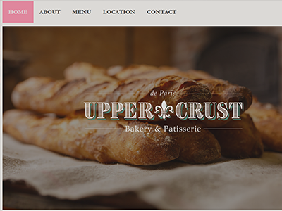
With Upper Crust's website, the goal was to continue the design, tone, and message established in the bakery's branding. While this was my first attempt at building a website, I worked on incorporating the same sense of authenticity and heritage through the color palette, focus on photography, and maintaining consistency with the bakery's print-marketing.
Upper Crust Bakery is a fictional French bakery and patisserie that I have worked with during my SNHU courses. The goal of the branding design was to convey the bakery's authenticity, celebrating the owner's French roots and pride for their baking. A number of ques were taken from Parisian patisseries, namely the color palette and typography. The Fleur-de-lis is also used as a repeated symbol throughout the brand, further tying the bakery to its French history.
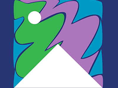
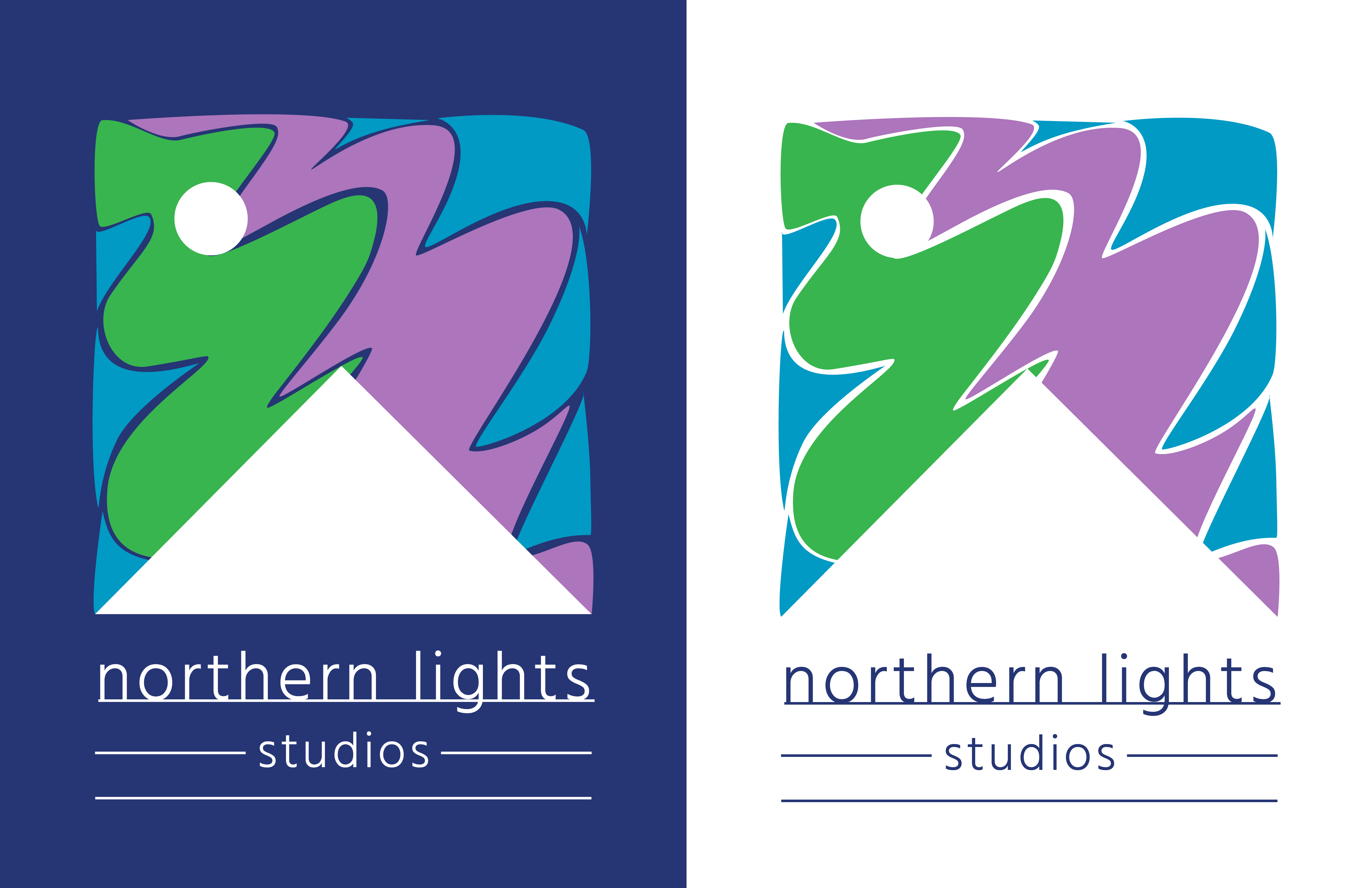
Northern Lights Studios is a fictional independent film company. Playing on the name of the studio, I wanted to incorporate the colors and shapes of the aurora borealis, simplifying the playful swirls of vibrant green, purple, and cyan into simple vectors. Furthering the theme of simple, geometric shapes, a white triangle and circle symbolize a moonlit, mountain skyline framing and grounding the northern lights. For the typography, I wanted to complement the logo with a thin, clean san-serif font, using all-lowercase and complementary lines to mimic the look of a horizon line. The logo is designed to work on a navy or white background.
Date: January 2018
Personal Project
Category: Graphic Design
Nothern Lights Studios
Business Card
This two-sided business card plays with the themes established in the original logo design
for Northern Lights Studios. The navy background draws from the colors of an illuminated night sky, while also allowing the other colors to appear even more vibrant. I wanted to simply showcase the logo on one side, placing it in the bottom half of the card for balance. On the other side, I incorporated another simplified aurora borealis vector that uses the same colors and curving motions as the logo. The swirls lead the eye down the card to the card-holder’s name and information, using the same san-serif font as the logo for the name and website and a complementary serif font for the contact information.
Date: January 2018
Personal Project
Category: Graphic Design
Boots and Suits
Illustration on Canvas Paper
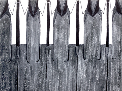
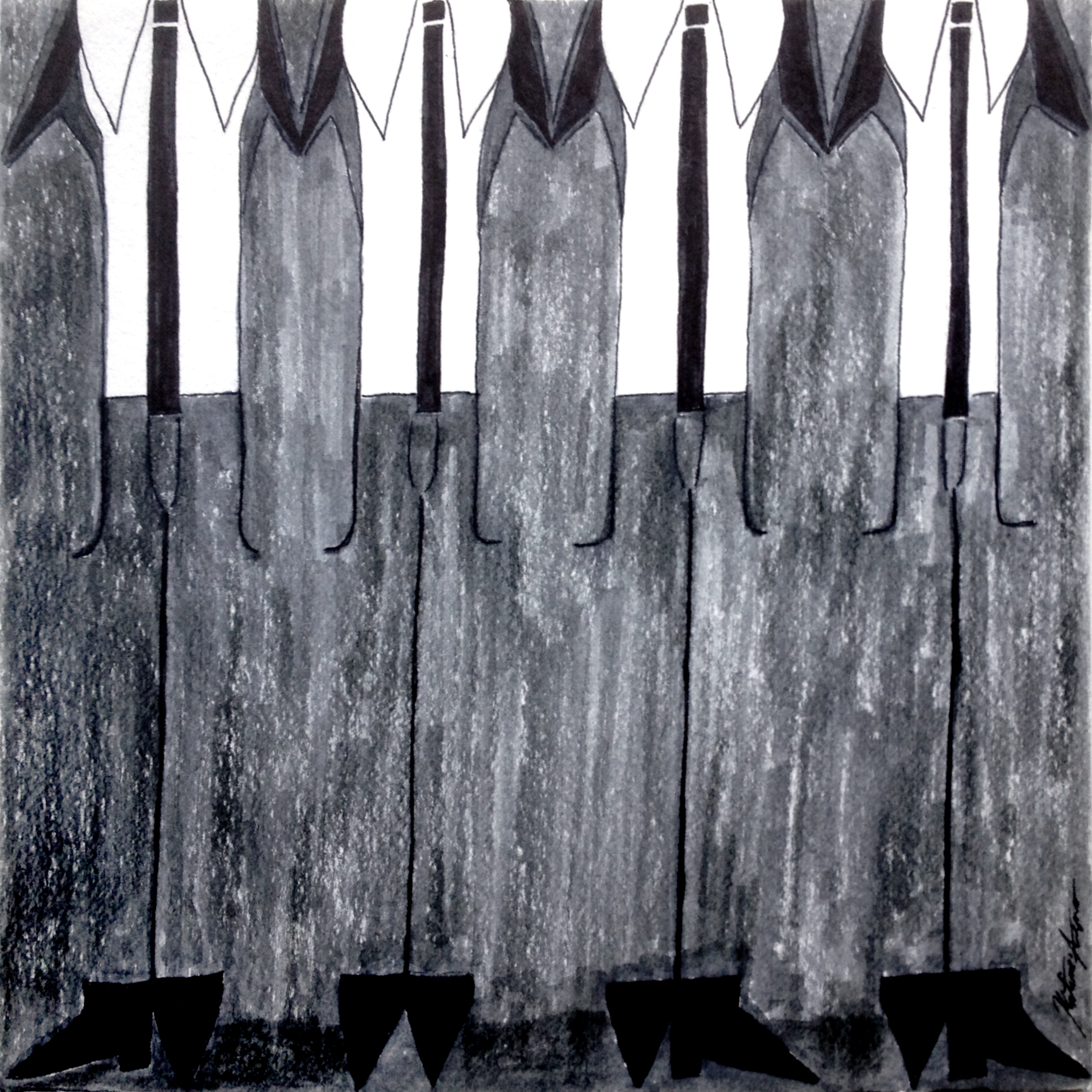
“Boots and Suits” is an abstract, geometric marker illustration on canvas paper created during my time in Liverpool, UK – the city that first got me interested in design and where I spent a good amount of time developing my style. Featured in the Milepost 5 Residents’ Showcase, February 2016 (Portland, Oregon).
Date: January 2015
Showcased: February 2016
Category: Artwork
The Van Haaftens
Digital Collage
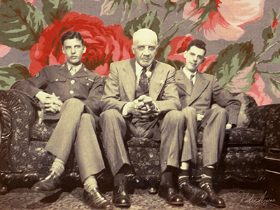
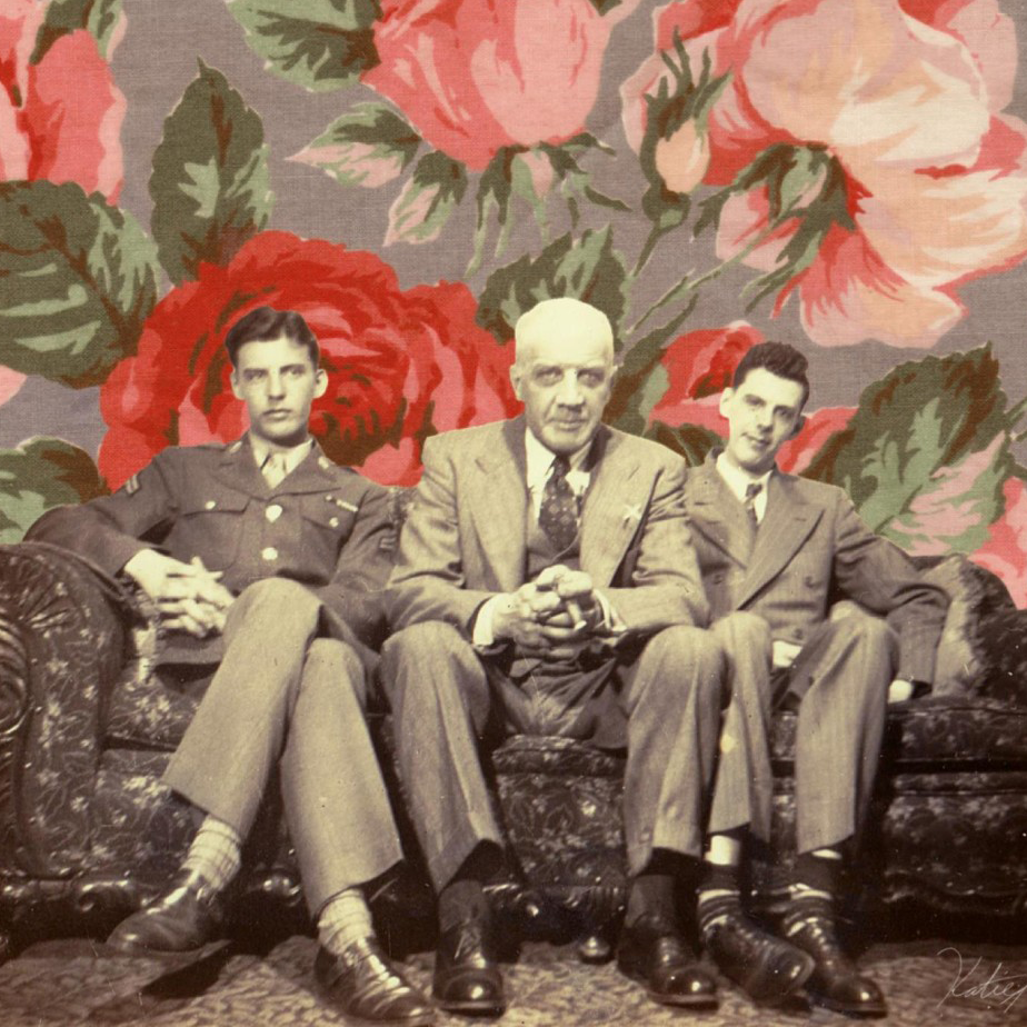
Created as a personal art project, this digital collage draws on family history to createa dynamic image. The background pattern is taken from one of my grandmother’shandkerchiefs, while the photograph (taken April 2, 1944) depicts my grandfather, great-grandfather, and great-uncle.
Date: May 2014
Category: Artwork
In The Cave
Acrylic Painting on Canvas-Paper
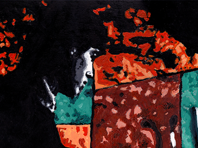
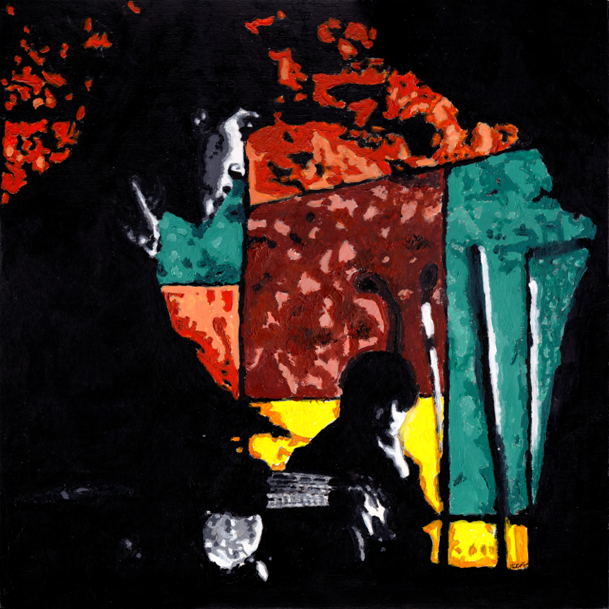
"In the Cave" depicts an image of the Cavern Club, Liverpool (which I used to live down the street from). The painting showcases two different eras: the black and white foreground depicts two of it's most famous resident musicians from the early 1960's, while the colorful background pays tribute to the new club's modern look. The use of simple shapes to compose a complex image, as well as a focus on color as a storytelling tool, are two key elements I've taken from my work as a painter into my work as a graphic designer. Thus, this piece showcases a unique intersection of my varied work.
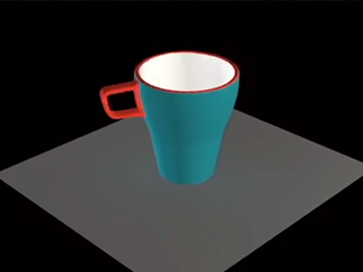
Created as a final project for a previous course, this video showcases the process of modeling and rendering a 3D tea cup. The video includes a turntable display of the cup, along with reference photos and various maps used for the piece.
Date: Novmber 2016
Category: Artwork
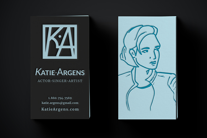
Personal Business Card
Date: December 2017
Category: Print Design & Visual Identity
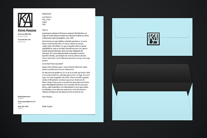
Personal Stationery
Date: December 2017
Category: Print Design & Visual Identity
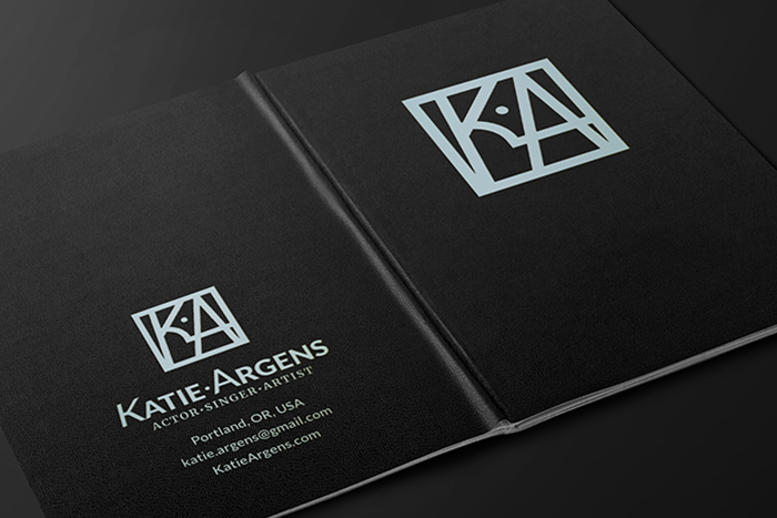
Portfolio and Journal
A small, physical booklet that showcases my work and can serve as a sketchbook, notebook, and project journal.