These are what I have done since Jan 2002 when I entered CCS.
It took me a while to realize what I was doing and what I should be doing, but
it was during the summer break in June when I was somehow "enlightened" and can
finally handle things better.
However the style of Transportation Design in US just
don't appeal to me after really looking at the industry and comparisons with
some European schools. I see it as a form of Product Design and not another
vase. Function comes before form for me.
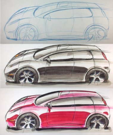
The following works are done with various mediums
from my experiments with them. Well, I like the Canson papers most as it can
easily bring out effects that you want in a dramatic way. It's quick too! The
fashion pad gives a very soft feel even with extremely hard forms. However it
has its limitations and maybe one day I can bring it further. The vellum is
something that I still got to work hard on.
You probably can see the progress with time when the
works were done, and now that I have decided to go into Product Design, the
progress did help me with a quicker start and understanding in the class.
Please click on the thumbnails for larger pictures...
as usual.
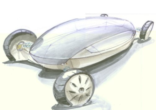
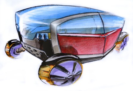
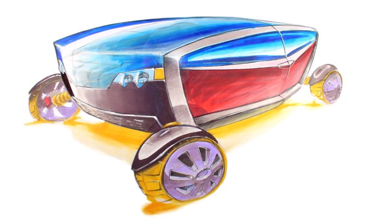
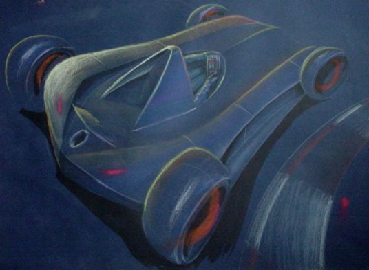
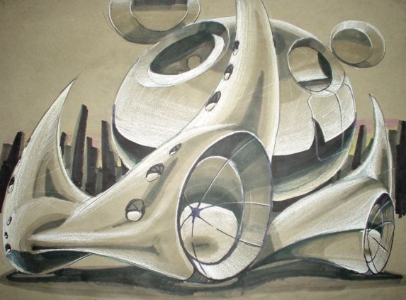
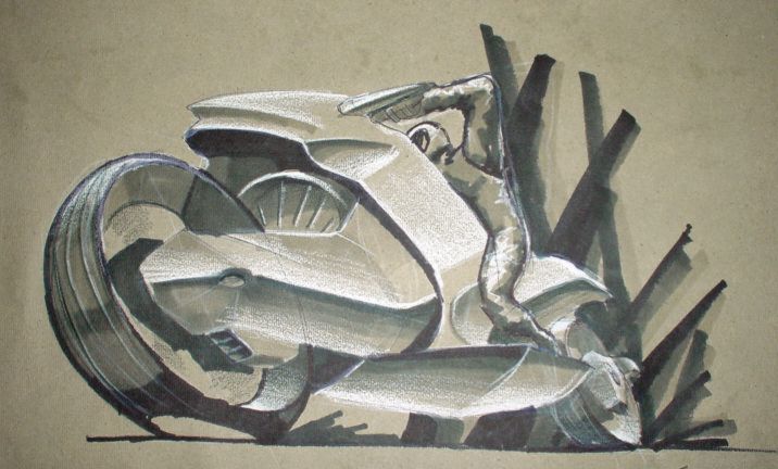
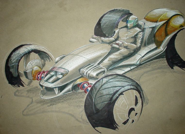
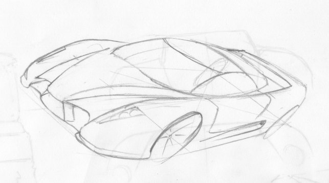
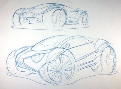
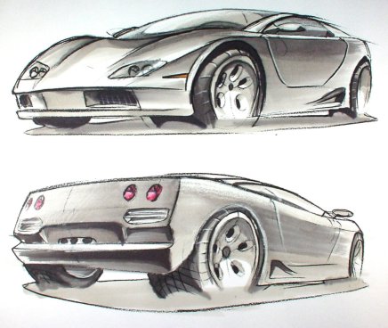
The
following series of 6 sketches is an evolution and exploration of the
opened-wheel concept, turned from a personalized vehicle to a lux-limo. It was
done over a period of 5 months casually, not a part of my class, but most of
them are done during the later part of my summer break from June to August.
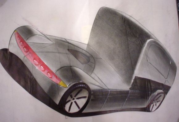
Now
these are works done during the Winter semester, mainly for class between Jan
and end of April.
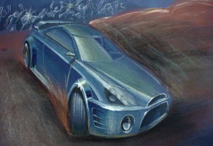
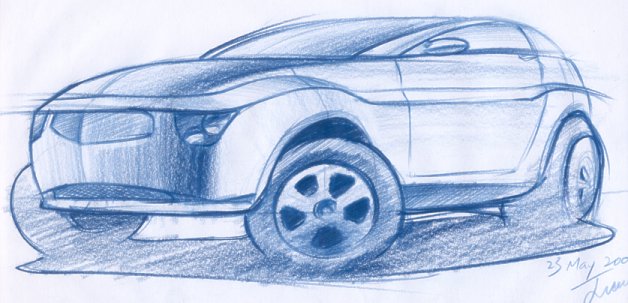
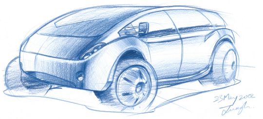
Next
are what I have done since the first to the last day of my summer break 2002,
between May and September.
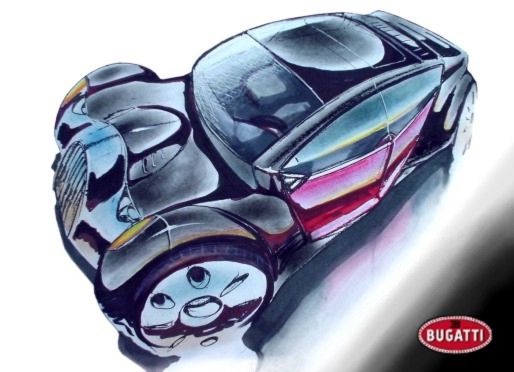
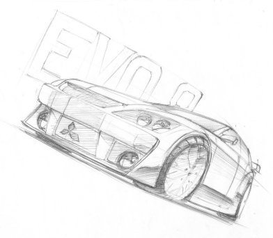
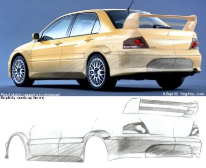
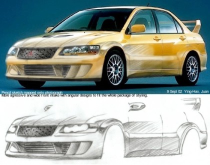
I
did these 2 recently( Sept 2002) initially for a Lancer body kit competition but
did not went through due to some reason which I considered insignificant.
Nevertheless this was my first successful attempt of merging pencil sketch with
existing picture, and will definitely help in my future presentations with
computer effects. BTW these 2 were done with Corel Photopaint 8.0.
There
will be more to come when I have digitalized other of my works, here and in
other sections. So please be patient and I will be sure to bring you good
stuffs!
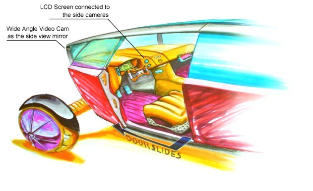
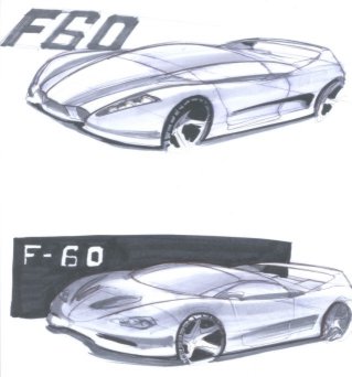
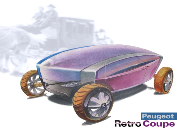
Here's my entry piece to Peugeot's 2nd contest. The theme is "Retro
Futurism". The concept, as you probably can see, originated from the
forms on the top of this page,
which is actually from that of a stage coach. I intended to submit just one of
those I have already done, as them coincidently match the theme of the
contest. However the details just don't suggest "Peugeot", thus I
made this coupe version of the concept, giving it more live and energy. This
is probably my best attempt of using vellum, the cleanest time:) Hope you will
like it!
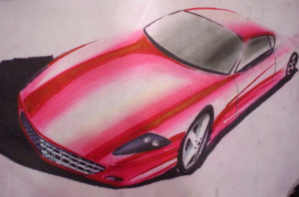
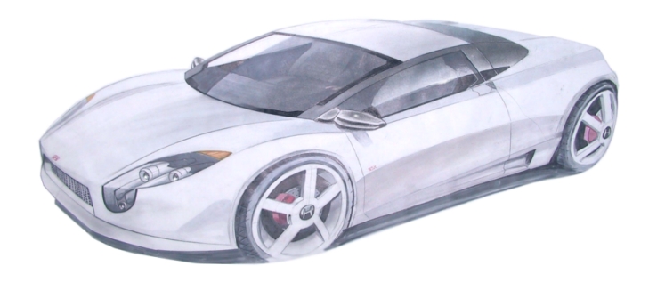
Here is my latest rendering done for vis-com class. It's a redesigned Honda
NSX as I really think the current design is getting out dated. This design is
geared towards the S2000 styling, with more balanced proportion( doesn't have
big butts like the current NSX), and a little of the European element in it.
Also this is my first attempt on the hardest color to render---white. Well,
it's relatively successful but what you see here has been edited, so the
original one doesn't look as good.
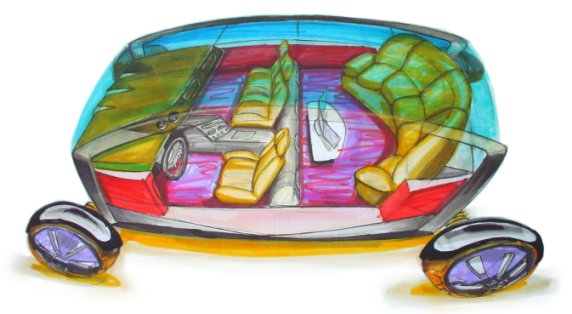
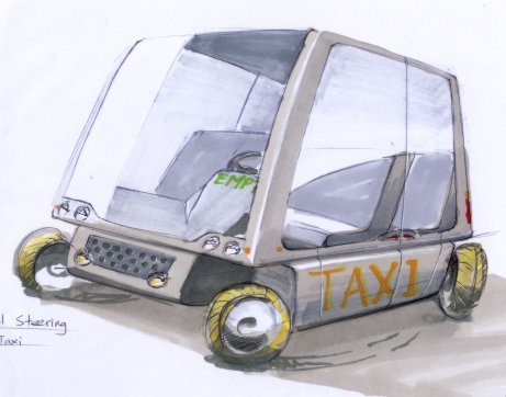
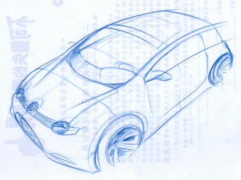
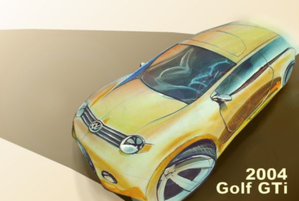
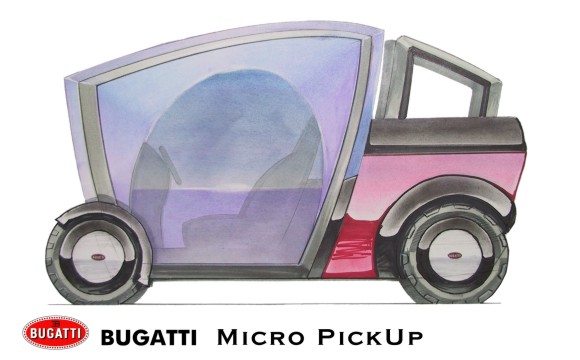
I was all onto micro cars suddenly and decided to do this design....:)
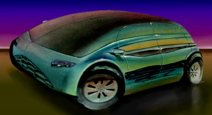
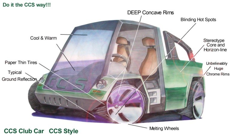
CCS Club Car. CCS Style...:( This is a stereotype illustration of
the rendering styles used in this school for many years. Although it's been
changing with the rest of the world, some are still evident in many of the
current student's works. Just goes to show the negative effect of pure
styling. Lot's of "cool" elements but stupid as it does not give the
viewer any sense of reality of how this design will be real life. Many of the
techniques used are just contradicting the purpose of the rendering, that is
to show the design and form, in my opinion.