MY HISTORY IN THE BUSINESS
ABOUT
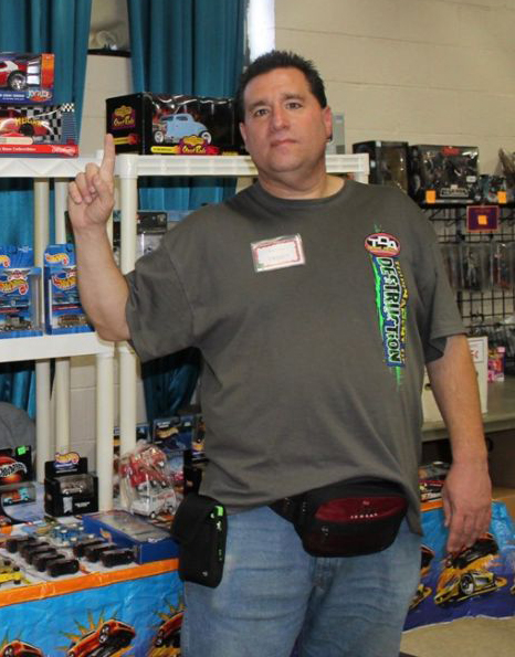
My name is Steve. I've been collecting and selling vintage toys and video games since the early 90's. I started out with my love of Star Wars and into a hobby of collecting toys when my son was born, as a way get him the complete collection of what he was into. As he got older and moved on from toys, I found myself selling his old toys and enjoying it. Soon it became a full fledged side business, and eventually a full time one. Over the years I've become a Lego expert.
DEVELOPMENT PROCESS
The purpose of this website is to be the one-stop shop for my uncle Steve's vintage toys and video games sales business. The site is to provide current and prospective customers with information regarding his current inventory, in person sales event schedule and contact information. To achieve this, I had to make sure all of this information was available and up to date.
The design started with an overall look and feel that I wanted to achieve, which was friendly, inviting and happy. I started with the home page; while I knew essentially what I wanted the basic layout to be, I had to figure out the specifics. I reviewed many other vintage toys retailer websites to get a better idea of common trends and gather inspiration for how to and not to design mine. For the background image of all the pages, I used a vintage toys pattern that encompassed my triadic color scheme, and lowered the opacity so it wasn't too distracting, also the main part of the page takes up a majority of it with a white background to break up the image, as to not have it be too over powering. The header and navigation were designed from the beginning, I wanted a custom logo in the top left corner and the navigation to be inline text in the top right of the header. This would help easily and clearly establish the site and how to navigate the site, which were links.
On the home page I wanted something that grabbed the end user's attention right away, so I researched and integrated a photo slideshow. I figured some key images of items he sells would help easily tell the visitor some of the top items he has for sale. Also, the user can click through the slideshow to view the images at their own pace. I also provided a form for users to fill out to be added to my uncle's mailing list to be updated on new items, sales or events. As this would help keep both the user and my uncle engaged with each other.
Each of the pages were made for a specific need of the visitor; merchandise, schedule, trade info, and an about page. These pages are straight to the point, so the user doesn't have to guess where to look for the specific task they want to do.
The footer I put in one of my triadic colors, yellow, as I felt was a nice light color that didn't take away from the rest of the page, as it only contains the copyright information for the website.
DEFENSE OF FINAL PRODUCT
As I previously stated, I wanted this site to be fun, friendly and informative. This is why I chose to use a triadic color scheme consisting of the primary colors throughout the site. Since the main part of my background is white, I chose to keep the text black and in a serif font, as that would make it more legible and easier on the visitor's eyes.
I kept the font a serif font for the larger blocks of text, as it is easier to read. Other types of fonts, such as sans-serif/decorative fonts may "look" nice, but that is only in small blurbs, as larger chunks of decorative texts can be hard to read and cause strain on the visitor's eyes. Took keep the site look fun, I created a logo with a decorative text, but it is only short text in a big sized font. Thus, it is easy to read and is light hearted.
The background image is that of vintage toys, and consists mainly of my primary triadic color schemes, which fits the theme, but other students had mentioned it was a bit overwhelming. To counteract this, I lowered the opacity of the image, and had main body of the page take up a bigger percentage of the page. This way, the image was still able to be there, but taking up less of the page and at a lower opacity was less harsh on the viewer's eyes.
To keep the end user engaged, I had the text be both informative and light hearted. I also included images and media that were both self-explanatory and fun. The video I included is a fun look back at the toy commercials of the 80's and 90's, which is perfect for a large area of the demographic that shops for vintage toys and video games. Everything on the site is easy to navigate, as everything is within one to two clicks.
OPPORTUNITIES FOR IMPROVEMENT AND GROWTH
I think the one main area of improvement the site could use, is possibly a better layout. While I like the initial layout of the site, I think there could be a more streamlined look. While it looks decent, I feel it still looks amateurish. Things such as using the background image in a smaller capacity, and incorporating more color from my triadic color scheme in more places. Also, if I had more time, I would have worked on a better-looking site logo. Something to better capture the fun of the site.
If I had more time to get a better understanding and handle of html/css, I would have liked to incorporate a slicker formatting and style, especially in regards to the layout of text. I would have also like to incorporate better graphic/UI design techniques, for a look that is more modern. This would have helped create a more "professional" look to the site. While I think this site is a good start, I feel there is a lot more that could be done to further enhance the look and style of the site.
If this was an actual professional site, I also would have added full form submission functionality, had I known how to. Also, I would have added more content and completed further development of the item pages with full details. More professional looking images would also enhance the site to look more professional. Together these would have made the site a more robust experience.